- Electric and Telecom Plans Free
- Fire and Emergency Plans Free
- Floor Plans Free
- Plant Layout Plans Free
- School and Training Plans Free
- Seating Plans Free
- Security and Access Plans Free
- Site Plans Free
- Sport Field Plans Free
- Business Process Diagrams Free
- Business Process Mapping Free
- Classic Business Process Modeling Free
- Cross-Functional Flowcharts Free
- Event-driven Process Chain Diagrams Free
- IDEF Business Process Diagrams Free
- Logistics Flow Charts Free
- Workflow Diagrams Free
- ConceptDraw Dashboard for Facebook Free
- Mind Map Exchange Free
- MindTweet Free
- Note Exchange Free
- Project Exchange Free
- Social Media Response Free
- Active Directory Diagrams Free
- AWS Architecture Diagrams Free
- Azure Architecture Free
- Cisco Network Diagrams Free
- Cisco Networking Free
- Cloud Computing Diagrams Free
- Computer Network Diagrams Free
- Google Cloud Platform Free
- Interactive Voice Response Diagrams Free
- Network Layout Floor Plans Free
- Network Security Diagrams Free
- Rack Diagrams Free
- Telecommunication Network Diagrams Free
- Vehicular Networking Free
- Wireless Networks Free
- Comparison Dashboard Free
- Composition Dashboard Free
- Correlation Dashboard Free
- Frequency Distribution Dashboard Free
- Meter Dashboard Free
- Spatial Dashboard Free
- Status Dashboard Free
- Time Series Dashboard Free
- Basic Circle-Spoke Diagrams Free
- Basic Circular Arrows Diagrams Free
- Basic Venn Diagrams Free
- Block Diagrams Free
- Concept Maps Free
- Family Tree Free
- Flowcharts Free
- Basic Area Charts Free
- Basic Bar Graphs Free
- Basic Divided Bar Diagrams Free
- Basic Histograms Free
- Basic Line Graphs Free
- Basic Picture Graphs Free
- Basic Pie Charts Free
- Basic Scatter Diagrams Free
- Aerospace and Transport Free
- Artwork Free
- Audio, Video, Media Free
- Business and Finance Free
- Computers and Communications Free
- Holiday Free
- Manufacturing and Maintenance Free
- Nature Free
- People Free
- Presentation Clipart Free
- Safety and Security Free
- Analog Electronics Free
- Audio and Video Connectors Free
- Basic Circuit Diagrams Free
- Chemical and Process Engineering Free
- Digital Electronics Free
- Electrical Engineering Free
- Electron Tube Circuits Free
- Electronic Block Diagrams Free
- Fault Tree Analysis Diagrams Free
- GHS Hazard Pictograms Free
- Home Automation and Wiring Free
- Mechanical Engineering Free
- One-line Diagrams Free
- Power Сircuits Free
- Specification and Description Language (SDL) Free
- Telecom and AV Circuits Free
- Transport Hazard Pictograms Free
- Data-driven Infographics Free
- Pictorial Infographics Free
- Spatial Infographics Free
- Typography Infographics Free
- Calendars Free
- Decision Making Free
- Enterprise Architecture Diagrams Free
- Fishbone Diagrams Free
- Organizational Charts Free
- Plan-Do-Check-Act (PDCA) Free
- Seven Management and Planning Tools Free
- SWOT and TOWS Matrix Diagrams Free
- Timeline Diagrams Free
- Australia Map Free
- Continent Maps Free
- Directional Maps Free
- Germany Map Free
- Metro Map Free
- UK Map Free
- USA Maps Free
- Customer Journey Mapping Free
- Marketing Diagrams Free
- Matrices Free
- Pyramid Diagrams Free
- Sales Dashboard Free
- Sales Flowcharts Free
- Target and Circular Diagrams Free
- Cash Flow Reports Free
- Current Activities Reports Free
- Custom Excel Report Free
- Knowledge Reports Free
- MINDMAP Reports Free
- Overview Reports Free
- PM Agile Free
- PM Dashboards Free
- PM Docs Free
- PM Easy Free
- PM Meetings Free
- PM Planning Free
- PM Presentations Free
- PM Response Free
- Resource Usage Reports Free
- Visual Reports Free
- House of Quality Free
- Quality Mind Map Free
- Total Quality Management TQM Diagrams Free
- Value Stream Mapping Free
- Astronomy Free
- Biology Free
- Chemistry Free
- Language Learning Free
- Mathematics Free
- Physics Free
- Piano Sheet Music Free
- Android User Interface Free
- Class Hierarchy Tree Free
- Data Flow Diagrams (DFD) Free
- DOM Tree Free
- Entity-Relationship Diagram (ERD) Free
- EXPRESS-G data Modeling Diagram Free
- IDEF0 Diagrams Free
- iPhone User Interface Free
- Jackson Structured Programming (JSP) Diagrams Free
- macOS User Interface Free
- Object-Role Modeling (ORM) Diagrams Free
- Rapid UML Free
- SYSML Free
- Website Wireframe Free
- Windows 10 User Interface Free
Basic Charts
Graphs and charts are popular and widely used way of representing the information and data in a visual graphical form, of organizing a set of numerical data making them easy to understand, that is especially important for large amount of data. They help depict statistical data in a clear and comprehensive way to make possible the comparison analysis and forecasting, to show relationships and effectively highlight trends. The graphs allow display the tabular numeric data and functions, relationships between two variables (independent and dependent). The special symbols, such as lines in a Line chart, bars in a Bar chart, slices in a Pie chart, etc. are used to depict the data.
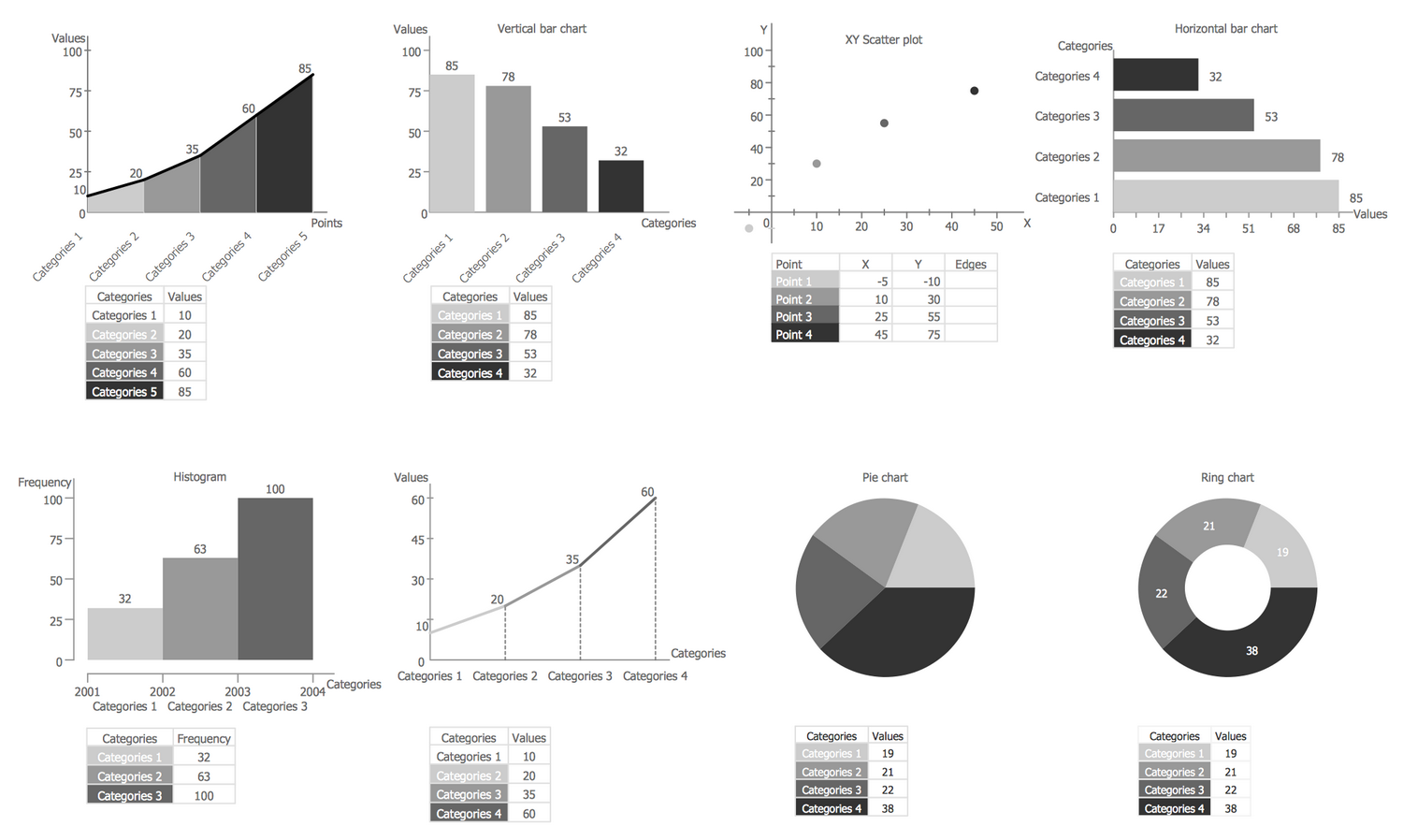
There are many different types of graphs and charts, which are applied in a wide variety of fields. The Basic Charts solution for ConceptDraw DIAGRAM is dedicated to creation the most popular and commonly used types of graphs and charts, such as Line Chart, Area Chart, Histogram, Scatter Diagram, Pie Chart, Donut Chart, Column Chart, Horizontal Bar Chart. It contains the predesigned vector stencils for each of these diagram types, also templates and a lot of typical examples and samples.
-
Install this solution Free -
What I need to get started -
Solution Requirements - This solution requires the following products to be installed:
ConceptDraw DIAGRAM v18 - This solution requires the following products to be installed:
-
Compatibility - Sonoma (14), Sonoma (15)
MS Windows 10, 11 - Sonoma (14), Sonoma (15)
-
Support for this Solution -
Helpdesk
There is 1 library containing 8 vector objects in the Basic Charts solution.
Design Elements — Basic Charts
Examples
There are a few samples that you see on this page which were created in the ConceptDraw DIAGRAM application by using the Basic Charts solution. Some of the solution's capabilities as well as the professional results which you can achieve are all demonstrated here on this page.
All source documents are vector graphic documents which are always available for modifying, reviewing and/or converting to many different formats, such as MS PowerPoint, PDF file, MS Visio, and many other graphic ones from the ConceptDraw Solution Park or ConceptDraw STORE. The Basic Charts solution is available to all ConceptDraw DIAGRAM users to get installed and used while working in the ConceptDraw DIAGRAM diagramming and drawing software.
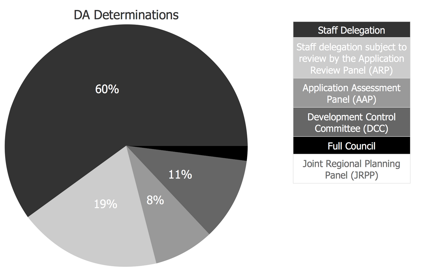
Example 1: Development Assessment Determination
This example was created in ConceptDraw DIAGRAM using the Basic Charts Library from the Basic Charts Solution. An experienced user spent 10 minutes creating this sample.
This diagram shows the development assessment determination using the Pie Chart. The percentage values for the parts of one total are represented as pie sectors of varied colors and corresponding sizes. The explanations for the colors is available the right side of a diagram in the form of a legend.
Example 2: Evolution of the Population
This example was created in ConceptDraw DIAGRAM using the Basic Charts Library from the Basic Charts Solution. An experienced user spent 5 minutes creating this sample.
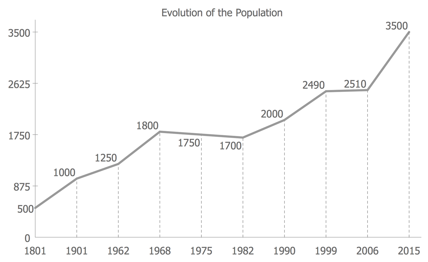
This Line Chart depicts the information about evolution of population over the long period of time. The data are represented as series of data points (each point is characterized by two variables) and are connected by line segments.
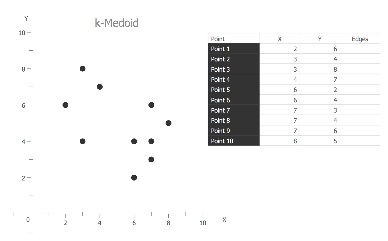
Example 3: K-Medoid
This example was created in ConceptDraw DIAGRAM using the Basic Charts Library from the Basic Charts Solution. An experienced user spent 5 minutes creating this sample.
This Scatter diagram illustrates the K-Medoid, the data sets are represented as a collection of points in Cartesian coordinates. The values of two variables for each point are entered to the table and then are automatically depicted on a diagram.
Example 4: Percentage of U.S. High School Students
This example was created in ConceptDraw DIAGRAM using the Basic Charts Library from the Basic Charts Solution. An experienced user spent 5 minutes creating this sample.
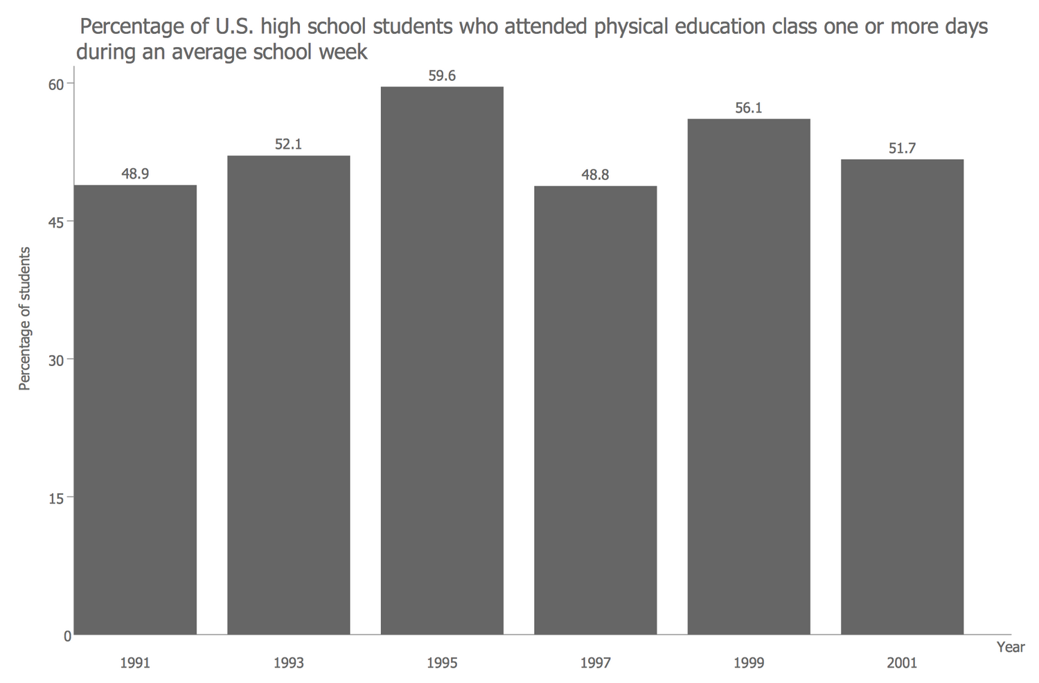
This example shows a Column Chart, its vertical bars depict the data and highlight the differences in percentage of U.S. high school students who attended physical education class one or more days during an average school week.
Example 5: San Francisco Population History
This example was created in ConceptDraw DIAGRAM using the Basic Charts Library from the Basic Charts Solution. An experienced user spent 10 minutes creating this sample.
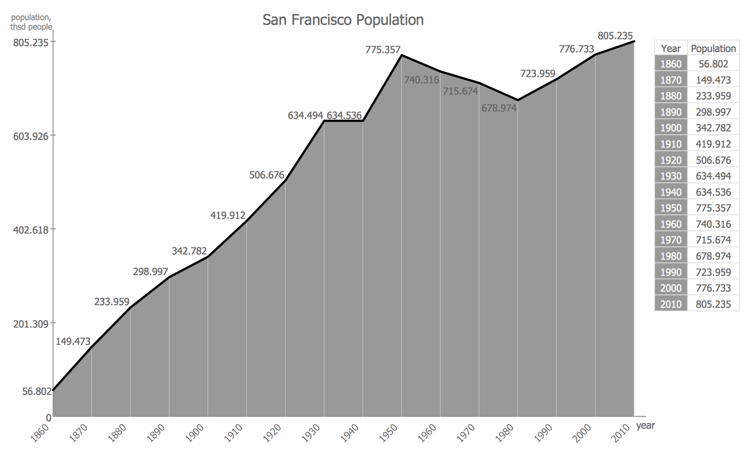
This Area Chart shows the population history of San Francisco over the last 150 years. It illustrates the changes in population quantity, depicting on a chart the amount of population in each 10 years, connecting them by a polygonal line and filling the area beneath this line.
