- Electric and Telecom Plans Free
- Fire and Emergency Plans Free
- Floor Plans Free
- Plant Layout Plans Free
- School and Training Plans Free
- Seating Plans Free
- Security and Access Plans Free
- Site Plans Free
- Sport Field Plans Free
- Business Process Diagrams Free
- Business Process Mapping Free
- Classic Business Process Modeling Free
- Cross-Functional Flowcharts Free
- Event-driven Process Chain Diagrams Free
- IDEF Business Process Diagrams Free
- Logistics Flow Charts Free
- Workflow Diagrams Free
- ConceptDraw Dashboard for Facebook Free
- Mind Map Exchange Free
- MindTweet Free
- Note Exchange Free
- Project Exchange Free
- Social Media Response Free
- Active Directory Diagrams Free
- AWS Architecture Diagrams Free
- Azure Architecture Free
- Cisco Network Diagrams Free
- Cisco Networking Free
- Cloud Computing Diagrams Free
- Computer Network Diagrams Free
- Google Cloud Platform Free
- Interactive Voice Response Diagrams Free
- Network Layout Floor Plans Free
- Network Security Diagrams Free
- Rack Diagrams Free
- Telecommunication Network Diagrams Free
- Vehicular Networking Free
- Wireless Networks Free
- Comparison Dashboard Free
- Composition Dashboard Free
- Correlation Dashboard Free
- Frequency Distribution Dashboard Free
- Meter Dashboard Free
- Spatial Dashboard Free
- Status Dashboard Free
- Time Series Dashboard Free
- Basic Circle-Spoke Diagrams Free
- Basic Circular Arrows Diagrams Free
- Basic Venn Diagrams Free
- Block Diagrams Free
- Concept Maps Free
- Family Tree Free
- Flowcharts Free
- Basic Area Charts Free
- Basic Bar Graphs Free
- Basic Divided Bar Diagrams Free
- Basic Histograms Free
- Basic Line Graphs Free
- Basic Picture Graphs Free
- Basic Pie Charts Free
- Basic Scatter Diagrams Free
- Aerospace and Transport Free
- Artwork Free
- Audio, Video, Media Free
- Business and Finance Free
- Computers and Communications Free
- Holiday Free
- Manufacturing and Maintenance Free
- Nature Free
- People Free
- Presentation Clipart Free
- Safety and Security Free
- Analog Electronics Free
- Audio and Video Connectors Free
- Basic Circuit Diagrams Free
- Chemical and Process Engineering Free
- Digital Electronics Free
- Electrical Engineering Free
- Electron Tube Circuits Free
- Electronic Block Diagrams Free
- Fault Tree Analysis Diagrams Free
- GHS Hazard Pictograms Free
- Home Automation and Wiring Free
- Mechanical Engineering Free
- One-line Diagrams Free
- Power Сircuits Free
- Specification and Description Language (SDL) Free
- Telecom and AV Circuits Free
- Transport Hazard Pictograms Free
- Data-driven Infographics Free
- Pictorial Infographics Free
- Spatial Infographics Free
- Typography Infographics Free
- Calendars Free
- Decision Making Free
- Enterprise Architecture Diagrams Free
- Fishbone Diagrams Free
- Organizational Charts Free
- Plan-Do-Check-Act (PDCA) Free
- Seven Management and Planning Tools Free
- SWOT and TOWS Matrix Diagrams Free
- Timeline Diagrams Free
- Australia Map Free
- Continent Maps Free
- Directional Maps Free
- Germany Map Free
- Metro Map Free
- UK Map Free
- USA Maps Free
- Customer Journey Mapping Free
- Marketing Diagrams Free
- Matrices Free
- Pyramid Diagrams Free
- Sales Dashboard Free
- Sales Flowcharts Free
- Target and Circular Diagrams Free
- Cash Flow Reports Free
- Current Activities Reports Free
- Custom Excel Report Free
- Knowledge Reports Free
- MINDMAP Reports Free
- Overview Reports Free
- PM Agile Free
- PM Dashboards Free
- PM Docs Free
- PM Easy Free
- PM Meetings Free
- PM Planning Free
- PM Presentations Free
- PM Response Free
- Resource Usage Reports Free
- Visual Reports Free
- House of Quality Free
- Quality Mind Map Free
- Total Quality Management TQM Diagrams Free
- Value Stream Mapping Free
- Astronomy Free
- Biology Free
- Chemistry Free
- Language Learning Free
- Mathematics Free
- Physics Free
- Piano Sheet Music Free
- Android User Interface Free
- Class Hierarchy Tree Free
- Data Flow Diagrams (DFD) Free
- DOM Tree Free
- Entity-Relationship Diagram (ERD) Free
- EXPRESS-G data Modeling Diagram Free
- IDEF0 Diagrams Free
- iPhone User Interface Free
- Jackson Structured Programming (JSP) Diagrams Free
- macOS User Interface Free
- Object-Role Modeling (ORM) Diagrams Free
- Rapid UML Free
- SYSML Free
- Website Wireframe Free
- Windows 10 User Interface Free
Correlation Dashboard
Any dependence in statistics is known to be some kind of a statistical relationship between two bivariate data or random variables. Correlation is known as a part of the statistical relationships that involve dependence. In more common usage it may also refer to the way two variables are placed to each other so they can have a linear relationship with each other.
The most popular examples of such dependent phenomena may include the correlation between the physical statures of parents and their children. Also, a correlation may appear between the price for a product and its demand.
Correlations are very useful for a reason of being able to indicate a predictive relationship. Such relationship can be always exploited in practice and an example for it may be an electrical utility that can produce less power on a mild day which is known from the correlation between weather and electricity demand.
For those users who intend to capture a UEM data, the UEM Correlation Overview dashboard may be created in order to show a variety of UEM capacity data so it may give an opportunity to get an overall picture of UEM deployment as a whole. Such dashboard may include such data as the Queued UEM Events, the Processed User Actions, the Dropped/Skipped User Actions, the Visits, User’s Action Correlation Time, UEM Correlation Activity — Web Requests, UEM Correlation Activity — CPU, Processed Web Requests and Beacons as well as the Visit Analysis.
Correlation Dashboard solution can be used while creating the dashboards in the ConceptDraw DIAGRAM diagramming and drawing software. This solution contains the set of the Live Objects that were designed for helping to visualize a predictive relationship between two numerical parameters of items from one or few series by using the Scatter Plot Charts.
-
Install this solution Free -
What I need to get started -
Solution Requirements - This solution requires the following products to be installed:
ConceptDraw DIAGRAM v18 - This solution requires the following products to be installed:
-
Compatibility - Sonoma (14), Sonoma (15)
MS Windows 10, 11 - Sonoma (14), Sonoma (15)
-
Support for this Solution -
Helpdesk
Related News:
Examples
The samples you see on this page were obtained by connecting a sample data source to templates from the Correlation Dashboard solution, to demonstrate some of the solution's capabilities and the results you can achieve.
These documents are vector graphic documents, created in ConceptDraw DIAGRAM using ConceptDraw Live Objects technology. They are available for modifying, reviewing and/or converting to many different formats, such as MS PowerPoint, PDF file, MS Visio, and many other graphic ones from the ConceptDraw Solution Park or ConceptDraw STORE. The Correlation Dashboard solution is available to all ConceptDraw DIAGRAM users to get installed and used while working in the ConceptDraw DIAGRAM diagramming and drawing software.
You can download sample data sources for all dashboards to see how changes made to data effect dashboard appearance.
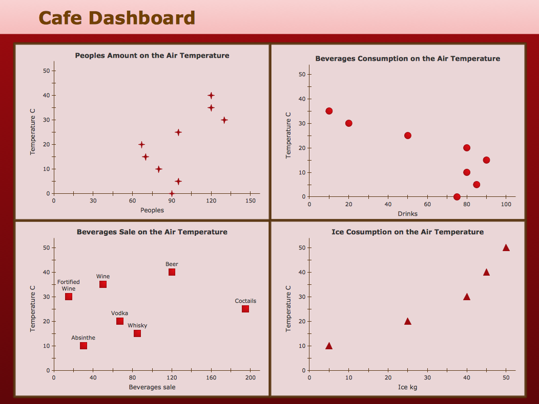
Example 1: Correlation Dashboard — Café Dashboard
This sample was created in ConceptDraw DIAGRAM using the Correlation Dashboard solution, and demonstrates the solution's capabilities and the results you can achieve using this solution. All the charts on this page change automatically when the data source changes.
This café performance dashboard contains four scatter plots. The scatter plots show how air temperature affects the café’s business metrics: people amount, beverage consumption and sale, ice cream consumption.

What I need to get started
Both ConceptDraw DIAGRAM diagramming and drawing software and the Correlation Dashboard solution can help creating the visual dashboard you need. The Correlation Dashboard solution can be found in the Dashboards area of ConceptDraw STORE application that can be downloaded from this site. Make sure that both ConceptDraw DIAGRAM and ConceptDraw STORE applications are installed on your computer before you get started.
How to install
After ConceptDraw STORE and ConceptDraw DIAGRAM are downloaded and installed, you can install the Correlation Dashboard solution from the ConceptDraw STORE.

Start using
To make sure that you are doing it all right, use the pre-designed symbols from the stencil libraries from the solution to make your drawings look smart and professional. Also, the pre-made examples from this solution can be used as drafts so your own drawings can be based on them. Using the samples, you can always change their structures, colors and data.

What is it?
Any ConceptDraw Live Object Library consists of Live Objects, the special graphic objects that can change their appearance depending on external data. The Library contains the set of Live Objects designed to visualize a predictive relationship between two numerical parameters of items from one or few series, using Scatter Plot Charts.
Why use it?
Use these Live Objects to build and display the Correlation Charts according to your quantitative data. Include these charts into corporate and team dashboards to shows whether the relationship between two numerical parameters of items follows or not the normally expected pattern.
Correlation Comparison
«A correlation comparison shows whether the relationship between two variables follows — or fails to follow — the pattern you would normally expect <...>
Gene Zelazny
Whenever your message includes words like related to, increases with, decreases with, changes with, varies with, or the converse such as doesn’t increase with, it’s an instant clue that you’re showing a correlation comparison»
Say It With Charts: The Executive's Guide to Visual Communication
4th Edition
McGraw-Hill | 2001. P. 22.
Here is some advice on how to select the chart type for your Corellation Comparison:
- Use a Bar Chart to show few data points
- Use an XY Scatter Chart to show many data points.