- Electric and Telecom Plans Free
- Fire and Emergency Plans Free
- Floor Plans Free
- Plant Layout Plans Free
- School and Training Plans Free
- Seating Plans Free
- Security and Access Plans Free
- Site Plans Free
- Sport Field Plans Free
- Business Process Diagrams Free
- Business Process Mapping Free
- Classic Business Process Modeling Free
- Cross-Functional Flowcharts Free
- Event-driven Process Chain Diagrams Free
- IDEF Business Process Diagrams Free
- Logistics Flow Charts Free
- Workflow Diagrams Free
- ConceptDraw Dashboard for Facebook Free
- Mind Map Exchange Free
- MindTweet Free
- Note Exchange Free
- Project Exchange Free
- Social Media Response Free
- Active Directory Diagrams Free
- AWS Architecture Diagrams Free
- Azure Architecture Free
- Cisco Network Diagrams Free
- Cisco Networking Free
- Cloud Computing Diagrams Free
- Computer Network Diagrams Free
- Google Cloud Platform Free
- Interactive Voice Response Diagrams Free
- Network Layout Floor Plans Free
- Network Security Diagrams Free
- Rack Diagrams Free
- Telecommunication Network Diagrams Free
- Vehicular Networking Free
- Wireless Networks Free
- Comparison Dashboard Free
- Composition Dashboard Free
- Correlation Dashboard Free
- Frequency Distribution Dashboard Free
- Meter Dashboard Free
- Spatial Dashboard Free
- Status Dashboard Free
- Time Series Dashboard Free
- Basic Circle-Spoke Diagrams Free
- Basic Circular Arrows Diagrams Free
- Basic Venn Diagrams Free
- Block Diagrams Free
- Concept Maps Free
- Family Tree Free
- Flowcharts Free
- Basic Area Charts Free
- Basic Bar Graphs Free
- Basic Divided Bar Diagrams Free
- Basic Histograms Free
- Basic Line Graphs Free
- Basic Picture Graphs Free
- Basic Pie Charts Free
- Basic Scatter Diagrams Free
- Aerospace and Transport Free
- Artwork Free
- Audio, Video, Media Free
- Business and Finance Free
- Computers and Communications Free
- Holiday Free
- Manufacturing and Maintenance Free
- Nature Free
- People Free
- Presentation Clipart Free
- Safety and Security Free
- Analog Electronics Free
- Audio and Video Connectors Free
- Basic Circuit Diagrams Free
- Chemical and Process Engineering Free
- Digital Electronics Free
- Electrical Engineering Free
- Electron Tube Circuits Free
- Electronic Block Diagrams Free
- Fault Tree Analysis Diagrams Free
- GHS Hazard Pictograms Free
- Home Automation and Wiring Free
- Mechanical Engineering Free
- One-line Diagrams Free
- Power Сircuits Free
- Specification and Description Language (SDL) Free
- Telecom and AV Circuits Free
- Transport Hazard Pictograms Free
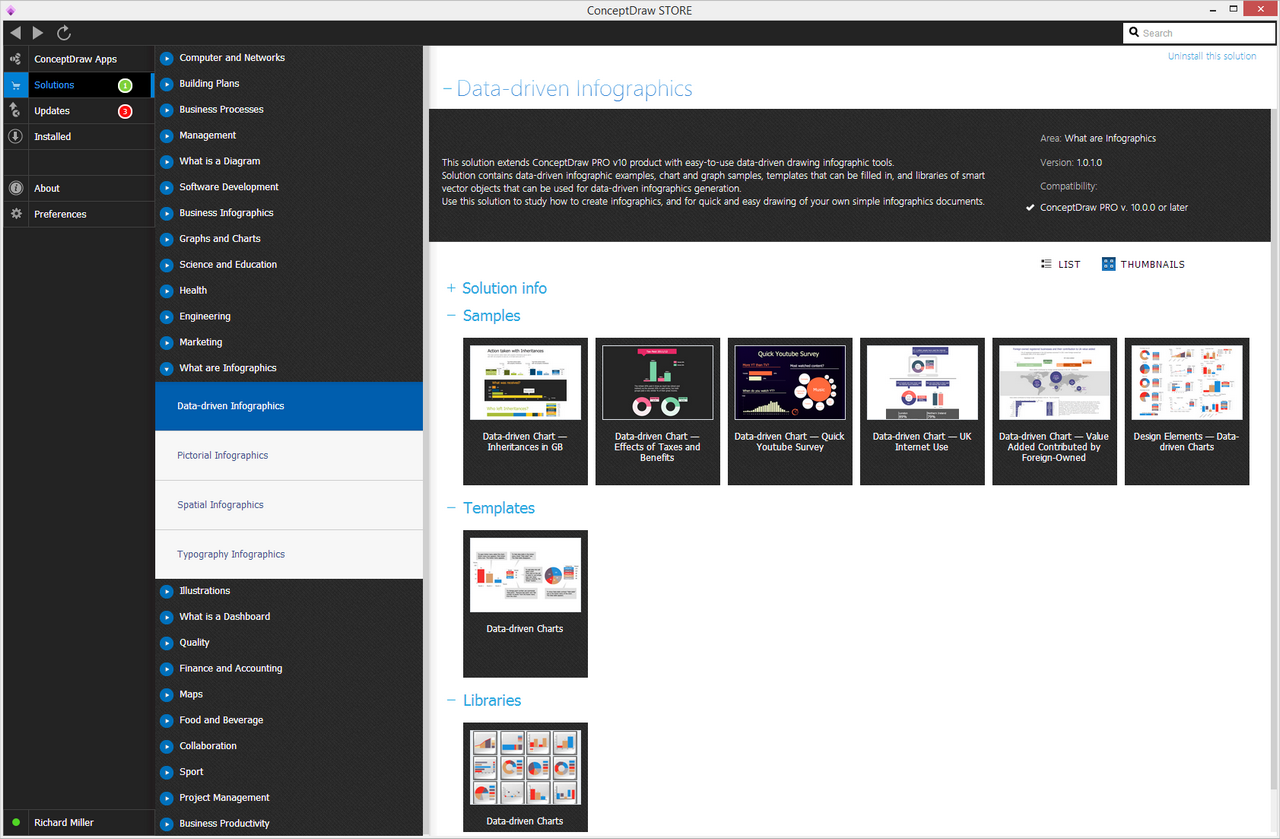
- Data-driven Infographics Free
- Pictorial Infographics Free
- Spatial Infographics Free
- Typography Infographics Free
- Calendars Free
- Decision Making Free
- Enterprise Architecture Diagrams Free
- Fishbone Diagrams Free
- Organizational Charts Free
- Plan-Do-Check-Act (PDCA) Free
- Seven Management and Planning Tools Free
- SWOT and TOWS Matrix Diagrams Free
- Timeline Diagrams Free
- Australia Map Free
- Continent Maps Free
- Directional Maps Free
- Germany Map Free
- Metro Map Free
- UK Map Free
- USA Maps Free
- Customer Journey Mapping Free
- Marketing Diagrams Free
- Matrices Free
- Pyramid Diagrams Free
- Sales Dashboard Free
- Sales Flowcharts Free
- Target and Circular Diagrams Free
- Cash Flow Reports Free
- Current Activities Reports Free
- Custom Excel Report Free
- Knowledge Reports Free
- MINDMAP Reports Free
- Overview Reports Free
- PM Agile Free
- PM Dashboards Free
- PM Docs Free
- PM Easy Free
- PM Meetings Free
- PM Planning Free
- PM Presentations Free
- PM Response Free
- Resource Usage Reports Free
- Visual Reports Free
- House of Quality Free
- Quality Mind Map Free
- Total Quality Management TQM Diagrams Free
- Value Stream Mapping Free
- Astronomy Free
- Biology Free
- Chemistry Free
- Language Learning Free
- Mathematics Free
- Physics Free
- Piano Sheet Music Free
- Android User Interface Free
- Class Hierarchy Tree Free
- Data Flow Diagrams (DFD) Free
- DOM Tree Free
- Entity-Relationship Diagram (ERD) Free
- EXPRESS-G data Modeling Diagram Free
- IDEF0 Diagrams Free
- iPhone User Interface Free
- Jackson Structured Programming (JSP) Diagrams Free
- macOS User Interface Free
- Object-Role Modeling (ORM) Diagrams Free
- Rapid UML Free
- SYSML Free
- Website Wireframe Free
- Windows 10 User Interface Free
Data-driven Infographics
Term “infographics” is a clipped compound of "graphics" and "information". They are the graphic visual representations of data, information or knowledge that are intended to present some information both clearly and quickly.
Being able to improve the cognition by utilizing different graphics in order to enhance the human visual system’s ability to see patterns, infographics have evolved to become the one to be widely used for mass communication. They can be designed with fewer assumptions about the readers' knowledge base to compare to any other type of visualizations.
There are three parts of all infographics: visual, the knowledge and the content. The first, the visual one, consists of both graphics and colours. There are two different types of graphics which are known to be called “reference” and “theme” ones. Reference graphics can be icons that are used for pointing to some certain data. Theme graphics can be included in all infographics, representing the underlying visual representation of some data. Statistics and facts can be a part of the content for infographics. They can be obtained from any number of sources. Such sources may be either news reports or census data, or both. The knowledge is known to be one of the most important aspects of infographics containing some sort of insight into the data that they are presenting.
Graphical representation of any data can be done via using the ConceptDraw DIAGRAM diagramming and drawing software. The Data-driven Infographics solution can help to represent the needed data that may induce its viewer to think about the substance, to create the needed graphic design. Using Data-driven Infographics solution may help to create the professionally-looking infographics in order to avoid distorting what some particular data have to say, to present many numbers in a small space, to make large data sets coherent and to encourage the eye to compare different pieces of data.
The Data-driven Infographics solution offers the easy-to-use data-driven drawing infographic tools to all the ConceptDraw DIAGRAM users as it contains the pre-made data-driven infographic examples, graph, and chart samples, as well as different templates, that can be filled in in order to make a unique-looking drawing. There are also a few stencil libraries that contain the smart vector objects to use for making the data-driven infographics quickly.
The Data-driven Infographics solution may be useful for many business specialists, such as the analysts, the project managers, and the project participants.
-
Install this solution Free -
What I need to get started -
Solution Requirements - This solution requires the following products to be installed:
ConceptDraw DIAGRAM v18 - This solution requires the following products to be installed:
-
Compatibility - Sonoma (14), Sonoma (15)
MS Windows 10, 11 - Sonoma (14), Sonoma (15)
-
Support for this Solution -
Helpdesk
There is 1 library containing 13 objects with data sources to create smart data-driven charts and waterfall charts.
Design Elements — Data-driven Charts

Examples
There are a few samples that you see on this page which were created in the ConceptDraw DIAGRAM application by using the Data-driven Infographics solution. Some of the solution's capabilities as well as the professional results which you can achieve are all demonstrated here on this page.
All source documents are vector graphic documents which are always available for modifying, reviewing and/or converting to many different formats, such as MS PowerPoint, PDF file, MS Visio, and many other graphic ones from the ConceptDraw Solution Park or ConceptDraw STORE. The Data-driven Infographics solution is available to all ConceptDraw DIAGRAM users to get installed and used while working in the ConceptDraw DIAGRAM diagramming and drawing software.
Example 1: Data-driven Chart — Effects of Taxes and Benefits
This diagram was created in ConceptDraw DIAGRAM using the Data Driven Charts Library from the Data-driven Infographics Solution. An experienced user spent 15 minutes creating this sample.
This sample shows the Data-driven chart for the effects of taxes and benefits. The infographic is a best way to visualize and represent any complex information in a simple and understandable form.

Example 2: Data-driven Chart — Inheritances in GB
This diagram was created in ConceptDraw DIAGRAM using the Data Driven Charts Library from the Data-driven Infographics Solution. An experienced user spent 30 minutes creating this sample.
This sample created with infographics tools of Data-driven Infographics Solution for ConceptDraw DIAGRAM isualizes the Inheritances in GB and the actions taken with them. All objects from the Data Driven Charts Library are smart objects – simply change the data at the tables and charts will change their views automatically.

Example 3: Data-driven Chart — Quick Youtube Survey
This diagram was created in ConceptDraw DIAGRAM using the Data Driven Charts Library from the Data-driven Infographics Solution. An experienced user spent 10 minutes creating this sample.
This Data-driven Infographic illustrates the Quick Youtube Survey. Make an infographic in ConceptDraw DIAGRAM quick and easy using the predesigned objects from the Data Driven Charts Library. Play with colors to make your chart pleasant to those whom you will show it.

Example 4: Data-driven Chart — UK Internet Use
This diagram was created in ConceptDraw DIAGRAM using the Data Driven Charts Library from the Data-driven Infographics Solution. An experienced user spent 20 minutes creating this sample.
This sample demonstrates the Data-driven chart of UK Internet using by people aged 16 years old and over. This one and many others infographic examples are available for viewing and editing from ConceptDraw STORE.

Example 5: Data-driven Chart — Value Added Contributed by Foreign-Owned
This diagram was created in ConceptDraw DIAGRAM using the Data Driven Charts Library from the Data-driven Infographics Solution. An experienced user spent 30 minutes creating this sample.
This Data-driven chart shows the value added contributed to UK by foreign-owned registered businesses. Using the smart objects from the Data Driven Charts Library from the Data-driven Infographics Solution, you can visually display the full set of data and facts that you have on this theme simply and fast.

More Examples and Templates

Inside


What I Need to Get Started
Both ConceptDraw DIAGRAM diagramming and drawing software and the Data-driven Infographics solution can help creating the infographics you need. The Data-driven Infographics solution can be found in the Infographics area of ConceptDraw STORE application that can be downloaded from this site. Make sure that both ConceptDraw DIAGRAM and ConceptDraw STORE applications are installed on your computer before you get started.
How to install
After ConceptDraw STORE and ConceptDraw DIAGRAM are downloaded and installed, you can install the Data-driven Infographics solution from the ConceptDraw STORE.

Start Using
To make sure that you are doing it all right, use the pre-designed symbols from the stencil libraries from the solution to make your drawings look smart and professional. Also, the pre-made examples from this solution can be used as drafts so your own drawings can be based on them. Using the samples, you can always change their structures, colors and data.
Data-driven Infographics
On a very simple level, infographics can be described as a way of presenting a particular piece of knowledge or data in a visual manner. There is endless variety in the way this can be achieved, and a wide of range of subjects that can be condensed in such a fashion. Perhaps the most common usage for the infographic, in business at least, is as a method to present company data as part of a succinct, easily digestible diagram. Sales teams will use them as an efficient method of sharing business results with team members and other stakeholders.
Because business data often consists of numerical values, the most effective way to display these are through certain infographic design elements — namely, charts, graphs, plots, graphic indicators and tables. These elements are ideal for the purpose, as information can be gained at a glance, and awkward groups of figures and text are condensed into graphic imagery. As an example, a company might sell a range of products. A bar chart would be an ideal way of presenting information regarding how many of each product is sold — each bar represents an item, and without closer inspection it will be immediately apparent which is performing best, and this will be the highest bar on the chart.
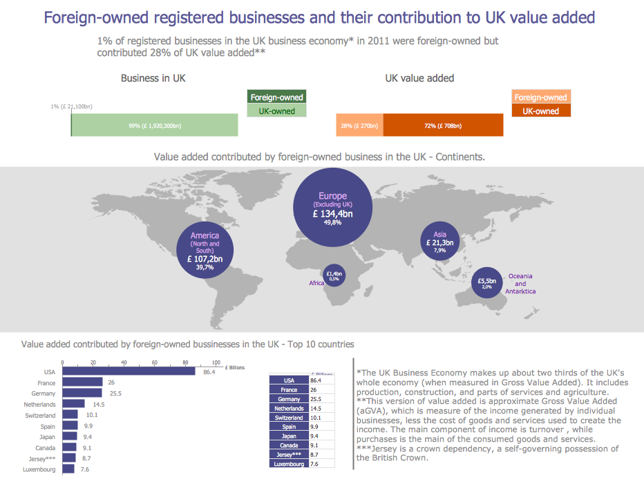
Infographic showing the value added by foreign-owned businesses in the UK — created using ConceptDraw DIAGRAM
So what benefit does this style of information delivery have for stakeholders in a business? We have already touched on the fact that graphic representations of data can be easily understood by all team members. This is especially important when presenting results to workers from other divisions of the company — by using graphic elements, you are negating the problem of role-specific or product-specific language that might not be universally understood.
Not only do infographics speed up understanding, they also get rid of the labor intensive aspect of physically sorting through files and figures, distilling results into one quantifiable data point. While there are limitations in just how detailed and introspective an infographic can be, at their optimum they provide an indication of the overall health of a business or some aspect of it. This isn't a one off experience either — data results can be produced and presented at any stage of a workflow or within a company's development. This is a great help to critical thinking and decision making in regards to business strategy — data can provide a snapshot of the company at that moment, giving you an indication of what decisions need to be made, which ones were made poorly in the past, and in which new direction the business must focus its efforts.
Data-driven infographics are used in wildly disparate areas of business and commerce. Here are a selection of professions, and a description of data usage and infographic's functionality within them:
Data-driven journalism
This is a relatively new phrase, that has come about due to the ever-increasing volumes of data available to journalists through new media such as the internet. The process involved in data-driven journalism can be described as such — DATA > FILTER > VISUALIZE > STORY — which is much the same as the previous examples given, except they have to frame their output into a textual narrative. Infographics in this case act as a supportive element to that narrative.Data-driven marketing
Another new term, that also benefits from the internet, and how close it places a business to its customers. Using this strategy, large amounts of customer specific data is collected, with the results used to create custom, relevant user experiences. Infographics are useful in this scenario to collate the customer data, and present it in a way that highlights trends, fashions and popular opinions. The same process works as an invaluable tool for improving general customer service.Infographic showing Internet usage in the UK — created using ConceptDraw DIAGRAM
Big data visualization
Big data refers to any system that is required to store and process massive amounts of data, far more than standard software on a personal computer or server could manage for instance. These can include CCTV, satellite imagery, or services that are continually in use, such as mobile phone data or meteorological readings. Condensing big data into infographic diagrams is more a necessity than an option — it's impossible to present the reams of information to team members or the public in its barest form.Data-driven management
This describes a management style that decides workflow and business strategy that follow strict indicators deduced from the data a company produces. For instance, your data might indicate that one product is selling very well, another item not so much. Data-driven management principles would suggest to focus production on the popular product, cutting out the less profitable items. Infographics are used in a similar fashion to previous examples, to collate data that can be analyzed and acted on by management, and shared with other stakeholders.
To make effective infographics, it's useful to have a wide variety of graphical elements — icons, clipart, stencils, charts and graphs — to illustrate your diagram. Through their powerful diagramming software, ConceptDraw DIAGRAM, CS Odessa have dedicated themselves to providing new and comprehensive solutions for business tasks and personal drawings. The Data-driven Infographics solution provides all the tools you need to present data as described by this article — as well as the charts mentioned previously, you can find histograms, divided bar charts, ring charts, line graphs and area charts — meaning you can find the perfect medium for displaying a certain type of data.
To make life easier on the user, and to facilitate the rapid updating of information within an infographic, each chart or graph object found in the solution is 'smart' in nature, and comes with its own data source. The values you enter into this data source effect the values represented in the graph, allowing you to re-enter data, resize charts and keep up with current business trends without completely overhauling your design. Sharing the infographics you create using ConceptDraw DIAGRAM is also an ideal way of giving clarity to the workforce and keeping them on message.
If you're not a graphic designer, there is no need to worry — despite the powerful nature of the software, CS Odessa have done everything they can to make the design process as simple for beginners as for those who are more advanced. With samples, video tutorials and a comprehensive help section found on the ConceptDraw website, you will be well on your way to creating your own, professional looking data-driven infographics.