- Electric and Telecom Plans Free
- Fire and Emergency Plans Free
- Floor Plans Free
- Plant Layout Plans Free
- School and Training Plans Free
- Seating Plans Free
- Security and Access Plans Free
- Site Plans Free
- Sport Field Plans Free
- Business Process Diagrams Free
- Business Process Mapping Free
- Classic Business Process Modeling Free
- Cross-Functional Flowcharts Free
- Event-driven Process Chain Diagrams Free
- IDEF Business Process Diagrams Free
- Logistics Flow Charts Free
- Workflow Diagrams Free
- ConceptDraw Dashboard for Facebook Free
- Mind Map Exchange Free
- MindTweet Free
- Note Exchange Free
- Project Exchange Free
- Social Media Response Free
- Active Directory Diagrams Free
- AWS Architecture Diagrams Free
- Azure Architecture Free
- Cisco Network Diagrams Free
- Cisco Networking Free
- Cloud Computing Diagrams Free
- Computer Network Diagrams Free
- Google Cloud Platform Free
- Interactive Voice Response Diagrams Free
- Network Layout Floor Plans Free
- Network Security Diagrams Free
- Rack Diagrams Free
- Telecommunication Network Diagrams Free
- Vehicular Networking Free
- Wireless Networks Free
- Comparison Dashboard Free
- Composition Dashboard Free
- Correlation Dashboard Free
- Frequency Distribution Dashboard Free
- Meter Dashboard Free
- Spatial Dashboard Free
- Status Dashboard Free
- Time Series Dashboard Free
- Basic Circle-Spoke Diagrams Free
- Basic Circular Arrows Diagrams Free
- Basic Venn Diagrams Free
- Block Diagrams Free
- Concept Maps Free
- Family Tree Free
- Flowcharts Free
- Basic Area Charts Free
- Basic Bar Graphs Free
- Basic Divided Bar Diagrams Free
- Basic Histograms Free
- Basic Line Graphs Free
- Basic Picture Graphs Free
- Basic Pie Charts Free
- Basic Scatter Diagrams Free
- Aerospace and Transport Free
- Artwork Free
- Audio, Video, Media Free
- Business and Finance Free
- Computers and Communications Free
- Holiday Free
- Manufacturing and Maintenance Free
- Nature Free
- People Free
- Presentation Clipart Free
- Safety and Security Free
- Analog Electronics Free
- Audio and Video Connectors Free
- Basic Circuit Diagrams Free
- Chemical and Process Engineering Free
- Digital Electronics Free
- Electrical Engineering Free
- Electron Tube Circuits Free
- Electronic Block Diagrams Free
- Fault Tree Analysis Diagrams Free
- GHS Hazard Pictograms Free
- Home Automation and Wiring Free
- Mechanical Engineering Free
- One-line Diagrams Free
- Power Сircuits Free
- Specification and Description Language (SDL) Free
- Telecom and AV Circuits Free
- Transport Hazard Pictograms Free
- Data-driven Infographics Free
- Pictorial Infographics Free
- Spatial Infographics Free
- Typography Infographics Free
- Calendars Free
- Decision Making Free
- Enterprise Architecture Diagrams Free
- Fishbone Diagrams Free
- Organizational Charts Free
- Plan-Do-Check-Act (PDCA) Free
- Seven Management and Planning Tools Free
- SWOT and TOWS Matrix Diagrams Free
- Timeline Diagrams Free
- Australia Map Free
- Continent Maps Free
- Directional Maps Free
- Germany Map Free
- Metro Map Free
- UK Map Free
- USA Maps Free
- Customer Journey Mapping Free
- Marketing Diagrams Free
- Matrices Free
- Pyramid Diagrams Free
- Sales Dashboard Free
- Sales Flowcharts Free
- Target and Circular Diagrams Free
- Cash Flow Reports Free
- Current Activities Reports Free
- Custom Excel Report Free
- Knowledge Reports Free
- MINDMAP Reports Free
- Overview Reports Free
- PM Agile Free
- PM Dashboards Free
- PM Docs Free
- PM Easy Free
- PM Meetings Free
- PM Planning Free
- PM Presentations Free
- PM Response Free
- Resource Usage Reports Free
- Visual Reports Free
- House of Quality Free
- Quality Mind Map Free
- Total Quality Management TQM Diagrams Free
- Value Stream Mapping Free
- Astronomy Free
- Biology Free
- Chemistry Free
- Language Learning Free
- Mathematics Free
- Physics Free
- Piano Sheet Music Free
- Android User Interface Free
- Class Hierarchy Tree Free
- Data Flow Diagrams (DFD) Free
- DOM Tree Free
- Entity-Relationship Diagram (ERD) Free
- EXPRESS-G data Modeling Diagram Free
- IDEF0 Diagrams Free
- iPhone User Interface Free
- Jackson Structured Programming (JSP) Diagrams Free
- macOS User Interface Free
- Object-Role Modeling (ORM) Diagrams Free
- Rapid UML Free
- SYSML Free
- Website Wireframe Free
- Windows 10 User Interface Free
Pie Charts
The Pie Chart is one of the most popular statistical charts, widely used to visualize all kinds of data, in cases when you need to show the ratio of the part and whole, to represent the proportion of each value relative to the total volume, to display the percentage ratio of several parts. The Pie Graph is named so for its resemblance to a sliced pie, which effectively displays proportions. It visualizes the entire data set as a disk, which is then divided into the sectors to display a numerical proportion and allows one to emphasize the value of each part of the total amount. The sector angle is proportional to the represented quantity, the sector's area corresponds to the contribution to the total volume.
There are several types of Pie Chart design — the sectors can be located at a short distance one from another or be joined into one whole, or even have a hole inside as a Donut Chart. You can also meet a variant, when some sector or group of sectors are slightly displaced from the common disk for additional emphasis on their importance. Pay special attention to the effective use of a bright color palette in your Pie Charts, which provides a visual division of information that facilitates greatly the interpretation and perception of information, and increases its understanding. Don't forget to add a legend or a table of values and correspondence of colors used on the chart. It is also recommended to control the number of sectors, because this type of chart the best suits and is the most informative for not very large number of them, else when the segments are thin and there are a lot of them, it is difficult to identify visually on how much one sector is larger than another.
The Pie Charts are extensively used in statistics and business for explaining data and work results, in mass media for comparison information, in geo analytics, for example to depict the distribution of population between the states, to present the groups of people by race or by native language within a single country, in chemistry for depiction the components of the mixtures, and also in many other fields.
The Pie Charts Solution for ConceptDraw DIAGRAM offers powerful drawing tools, varied templates, samples, and a library of vector stencils for the simple construction and design of the Pie Charts of varied kinds — the Donut Charts, Ring Charts, and Pie Graph Worksheets.
-
Buy this solution $20 -
Solution Requirements - This solution requires the following products to be installed:
ConceptDraw DIAGRAM v18 - This solution requires the following products to be installed:
-
Compatibility - Sonoma (14), Sonoma (15)
MS Windows 10, 11 - Sonoma (14), Sonoma (15)
-
Support for this Solution -
Helpdesk
There is 1 library containing 30 vector objects in the Pie Charts solution.
Design Elements — Pie Charts

Related News:
CS Odessa Announces Additions to Powerful Graphs and Charts Area in ConceptDraw Solution ParkExamples
There are a few samples that you see on this page which were created in the ConceptDraw DIAGRAM application by using the Pie Charts solution. Some of the solution's capabilities as well as the professional results which you can achieve are all demonstrated here on this page.
All source documents are vector graphic documents which are always available for modifying, reviewing and/or converting to many different formats, such as MS PowerPoint, PDF file, MS Visio, and many other graphic ones from the ConceptDraw Solution Park or ConceptDraw STORE. The Pie Charts solution is available to all ConceptDraw DIAGRAM users to get installed and used while working in the ConceptDraw DIAGRAM diagramming and drawing software.
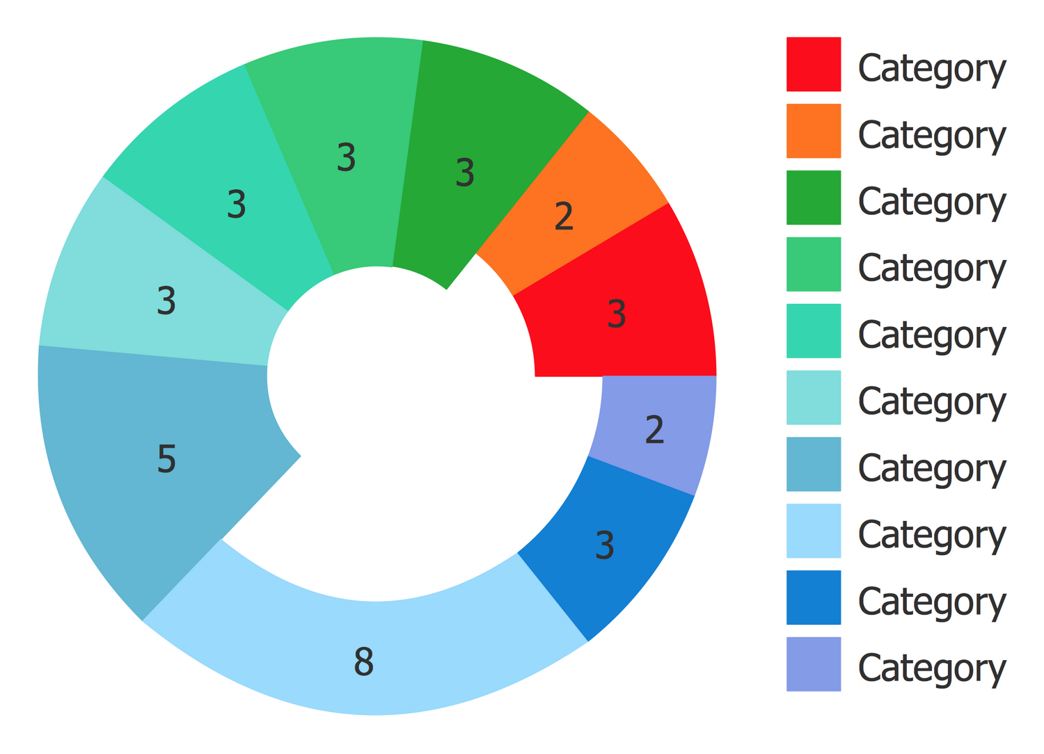
Template 1: Pie Chart
Filling of this Pie Chart template is the quickest way of drawing a Pie Chart of any complexity and quantity of "slices". The chart has the form of a disc and consists of the sectors, which angles are proportional to the corresponding table quantities. Make necessary changes to the table and also use additional features from the Action menu of a Pie Chart object. Name the categories and input the values for each category into the table. Apply own fill color to each sector, select the colors for the table cells and they will be automatically applied to the chart sectors. The use of bright color style boosts the popularity of your chart, you can change a given style to any other desired. By pressing the Action button one can add or remove slices using the corresponding actions and define the own preferred number of slices. Also, one can hide/show the values and the whole table. The legend is always displayed and contains a definition of categories that correspond to each sector.

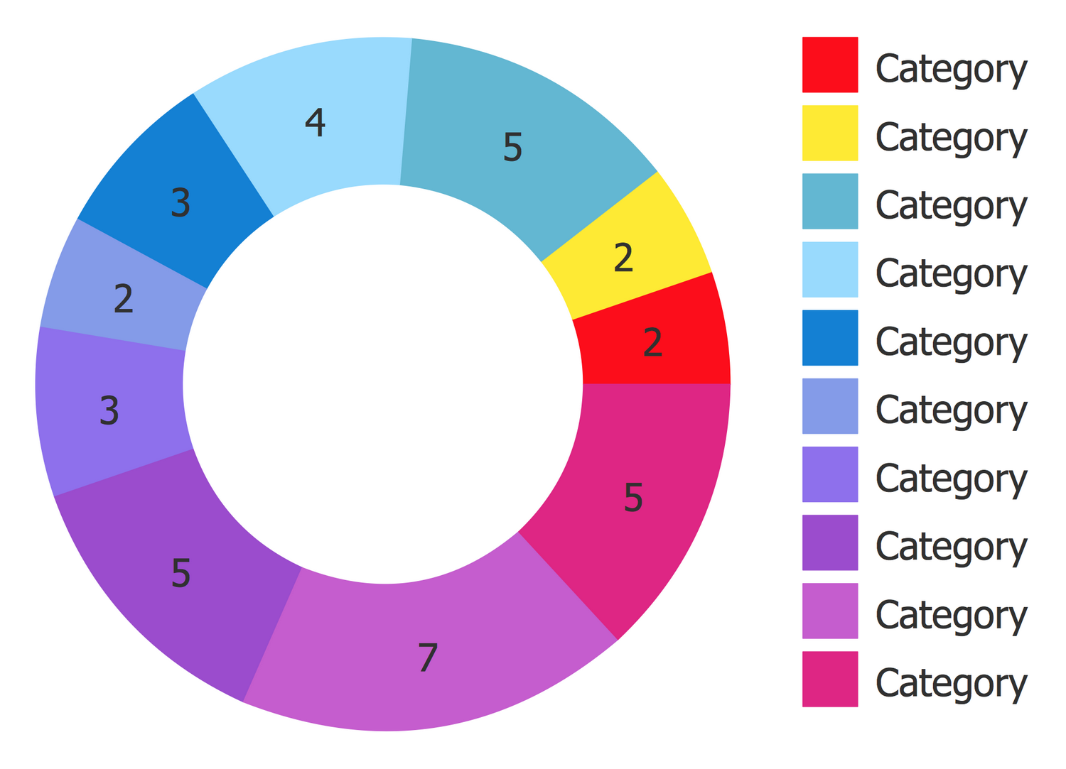
Template 2: Donut Chart
This example was created in ConceptDraw DIAGRAM using the Pie Charts Library from the Pie Charts Solution. An experienced user spent 2 minutes creating this template.
This Donut Chart template is one of the numerous ready-to-use templates of Pie Chart, Donut Chart, Ring Chart, Arrow Circle Chart, Doughnut Chart, and others offered by the ConceptDraw's Pie Charts Solution. This template looks like a disc with a blank center, but its functionality is identical to a Pie Chart. It lets one visualize the percentage of parts of the whole, gives the ability to support multiple statistics as one and is a perfect base for your own diagrams. You can input your data to an existing template and then redesign it according to your taste. Make necessary changes to the table and also use additional features from the Action menu of the Donut Chart object. The resulting Donut Chart will be the best chart for using in your business documents, on websites, in presentation slides and infographics, billboards, etc. The proposed color style can be easily changed according to your desire.

Example 1: Doughnut Chart — Renewable Energy
This example was created in ConceptDraw DIAGRAM using the Pie Charts Library from the Pie Charts Solution. An experienced user spent 2 minutes creating this sample.
This Doughnut Chart sample is devoted to various energy sources, including the renewable ones (natural sources) and displays the proportions of their use. It was constructed on the base of the "Example of a doughnut chart.png" Wikipedia file. There are considered such energy sources as solar, wind, hydro, biogas, and biomass, from which 80% are renewable and allow receiving renewable energy. The main characteristic and advantage of renewable sources is their ability to naturally replenish. That is why renewable sources become more and more popular today and provide energy in four important areas: electricity generation, rural off-grid energy services, air, water heating and cooling, and transportation. Each source is represented by its own color on this diagram that is an undoubted visual feature. ConceptDraw DIAGRAM software contains a variety of pie, donut, doughnut, ring, sector, exploded pie vector objects and other colorful clipart that are helpful for designing exceptionally powerful diagrams.

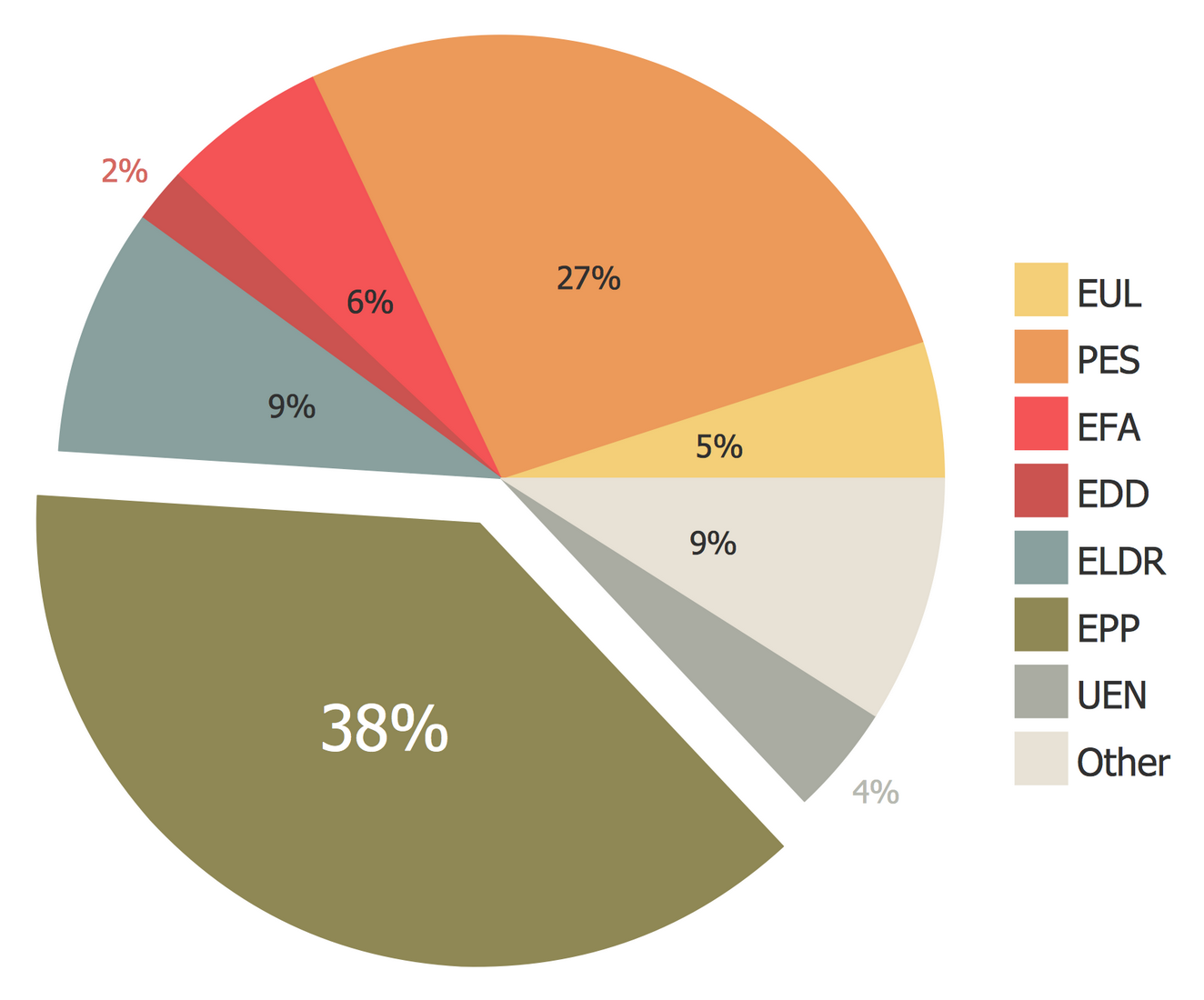
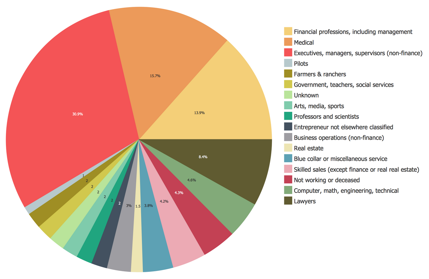
Example 2: Pie Chart — OLAB Fiscal Year
This example was created in ConceptDraw DIAGRAM using the Pie Charts Library from the Pie Charts Solution. An experienced user spent 5 minutes creating this sample.
This Pie Chart demonstrates the work report for the fiscal year of the OLAB (Office of Legislative Affairs and Budget). It is based on the official data from the website of Office of Legislative Affairs and Budget, ACF (Administration for Children and Families), and the U.S. Department of Health and Human Services. The fiscal year or financial year is a common period for financial reporting in many jurisdictions all over the world, it is used in accounting and taxation of the businesses and other financial organizations. At this the financial year may not be the same as the calendar year, more frequently it coincides with the period of income tax reporting. The temporary assistance for the needy families counts 38% and occupies the most part in this OLAP fiscal year report. The use of individual color for each pie slice lets you make your Pie Graph easier for comprehension and perception.

Example 3: Donut Chart — State and Local Revenue and Expenditures
This example was created in ConceptDraw DIAGRAM using the Pie Charts Library from the Pie Charts Solution. An experienced user spent 10 minutes creating this sample.
The Donut Chart is a variation of the Pie Chart with a blank center. This sample represents two visual and colorful Donut Charts conveniently located close to each other; at this one of them contains the sources of inflow of money to the state and local budget, and other — the items of the expenditure these incomes. Among the sources of inflow, you can find the corporate net income taxes, total license taxes, total selective sales taxes, general sales, and gross receipts taxes, individual income taxes, property taxes, and other taxes. The most quantity of income is received from the individual income taxes (36,6%) and general sales and gross receipts taxes (30,1%). The items of the expenditure in their turn are represented by elementary and secondary education, higher education, public assistance, Medicaid, corrections, transportation, and all other. Most expenses are holding up for medical aid (24,4%) and other costs (33,1%).

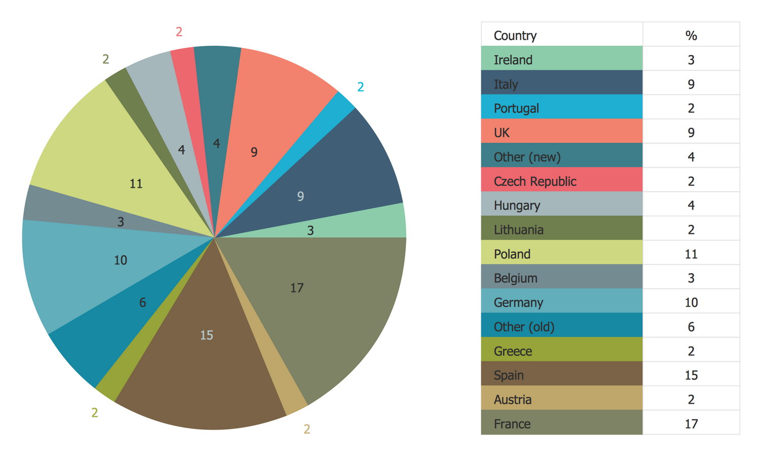
Example 4: Pie Chart — Europe Browser Usage Share
This example was created in ConceptDraw DIAGRAM using the Pie Charts Library from the Pie Charts Solution. An experienced user spent 5 minutes creating this sample.
This Pie Chart with separated sectors is based on the Wikimedia Commons file "2011 01 Europe Browser share crop.png" and illustrates in percent the usage of different browsers in Europe in January 2011. All the most popular browsers are represented in this chart. Firefox is in the top position and is used by 37.9% of people. The Internet Explorer is on the second place 36.9%, Chrome is on the third position 15.5%, the other two browsers Opera and Safari have approximately equal popularity, they are used by 4.2% and 4.9% respectively. You can separate all sectors or selectively some of them, according to your needs, and just slightly move them aside, or stay all sectors together in a classical Pie Chart view. Use the legend to clarify the affiliation of colors on your Pie Graph worksheets literally in seconds. The percent ratios are also duplicated in a legend for this Pie diagram.

Example 5: Pie Chart — 2008 Autogas Consumption
This example was created in ConceptDraw DIAGRAM using the Pie Charts Library from the Pie Charts Solution. An experienced user spent 5 minutes creating this sample.
This Pie Chart illustrates the consumption of autogas by different countries in 2008. The autogas or liquefied petroleum gas (LPG) is a "green" fuel, the mixture of propane and butane that is used as a fuel in internal combustion engines in vehicles and in generators as well. At your discretion, you can denote numeric values directly on pie slices of the chart or for example at the separate table near the chart, or don't specify at all as on this sample. In the last case, one can visually evaluate the ratios of the parts, compare them and define which part is the biggest and which the smallest one. In the context of this sample, one can easily evaluate what countries consumed the biggest and the lowest quantity of autogas in 2008. You see that these are the composite group of other countries and the USA correspondingly. Among the separate countries the biggest quantity of autogas was consumed by South Korea.

Example 6: Pie Chart — 2007 World Uranium Mining
This example was created in ConceptDraw DIAGRAM using the Pie Charts Library from the Pie Charts Solution. An experienced user spent 5 minutes creating this sample.
This Pie Chart sample shows the world uranium mining by countries in 2007. It is based on the data from the "2007Uranium.PNG" Wikimedia Commons file and the World Nuclear Association (WNA) data. The uranium is the most energy-intensive fuel, only several kilograms of uranium can produce the same amount of electricity and heat as tons of coal and oil or thousands of cubic meters of gas. Among the countries occupied by the extraction of uranium from the ground and having its reserves are Uzbekistan, Namibia, Niger, Russia, Kazakhstan, Australia, Canada, South Africa, Ukraine, China, USA, and other countries. At this, Canada, Australia, and Kazakhstan occupy the leading positions in this process and mine 23%, 21%, and 16% correspondingly from the whole world's amount of extracted uranium in 2007. The placement of the percent symbol in the middle of this Pie Chart significantly lightens it, when the typing of this symbol near each number can lead to the chart's visual overloading.

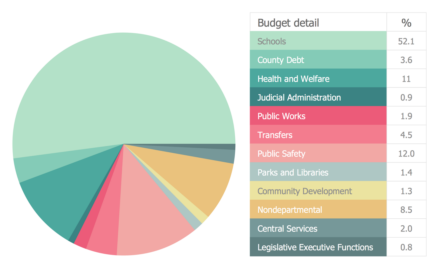
Example 7: Pie Chart — State Operating Funds
This example was created in ConceptDraw DIAGRAM using the Pie Charts Library from the Pie Charts Solution. An experienced user spent 5 minutes creating this sample.
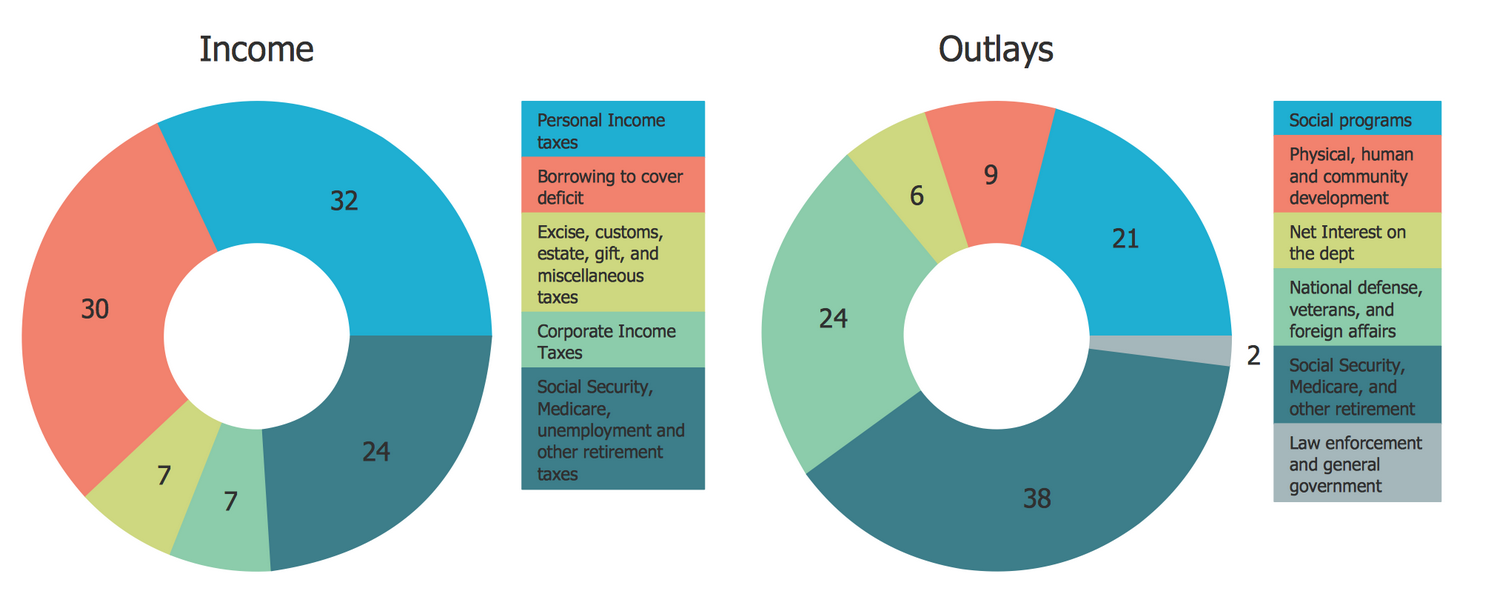
This sample combines two Pie Charts illustrating where New York’s budget dollars come from and how taxpayer money is being spent. They both were designed on the base of Donut Charts from the website of the New York State Open Budget. The state funds operating budget includes the general fund and other financial activities supported by state and filled by index taxes, misc receipts, and other income. The taxes comprise 80% of the state operating funds, while the misc receipts and others comprise 20%. But where do these funds go? On the diagram on the right, you can observe all items of expenditure, among them the school aid (school year basis), Medicaid (all agencies local), Debt/Capital, elected officials, university, executive, and other local assistance. The largest item of expenditure is the school aid (26%), then we see the other local assistance (22%), Medicaid (20%), and other items with lower percent ratios.

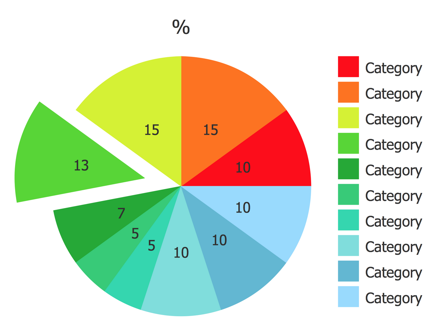
Example 8: Exploded Pie Chart — Percentages of the U.S. Population by Race
This example was created in ConceptDraw DIAGRAM using the Pie Charts Library from the Pie Charts Solution. An experienced user spent 5 minutes creating this sample.
This Exploded Pie Chart sample was constructed on the base of the United States Census Bureau data and "Percentages of the U.S. population by race — 2000.png" Wikimedia Commons file. It illustrates the racial make-up of the U.S. in 2000. According to the diagram, the percentages of the U.S. population were distributed with a predominance of the white race population that comprised 75,1%, at the same time the black race also comprised a significant part of the population 12,3% in 2000. The white race is represented by the population originated from Europe, the Middle East, and North Africa. The remaining racial shares were not so numerous and constituted respectively: American Indian (0,9%), Asian (3,6%), Pacific Islander (0,1%), two or more races (5,5%), and the group including some other races (2,4%). Moreover, all these sectors comprising the minority are visually highlighted by their slightly offset from the big sector on this Pie Chart.

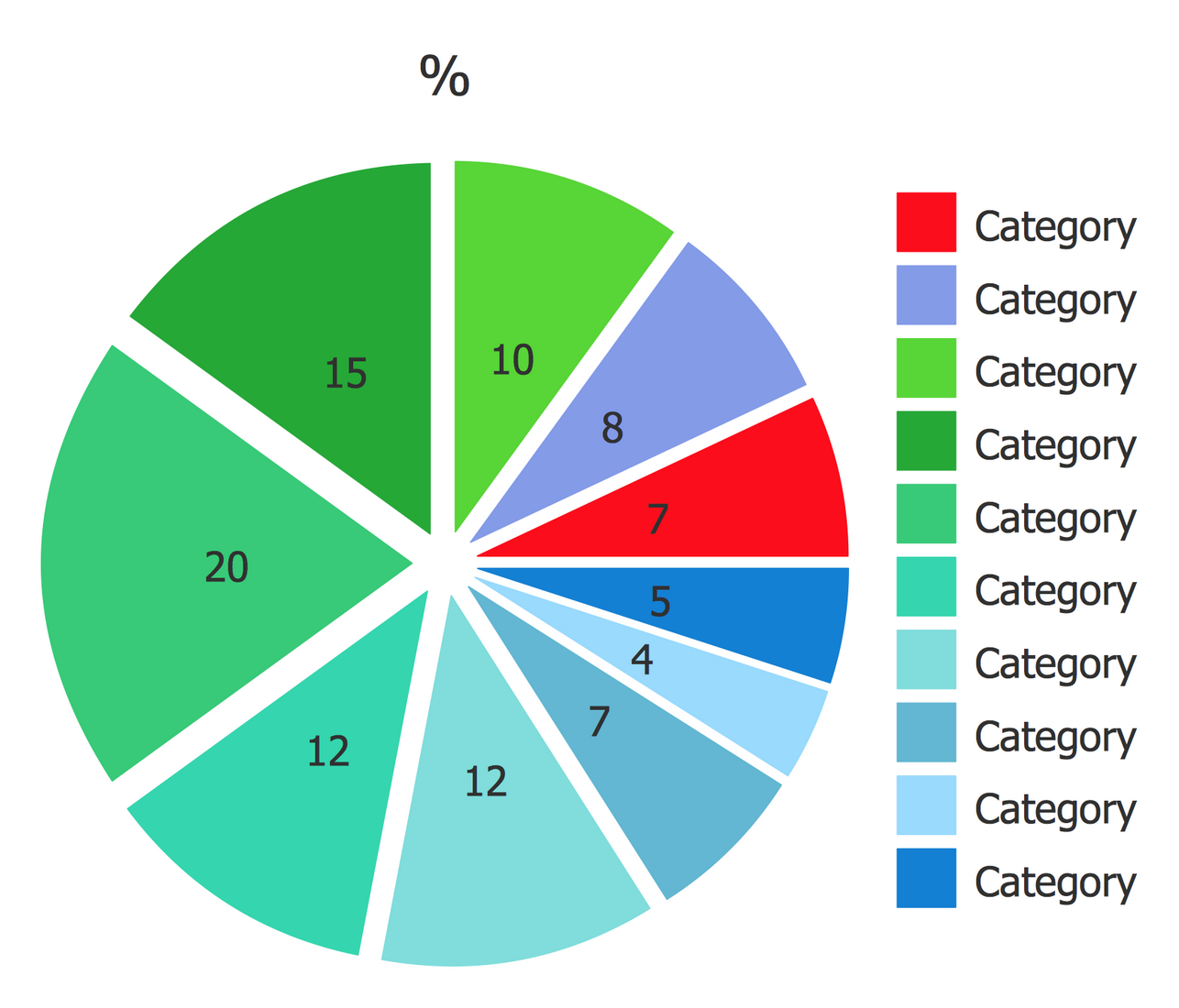
Example 9: Ring Chart — Major Categories of Federal Spending
This example was created in ConceptDraw DIAGRAM using the Pie Charts Library from the Pie Charts Solution. An experienced user spent 5 minutes creating this sample.
This Ring Chart sample was constructed on the base of the Donut Chart from the ForeignAssistance.gov website and demonstrates the major categories of U.S. federal spending. The USA is a federal republic with clear legislation and a tax system. The U.S. taxes provide huge income in a federal budget, these are the taxes on income, property, sales, estates, imports, dividends, payroll, capital gains, and other fees, which are then distributed to different directions. Among the ways of federal spending, one can find social security, defense, nondefense, Medicare and Medicaid, net interest, foreign assistance, and other mandatory. All these categories are distributed in the following way: the social security is the most multiple and comprises 24%, on the second place are the Medicare and Medicaid that constitute 23%, the other mandatory 17%, nondefense 14%, defense 15%, net interest 6%, and foreign assistance 1%. Each item has its own color and width on this chart.

Example 10: Pie Chart — Saturated Fats in the U.S. Population Diet
This example was created in ConceptDraw DIAGRAM using the Pie Charts Library from the Pie Charts Solution. An experienced user spent 5 minutes creating this sample.
This Pie Chart sample illustrates the percentage of saturated fats in the U.S. population diet. It was redesigned from the illustration "Food Category Sources of Saturated Fats in the U.S. Population Ages 2 Years and Older" published on the webpage "A Closer Look at Current Intakes and Recommended Shifts" that is a part of the U.S. Office of Disease Prevention and Health Promotion (ODPHP) website. The main feature of this sample is the refinement of the main Pie Chart by the creation of an additional Pie Chart near the main one in a callout. This solution allows visual unloading the main chart and at the same time provides complete detailed information about the major category of the mixed dishes (35%) and categories forming it (pizza 6%, burgers and sandwiches 19%, meat, poultry and seafood dishes 4%, rice, pasta and grain dishes 5%, soups 1%). The other sources of saturated fats in the U.S. are represented by snacks and sweets (18%), protein foods (15%), dairy (13%), vegetables (7%), condiments, gravies, spreads and salad dressings (7%), grains (4%), and beverages (not milk or 100% fruit juice) (1%), fruits and fruit juice (0%).

Inside


What I Need to Get Started
After ConceptDraw DIAGRAM is installed, the Pie Charts solution can be purchased either from the Graphs and Charts area of ConceptDraw STORE itself or from our online store. Thus, you will be able to use the Pie Charts solution straight after.

How to install
First of all, make sure that both ConceptDraw STORE and ConceptDraw DIAGRAM applications are downloaded and installed on your computer. Next, install the Pie Charts solution from the ConceptDraw STORE to use it in the ConceptDraw DIAGRAM application.

Start Using
Start using the Pie Charts solution to make the professionally looking numerical data by adding the design elements taken from the stencil libraries and editing the pre-made examples that can be found there.
