- Electric and Telecom Plans Free
- Fire and Emergency Plans Free
- Floor Plans Free
- Plant Layout Plans Free
- School and Training Plans Free
- Seating Plans Free
- Security and Access Plans Free
- Site Plans Free
- Sport Field Plans Free
- Business Process Diagrams Free
- Business Process Mapping Free
- Classic Business Process Modeling Free
- Cross-Functional Flowcharts Free
- Event-driven Process Chain Diagrams Free
- IDEF Business Process Diagrams Free
- Logistics Flow Charts Free
- Workflow Diagrams Free
- ConceptDraw Dashboard for Facebook Free
- Mind Map Exchange Free
- MindTweet Free
- Note Exchange Free
- Project Exchange Free
- Social Media Response Free
- Active Directory Diagrams Free
- AWS Architecture Diagrams Free
- Azure Architecture Free
- Cisco Network Diagrams Free
- Cisco Networking Free
- Cloud Computing Diagrams Free
- Computer Network Diagrams Free
- Google Cloud Platform Free
- Interactive Voice Response Diagrams Free
- Network Layout Floor Plans Free
- Network Security Diagrams Free
- Rack Diagrams Free
- Telecommunication Network Diagrams Free
- Vehicular Networking Free
- Wireless Networks Free
- Comparison Dashboard Free
- Composition Dashboard Free
- Correlation Dashboard Free
- Frequency Distribution Dashboard Free
- Meter Dashboard Free
- Spatial Dashboard Free
- Status Dashboard Free
- Time Series Dashboard Free
- Basic Circle-Spoke Diagrams Free
- Basic Circular Arrows Diagrams Free
- Basic Venn Diagrams Free
- Block Diagrams Free
- Concept Maps Free
- Family Tree Free
- Flowcharts Free
- Basic Area Charts Free
- Basic Bar Graphs Free
- Basic Divided Bar Diagrams Free
- Basic Histograms Free
- Basic Line Graphs Free
- Basic Picture Graphs Free
- Basic Pie Charts Free
- Basic Scatter Diagrams Free
- Aerospace and Transport Free
- Artwork Free
- Audio, Video, Media Free
- Business and Finance Free
- Computers and Communications Free
- Holiday Free
- Manufacturing and Maintenance Free
- Nature Free
- People Free
- Presentation Clipart Free
- Safety and Security Free
- Analog Electronics Free
- Audio and Video Connectors Free
- Basic Circuit Diagrams Free
- Chemical and Process Engineering Free
- Digital Electronics Free
- Electrical Engineering Free
- Electron Tube Circuits Free
- Electronic Block Diagrams Free
- Fault Tree Analysis Diagrams Free
- GHS Hazard Pictograms Free
- Home Automation and Wiring Free
- Mechanical Engineering Free
- One-line Diagrams Free
- Power Сircuits Free
- Specification and Description Language (SDL) Free
- Telecom and AV Circuits Free
- Transport Hazard Pictograms Free
- Data-driven Infographics Free
- Pictorial Infographics Free
- Spatial Infographics Free
- Typography Infographics Free
- Calendars Free
- Decision Making Free
- Enterprise Architecture Diagrams Free
- Fishbone Diagrams Free
- Organizational Charts Free
- Plan-Do-Check-Act (PDCA) Free
- Seven Management and Planning Tools Free
- SWOT and TOWS Matrix Diagrams Free
- Timeline Diagrams Free
- Australia Map Free
- Continent Maps Free
- Directional Maps Free
- Germany Map Free
- Metro Map Free
- UK Map Free
- USA Maps Free
- Customer Journey Mapping Free
- Marketing Diagrams Free
- Matrices Free
- Pyramid Diagrams Free
- Sales Dashboard Free
- Sales Flowcharts Free
- Target and Circular Diagrams Free
- Cash Flow Reports Free
- Current Activities Reports Free
- Custom Excel Report Free
- Knowledge Reports Free
- MINDMAP Reports Free
- Overview Reports Free
- PM Agile Free
- PM Dashboards Free
- PM Docs Free
- PM Easy Free
- PM Meetings Free
- PM Planning Free
- PM Presentations Free
- PM Response Free
- Resource Usage Reports Free
- Visual Reports Free
- House of Quality Free
- Quality Mind Map Free
- Total Quality Management TQM Diagrams Free
- Value Stream Mapping Free
- Astronomy Free
- Biology Free
- Chemistry Free
- Language Learning Free
- Mathematics Free
- Physics Free
- Piano Sheet Music Free
- Android User Interface Free
- Class Hierarchy Tree Free
- Data Flow Diagrams (DFD) Free
- DOM Tree Free
- Entity-Relationship Diagram (ERD) Free
- EXPRESS-G data Modeling Diagram Free
- IDEF0 Diagrams Free
- iPhone User Interface Free
- Jackson Structured Programming (JSP) Diagrams Free
- macOS User Interface Free
- Object-Role Modeling (ORM) Diagrams Free
- Rapid UML Free
- SYSML Free
- Website Wireframe Free
- Windows 10 User Interface Free
Politics Infographics
Infographics and visual effects have a great value in any field and especially in politics. In this sector, they have surpassed all other types of graphics due to their impact on people. Visual elements in the form of infographics are dynamic and vibrant; they contain clipart, graphics, diagrams, schematic tables and other graphic information, and some text. All these facts make them really the best way to make your presentations, messages, and documents illustrative, colorful, and comprehensive, to present political news, facts, statistics, and other important information in an accessible, understandable and even fascinating way.
Political infographics are the simplest, most visual and intuitive way to communicate with your audience on political issues. The main objective of almost all political infographic images is to inform about actions in the political arena. They are the best way for making complex information easy to understand, allow clarifying political science, political concepts, explaining complex political terms and political fundamentals using simplified graphical analogies, representing characteristics of different political directions, allocating the rights of the participant in political relations, comparing political directions, methods, solutions, and actions. They provide an understanding of current and past policies, allowing you to compare and find the main differences and similarities.
The most part of marketers, politicians, journalists, scientists, speakers in other fields has already appreciated all advantages of infographics. This is a good visual solution for political candidates and government officials who want the audience to support them and become more understandable to the viewer. Political infographics assist speakers in speeches as well as their audience, help to form an opinion about political candidates, understand economic or politic issues, help to outline the main points of the programs of political parties, conduct and analyze the results of political polls. In general, the infographics can become a persuasive tool for anyone involved in politics.
ConceptDraw DIAGRAM extended with a Politics Infographics solution is an effective way to design political infographics, diagrams, presentations, illustrations, and other materials on political topics, depicting political news, describing the main points of countries’ foreign policy, identity politics, and points of programs of political parties. This solution offers its users a huge collection of predesigned vector objects and illustrative samples. The effectiveness of your politic infographics design is determined by the viewers’ understanding, so think visually and focus on visuality, then your political infographics will attract attention and cause an active discussion. Politics is a sector where your creativity is welcome, and Politics Infographics solution will help you with your implementation.
-
Buy this solution $25 -
Solution Requirements - This solution requires the following products to be installed:
ConceptDraw DIAGRAM v18 - This solution requires the following products to be installed:
-
Compatibility - Sonoma (14), Sonoma (15)
MS Windows 10, 11 - Sonoma (14), Sonoma (15)
-
Support for this Solution -
Helpdesk
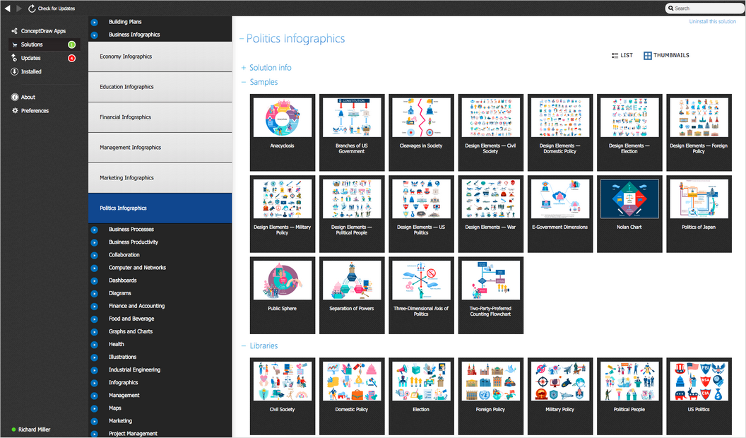
There are 8 libraries containing 358 vector stencils and 10 examples for design politic infographics and make sample politic chart.
Design Elements — Political People
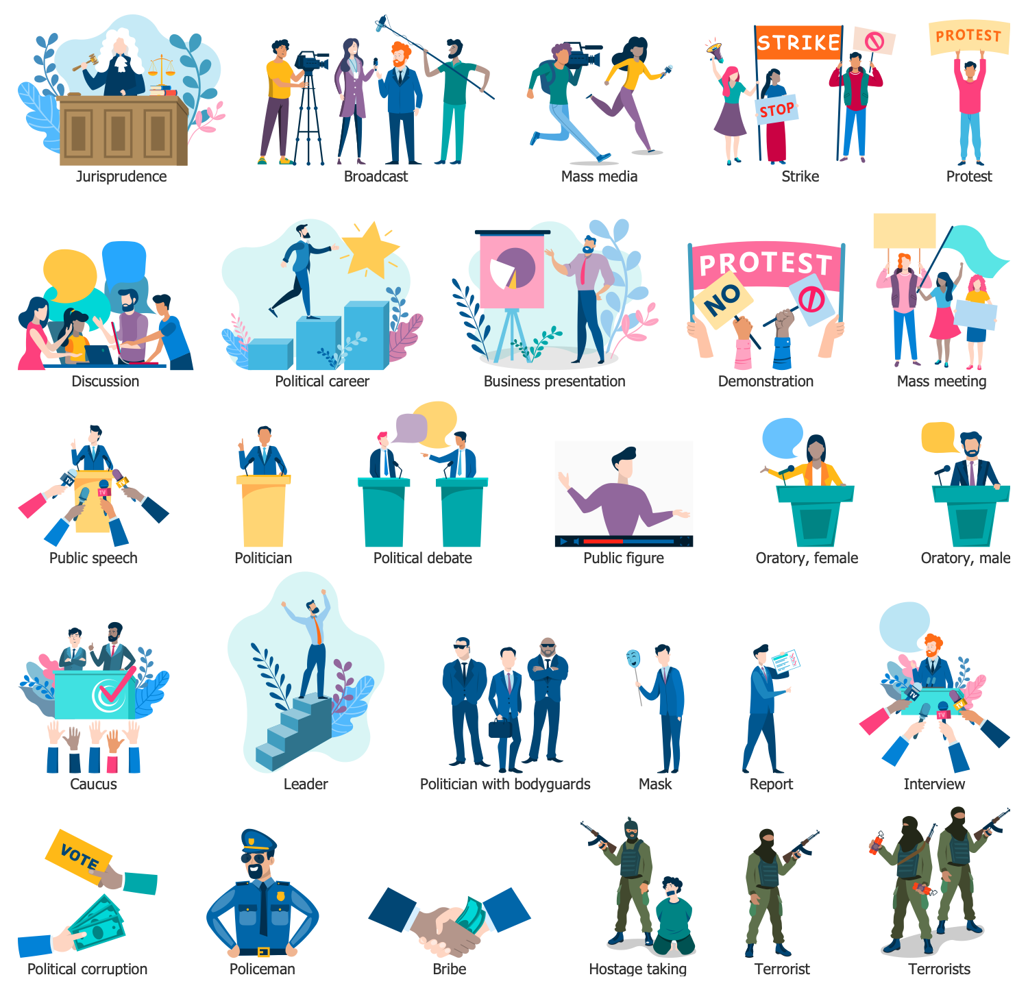
Design Elements — Civil Society
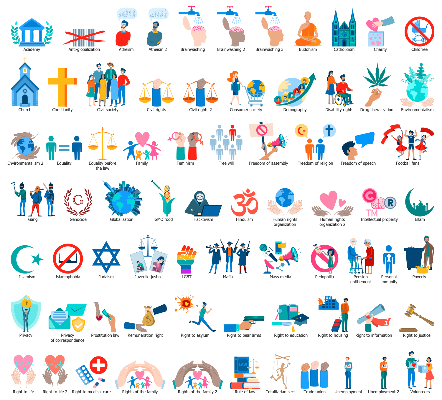
Design Elements — Domestic Policy
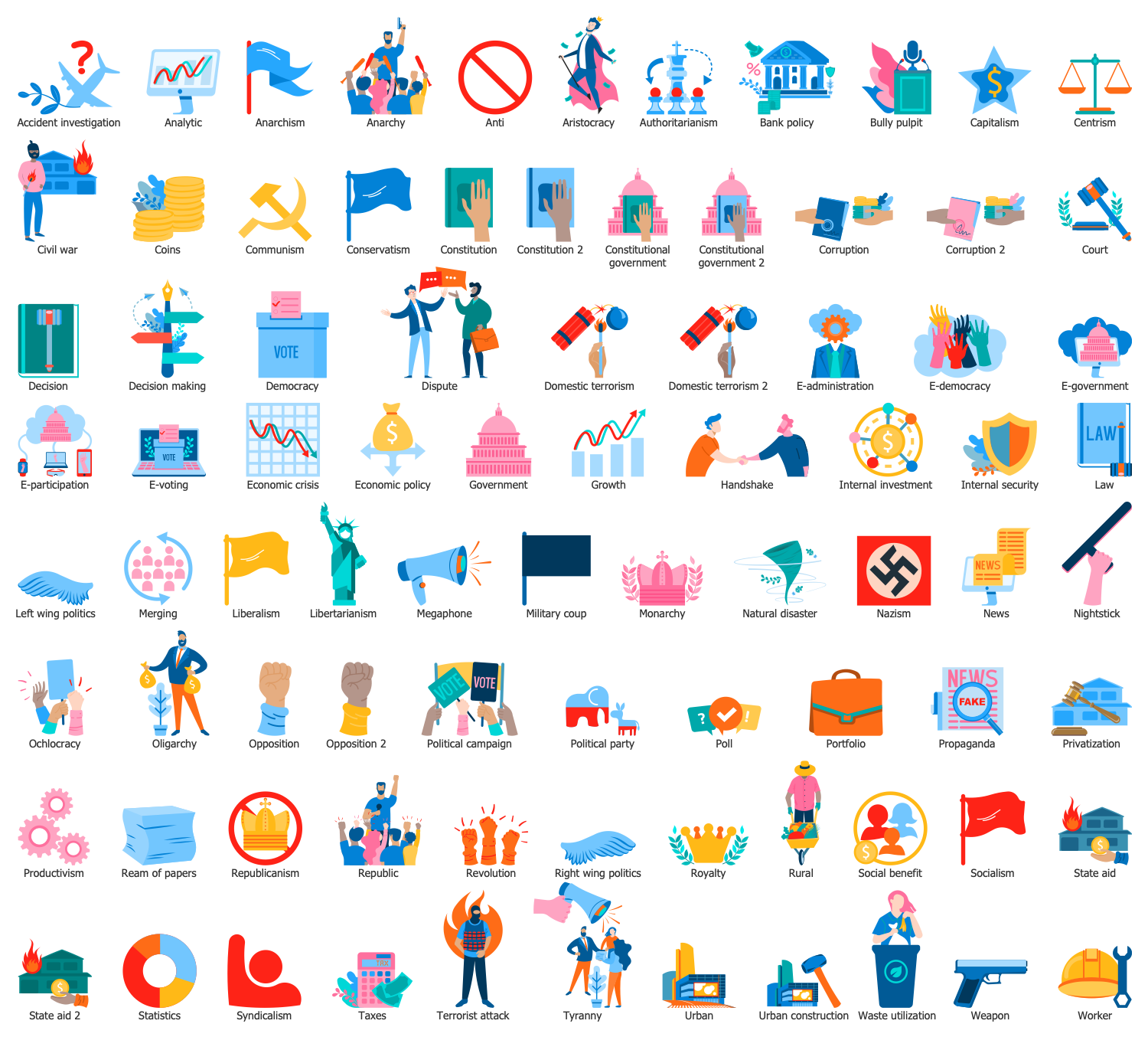
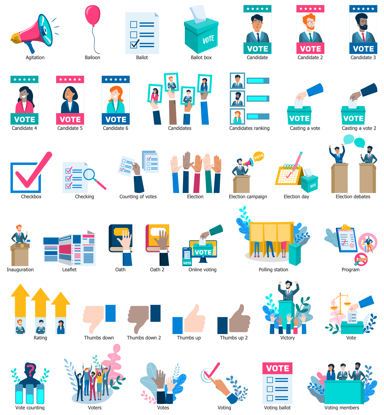
Design Elements — Election
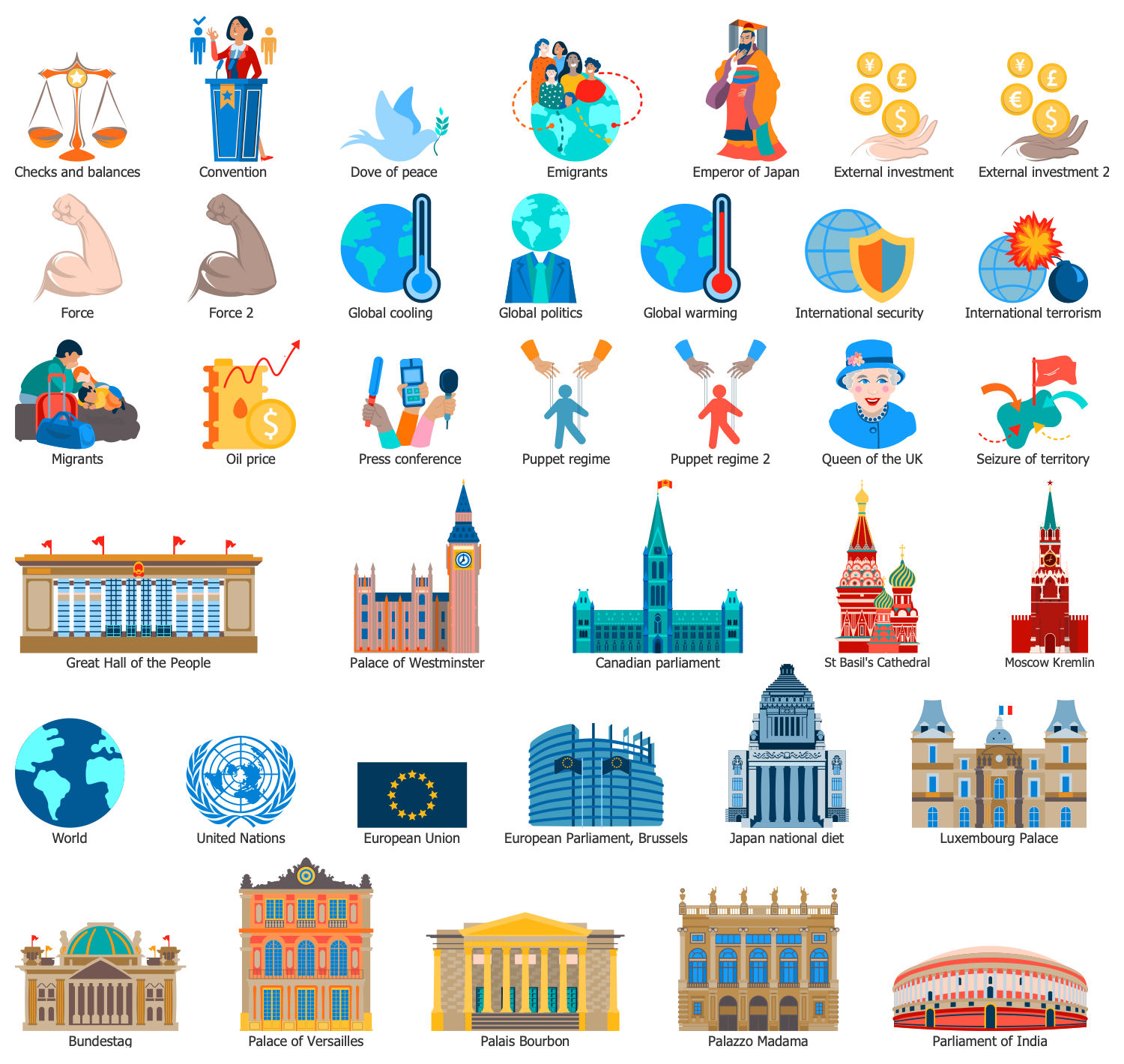
Design Elements — Foreign Policy
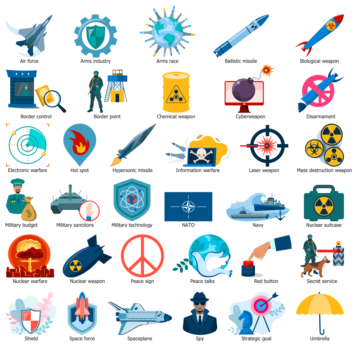
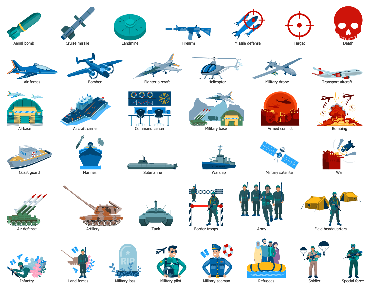
Design Elements — Military Policy
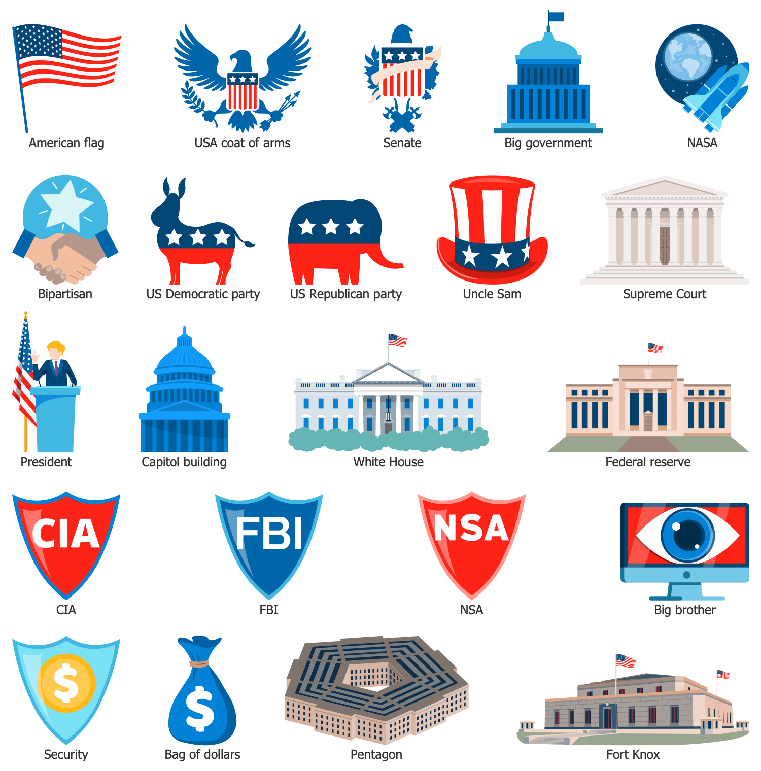
Design Elements — US Politics
Design Elements — War
Politics Infographics Examples
There are a few samples that you see on this page which were created in the ConceptDraw DIAGRAM application by using the Politics Infographics solution. Some of the solution's capabilities as well as the professional results which you can achieve are all demonstrated here on this page.
All source documents are vector graphic documents which are always available for modifying, reviewing and/or converting to many different formats, such as MS PowerPoint, PDF file, MS Visio, and many other graphic ones from the ConceptDraw Solution Park or ConceptDraw STORE. The Politics Infographics solution is available to all ConceptDraw DIAGRAM users to get installed and used while working in the ConceptDraw DIAGRAM diagramming and drawing software.
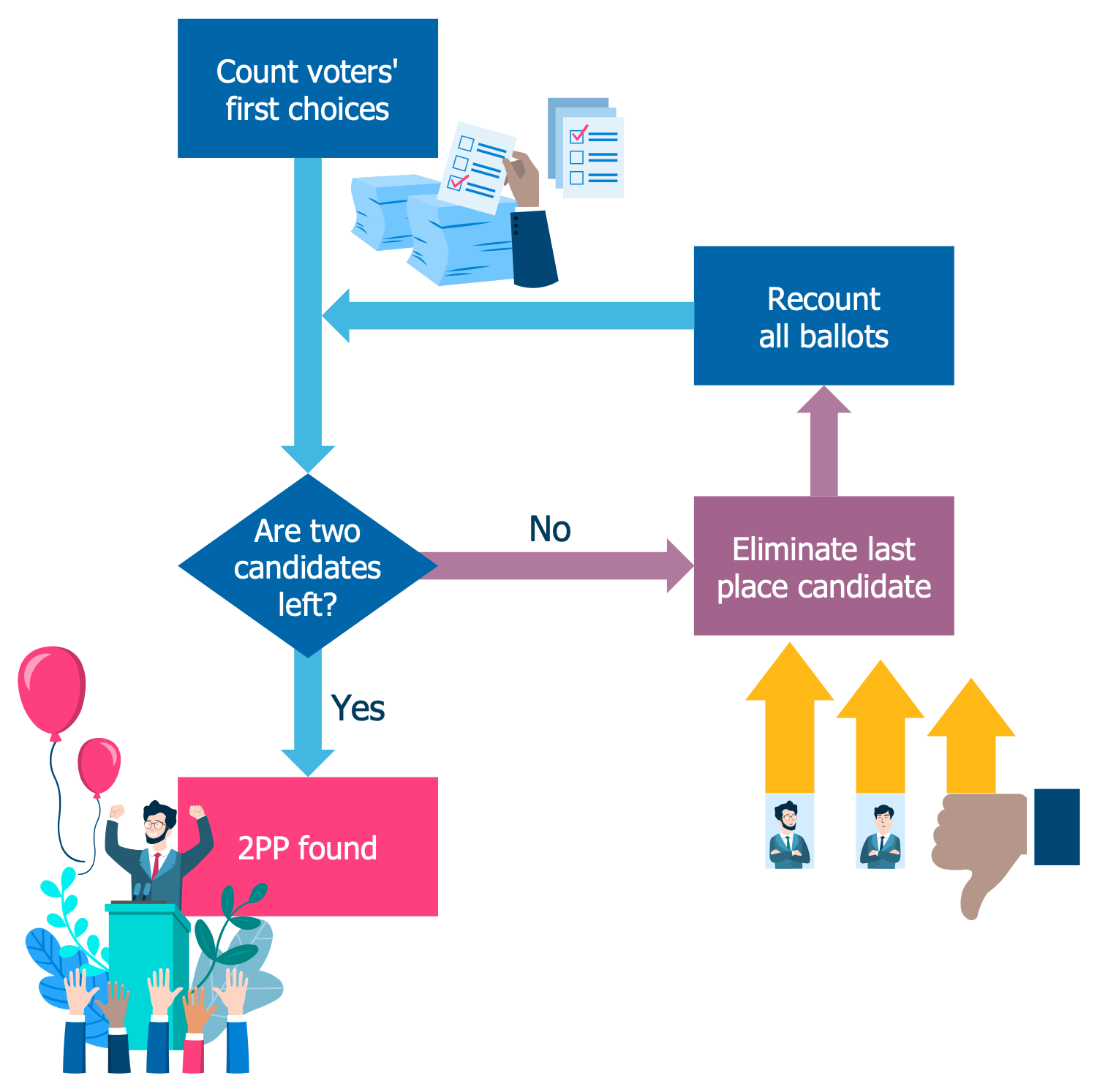
Example 1: Two Party Preferred Counting Flowchart
This sample depicts the two-party-preferred counting flowchart. This is the preferred voting form in Australia. The votes are counted, and the candidate with the fewest votes is eliminated due to last place. Then the ballots are recounting to the next option and this is implemented in described way until there are two candidates left and a two-party-preferred figure is defined. These last two candidates will be the representatives from the two major parties. The two-party-preferred method is effective for estimating the result of voting and making predictions of subsequent preferences from smaller parties in order of their expected elimination during the process of instant-runoff voting. And finally, it is used to predict which major parties will win and hold the majority of seats in a further formed government. The voting results in Australia over the past decades can be also illustrated here in a diagram as statistics on the method's use.
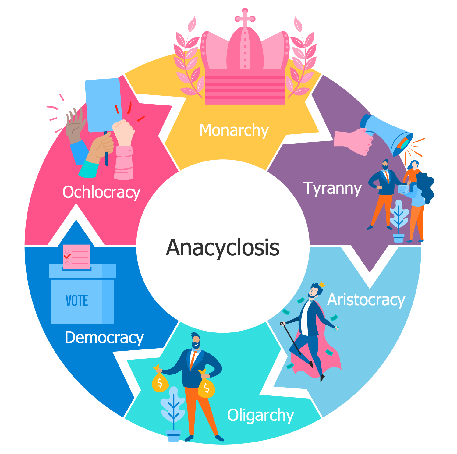
Example 2: Anacyclosis
The anacyclosis is a cyclic theory of political evolution. This sample illustrates the sequence in which the anacyclosis proceeds according to Polybius. The diagram counts six components and is constructed in a form of a Circular Arrow diagram. The theory of anacyclosis is based upon three basic forms that proceed in a certain order. It is believed that the "benign" government such as monarchy, aristocracy, and democracy are weak and unstable, and that's why they strive to outgrow into the three basic forms of "malignant" government, which are the tyranny, oligarchy, and ochlocracy. The interests of "malignant" governments are focused on the interests of a selected few while the "benign" ones take into account the interests of all. For example, a monarchy with a king in charge, which abuses its authority degenerates to tyranny. All these forms at the head with monarchy are presented in a diagram along with corresponding clipart images. Use ConceptDraw’s Politics Infographics solution to describe the principles of internal and external politics, foreign policy, identity politics in visual terms.
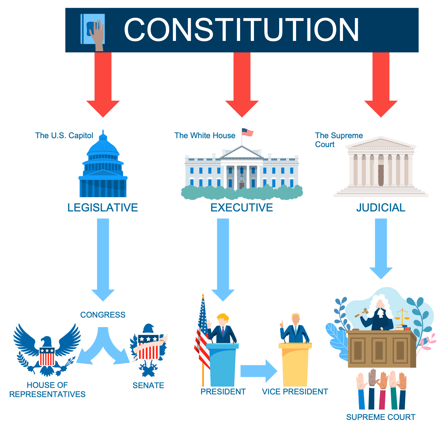
Example 3: Branches of US Government
This sample depicts the branches of the federal government of the United States according to the U.S. Constitution. The United States government is based on the principles of republicanism and federalism. There are three branches that make up the government: the executive, marked by the White House, the legislative — The U.S. Capitol, and the judiciary — The Supreme Court. The United States Congress is carried to the legislative branch of the federal government and being bicameral comprises the House of Representatives and Senate. The executive power belongs to the president, so it is also included along with a vice president. And finally, the judicial branch that is represented by the Supreme Court and also includes the courts of appeals, district courts and courts of special jurisdiction. Being strictly listed this structure is now easily observed and perceived by wide auditorium, and can be extended with detailed information about the authorities of representatives of each branch.
Example 4: Cleavages in Society
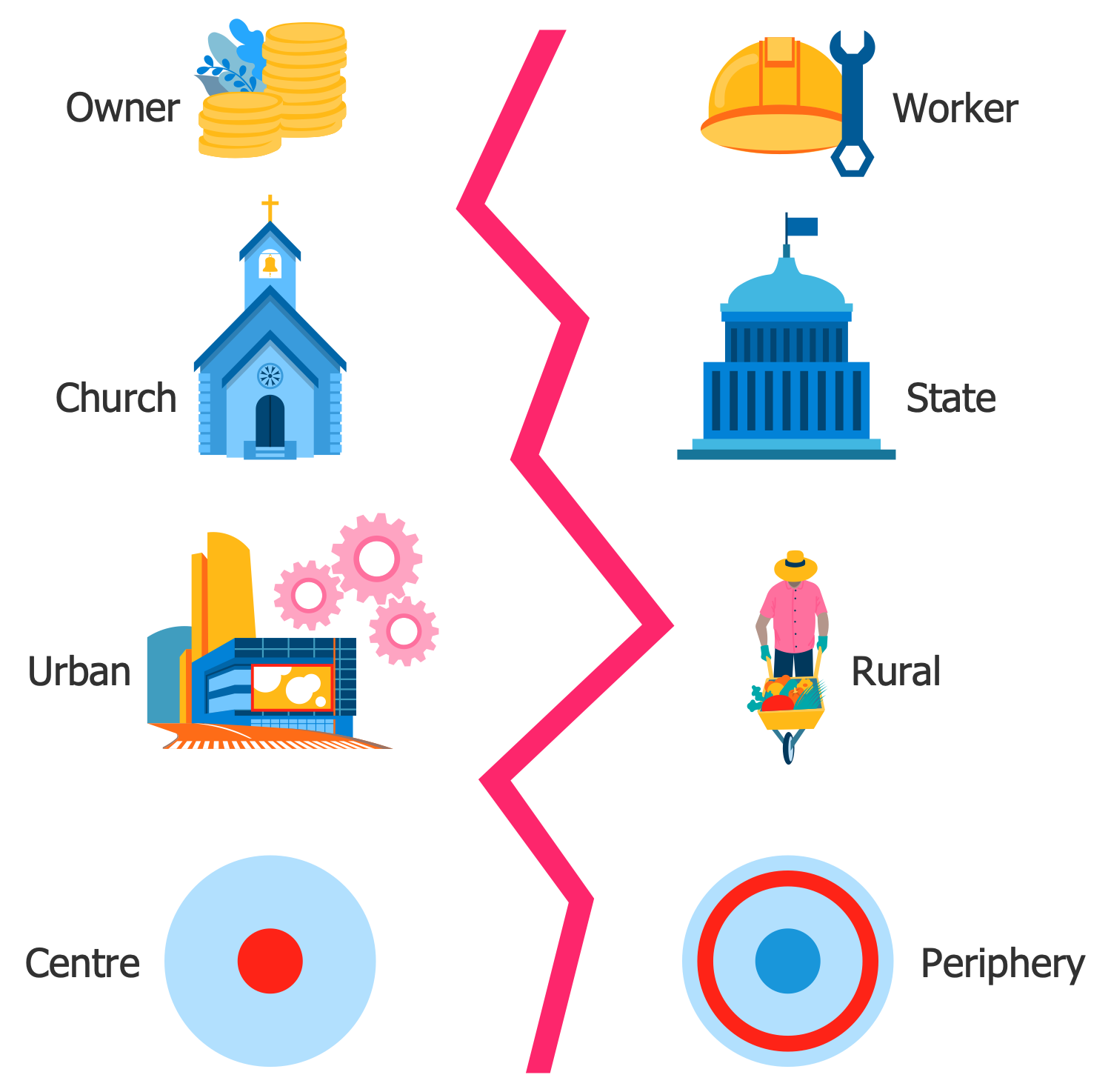
This sample presents split in society according to the theory of Seymour Martin Lipset and Stein Rokkan, which was developed in the 1960s as an idea of a division of voters into voting blocs. In 1967 Lipset and Rokkan defined four basic cleavages for western civilization that further influenced all European political parties. According to this theory, the established structure of political parties system in Western Europe is the result of social conflicts in these societies that arose as a result of the separation between the center and the periphery, the state and the church, the city and the village, the owner and the worker. These four opposing groups are shown in this illustration. The listed conflicts appeared as the result of modernization processes and revolutions that have taken place in the countries of Western Europe. The first two conflicts occurred in the result of national revolutions in these countries, and the other two — industrial revolutions.
Example 5: E-Government Dimensions
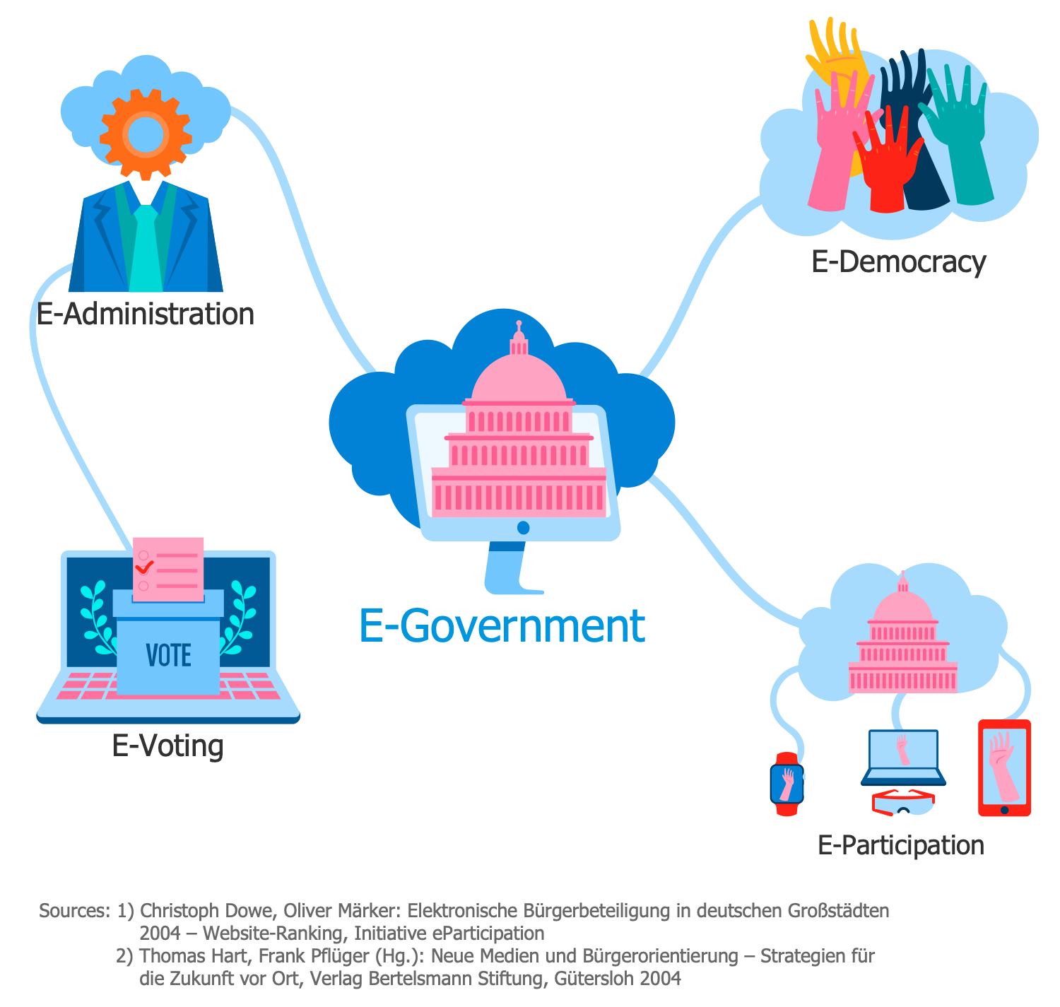
This sample illustrates the dimensions of E-government that uses information and communication technologies, technological communications devices, and Internet to provide public services and information to the citizens of a certain country or region. E-government is a useful opportunity, now implemented and developed in many countries and jurisdictions. It provides citizens with new opportunities for access to public services, allowing the government to provide its services to citizens directly and conveniently. This form allows achieving better management, creates convenient conditions for citizens, expands the scope, including the involvement of citizens in management. The system of E-government is realized with the use of graphical user interfaces, instant messaging, audio/video presentations, etc. and is convenient in use. However, E-government has some disadvantages that might be overcome in close future, these are the lack of equality in public access to computers and Internet, the threat to reliability of the information on the web, vulnerability to cyber attacks.
Example 6: Nolan Chart
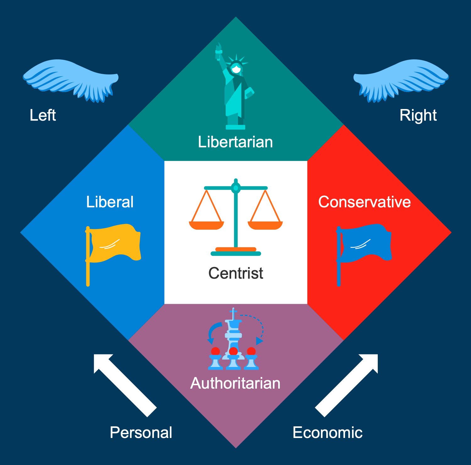
This sample presents the Nolan Chart in its traditional form. It is a chart designed by American libertarian activist David Nolan in 1969 that expands political view analysis and allows you to take a broad look at libertarianism. Nolan divided all human political actions into two broad categories: economic and personal, which are presented in this chart. The economic actions include all that people do as producers and consumers and personal ones are related with all that concerns their self-expression and individual relations. There are presented the right parties including conservatives and in opposite them the left including liberals. The first ones stand for more freedom in economic matters and more government intervention in personal, the second ones vice versa. The libertarians favor both personal and economic freedom, free markets and oppose government intervention in both areas. The authoritarian oppositionists maintain government control in both of these areas. The centrists are also included.
Example 7: Politics of Japan
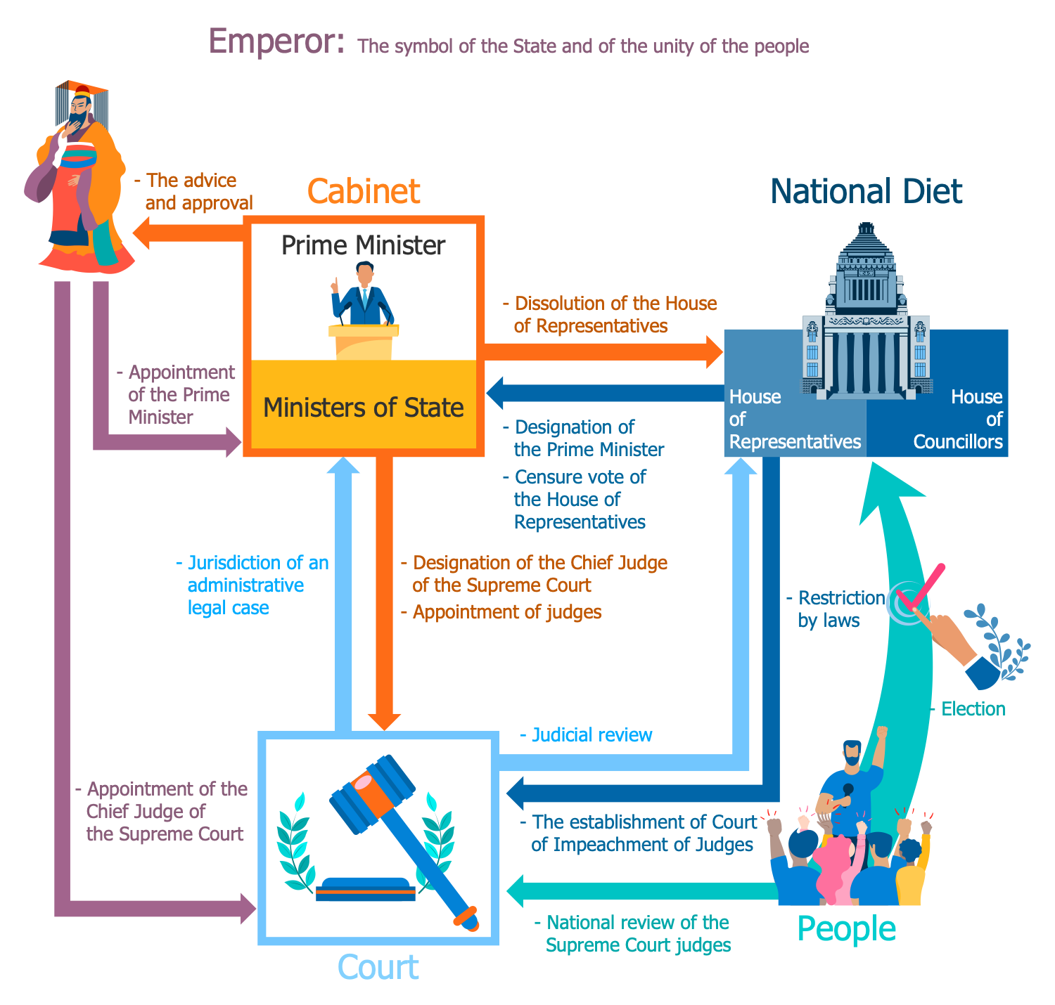
This sample illustrates the structure of the political system in Japan, which constitutes the multi-party bicameral parliamentary representative democratic constitutional monarchy, where the Constitution defines a system of civil law and the rights of Japanese people. The Emperor is at the top of the structure, he is a symbol of the State and the unity of people, executes the ceremonial duties and haven't real power. The Prime Minister is the head of government and cabinet, and both represent the executive branch. The Prime Minister must be a civilian and is designated by the Emperor as directed by the Diet. In turn the Cabinet members are appointed by the Prime Minister, also from the civilians. The National Diet relates to the legislative power and includes the House of Representatives and the House of Councillors. And finally, the judiciary is presented by the Supreme Court and lower courts.
Example 8: Public Sphere
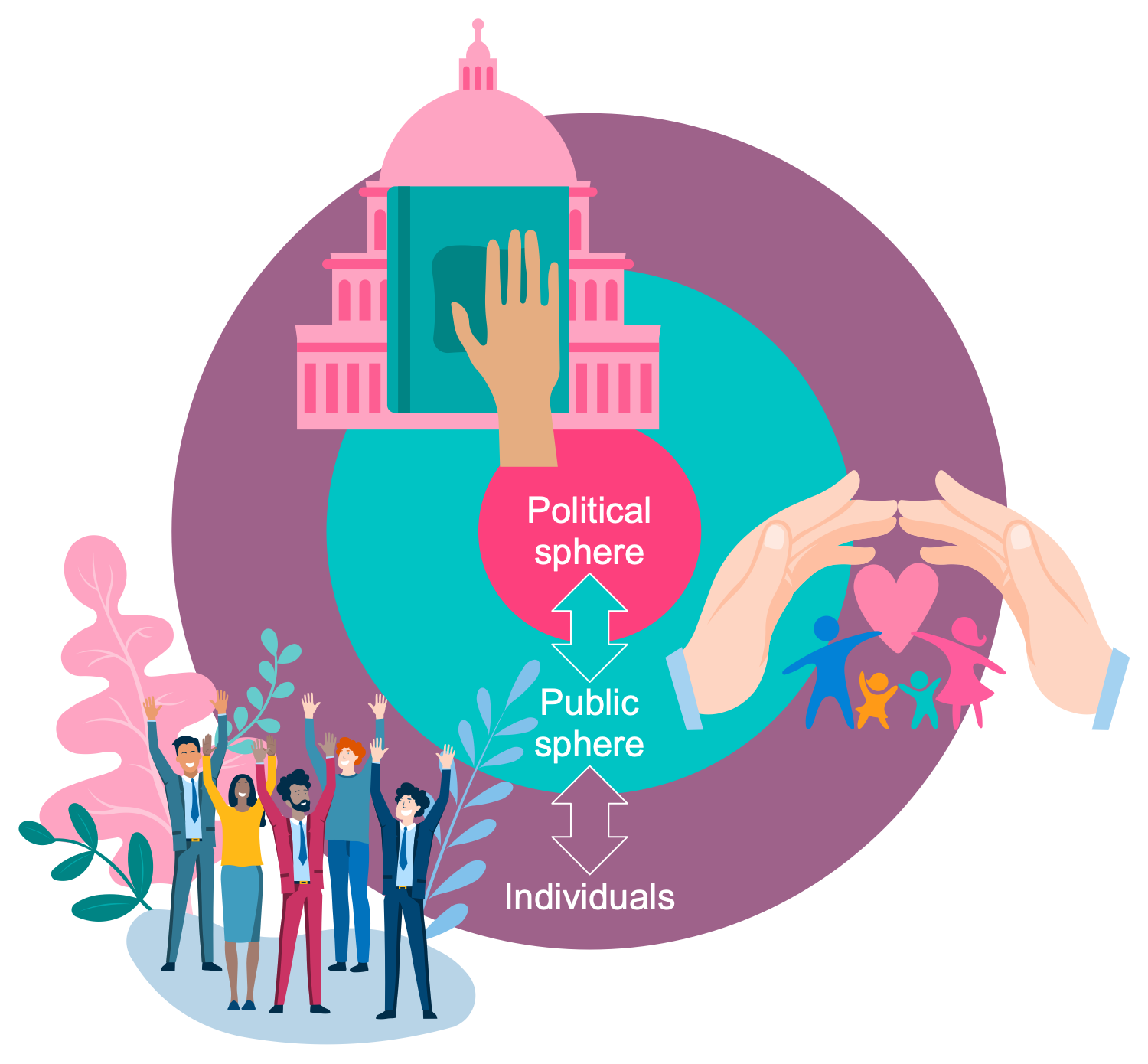
This political infographic is dedicated to the public sphere and depicts its connection with the political sphere and individuals. In a broad sense, the public sphere is an area of a social life that joins individuals together with a goal to identify and discuss the problems of mutual interest to elaborate a common opinion about them that will impact political actions. More often these discussions are realized by means of personal meetings, mass media, social media, publications, and documents. The public sphere is considered by people as a power based on democracy and motivating to the formation of a common public opinion, which later becomes a political action. The term public sphere was first coined by the German philosopher Jürgen Habermas, who defined it as a virtual or imaginary community, the existence of which is not necessary in any particular space. The use of apt clipart allows you to make this diagram interesting and understandable, to reflect the unification of individuals with the same goal or problem that needs to be solved.
Example 9: Separation of Powers
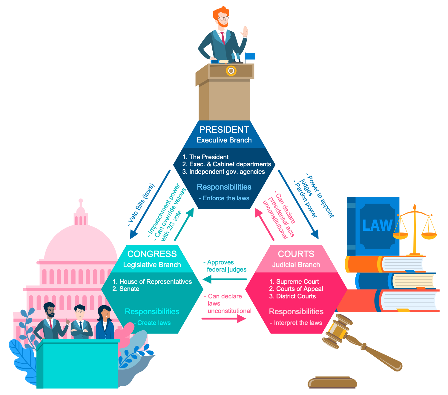
This political infographic is dedicated to the separation of powers between authorities in France. The governance power is divided into three main branches — executive, legislative, and judicial. Each of them has its own separate and independent powers and responsibilities, not conflicting with each other. The President represents the executive branch, which also includes Executive and Cabinet departments as well as Independent government agencies, all working together to ensure compliance with the laws. The Congress relates to the legislative branch occupied by creating laws along with the House of Representatives and Senate. The Courts belong to the judicial branch, they interpret the laws and include the Supreme Court, Courts of Appeal, and District Courts. You see that each branch is limited only by its own functions and does not relate to the functions of others, this method prevents the concentration of power. Being colorful and illustrative this diagram will be interesting for everyone.
Example 10: Three Dimensional Axis of Politics
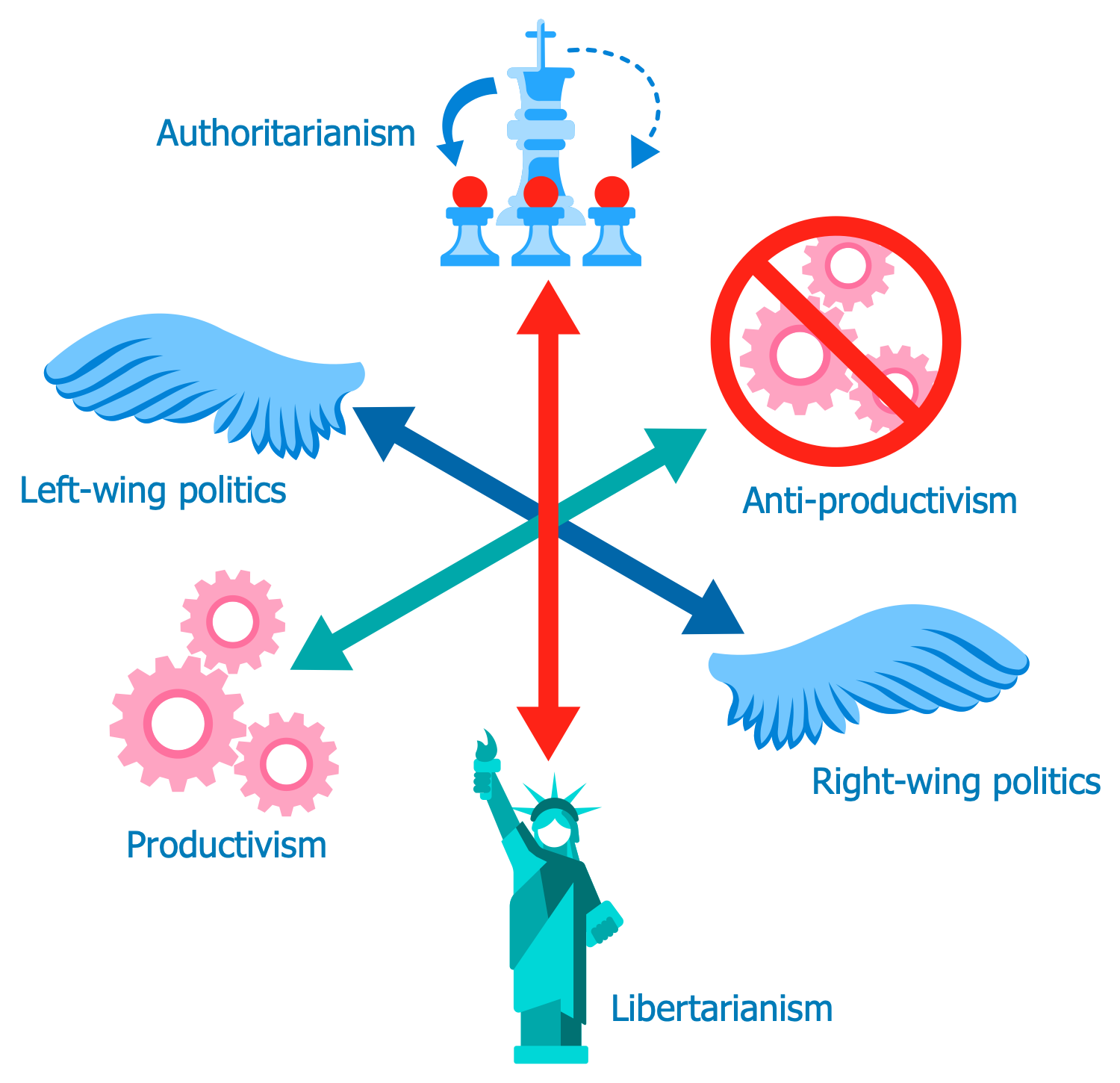
The visual organization in political groups, organizations, and parties in accordance with certain conceptual axes is accepted in the political sphere. The axes present groups with diametrically opposite views, concepts, and programs at their ends, such as left-right, dependency-autonomy, and so on. Initially, European political polls used one-dimensional politics and showed that it uses only one axis from left to right, but today many countries, regions and organizations have a more complex political spectrum, respectively counting more axes. This sample illustrates the three-dimensional axis structure of politics. The vertical axis is authoritarianism-libertarianism, it is colored by red. The other two axes are crossed, they represent left-wing politics and right-wing politics highlighted in blue, and productivism with opposite anti-productivism colored in light-blue. Adding the third axis was proposed by the researcher and ecologist Florent Marcellesi and made it possible to consider ecologism as a political ideology. The color differentiation and clipart are visual and suitable even is serious issues, so don't be afraid to experiment and present political news visually.
Inside
What I Need to Get Started
After ConceptDraw DIAGRAM is installed, the Politics Infographics solution can be purchased either from the Business Infographics area of ConceptDraw STORE itself or from our online store. Thus, you will be able to use the Politics Infographics solution straight after.
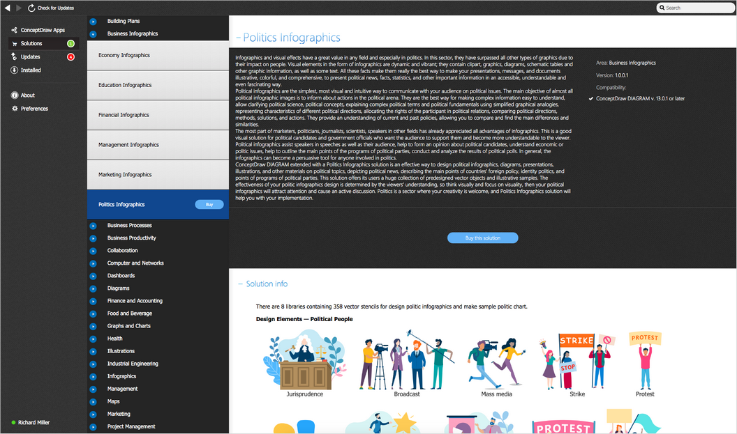
How to install
First of all, make sure that both ConceptDraw STORE and ConceptDraw DIAGRAM applications are downloaded and installed on your computer. Next, install the Politics Infographics solution from the ConceptDraw STORE to use it in the ConceptDraw DIAGRAM application.
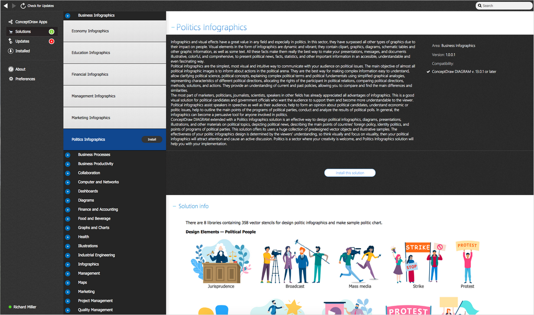
Start using
Start using the Politics Infographics solution to make the professionally looking illustrations by adding the design elements taken from the stencil libraries and editing the pre-made examples that can be found there.
