- Electric and Telecom Plans Free
- Fire and Emergency Plans Free
- Floor Plans Free
- Plant Layout Plans Free
- School and Training Plans Free
- Seating Plans Free
- Security and Access Plans Free
- Site Plans Free
- Sport Field Plans Free
- Business Process Diagrams Free
- Business Process Mapping Free
- Classic Business Process Modeling Free
- Cross-Functional Flowcharts Free
- Event-driven Process Chain Diagrams Free
- IDEF Business Process Diagrams Free
- Logistics Flow Charts Free
- Workflow Diagrams Free
- ConceptDraw Dashboard for Facebook Free
- Mind Map Exchange Free
- MindTweet Free
- Note Exchange Free
- Project Exchange Free
- Social Media Response Free
- Active Directory Diagrams Free
- AWS Architecture Diagrams Free
- Azure Architecture Free
- Cisco Network Diagrams Free
- Cisco Networking Free
- Cloud Computing Diagrams Free
- Computer Network Diagrams Free
- Google Cloud Platform Free
- Interactive Voice Response Diagrams Free
- Network Layout Floor Plans Free
- Network Security Diagrams Free
- Rack Diagrams Free
- Telecommunication Network Diagrams Free
- Vehicular Networking Free
- Wireless Networks Free
- Comparison Dashboard Free
- Composition Dashboard Free
- Correlation Dashboard Free
- Frequency Distribution Dashboard Free
- Meter Dashboard Free
- Spatial Dashboard Free
- Status Dashboard Free
- Time Series Dashboard Free
- Basic Circle-Spoke Diagrams Free
- Basic Circular Arrows Diagrams Free
- Basic Venn Diagrams Free
- Block Diagrams Free
- Concept Maps Free
- Family Tree Free
- Flowcharts Free
- Basic Area Charts Free
- Basic Bar Graphs Free
- Basic Divided Bar Diagrams Free
- Basic Histograms Free
- Basic Line Graphs Free
- Basic Picture Graphs Free
- Basic Pie Charts Free
- Basic Scatter Diagrams Free
- Aerospace and Transport Free
- Artwork Free
- Audio, Video, Media Free
- Business and Finance Free
- Computers and Communications Free
- Holiday Free
- Manufacturing and Maintenance Free
- Nature Free
- People Free
- Presentation Clipart Free
- Safety and Security Free
- Analog Electronics Free
- Audio and Video Connectors Free
- Basic Circuit Diagrams Free
- Chemical and Process Engineering Free
- Digital Electronics Free
- Electrical Engineering Free
- Electron Tube Circuits Free
- Electronic Block Diagrams Free
- Fault Tree Analysis Diagrams Free
- GHS Hazard Pictograms Free
- Home Automation and Wiring Free
- Mechanical Engineering Free
- One-line Diagrams Free
- Power Сircuits Free
- Specification and Description Language (SDL) Free
- Telecom and AV Circuits Free
- Transport Hazard Pictograms Free
- Data-driven Infographics Free
- Pictorial Infographics Free
- Spatial Infographics Free
- Typography Infographics Free
- Calendars Free
- Decision Making Free
- Enterprise Architecture Diagrams Free
- Fishbone Diagrams Free
- Organizational Charts Free
- Plan-Do-Check-Act (PDCA) Free
- Seven Management and Planning Tools Free
- SWOT and TOWS Matrix Diagrams Free
- Timeline Diagrams Free
- Australia Map Free
- Continent Maps Free
- Directional Maps Free
- Germany Map Free
- Metro Map Free
- UK Map Free
- USA Maps Free
- Customer Journey Mapping Free
- Marketing Diagrams Free
- Matrices Free
- Pyramid Diagrams Free
- Sales Dashboard Free
- Sales Flowcharts Free
- Target and Circular Diagrams Free
- Cash Flow Reports Free
- Current Activities Reports Free
- Custom Excel Report Free
- Knowledge Reports Free
- MINDMAP Reports Free
- Overview Reports Free
- PM Agile Free
- PM Dashboards Free
- PM Docs Free
- PM Easy Free
- PM Meetings Free
- PM Planning Free
- PM Presentations Free
- PM Response Free
- Resource Usage Reports Free
- Visual Reports Free
- House of Quality Free
- Quality Mind Map Free
- Total Quality Management TQM Diagrams Free
- Value Stream Mapping Free
- Astronomy Free
- Biology Free
- Chemistry Free
- Language Learning Free
- Mathematics Free
- Physics Free
- Piano Sheet Music Free
- Android User Interface Free
- Class Hierarchy Tree Free
- Data Flow Diagrams (DFD) Free
- DOM Tree Free
- Entity-Relationship Diagram (ERD) Free
- EXPRESS-G data Modeling Diagram Free
- IDEF0 Diagrams Free
- iPhone User Interface Free
- Jackson Structured Programming (JSP) Diagrams Free
- macOS User Interface Free
- Object-Role Modeling (ORM) Diagrams Free
- Rapid UML Free
- SYSML Free
- Website Wireframe Free
- Windows 10 User Interface Free
Comparison Dashboard
Dashboards can be broken down due to their role and taking into consideration whether they are analytical, operational, informational or strategic. The last-mentioned dashboards support managers within an organization, providing both quick and clear overview that they have to start monitoring both health and opportunities for their business. Dashboards of this type are known to be focusing on the high-level measures of performance.
Dashboards that are used for analytical purposes may include more context, history and comparisons than the strategic ones. Analytical dashboards usually support different interactions with the data. Dashboards that are used for monitoring different operations are often designed differently from those that support strategic decision making or data analysis. They also often require monitoring of different activities as well as the events that can be constantly changing, requiring more attention and response.
Any Comparison Dashboard is the one that integrates one screen to view the Comparison Charts as well as different Indicators in a way of the Column Charts, Horizontal Bar Charts, Line Charts, Columns Indicators, Dot Plots, Two Bubbles Indicators, Left and Right Arrows Indicators, Up and Down Arrows Indicators, Two Up Arrows Indicator, Scales Indicators, etc.
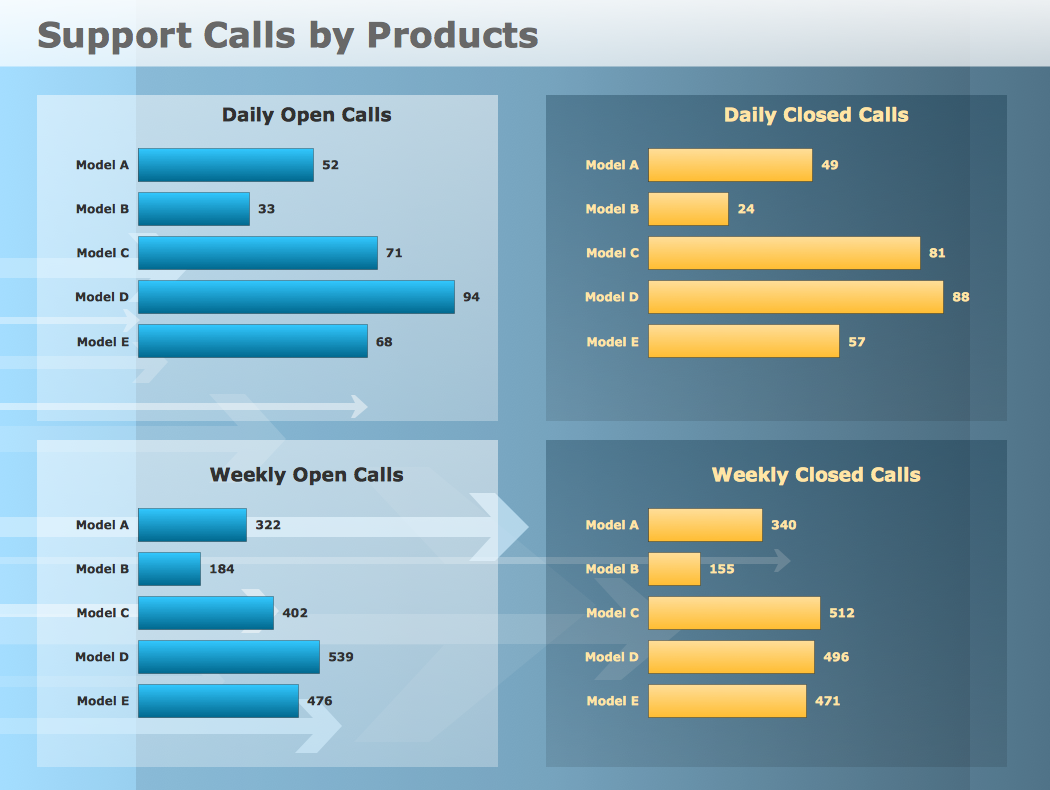
All the mentioned tools are available to be used from the Comparison Dashboard solution while working in the ConceptDraw DIAGRAM diagramming and drawing software, including the pre-made examples of the dashboards, such as an “example 1: Comparison Dashboard — Support Calls by Products” and “Support calls by Products” one.
This particular sample was created by using the ConceptDraw DIAGRAM application and it demonstrates the Comparison Dashboard solution's capabilities well. All the charts can change their data automatically when its source changes. The mentioned dashboard contains four horizontal bar charts that illustrate the comparison of both closed and open support calls for five product models daily and weekly.
As a general rule, the Comparison Dashboard solution is used by such specialists as project managers, scientists, teachers, technicians and many other managers who care for their reputation as well as for a result of their work.-
Install this solution Free -
What I need to get started -
Solution Requirements - This solution requires the following products to be installed:
ConceptDraw DIAGRAM v18 - This solution requires the following products to be installed:
-
Compatibility - Sonoma (14), Sonoma (15)
MS Windows 10, 11 - Sonoma (14), Sonoma (15)
-
Support for this Solution -
Helpdesk
Related News:
Examples
The samples you see on this page were obtained by connecting a sample data source to templates from the Comparison Dashboard solution, to demonstrate some of the solution's capabilities and the results you can achieve.
These documents are vector graphic documents, created in ConceptDraw DIAGRAM using ConceptDraw Live Objects technology. They are available for modifying, reviewing and/or converting to many different formats, such as MS PowerPoint, PDF file, MS Visio, and many other graphic ones from the ConceptDraw Solution Park or ConceptDraw STORE. The Comparison Dashboard solution is available to all ConceptDraw DIAGRAM users to get installed and used while working in the ConceptDraw DIAGRAM diagramming and drawing software.
You can download sample data sources for all dashboards to see how changes made to data effect dashboard appearance.
Example 1: Comparison Dashboard — Support Calls by Products
This sample was created in ConceptDraw DIAGRAM using the Comparison Dashboard solution, and demonstrates the solution's capabilities and the results you can achieve using this solution. All the charts on this page change automatically when the data source changes.
This support performance dashboard contains four horizontal bar charts. The bar charts show the comparison of open and closed support calls for five product models daily and weekly.

What I need to get started
Both ConceptDraw DIAGRAM diagramming and drawing software and the Comparison Dashboard solution can help creating the visual dashboard you need. The Comparison Dashboard solution can be found in the Dashboards area of ConceptDraw STORE application that can be downloaded from this site. Make sure that both ConceptDraw DIAGRAM and ConceptDraw STORE applications are installed on your computer before you get started.
How to install
After ConceptDraw STORE and ConceptDraw DIAGRAM are downloaded and installed, you can install the Comparison Dashboard solution from the ConceptDraw STORE.

Start using
To make sure that you are doing it all right, use the pre-designed symbols from the stencil libraries from the solution to make your drawings look smart and professional. Also, the pre-made examples from this solution can be used as drafts so your own drawings can be based on them. Using the samples, you can always change their structures, colors and data.

What is Comparison Dashboard?
|
|
Why use it?
Each Comparison Chart or Indicator displays your source data, to visually communicate Item Comparison.You can include Composition Charts and Indicators into your business or technical dashboards to show the ranking of your items.
Item Comparison
«In an item comparison, we want to compare how things rank: are they about the same, or is one more or less than the others? ...Words indicating larger than, smaller than, or equal are clues to an item comparison. Communication.»
Gene Zelazny
Say It With Charts: The Executive's Guide to Visual Communication
4th Edition
McGraw-Hill | 2001. P. 22.
|
|
What chart or indicator should you use?
Use Horizontal Bar Charts. Also, you can use Column Chart for a few data points. Avoid using the vertical category labels in Column Charts, use Horizontal Bar Charts with horizontal labels instead. Use Comparison Indicators for pairwise comparison.
The libraries of Comparison Charts and Comparison Indicators consist of Live Objects, the special shapes that can change their appearance depending on external data.