- Electric and Telecom Plans Free
- Fire and Emergency Plans Free
- Floor Plans Free
- Plant Layout Plans Free
- School and Training Plans Free
- Seating Plans Free
- Security and Access Plans Free
- Site Plans Free
- Sport Field Plans Free
- Business Process Diagrams Free
- Business Process Mapping Free
- Classic Business Process Modeling Free
- Cross-Functional Flowcharts Free
- Event-driven Process Chain Diagrams Free
- IDEF Business Process Diagrams Free
- Logistics Flow Charts Free
- Workflow Diagrams Free
- ConceptDraw Dashboard for Facebook Free
- Mind Map Exchange Free
- MindTweet Free
- Note Exchange Free
- Project Exchange Free
- Social Media Response Free
- Active Directory Diagrams Free
- AWS Architecture Diagrams Free
- Azure Architecture Free
- Cisco Network Diagrams Free
- Cisco Networking Free
- Cloud Computing Diagrams Free
- Computer Network Diagrams Free
- Google Cloud Platform Free
- Interactive Voice Response Diagrams Free
- Network Layout Floor Plans Free
- Network Security Diagrams Free
- Rack Diagrams Free
- Telecommunication Network Diagrams Free
- Vehicular Networking Free
- Wireless Networks Free
- Comparison Dashboard Free
- Composition Dashboard Free
- Correlation Dashboard Free
- Frequency Distribution Dashboard Free
- Meter Dashboard Free
- Spatial Dashboard Free
- Status Dashboard Free
- Time Series Dashboard Free
- Basic Circle-Spoke Diagrams Free
- Basic Circular Arrows Diagrams Free
- Basic Venn Diagrams Free
- Block Diagrams Free
- Concept Maps Free
- Family Tree Free
- Flowcharts Free
- Basic Area Charts Free
- Basic Bar Graphs Free
- Basic Divided Bar Diagrams Free
- Basic Histograms Free
- Basic Line Graphs Free
- Basic Picture Graphs Free
- Basic Pie Charts Free
- Basic Scatter Diagrams Free
- Aerospace and Transport Free
- Artwork Free
- Audio, Video, Media Free
- Business and Finance Free
- Computers and Communications Free
- Holiday Free
- Manufacturing and Maintenance Free
- Nature Free
- People Free
- Presentation Clipart Free
- Safety and Security Free
- Analog Electronics Free
- Audio and Video Connectors Free
- Basic Circuit Diagrams Free
- Chemical and Process Engineering Free
- Digital Electronics Free
- Electrical Engineering Free
- Electron Tube Circuits Free
- Electronic Block Diagrams Free
- Fault Tree Analysis Diagrams Free
- GHS Hazard Pictograms Free
- Home Automation and Wiring Free
- Mechanical Engineering Free
- One-line Diagrams Free
- Power Сircuits Free
- Specification and Description Language (SDL) Free
- Telecom and AV Circuits Free
- Transport Hazard Pictograms Free
- Data-driven Infographics Free
- Pictorial Infographics Free
- Spatial Infographics Free
- Typography Infographics Free
- Calendars Free
- Decision Making Free
- Enterprise Architecture Diagrams Free
- Fishbone Diagrams Free
- Organizational Charts Free
- Plan-Do-Check-Act (PDCA) Free
- Seven Management and Planning Tools Free
- SWOT and TOWS Matrix Diagrams Free
- Timeline Diagrams Free
- Australia Map Free
- Continent Maps Free
- Directional Maps Free
- Germany Map Free
- Metro Map Free
- UK Map Free
- USA Maps Free
- Customer Journey Mapping Free
- Marketing Diagrams Free
- Matrices Free
- Pyramid Diagrams Free
- Sales Dashboard Free
- Sales Flowcharts Free
- Target and Circular Diagrams Free
- Cash Flow Reports Free
- Current Activities Reports Free
- Custom Excel Report Free
- Knowledge Reports Free
- MINDMAP Reports Free
- Overview Reports Free
- PM Agile Free
- PM Dashboards Free
- PM Docs Free
- PM Easy Free
- PM Meetings Free
- PM Planning Free
- PM Presentations Free
- PM Response Free
- Resource Usage Reports Free
- Visual Reports Free
- House of Quality Free
- Quality Mind Map Free
- Total Quality Management TQM Diagrams Free
- Value Stream Mapping Free
- Astronomy Free
- Biology Free
- Chemistry Free
- Language Learning Free
- Mathematics Free
- Physics Free
- Piano Sheet Music Free
- Android User Interface Free
- Class Hierarchy Tree Free
- Data Flow Diagrams (DFD) Free
- DOM Tree Free
- Entity-Relationship Diagram (ERD) Free
- EXPRESS-G data Modeling Diagram Free
- IDEF0 Diagrams Free
- iPhone User Interface Free
- Jackson Structured Programming (JSP) Diagrams Free
- macOS User Interface Free
- Object-Role Modeling (ORM) Diagrams Free
- Rapid UML Free
- SYSML Free
- Website Wireframe Free
- Windows 10 User Interface Free
Divided Bar Diagrams
A Divided Bar Graph is a chart used to show the data, in which the total volume is divided into the categories or components. This chart is represented as a rectangle divided into smaller rectangles along its length in proportion to data which it represents. So, the segments in a Divided Bar represent a set of quantities according to the different proportions of the total amount. The Divided Bar Charts are used for comparative purposes in many fields, especially in statistics, marketing, business, economics, sales, etc. They are also useful when used to depict changes over time.
Thus, a Divided Bar Graph based on your data usually contains several segments that are either different in length or equal, and by looking at them, you can immediately visually trace the relationship between them and draw conclusions. Divided Bars are used for visual presentation and analysis of the collected information allowing you to observe proportional relationships between data. Thus, it is effective to apply different colors and color intensities when designing your Divided Bar Graphs, to visually emphasize important points and aspects of comparisons, and to focus audience's attention when they are used in presentations, meetings, and discussions.
Divided Bar Diagrams Solution extends the capabilities of ConceptDraw DIAGRAM with templates, samples, and a library of vector stencils for drawing high impact and professional Divided Bar Diagrams and Graphs, Bar Diagram Math, and Stacked Graph. Divided Bar Diagram library objects include a legend that describes categories and can be shown or hidden, moved into a diagram; some objects also include a table of input values for categories. Enter your data in the table, and the segments will be displayed on the chart in accordance with the table data; when you make changes, the chart changes automatically.
In addition, you have complete freedom of action — by entering absolute values in the table, if necessary, you can display percentage values in chart segments using the action menu. The objects and the Divided Bar Diagram template are fully customizable. Select an object to your liking, and then add or delete segments, set your own number of segments, display data in a chart as a percentage or absolute values, show or hide the value display, data table, legend, and also make one more necessary change, such as color gamut, color intensity, etc. As a rule, each segment has its own color, and the correspondence of categories and colors is described in the legend.
-
Buy this solution $25 -
Solution Requirements - This solution requires the following products to be installed:
ConceptDraw DIAGRAM v18 - This solution requires the following products to be installed:
-
Compatibility - Sonoma (14), Sonoma (15)
MS Windows 10, 11 - Sonoma (14), Sonoma (15)
-
Support for this Solution -
Helpdesk
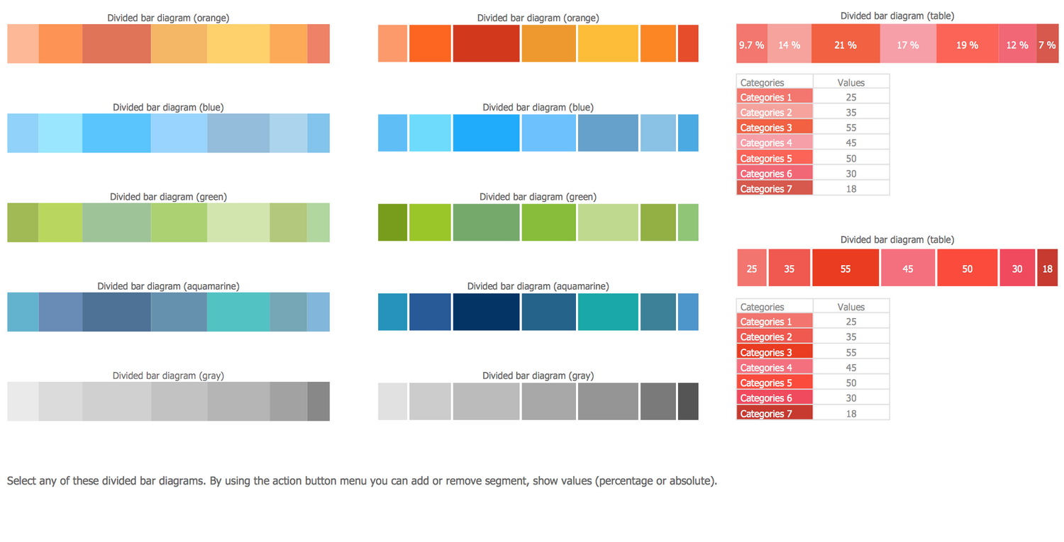
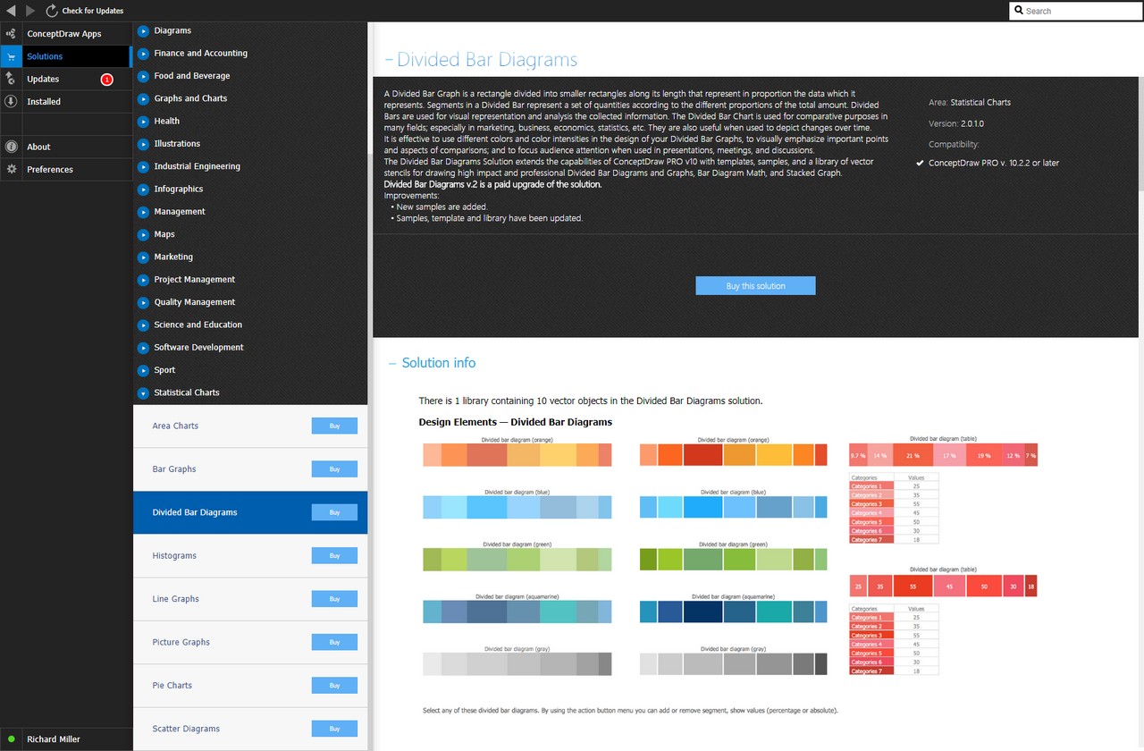
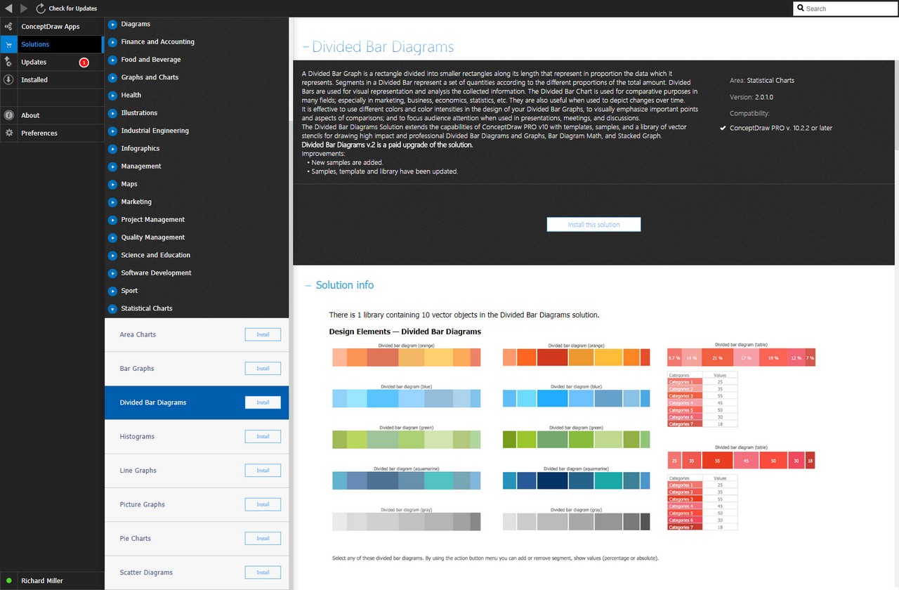
There is 1 library containing 10 vector objects in the Divided Bar Diagrams solution.
Design Elements — Divided Bar Diagrams
Related News:
CS Odessa Announces Additions to Powerful Graphs and Charts Area in ConceptDraw Solution ParkExamples
There are a few samples that you see on this page which were created in the ConceptDraw DIAGRAM application by using the Divided Bar Diagrams solution. Some of the solution's capabilities as well as the professional results which you can achieve are all demonstrated here on this page.
All source documents are vector graphic documents which are always available for modifying, reviewing and/or converting to many different formats, such as MS PowerPoint, PDF file, MS Visio, and many other graphic ones from the ConceptDraw Solution Park or ConceptDraw STORE. The Divided Bar Diagrams solution is available to all ConceptDraw DIAGRAM users for installation and use when working with the ConceptDraw DIAGRAM charting and drawing software.
Template: Divided Bar Diagram
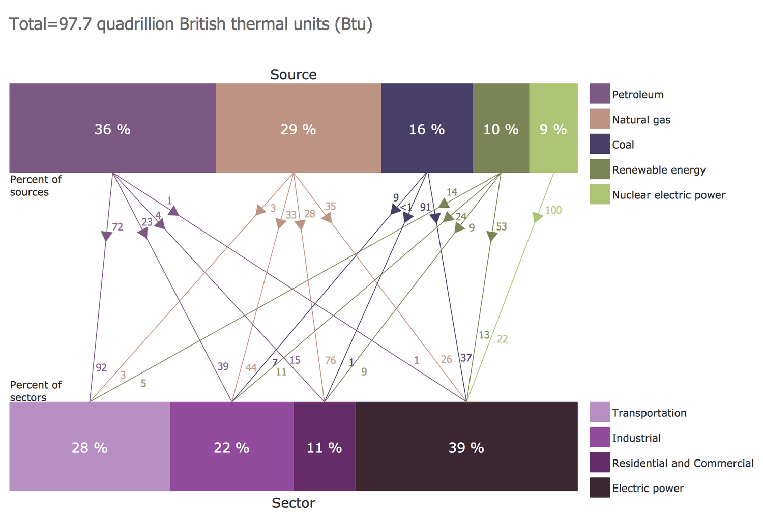
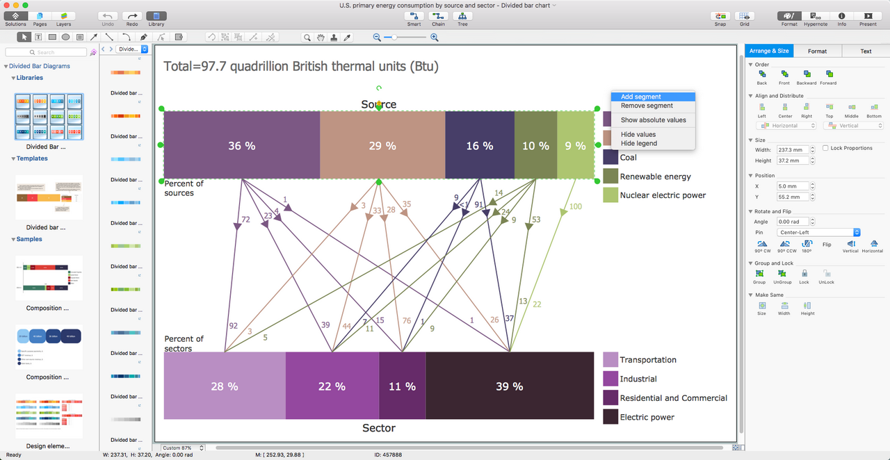
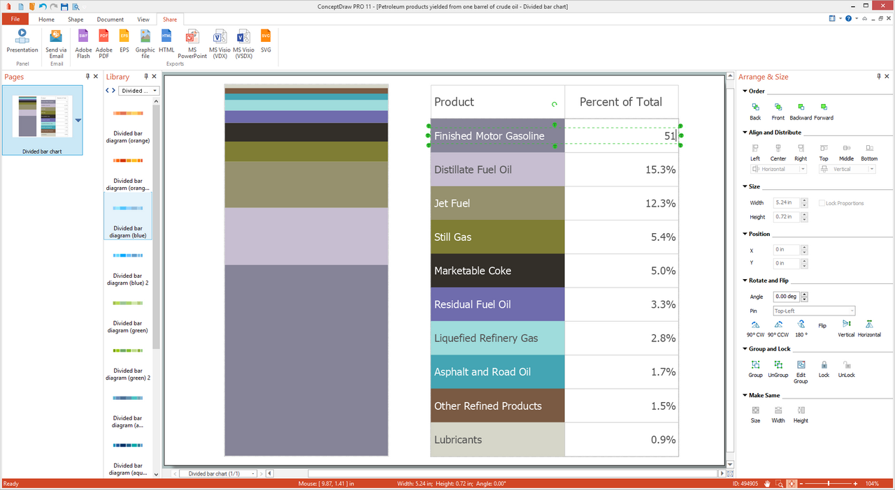
This Divided Bar Chart template is a good base for designing your own professional-looking Divided Bar Chart. It is also a detailed instruction on how to draw Divided Bar Chart, at this unambiguous and clear. You can observe the diagram and table on this template. All input values for each category are entered into the table and on their base, the Divided Bar Diagram is automatically constructed. The legend represents the description of categories and can be shown/hidden, on your desire. You are also free to choose the colors on your taste, just clicking on the category in the table and changing its color, and it will be automatically changed on your chart. The menu commands available in result of action button clicking, allow you to add/remove segments, set segments number, show percentage or absolute values, show/hide values, legend, table. The legend is combined with a table in this template, you are able to hide the table’s part leaving only the legend visible or to hide them both.
Example 1: U.S. Primary Energy Consumption by Source and Sector
This example was created in ConceptDraw DIAGRAM using the Divided Bar Diagrams Library from the Divided Bar Diagrams Solution. An experienced user spent 20 minutes creating this sample.
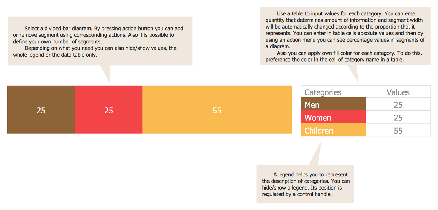
This Divided Bar Diagram sample represents in expanded form the consumption of primary energy by sources and main consumer sectors in the U.S. in 2015. The chart is based on data from the U.S. Energy Information Administration and the article "U.S. Energy Facts Explained, Consumption & Production". The total consumption amounted to 97.7 quadrillion Btu (British thermal units) in 2015. There are used many sources of primary energy in the U.S., among them petroleum, natural gas, coal, renewable energy, and nuclear electric power. The percent values of consumption all them in 2015 are depicted in the first Bar Diagram. The second one represents the percent proportions of the main consumer sectors, such as transportation, industrial, residential and commercial, electric power; the last one is the biggest. The use of each source greatly varies by sectors. Thus, natural gas provides 3% of the energy used for transportation, 35% to generate electricity, 33% of the energy for industrial, and 28% for the residential and commercial sector; the nuclear electric power is used only for electricity, etc.
Example 2: Your Agency is Committed to Creating a Diverse Workforce
This example was created in ConceptDraw DIAGRAM using the Divided Bar Diagrams Library from the Divided Bar Diagrams Solution. An experienced user spent 10 minutes creating this sample.
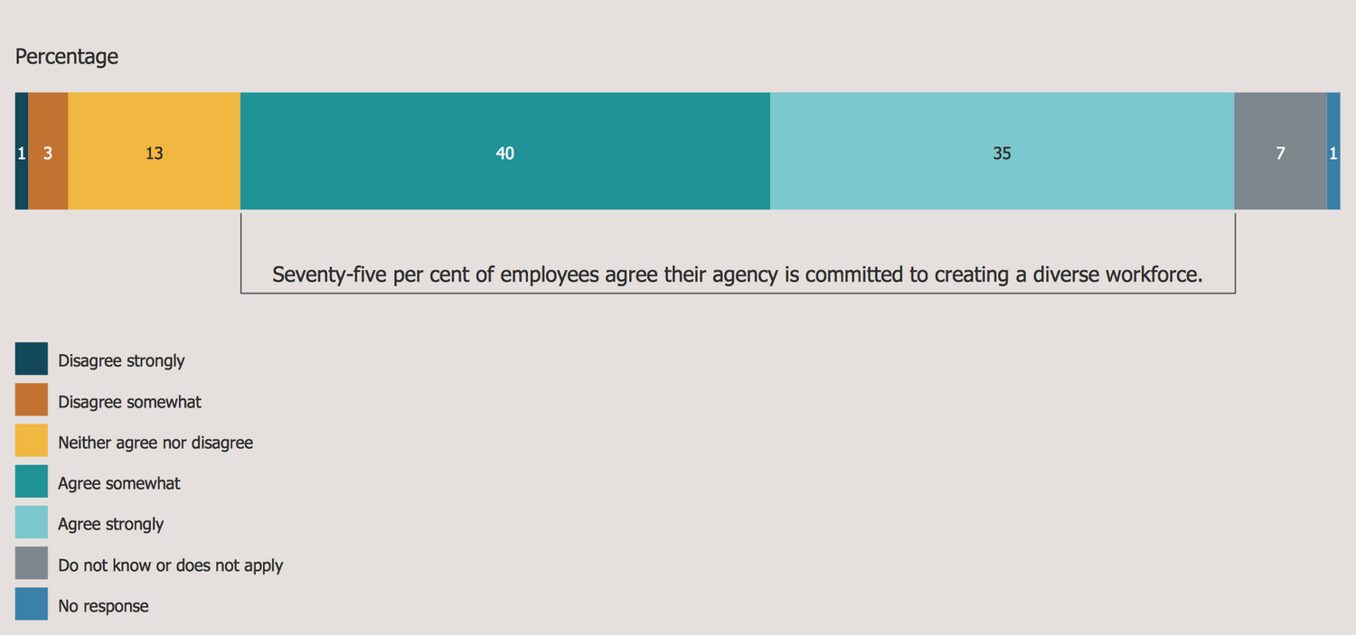
This Divided Bar Diagram demonstrates the results of the public poll about the aspiration of the agency to the creation of a diverse workforce. It was designed on the base of the "Employee perception survey results" article from the website of the Public Sector Commission, the Government of Western Australia. The Employee perception survey is conducted each year by the Public Sector Commission and is the part of its annual survey program directed on the improvement the work of public sector agencies and authorities in questions of planning and awareness-raising. The quick look at the diagram lets instantly remark the opinion of the vast majority — the "agree somewhat" people amounted 40%, while the minority (1%) are "disagree strongly", and 1% also amounted "no response". It is also depicted the union of people "agree somewhat" and "agree strongly", their total quantity comprised 75% — all these employees agree their agency is committed to creating a diverse workforce.
Example 3: Shares of Aggregate Income
This example was created in ConceptDraw DIAGRAM using the Divided Bar Diagrams Library from the Divided Bar Diagrams Solution. An experienced user spent 10 minutes creating this sample.
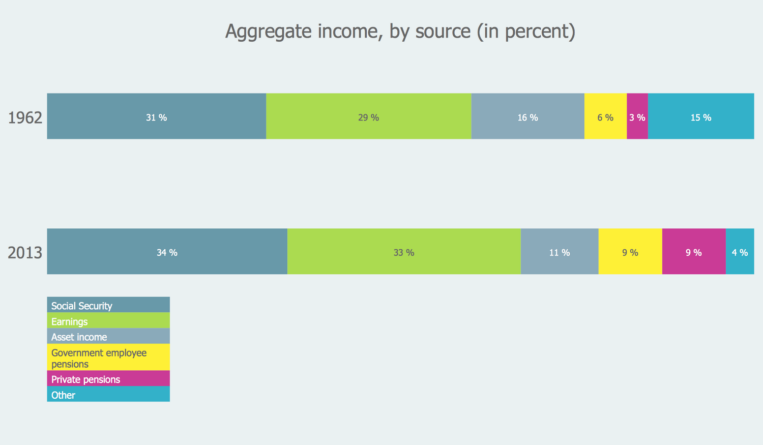
Divided Bar Diagram is a good choice to visually represent data divided into categories for further easy comparison them. This Divided Bar Chart was constructed on the base of data from the website of the U.S. Social Security Administration (SSA) and illustrates the shares of aggregate incomes by the source in percent in 1962 and 2013 separately, as well as lets one easily compare their values. There are included several categories of incomes: earnings, asset income, government employee pensions, private pensions, and others. Each of these categories is colored differently from other ones and all they are represented on both bars in corresponding proportions. The correspondence of colors is represented in a legend. You can see that data for 1962 and 2013 significantly differ and especially large this difference is for the private pensions and other incomes. If in 1962, they were 3% and 15% correspondingly, in 2013 we can observe that they count 9% and 4%.
Example 4: Taking Up Flexible Work Options Leave Arrangements
This example was created in ConceptDraw DIAGRAM using the Divided Bar Diagrams Library from the Divided Bar Diagrams Solution. An experienced user spent 10 minutes creating this sample.
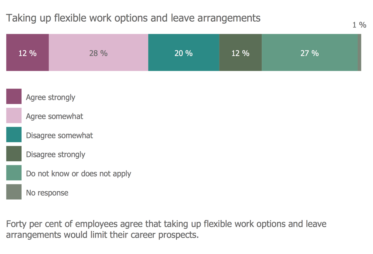
Divided Bar Diagrams are very popular, convenient and useful for comparing statistics and for showing results of various public opinion polls. This diagram is a good confirmation of these words, it shows the employee perception survey results in percentage. The sample is based on the data from the article "Employee perception survey results" published on the website of the Public Sector Commission, the Government of Western Australia. The results of answering the question posed in the 2011/12 survey about taking up flexible work options and leave arrangements are represented. The results show that opinions on this issue quite sharply divided, significant quantity of employees (40%) agree that taking up flexible work options and leave arrangements will sharply limit their career prospects, these are the "agree strongly" and "agree somewhat", when 32% disagree include "disagree somewhat" and "disagree strongly", 27% "do not know or does not apply", and 1% "no response".
Example 5: Divided Bar Diagram — Workplace Culture
This example was created in ConceptDraw DIAGRAM using the Divided Bar Diagrams Library from the Divided Bar Diagrams Solution. An experienced user spent 10 minutes creating this sample.
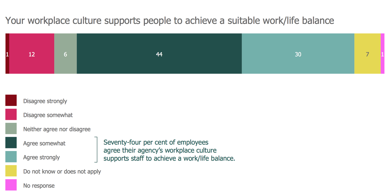
This Divided Bar Diagram sample demonstrates the percentage results of a staff survey. The data are taken from the webpage "Employee perception survey results" published on the website of the Public Sector Commission, the Government of Western Australia. Were offered 7 variants of answers on the question: "your workplace culture supports people to achieve a suitable work/life balance". Among the responses' variants were: disagree strongly, disagree somewhat, neither agree nor disagree, agree somewhat, agree strongly, do not know or does not apply, and no response. Each answer is represented in percent, the corresponding bar's part is proportional to this value and visually colored with its own color. According to the Bar Diagram, the total number of employees agree their agency’s workplace culture supports staff to achieve a work/life balance comprise 74%, the total number of disagree employees is 13%, 6% are neither agree nor disagree employees, and other variants of responses comprise 8%.
Example 6: Composition of State Government Revenue
This example was created in ConceptDraw DIAGRAM using the Divided Bar Diagrams Library from the Divided Bar Diagrams Solution. An experienced user spent 5 minutes creating this sample.
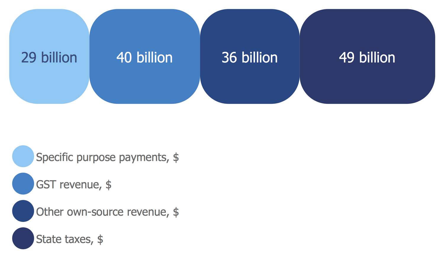
This Divided Bar Diagram sample is based on the chart "Composition of state government revenue in 2006‑07" published on Australia's future tax system website and depicts the composition of Australian state government revenue in 2006‑2007. The use of Divided Bar Graph to compare data provides one with plenty of opportunities to use methods that allow you to focus the attention of your audience to particular aspects of the comparison. The order you put the categories is one of such methodologies. In the offered case, the order of the categories is enhanced by the intensity of color. The extrema are marked with a minimum and maximum color intensity, respectively. At this, the correspondence of colors to the categories, you can find in a legend. Among the offered categories we can observe the specific purpose payments comprised $29 billion, GTS revenue that is an Australian government tax comprised $40 billion, other own-source revenue $36 billion, and state taxes $49 billion.
Example 7: Composition of Estates
This example was created in ConceptDraw DIAGRAM using the Divided Bar Diagrams Library from the Divided Bar Diagrams Solution. An experienced user spent 10 minutes creating this sample.
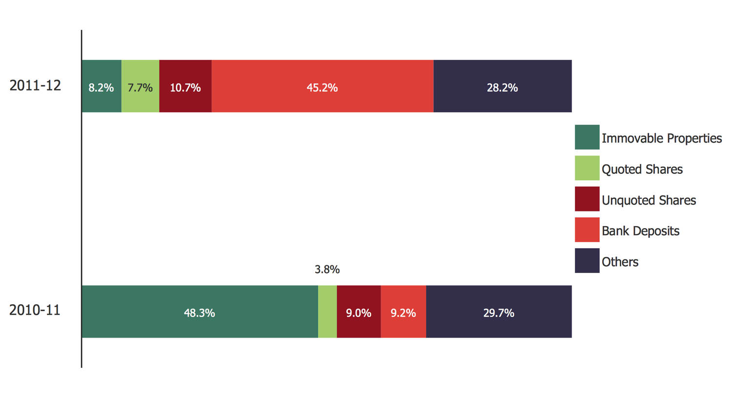
This Divided Bar Diagram sample was created on the base of the illustration "Composition of estates" from the website of the Inland Revenue Department of the Government of the Hong Kong Special Administrative Region and demonstrates the composition of estates and cases that were processed in 2010-11 and 2011-12. According to the Hong Kong law, the estate duty was charged from the part of the estate of a deceased person that was situated in Hong Kong upon to 2006 when the Revenue Ordinance and Abolition of Estate Duty entered into force. After the abolition of estate duty, the number of new cases decreased since 2010-11 to 2011-12. According to the shown Bar Diagrams, the estates are composed of the immovable properties, quoted shares, unquoted shares, bank deposits, and others in different proportions in 2010 and 2011. These bars can be easily visually compared to each other due to the close location of bars and equal coloring of the bars' parts corresponding to the same categories.
Example 8: Global Natural Gas Consumption
This example was created in ConceptDraw DIAGRAM using the Divided Bar Diagrams Library from the Divided Bar Diagrams Solution. An experienced user spent 5 minutes creating this sample.
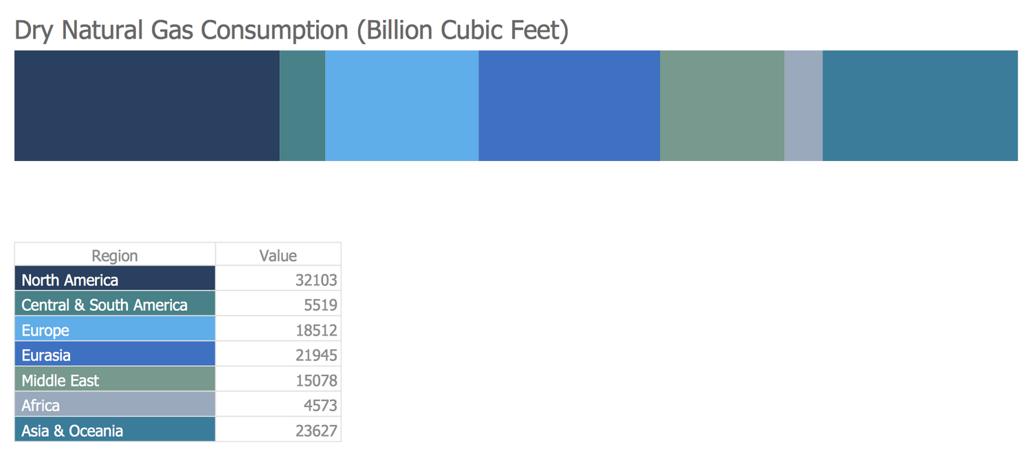
This Divided Bar Diagram sample shows the global dry natural gas consumption by regions in 2013. Data are represented in Billion Cubic Feet for North America, Central & South America, Europe, Eurasia, Middle East, Africa, and Asia & Oceania. They were taken from the International Energy Statistics webpage that is the part of the U.S. Energy Information Administration (EIA) website. The values for different regions are represented at the table, on the base of which this Bar Diagram was constructed. Each region is filled with an individual color for easy identification according to the legend. The Divided Bar Diagram ConceptDraw's object let one easily draw Divided Bar Diagram, as well as change the segments number, remove or add the segments and color them in the desired way. Now, the values are hidden in the diagram, but you can show the absolute values from the table or percentage, as well as hide/show the legend or only the table.
Example 9: London Elections Results
This example was created in ConceptDraw DIAGRAM using the Divided Bar Diagrams Library from the Divided Bar Diagrams Solution. An experienced user spent 5 minutes creating this sample.
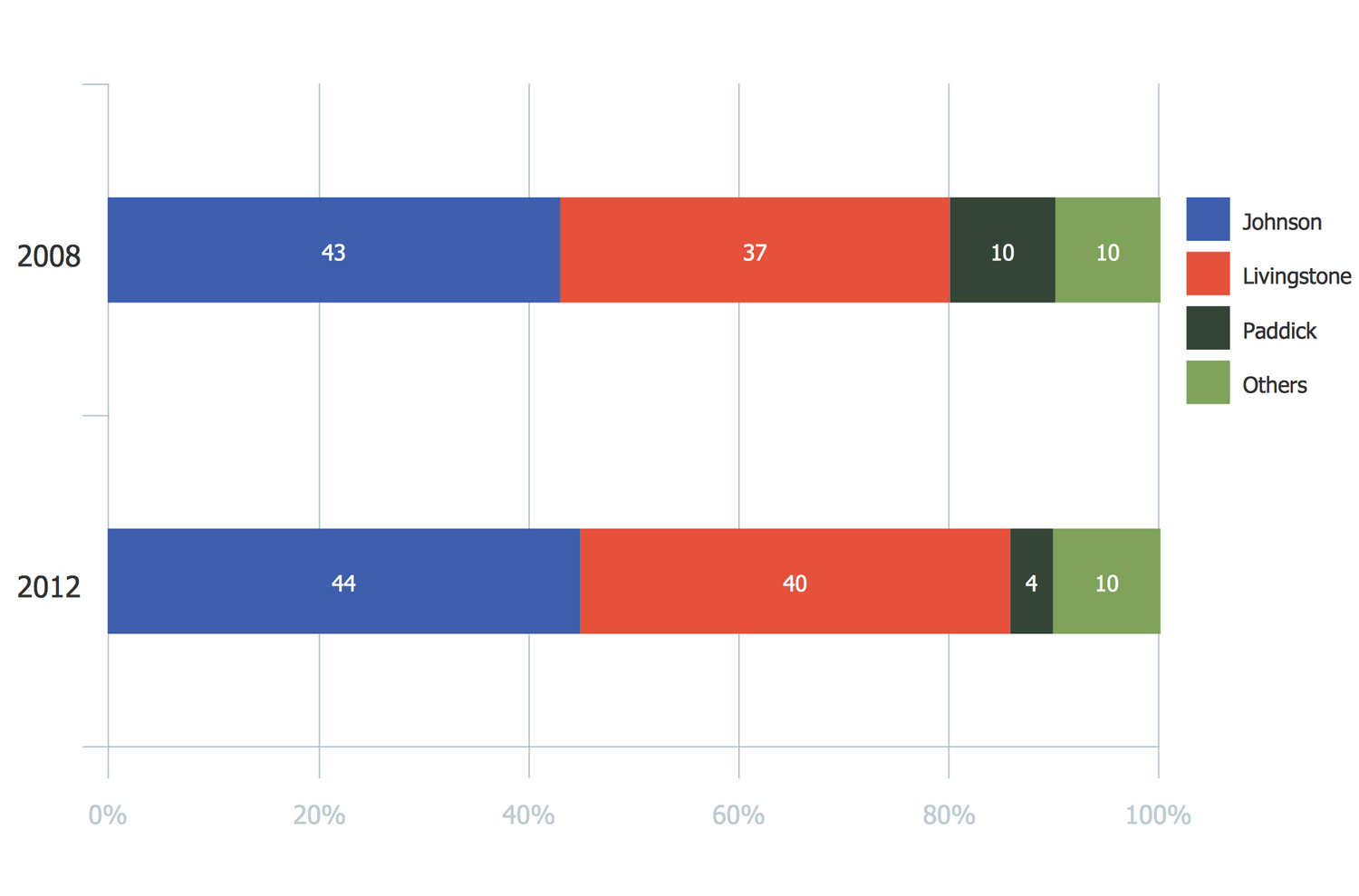
This Divided Bar Diagram sample demonstrates the London election results in 2008 and 2012. It was designed using data from the infographics "London Elections Results by Numbers" published on the london.gov.uk website that is an official website of London Assembly and Mayor of London. There are represented the election results for three main candidates: Johnson, Livingstone, Paddick, and the separate combined group representing other candidates. The results for different years are represented on the separated Bar Charts but placed one under the other that is incredibly convenient for comparing them. In addition, you can also observe the percentage scale, which allows you to additionally navigate in percentages. Color differentiation of candidates is also used. Thanks to all these advantages of ConceptDraw's Divided Bar Diagrams, it’s immediately noticeable that the first of the candidates listed got the largest number in both considered years, the second one is close to him, but still scored less, and the rest ones are behind.
Example 10: Petroleum Products Yielded from One Barrel of Crude Oil
This example was created in ConceptDraw DIAGRAM using the Divided Bar Diagrams Library from the Divided Bar Diagrams Solution. An experienced user spent 10 minutes creating this sample.
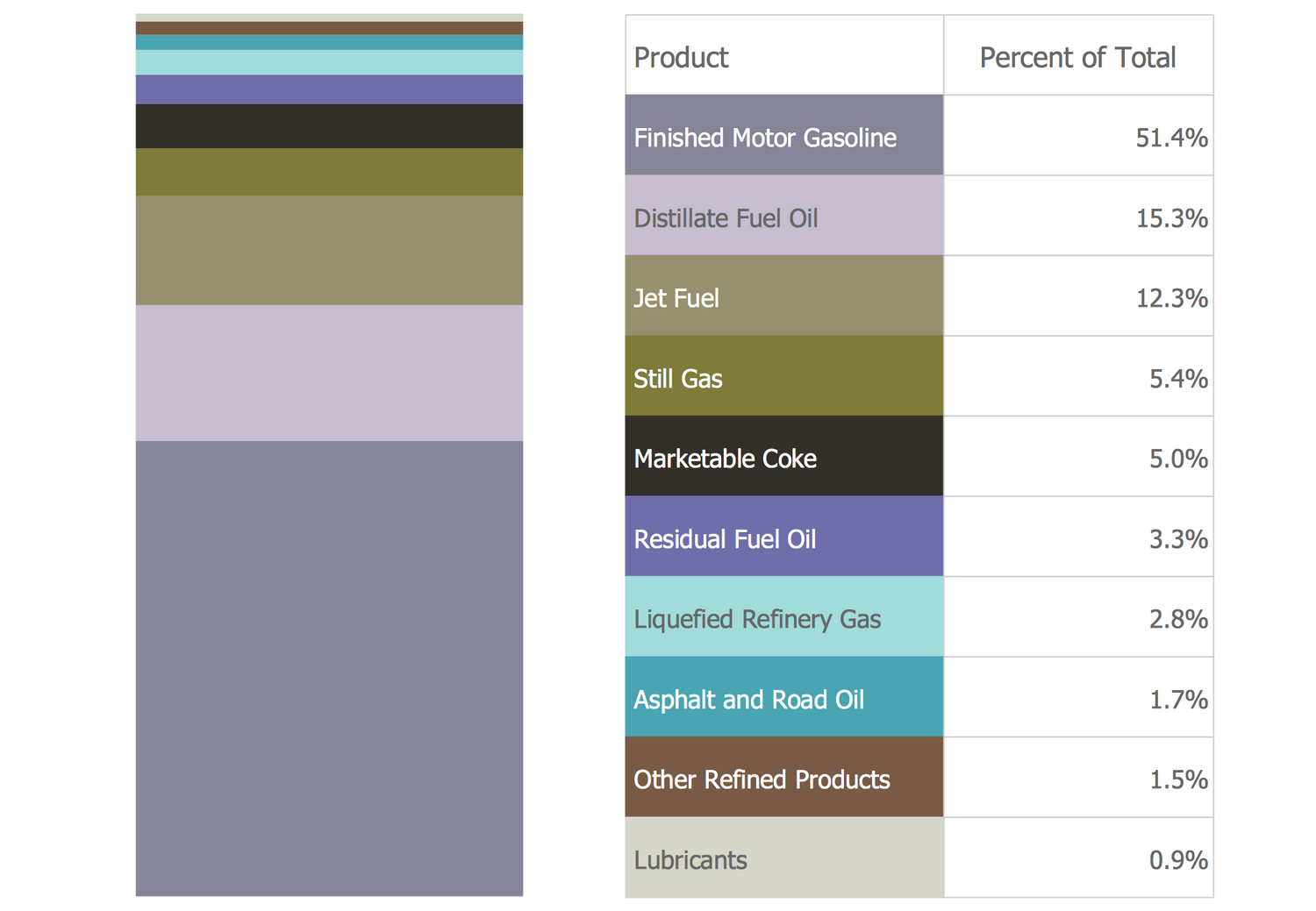
This Divided Bar Chart sample illustrates the full list of petroleum products yielded from 1 barrel of crude oil in California in 2004. This sample was designed using data from the chart published on the California Energy Almanac website. The percentage composition of the products is reflected at the table and in the Divided Bar Chart. When considering carefully this diagram you will immediately notice that the finished motor gasoline comprised the largest part of the produced oil products, namely 51.4%, distillate fuel oil amounted 15.3%, jet fuel 12.3%, the rest ones are still gas, marketable coke, residual fuel oil, liquefied petroleum gas, asphalt and road oil, other refined products, and lubricants, the part of each of which ranges from 5.4% to 0.9%. Note also that the percentage ratios are sorted from larger to smaller in the table and from smaller to larger (from top to bottom) in the chart. This chart is located vertically, but you can draw Divided Bar Graph of any orientation in ConceptDraw DIAGRAM, as well as rotate it to the desired angle.
Inside
What I Need to Get Started
After ConceptDraw DIAGRAM is installed, the Divided Bar Diagrams solution can be purchased either from the Statistical Charts area of ConceptDraw STORE itself or from our online store. Thus, you will be able to use the Divided Bar Diagrams solution straight after.
How to install
First of all, make sure that both ConceptDraw STORE and ConceptDraw DIAGRAM applications are downloaded and installed on your computer. Next, install the Divided Bar Diagrams solution from the ConceptDraw STORE to use it in the ConceptDraw DIAGRAM application.
Start Using
Start using the Divided Bar Diagrams solution to make the professionally looking numerical data by adding the design elements taken from the stencil libraries and editing the pre-made examples that can be found there.
