- Electric and Telecom Plans Free
- Fire and Emergency Plans Free
- Floor Plans Free
- Plant Layout Plans Free
- School and Training Plans Free
- Seating Plans Free
- Security and Access Plans Free
- Site Plans Free
- Sport Field Plans Free
- Business Process Diagrams Free
- Business Process Mapping Free
- Classic Business Process Modeling Free
- Cross-Functional Flowcharts Free
- Event-driven Process Chain Diagrams Free
- IDEF Business Process Diagrams Free
- Logistics Flow Charts Free
- Workflow Diagrams Free
- ConceptDraw Dashboard for Facebook Free
- Mind Map Exchange Free
- MindTweet Free
- Note Exchange Free
- Project Exchange Free
- Social Media Response Free
- Active Directory Diagrams Free
- AWS Architecture Diagrams Free
- Azure Architecture Free
- Cisco Network Diagrams Free
- Cisco Networking Free
- Cloud Computing Diagrams Free
- Computer Network Diagrams Free
- Google Cloud Platform Free
- Interactive Voice Response Diagrams Free
- Network Layout Floor Plans Free
- Network Security Diagrams Free
- Rack Diagrams Free
- Telecommunication Network Diagrams Free
- Vehicular Networking Free
- Wireless Networks Free
- Comparison Dashboard Free
- Composition Dashboard Free
- Correlation Dashboard Free
- Frequency Distribution Dashboard Free
- Meter Dashboard Free
- Spatial Dashboard Free
- Status Dashboard Free
- Time Series Dashboard Free
- Basic Circle-Spoke Diagrams Free
- Basic Circular Arrows Diagrams Free
- Basic Venn Diagrams Free
- Block Diagrams Free
- Concept Maps Free
- Family Tree Free
- Flowcharts Free
- Basic Area Charts Free
- Basic Bar Graphs Free
- Basic Divided Bar Diagrams Free
- Basic Histograms Free
- Basic Line Graphs Free
- Basic Picture Graphs Free
- Basic Pie Charts Free
- Basic Scatter Diagrams Free
- Aerospace and Transport Free
- Artwork Free
- Audio, Video, Media Free
- Business and Finance Free
- Computers and Communications Free
- Holiday Free
- Manufacturing and Maintenance Free
- Nature Free
- People Free
- Presentation Clipart Free
- Safety and Security Free
- Analog Electronics Free
- Audio and Video Connectors Free
- Basic Circuit Diagrams Free
- Chemical and Process Engineering Free
- Digital Electronics Free
- Electrical Engineering Free
- Electron Tube Circuits Free
- Electronic Block Diagrams Free
- Fault Tree Analysis Diagrams Free
- GHS Hazard Pictograms Free
- Home Automation and Wiring Free
- Mechanical Engineering Free
- One-line Diagrams Free
- Power Сircuits Free
- Specification and Description Language (SDL) Free
- Telecom and AV Circuits Free
- Transport Hazard Pictograms Free
- Data-driven Infographics Free
- Pictorial Infographics Free
- Spatial Infographics Free
- Typography Infographics Free
- Calendars Free
- Decision Making Free
- Enterprise Architecture Diagrams Free
- Fishbone Diagrams Free
- Organizational Charts Free
- Plan-Do-Check-Act (PDCA) Free
- Seven Management and Planning Tools Free
- SWOT and TOWS Matrix Diagrams Free
- Timeline Diagrams Free
- Australia Map Free
- Continent Maps Free
- Directional Maps Free
- Germany Map Free
- Metro Map Free
- UK Map Free
- USA Maps Free
- Customer Journey Mapping Free
- Marketing Diagrams Free
- Matrices Free
- Pyramid Diagrams Free
- Sales Dashboard Free
- Sales Flowcharts Free
- Target and Circular Diagrams Free
- Cash Flow Reports Free
- Current Activities Reports Free
- Custom Excel Report Free
- Knowledge Reports Free
- MINDMAP Reports Free
- Overview Reports Free
- PM Agile Free
- PM Dashboards Free
- PM Docs Free
- PM Easy Free
- PM Meetings Free
- PM Planning Free
- PM Presentations Free
- PM Response Free
- Resource Usage Reports Free
- Visual Reports Free
- House of Quality Free
- Quality Mind Map Free
- Total Quality Management TQM Diagrams Free
- Value Stream Mapping Free
- Astronomy Free
- Biology Free
- Chemistry Free
- Language Learning Free
- Mathematics Free
- Physics Free
- Piano Sheet Music Free
- Android User Interface Free
- Class Hierarchy Tree Free
- Data Flow Diagrams (DFD) Free
- DOM Tree Free
- Entity-Relationship Diagram (ERD) Free
- EXPRESS-G data Modeling Diagram Free
- IDEF0 Diagrams Free
- iPhone User Interface Free
- Jackson Structured Programming (JSP) Diagrams Free
- macOS User Interface Free
- Object-Role Modeling (ORM) Diagrams Free
- Rapid UML Free
- SYSML Free
- Website Wireframe Free
- Windows 10 User Interface Free
Scatter Diagrams
A Scatter Chart (other names Scatter Plot, Scatter Diagram, Scatter Graph, Correlation Chart) is one of the Seven Basic tools of quality control. This is a simple and convenient tool intended to identify the relationship between two types of data and allowing one to visualize how a change in one variable affects another one. A Scatter Chart displays the data set as a collection of points in Cartesian coordinates; each of them is determined by the values of two variables (position on the horizontal axis and vertical axis).
Scatter Diagrams are used for identifying potential linear and nonlinear relationships between variables, as well as to show the absence or presence of correlation between two variables and to define its degree, to depict the relationships of price and quality rating, to determine the correlation between the quality parameter and the factor affecting it. The correlation can be positive, negative, or null, and its type can be easily determined with only a glance at the position of points on the Scatter Chart.
A Scatter Chart is a quite informative diagram. The direction and compactness of the points' cluster indicate the type and strength of the relationship between two variables, on the basis of which it is possible to make certain conclusions and to take further decisions. The more this cluster is similar to the straight line, the stronger is the correlation between the paired data. However, in some cases, a strong relationship can also be significantly affected by some third variable, which eventually clusters the points on the Scatter Diagram.
The Scatter Diagrams Solution extends ConceptDraw DIAGRAM functionality with templates, samples, and a library of vector stencils that make simple the construction of a Scatter Plot of any complexity. The Scatter Chart Solution makes it easy to design attractive Scatter Diagrams used in various fields of science, work, and life activities. Use the ConceptDraw DIAGRAM application's ability to enter the data to the table and to construct the Scatter Plot Graph automatically according to these data.
-
Buy this solution $25 -
Solution Requirements - This solution requires the following products to be installed:
ConceptDraw DIAGRAM v18 - This solution requires the following products to be installed:
-
Compatibility - Sonoma (14), Sonoma (15)
MS Windows 10, 11 - Sonoma (14), Sonoma (15)
-
Support for this Solution -
Helpdesk
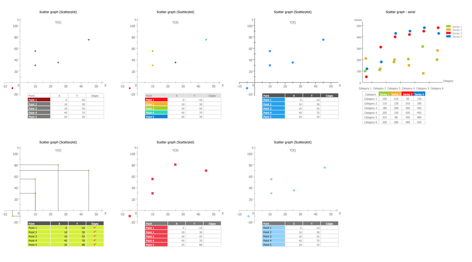
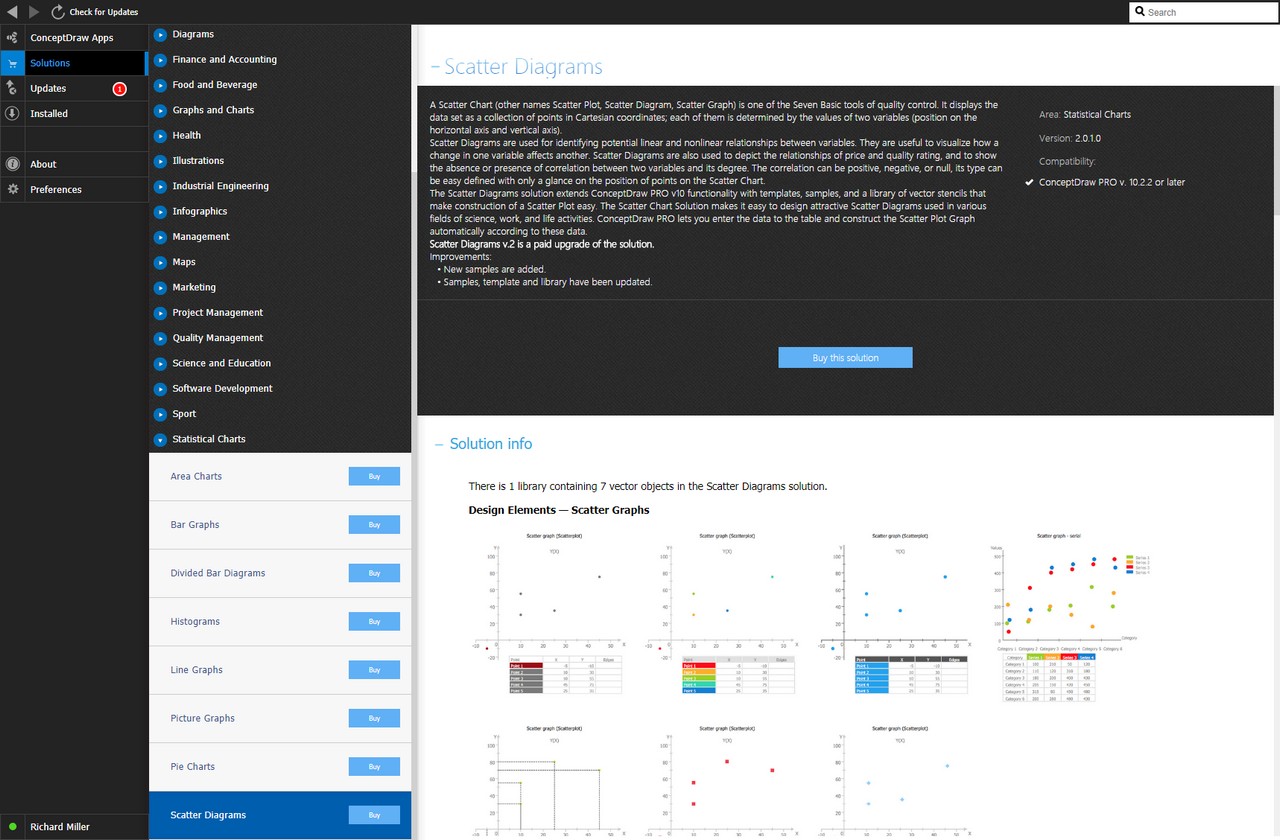
There is 1 library containing 7 vector objects in the Scatter Diagrams solution.
Design Elements — Scatter Graphs
Related News:
CS Odessa Announces Additions to Powerful Graphs and Charts Area in ConceptDraw Solution ParkExamples
There are a few samples that you see on this page which were created in the ConceptDraw DIAGRAM application by using the Scatter Diagrams solution. Some of the solution's capabilities as well as the professional results which you can achieve are all demonstrated here on this page.
All source documents are vector graphic documents which are always available for modifying, reviewing and/or converting to many different formats, such as MS PowerPoint, PDF file, MS Visio, and many other graphic ones from the ConceptDraw Solution Park or ConceptDraw STORE. The Scatter Diagrams solution is available to all ConceptDraw DIAGRAM users to get installed and used while working in the ConceptDraw DIAGRAM diagramming and drawing software.
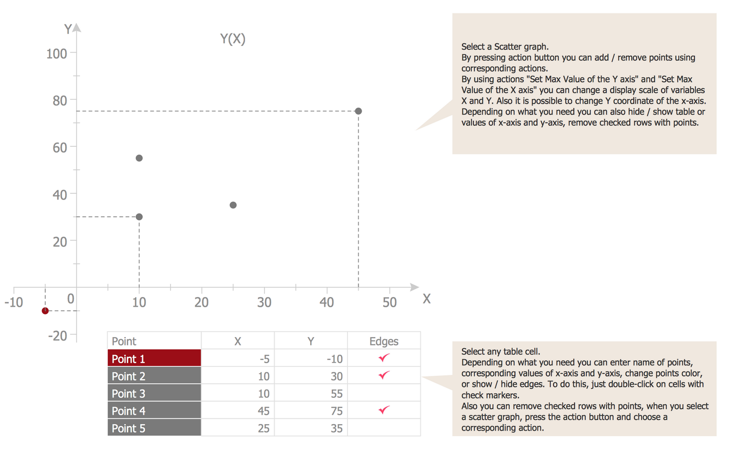
Template: Scatter Graph
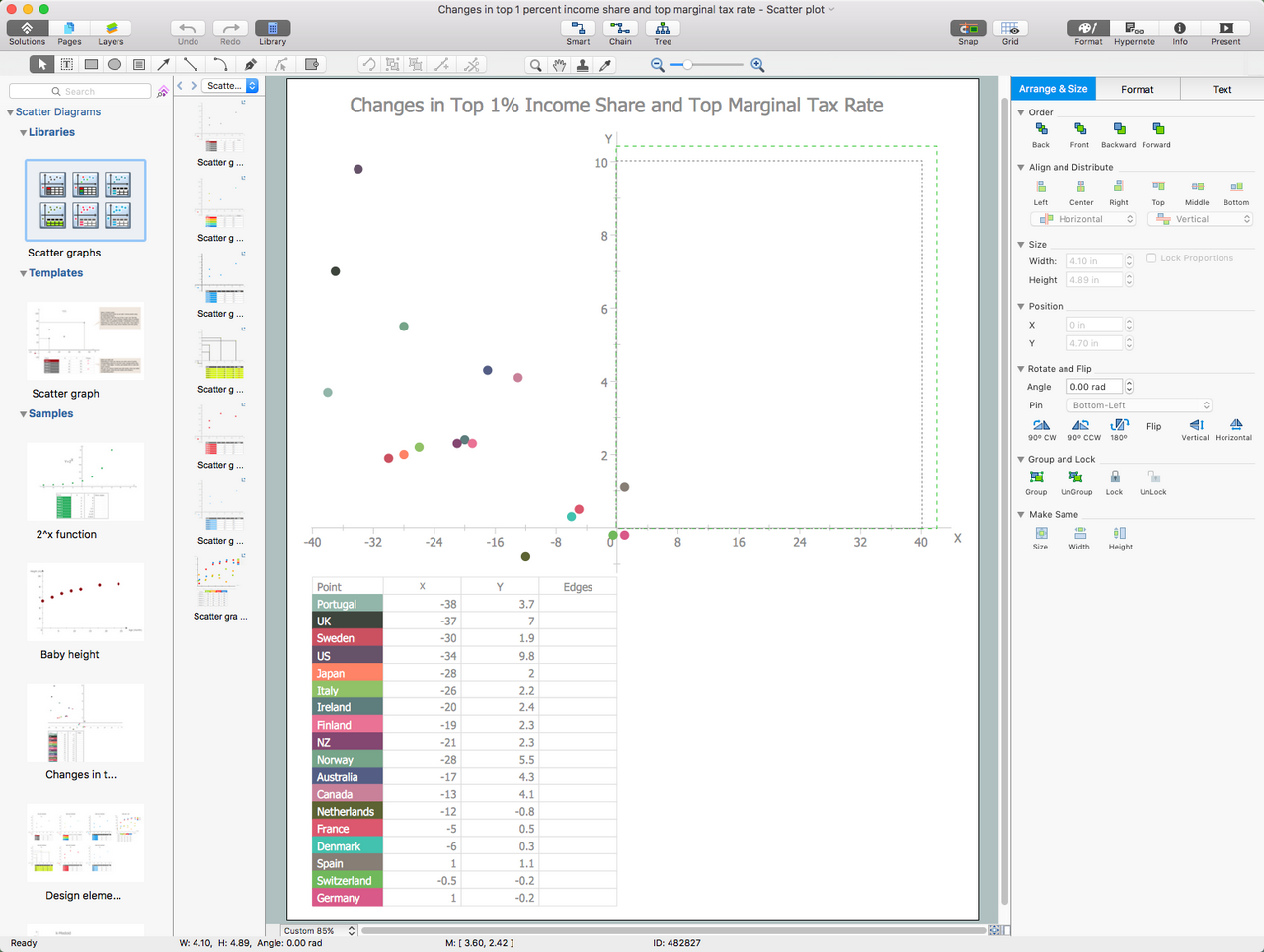
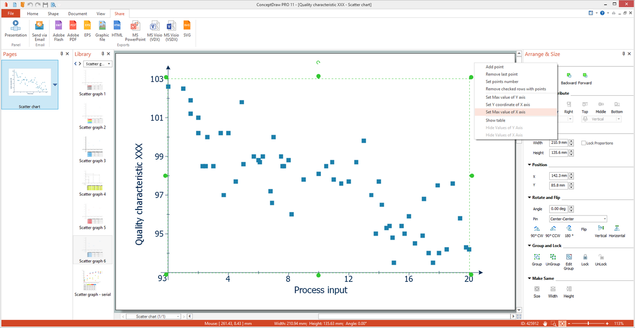
This template will help you save your time while drawing a Scatter Chart. You are able to add or remove points using the commands from the object’s Action menu and assign their values using the table object. The use of the "Set Max Value of the Y-axis" and "Set Max Value of the X-axis" actions allows changing a display scale of variables X and Y. You can hide/show the table or values of the x-axis and y-axis, to enter the names of points at the table and also corresponding values, to remove the checked rows with points, or to change the points colors on the desired ones. The change of color under the point's name in the table on any bright color conducts to immediate highlighting this point with it in the chart. You can also show/hide edges, for this simply double-click on the corresponding cell to check marker or remove it, any action will be automatically reflected in a diagram.
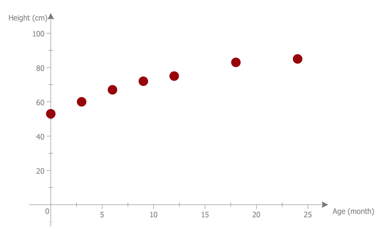
Example 1: Scatter Diagram — Baby Height
This example was created in ConceptDraw DIAGRAM using the Scatter Diagrams library from the Scatter Diagrams solution. An experienced user spent 5 minutes creating this sample.
This informative sample visualizes the correlation between a baby's height and age. Any scatter diagram displays data as a collection of points, you can see well visible large red points in this sample that depict the statistical dependence, how the baby’s height relates to its age. Each of them has the value of one variable determining the position on the horizontal axis and the value of the other variable determining its position on the vertical axis. When looking at this diagram, you can note that the newborn has a height near 56 cm, when the child at the age of two years is little more than 80 cm. At this, if from 0 to 18 months we can see the active growth, from 18 to 24 months the child's height is almost stable and unaltered. The diagram can be prolonged on your desire with statistical data according to further baby's growth.
Example 2: Scatter Plot — Linear Regression
This example was created in ConceptDraw DIAGRAM using the Scatter Diagrams library from the Scatter Diagrams solution. An experienced user spent 10 minutes creating this sample.
This Scatter Diagram illustrates the linear regression — the method widely used in statistics, which allows modeling the relationships between the dependent variable y and one or several independent variables x with a linear dependence function. Being designed in ConceptDraw DIAGRAM, this sample is based on the data from the Engineering Statistics Handbook published on the website of the National Institute of Standards and Technology, the U.S. Department of Commerce. The diagram shows the Alaska pipeline data and specifies that a linear regression model can be appropriate. The Scatter plot graph is a useful diagnostic tool applied to determine the associations and to trace the cause-and-effect mechanism, it also allows detecting the kind of correlation if it exists: strong linear positive correlation or strong linear negative correlation, exact linear positive correlation, quadratic relationship, exponential relationship, sinusoidal relationship, outlier, variation of y doesn't depend on x or variation of y does depend on x.
Example 3: Scatter Plot with Missing Categories
This example was created in ConceptDraw DIAGRAM using the Scatter Diagrams library from the Scatter Diagrams solution. An experienced user spent 7 minutes creating this sample.
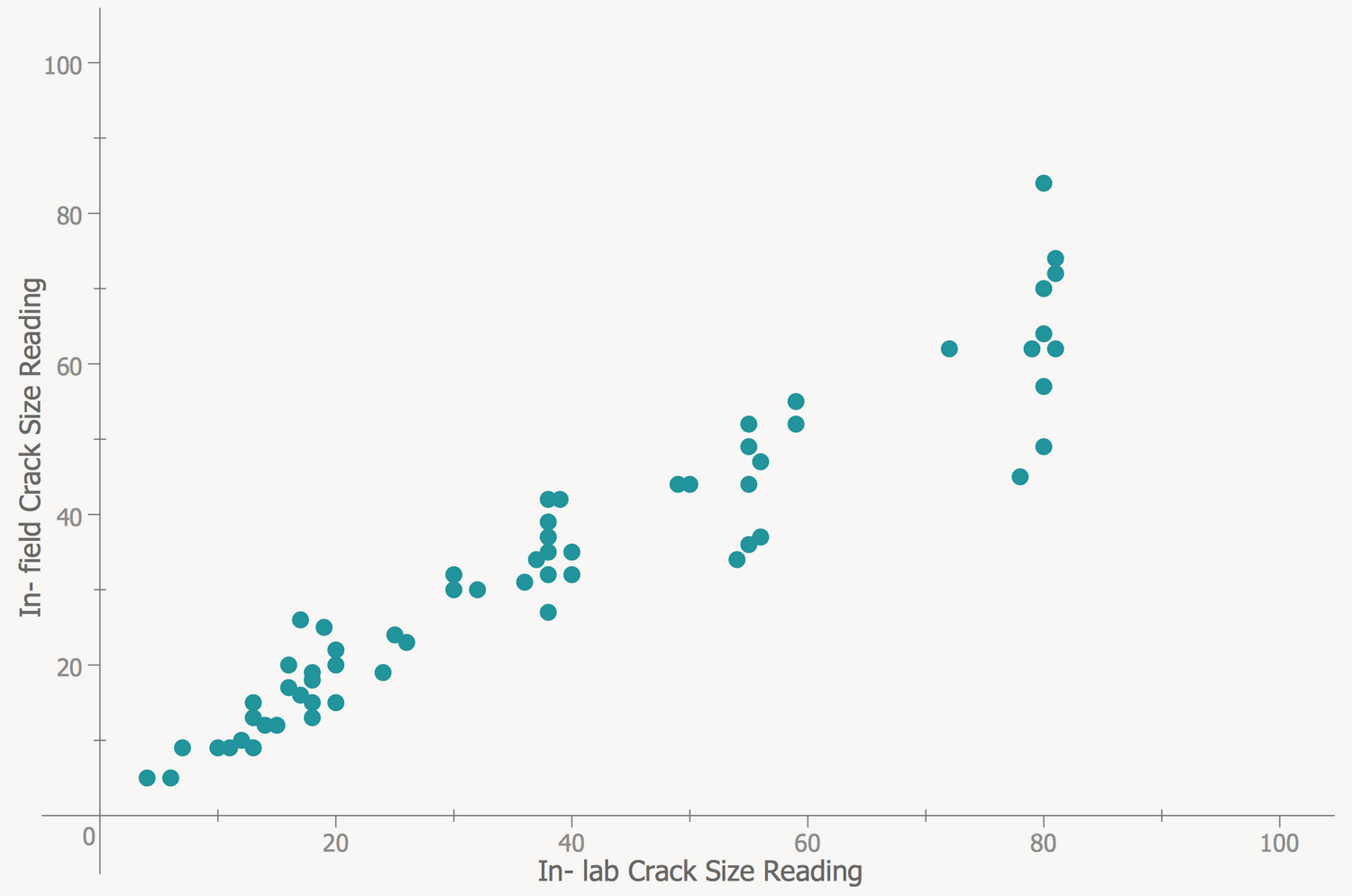
This sample diagram was designed on the base of the Wikimedia Commons files "Scatter Plot with missing categories.svg" and "A scatter plot without missing categories.svg". The diagram compares two scatter plots by placing them side by side — regular scatter plot and scatter plot with missing categories. The graphs showing all data can be sometimes extremely overloaded and incredibly complex, while the graphs designed with missing categories will be neater and light for observing and perception. You need only track that the data on the graph not be misrepresented, to exclude the opportunity of making an incorrect conclusion. This trick can be also used to make a favorable visual impression excluding the data about negative returns. Thus, the growth in the left graph seems to be more linear with less variation. For increasing visibility, you can use the properties of colors and additionally highlight the differences using the more vivid color.

Example 4: Scatter Diagram — Strong Positive Linear Correlation
This example was created in ConceptDraw DIAGRAM using the Scatter Diagrams library from the Scatter Diagrams solution. An experienced user spent 5 minutes creating this sample.
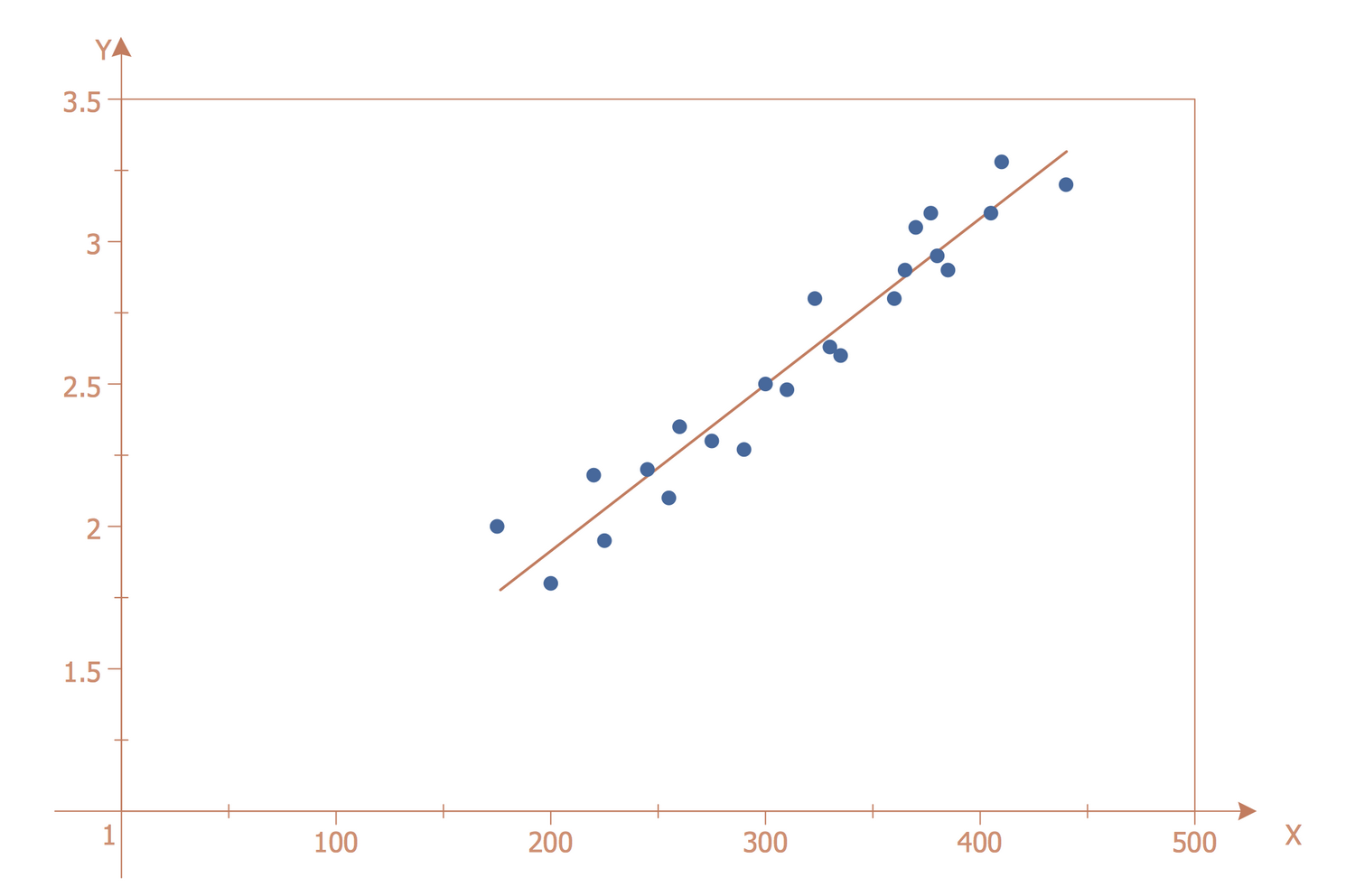
This Scatter diagram demonstrates a strong positive linear correlation. It is based on the data taken from the Engineering Statistics Handbook published on the website of the National Institute of Standards and Technology (NIST), the U.S. Department of Commerce. The straight line freely passes through data, so exists the linear dependence between them that is perfectly illustrated in this diagram. If the scatter about the line is quite small, like in this sample, we can ascertain the presence of strong linear dependence. Note that the slope of the line is positive — for the small values of x correspond the small values of y and for the large values of x correspond the large values of y as well, so such slope shows the existence of a positive correlation between x and y. The straight line is colored with red to visually differ from the set of depicted blue points.
Example 5: Scatter Diagram — Widgets Price
This example was created in ConceptDraw DIAGRAM using the Scatter Diagrams library from the Scatter Diagrams solution. An experienced user spent 5 minutes creating this sample.
This Scatter graph sample shows a strong negative correlation or inverse correlation. It is based on the Wikimedia Commons file "Scatter plot showing strong negative correlation. 02.jpg". You can oversee on the graph that the increase of one variable is associated with the decrease of another variable, the points are placed with the slope from the upper left corner to the lower right. This fact indicates the presence of a negative correlation between the variables x and y. The correlation has a huge value for many different fields. This method of processing the statistical information is popular in economic, technical, social and other sciences, including astrophysics, psychology, sociology, metallurgy, agrochemistry, biometrics, hydrobiology, quality control of industrial products, etc. due to the simplicity of calculating the correlative coefficients, the ease of interpreting the results and the lack of need to make more complex mathematical calculations taking a lot of efforts and time.

Example 6: Scatter Diagram — 2^x Function Graph
This example was created in ConceptDraw DIAGRAM using the Scatter Diagrams library from the Scatter Diagrams solution. An experienced user spent 7 minutes creating this sample.
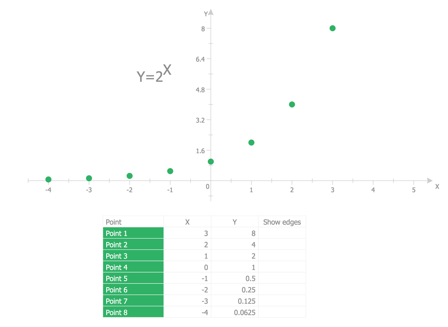
The Scatter graph sample illustrates the exponent function — 2^x Function Graph. The exponentiation is a mathematical operation that corresponds to the repeated multiplication of the number on itself the defined quantity of times. The graph is placed in the first and second parts of the Cartesian coordinate system, so the y coordinates always have positive values. The exponentiation has a wide application not only in mathematics, but also in many other fields — physics, economics, computer science, chemistry, biology, statistics, kinetics, cryptography, and other ones. You can see the point with coordinates (0, 1) because any nonzero number raised to the power of 0 equals 1. At x = 1, the value of y equals the base number because any number raised to the power of 1 equals the number itself. The coordinates of other points from the graph you can find calculated into the table near the diagram.
Example 7: Scatter Diagram — Quality Characteristic XXX
This example was created in ConceptDraw DIAGRAM using the Scatter Diagrams library from the Scatter Diagrams solution. An experienced user spent 10 minutes creating this sample.
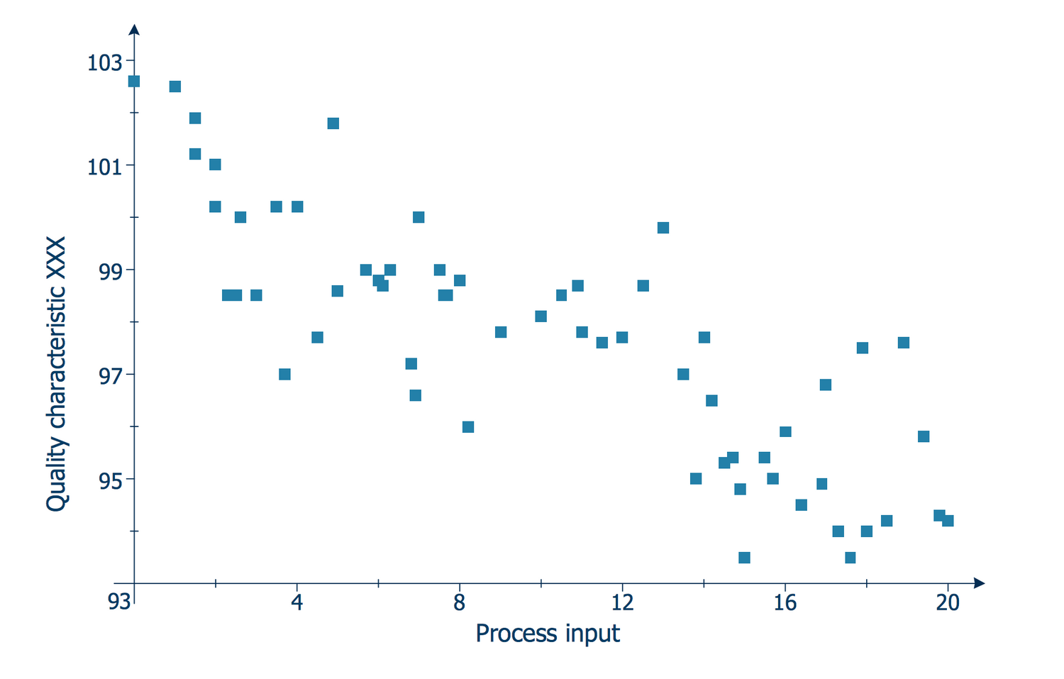
The Scatter diagrams are used to graphically depict the relationships between two variables. At this, the values of the independent parameter are typically plotted on the horizontal axis and the values of the dependent parameter are plotted on the vertical axis. The Scatter plots are often used along with the correlation analysis and show the presence or absence of the correlation between two variables. This Scatter graph sample illustrates the quality characteristic vs process input. It was constructed on the base of the Wikimedia Commons file "Scatter diagram for quality characteristic XXX.svg". To each observation corresponds the point, which coordinates are equal to the values of two parameters of this observation — process input and quality characteristic. The correlation analysis is widely popular in many fields of activity and one can easily make a Scatter plot for its own case and sector using the ConceptDraw's Scatter Diagrams solution.
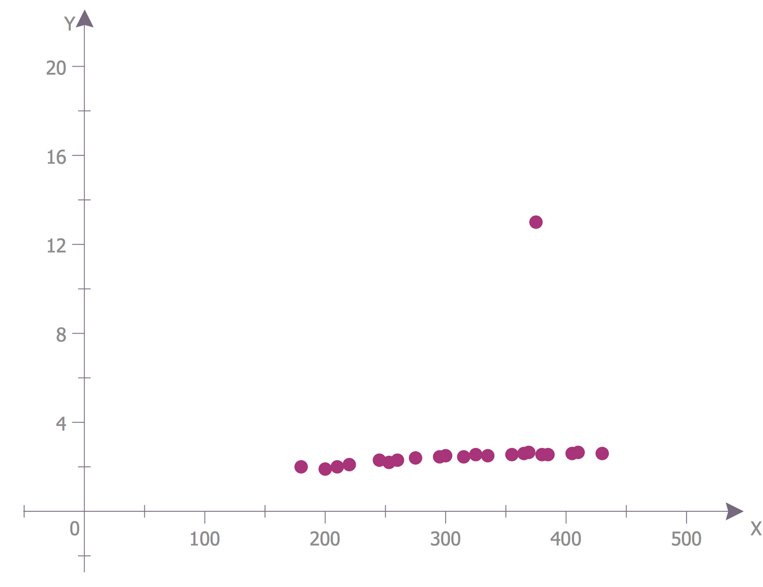
Example 8: Scatter Diagram — Outlier Detection
This example was created in ConceptDraw DIAGRAM using the Scatter Diagrams library from the Scatter Diagrams solution. An experienced user spent 5 minutes creating this sample.
The Scatter Chart sample is based on the data published at the Engineering Statistics Handbook and placed on the website of the National Institute of Standards and Technology (NIST), the U.S. Department of Commerce. It shows the outliers and represents them as data points. In statistics, the outlier is a measurement result that stands out from the overall selection. Data come from a linear model that has a defined slope and variation except for the outlier that is generated from some other model. Since many statistical methods stall on the selection with outliers, the last ones need to be detected, and then excluded from the selection. The detection of outliers is incredibly important for effective modeling. The outliers need to be excluded from the model with a goal to model the ideal fit for almost all points. In the opposite case, if all data will be included in linear regression, the model will be poor almost everywhere.
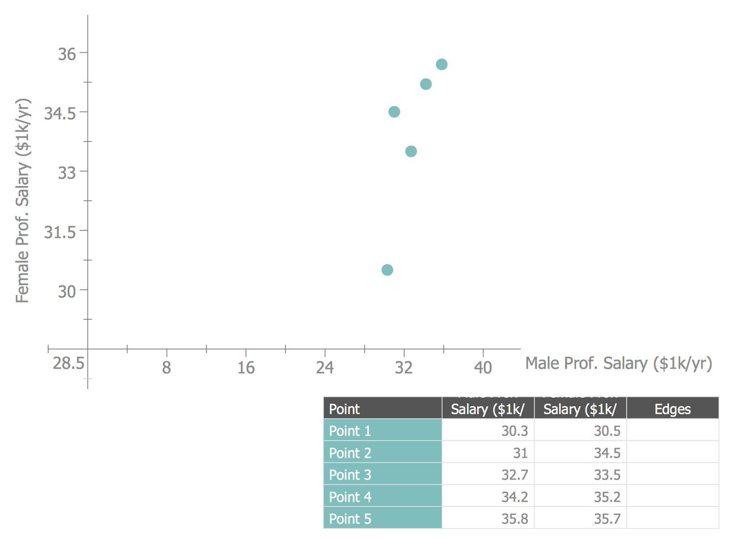
Example 9: Scatter Diagram — Positive Correlation with Outliers
This example was created in ConceptDraw DIAGRAM using the Scatter Diagrams library from the Scatter Diagrams solution. An experienced user spent 5 minutes creating this sample.
The Scatter Chart sample shows a positive correlation with outliers. It was constructed on the base of the Wikimedia Commons file "Scatter plot showing a positive correlation with outliers.jpg". The y-axis corresponds to the female professional salary and the x-axis corresponds to the male professional salary in $k per year. The table with values is based on the statistical data and represents the values for five points. The data entered into the table in ConceptDraw DIAGRAM are automatically depicted in a Scatter diagram. You can see the strict relationship between the variables x and y, when one variable decreases, the other one also decreases and vice versa. There is also an outlier in this diagram — the point that is distant from the other ones. It can be related to the variability in the measurements or can indicate the experimental error. Often such points of outliers are excluded from the data set and diagram.
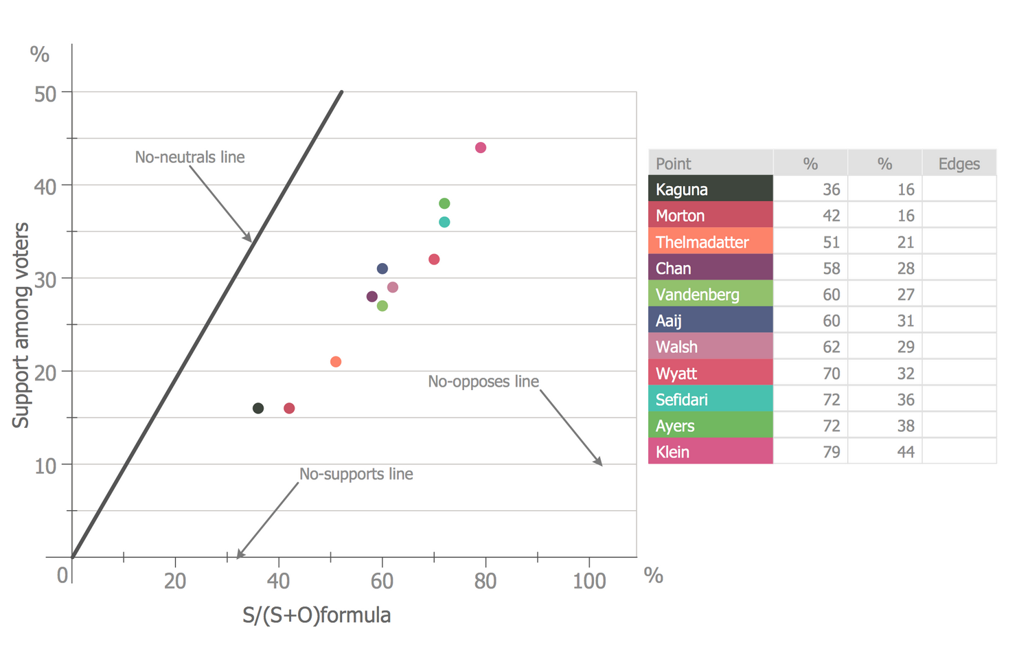
Example 10: Scatter Diagram — WMF Board Election Results 2013
This example was created in ConceptDraw DIAGRAM using the Scatter Diagrams library from the Scatter Diagrams solution. An experienced user spent 5 minutes creating this sample.
The Scatter Chart sample demonstrates the Wikimedia Foundation (WMF) Board election results (community-elected seats) in 2013. It is based on the Wikimedia Commons file "WMF Board election results 2013.png". There are represented the results for eleven candidates. The horizontal axis corresponds to the values calculated according to the S/(S+0) formula, the vertical axis corresponds to the support among voters. Each point depicted in the graph has two coordinates assigned at the table and represents one candidate. Three candidates with the highest results at the table (Klein, Ayers, and Sefidari) were successful according to the S/S+O formula. They are depicted at the top right in the chart and were elected by the community as the trustees of the Wikimedia Foundation Board. The other eight candidates were unsuccessful. Each candidate is represented by its own color, the correspondence of colors you can find at the table. On your desire, you can use one color for the winners to visually highlight them in the graph.
Inside
What I Need to Get Started
After ConceptDraw DIAGRAM is installed, the Scatter Diagrams solution can be purchased either from the Graphs and Charts area of ConceptDraw STORE itself or from our online store. Thus, you will be able to use the Scatter Diagrams solution straight after.
How to install
First of all, make sure that both ConceptDraw STORE and ConceptDraw DIAGRAM applications are downloaded and installed on your computer. Next, install the Scatter Diagrams solution from the ConceptDraw STORE to use it in the ConceptDraw DIAGRAM application.

Start Using
Start using the Scatter Diagrams solution to make the professionally looking numerical data by adding the design elements taken from the stencil libraries and editing the pre-made examples that can be found there.
