- Electric and Telecom Plans Free
- Fire and Emergency Plans Free
- Floor Plans Free
- Plant Layout Plans Free
- School and Training Plans Free
- Seating Plans Free
- Security and Access Plans Free
- Site Plans Free
- Sport Field Plans Free
- Business Process Diagrams Free
- Business Process Mapping Free
- Classic Business Process Modeling Free
- Cross-Functional Flowcharts Free
- Event-driven Process Chain Diagrams Free
- IDEF Business Process Diagrams Free
- Logistics Flow Charts Free
- Workflow Diagrams Free
- ConceptDraw Dashboard for Facebook Free
- Mind Map Exchange Free
- MindTweet Free
- Note Exchange Free
- Project Exchange Free
- Social Media Response Free
- Active Directory Diagrams Free
- AWS Architecture Diagrams Free
- Azure Architecture Free
- Cisco Network Diagrams Free
- Cisco Networking Free
- Cloud Computing Diagrams Free
- Computer Network Diagrams Free
- Google Cloud Platform Free
- Interactive Voice Response Diagrams Free
- Network Layout Floor Plans Free
- Network Security Diagrams Free
- Rack Diagrams Free
- Telecommunication Network Diagrams Free
- Vehicular Networking Free
- Wireless Networks Free
- Comparison Dashboard Free
- Composition Dashboard Free
- Correlation Dashboard Free
- Frequency Distribution Dashboard Free
- Meter Dashboard Free
- Spatial Dashboard Free
- Status Dashboard Free
- Time Series Dashboard Free
- Basic Circle-Spoke Diagrams Free
- Basic Circular Arrows Diagrams Free
- Basic Venn Diagrams Free
- Block Diagrams Free
- Concept Maps Free
- Family Tree Free
- Flowcharts Free
- Basic Area Charts Free
- Basic Bar Graphs Free
- Basic Divided Bar Diagrams Free
- Basic Histograms Free
- Basic Line Graphs Free
- Basic Picture Graphs Free
- Basic Pie Charts Free
- Basic Scatter Diagrams Free
- Aerospace and Transport Free
- Artwork Free
- Audio, Video, Media Free
- Business and Finance Free
- Computers and Communications Free
- Holiday Free
- Manufacturing and Maintenance Free
- Nature Free
- People Free
- Presentation Clipart Free
- Safety and Security Free
- Analog Electronics Free
- Audio and Video Connectors Free
- Basic Circuit Diagrams Free
- Chemical and Process Engineering Free
- Digital Electronics Free
- Electrical Engineering Free
- Electron Tube Circuits Free
- Electronic Block Diagrams Free
- Fault Tree Analysis Diagrams Free
- GHS Hazard Pictograms Free
- Home Automation and Wiring Free
- Mechanical Engineering Free
- One-line Diagrams Free
- Power Сircuits Free
- Specification and Description Language (SDL) Free
- Telecom and AV Circuits Free
- Transport Hazard Pictograms Free
- Data-driven Infographics Free
- Pictorial Infographics Free
- Spatial Infographics Free
- Typography Infographics Free
- Calendars Free
- Decision Making Free
- Enterprise Architecture Diagrams Free
- Fishbone Diagrams Free
- Organizational Charts Free
- Plan-Do-Check-Act (PDCA) Free
- Seven Management and Planning Tools Free
- SWOT and TOWS Matrix Diagrams Free
- Timeline Diagrams Free
- Australia Map Free
- Continent Maps Free
- Directional Maps Free
- Germany Map Free
- Metro Map Free
- UK Map Free
- USA Maps Free
- Customer Journey Mapping Free
- Marketing Diagrams Free
- Matrices Free
- Pyramid Diagrams Free
- Sales Dashboard Free
- Sales Flowcharts Free
- Target and Circular Diagrams Free
- Cash Flow Reports Free
- Current Activities Reports Free
- Custom Excel Report Free
- Knowledge Reports Free
- MINDMAP Reports Free
- Overview Reports Free
- PM Agile Free
- PM Dashboards Free
- PM Docs Free
- PM Easy Free
- PM Meetings Free
- PM Planning Free
- PM Presentations Free
- PM Response Free
- Resource Usage Reports Free
- Visual Reports Free
- House of Quality Free
- Quality Mind Map Free
- Total Quality Management TQM Diagrams Free
- Value Stream Mapping Free
- Astronomy Free
- Biology Free
- Chemistry Free
- Language Learning Free
- Mathematics Free
- Physics Free
- Piano Sheet Music Free
- Android User Interface Free
- Class Hierarchy Tree Free
- Data Flow Diagrams (DFD) Free
- DOM Tree Free
- Entity-Relationship Diagram (ERD) Free
- EXPRESS-G data Modeling Diagram Free
- IDEF0 Diagrams Free
- iPhone User Interface Free
- Jackson Structured Programming (JSP) Diagrams Free
- macOS User Interface Free
- Object-Role Modeling (ORM) Diagrams Free
- Rapid UML Free
- SYSML Free
- Website Wireframe Free
- Windows 10 User Interface Free
Histograms
A Histogram is a type of diagram, which graphically illustrates an evaluation of the probability distribution of quantitative continuous data and is constructed in a bar format. This is one of Seven key quality control tools. The data is divided into intervals, called bins, which are successively marked on the horizontal axis, and rectangles, 3D blocks or cylinders are drawn above them; the area of each rectangle is proportional to the frequency of observations falling in the corresponding interval. Usually, the widths of rectangles on a Histogram Chart are equal, but it isn't a strict requirement, and their heights determine the proportions of the displayed parameter.
In fact, the Histogram is a series of bars of the same width, but with different heights, which show the distribution of data, while the column width is the interval in the observation range, and its height is the amount of data that falls on one or another part of the interval. The Histograms are useful to compare the data for several individual items. You can also create a Histogram to plot a data graph that spans several periods (days, weeks, months, years) and visually display how the values change over time.
The Histograms are a graphical way of presenting the tabular data, they are highly widespread in statistics allowing one to graphically display statistical indicators. The diagrams of this type give an approximate idea of the density of the main data distribution and allow visualizing the probability density functions of some random variable, based on the choice of the distribution of individual measurements of product parameters or process, as well as to identify trends in the measured quality parameters of the object and to visually assess the law of their distribution.
How to make a Histogram? Making a Histogram is an incredibly easy process when it is done with ConceptDraw DIAGRAM. The Histograms Solution enhances the ConceptDraw DIAGRAM functionality with extensive drawing tools, numerous samples and examples; also a quick-start template and library of ready-to-use vector stencils for visualization data and professional drawing Histograms.
-
Buy this solution $30 -
Solution Requirements - This solution requires the following products to be installed:
ConceptDraw DIAGRAM v18 - This solution requires the following products to be installed:
-
Compatibility - Sonoma (14), Sonoma (15)
MS Windows 10, 11 - Sonoma (14), Sonoma (15)
-
Support for this Solution -
Helpdesk
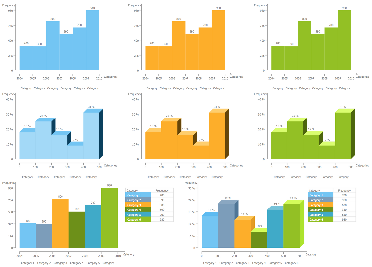
There is 1 library containing 8 vector objects in the Histograms solution.
Design Elements — Histograms
Related News:
CS Odessa Announces Additions to Powerful Graphs and Charts Area in ConceptDraw Solution ParkExamples
There are a few samples that you see on this page which were created in the ConceptDraw DIAGRAM application by using the Histograms solution. Some of the solution's capabilities as well as the professional results which you can achieve are all demonstrated here on this page.
All source documents are vector graphic documents which are always available for modifying, reviewing and/or converting to many different formats, such as MS PowerPoint, PDF file, MS Visio, and many other graphic ones from the ConceptDraw Solution Park or ConceptDraw STORE. The Histograms solution is available to all ConceptDraw DIAGRAM users to get installed and used while working in the ConceptDraw DIAGRAM diagramming and drawing software.
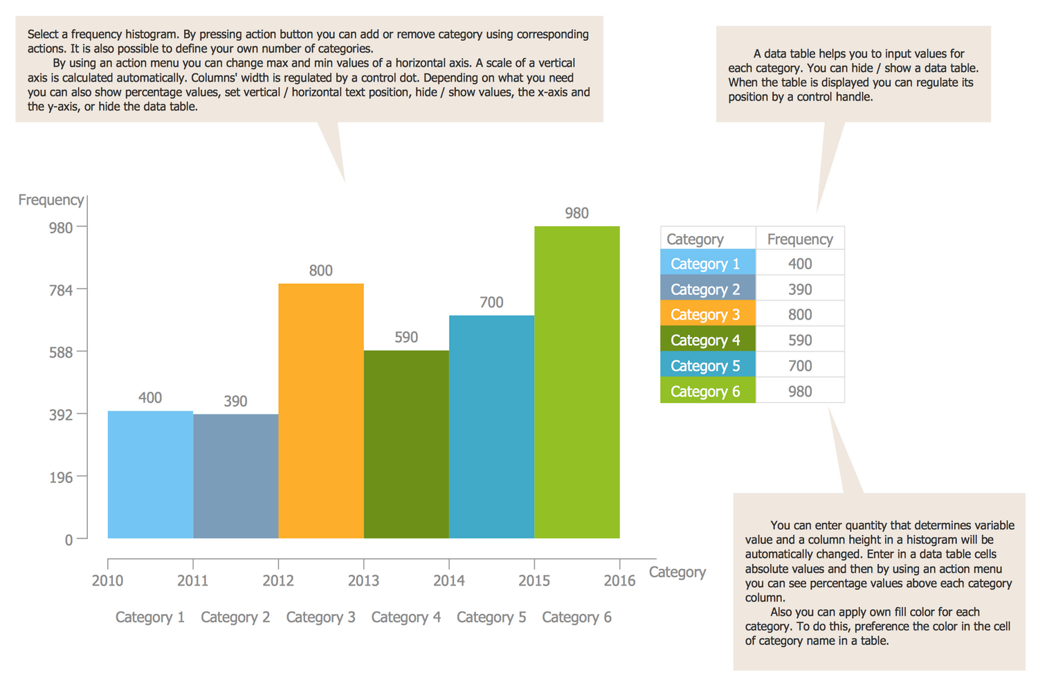
Template: Histogram
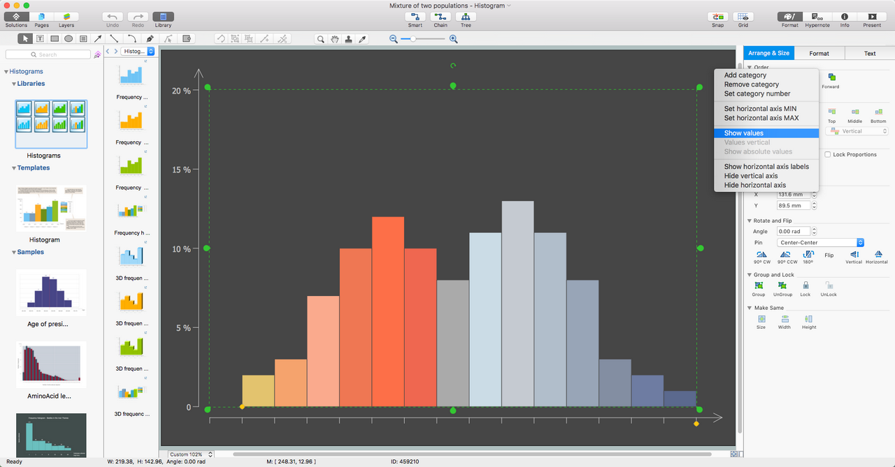
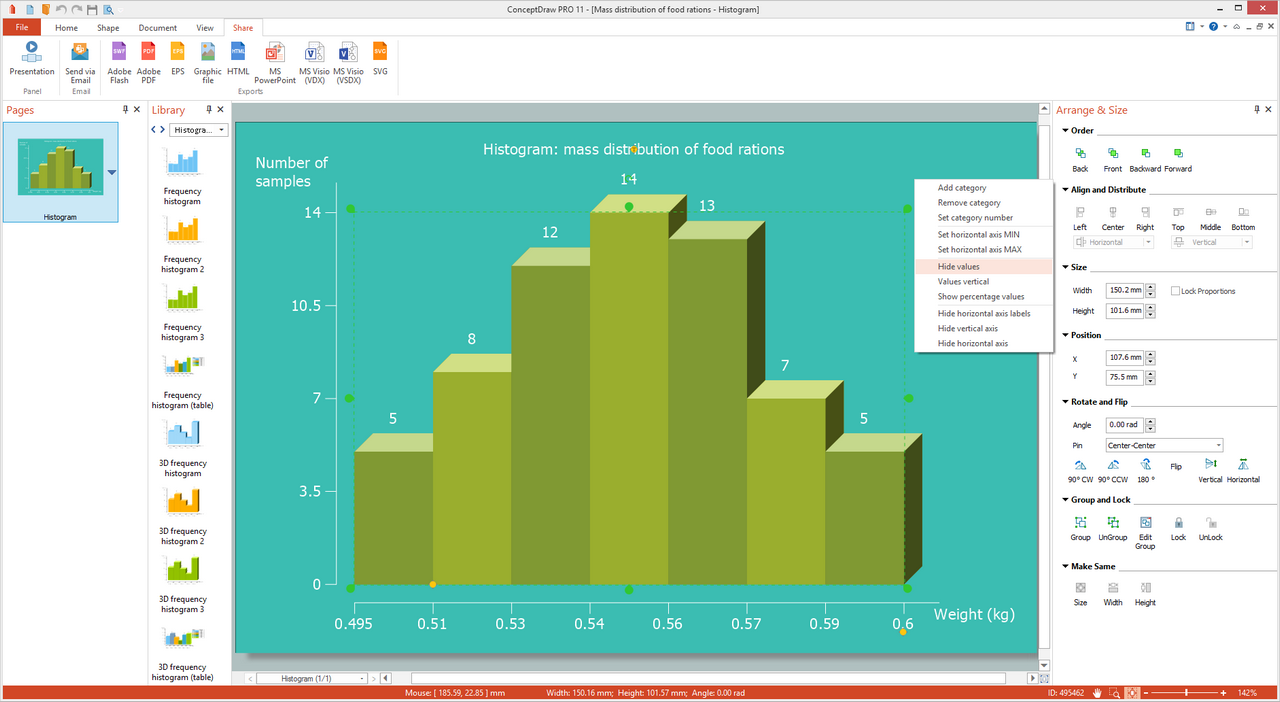
How to make a Histogram? This template is a ready 2D Histogram, which requires only entering the actual and correct data at the table to refresh the information. Callouts extensively explain the principles of construction of the Histograms. All ConceptDraw's Histogram objects have the action button providing wide opportunities for designing and customizing your Histograms. They allow adding or removing categories, defining the desired number of categories, setting maximal and minimal values of the x-axis, automatically scaling the y-axis and columns' width. You are free to choose to hide or show the values, depict them in percentage or absolute view, as well as to place them horizontally or vertically. The diagram's axes also can be shown or hidden, the same features can be applied to the table. The color solution for the Histogram is also only your own choice, ConceptDraw DIAGRAM software gives you complete freedom in choosing the palette for your Histogram. Design with pleasure 2D and 3D Histograms in ConceptDraw DIAGRAM!
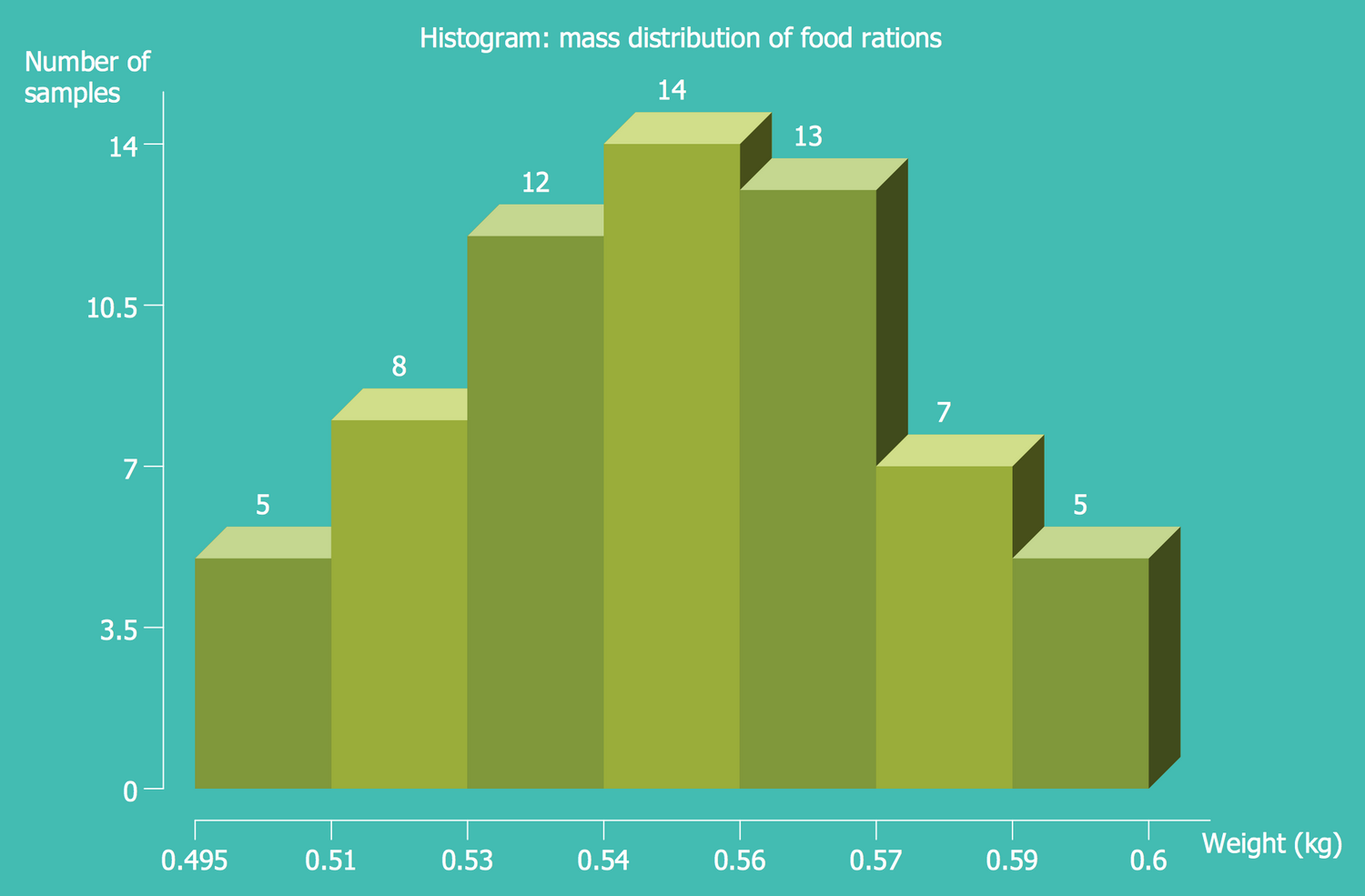
Example 1: Histogram — Mass Distribution of Food Rations
This example was created in ConceptDraw DIAGRAM using the Histograms Library from the Histograms Solution. An experienced user spent 5 minutes creating this sample.
This Histogram represents the mass distribution of food rations and was designed on the base of the Wikimedia Commons file "Histo alimentaire.svg". The x-axis depicts the weights of food rations in kilograms, the y-axis represents the number of samples of each weight. This Histogram is an example of 3D Histogram, but the ConceptDraw DIAGRAM software enhanced with powerful Histograms solution offers equal possibilities for design 2D or 3D histograms, all depends on your preferences. The choice of a Histogram view for depicting the mass distribution is a reliable form of representing results of researches and statistical data, allowing one to immediately note the max and min values. The different shades of green used in the coloration of the columns add even more expressiveness to this Histogram. The color gamma of the ConceptDraw's Histogram can be anyone you like or suitable to the style of document, presentation or webpage where it will be located.
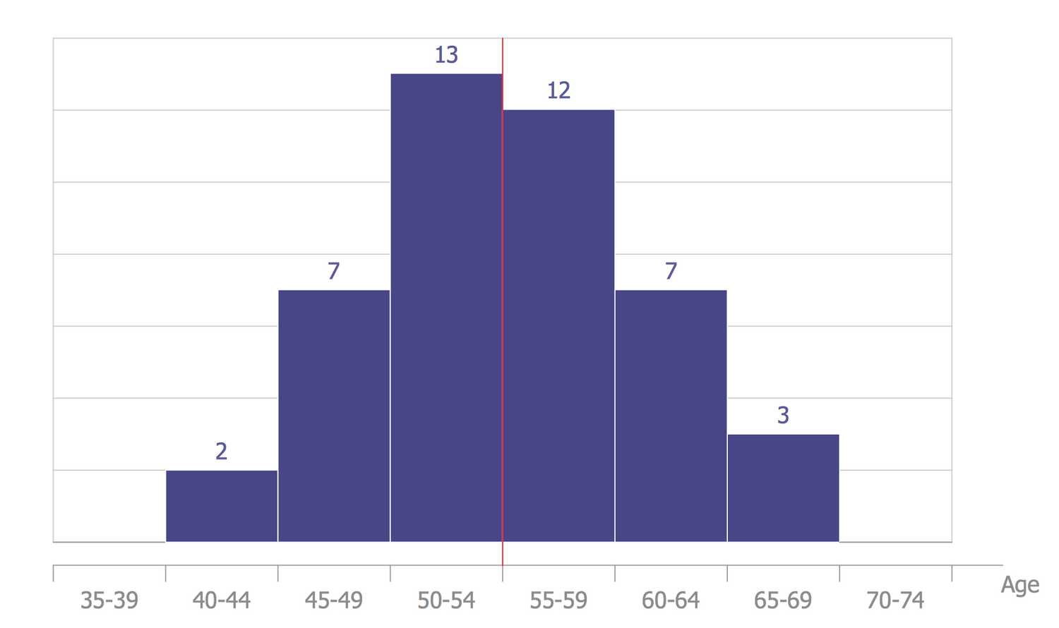
Example 2: Histogram — Age of Presidential Ascension
This example was created in ConceptDraw DIAGRAM using the Histograms Library from the Histograms Solution. An experienced user spent 5 minutes creating this sample.
This Histogram was redesigned from the Wikimedia Commons file "Age of presidential ascention.jpg" and depicts statistical data for the age of US presidents ascension. The age is considered on the date of their election on the president post. It is clear that the largest number of people ascended this position at the age of 50-54 years, a slightly smaller number was little older — at the age of 55-59. At the same time, the smallest number of US presidents at the moment of their election was at the age of 40-44. Thus, the youngest of them was Theodore Roosevelt elected to the president post at the age of 42, the oldest one was Ronald Reagan who was 69 years at the moment of his inauguration. The border of the mean age is brightly highlighted with a red line, the color of all columns is the same. If required, you can change the color of any column according to your preferences and needs.
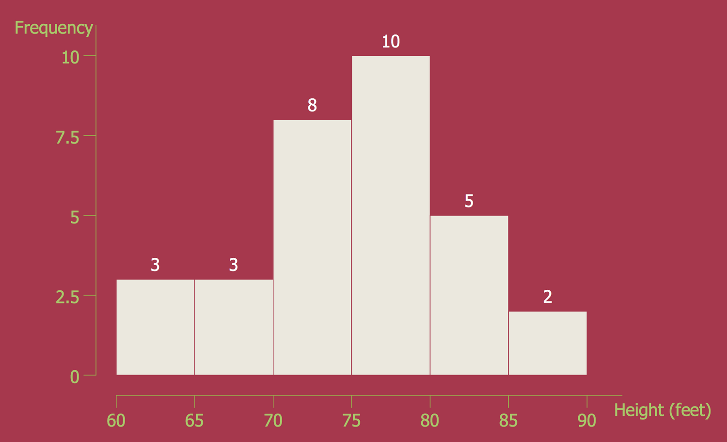
Example 3: Histogram — Black Cherry Tree Height
This example was created in ConceptDraw DIAGRAM using the Histograms Library from the Histograms Solution. An experienced user spent 5 minutes creating this sample.
This Histogram sample visually demonstrates the frequency distribution of heights of the black cherry tree. It was designed on the base of the Wikimedia Commons file "Black cherry tree histogram.svg" and underlines the prevalence of the Histograms and their applicability to a huge variety of fields. The x-axis depicts the height in feet, the y-axis represents the frequency with what the black cherry trees of different heights grow. According to the represented data, the max number of the black cherry trees have the height from 75 to 80 feet, these are 10 trees from the selection. The higher trees of black cherry are met very rarely, you can see that only 2 trees from this distribution have the max height (between 85 and 90 feet). How to draw a Histogram the most quickly and easily? Use as the base the ready Histogram objects offered by the ConceptDraw's Histograms solution to make a Histogram and don't afraid to experiment with the look of your charts.
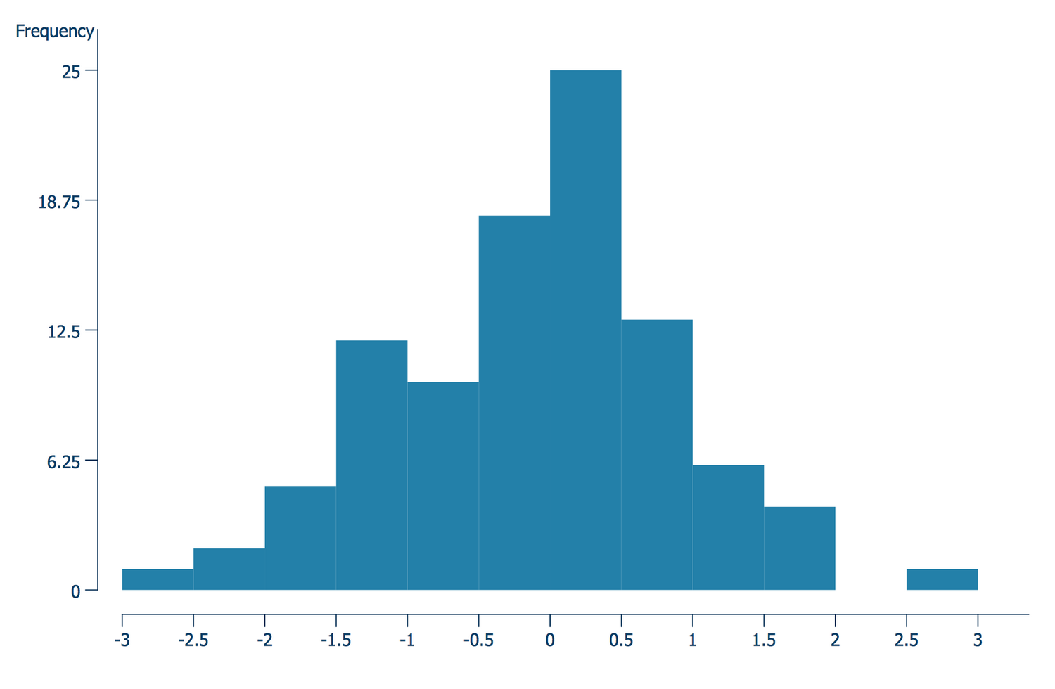
Example 4: Histogram — Normal Distribution
This example was created in ConceptDraw DIAGRAM using the Histograms Library from the Histograms Solution. An experienced user spent 20 minutes creating this sample.
This Histogram Chart is a sample of a normal distribution or Gaussian distribution, which is widely used in the probability theory and statistics, in the natural and social sciences. It was designed on the base of the "Histogram example.svg" file offered by Wikimedia Commons. Here you can find the random selection of 100 observations and their normal distribution N (0,1). The normal distribution is a common continuous probability distribution that is used to represent the real-valued random variables which distributions are not known. The normal distribution is the most common type of distribution, its discovery is related to the names of K. Gauss and P. Laplace. It is used in the analysis of measurement errors, control of technological processes and modes, in the analysis and prediction of various phenomena in medicine, biology, and other fields of knowledge. The normal distribution is the limiting and other distributions approach it. Only continuous random variables obey the normal law.
Example 5: Histogram — Repartition of Height
This example was created in ConceptDraw DIAGRAM using the Histograms Library from the Histograms Solution. An experienced user spent 5 minutes creating this sample.
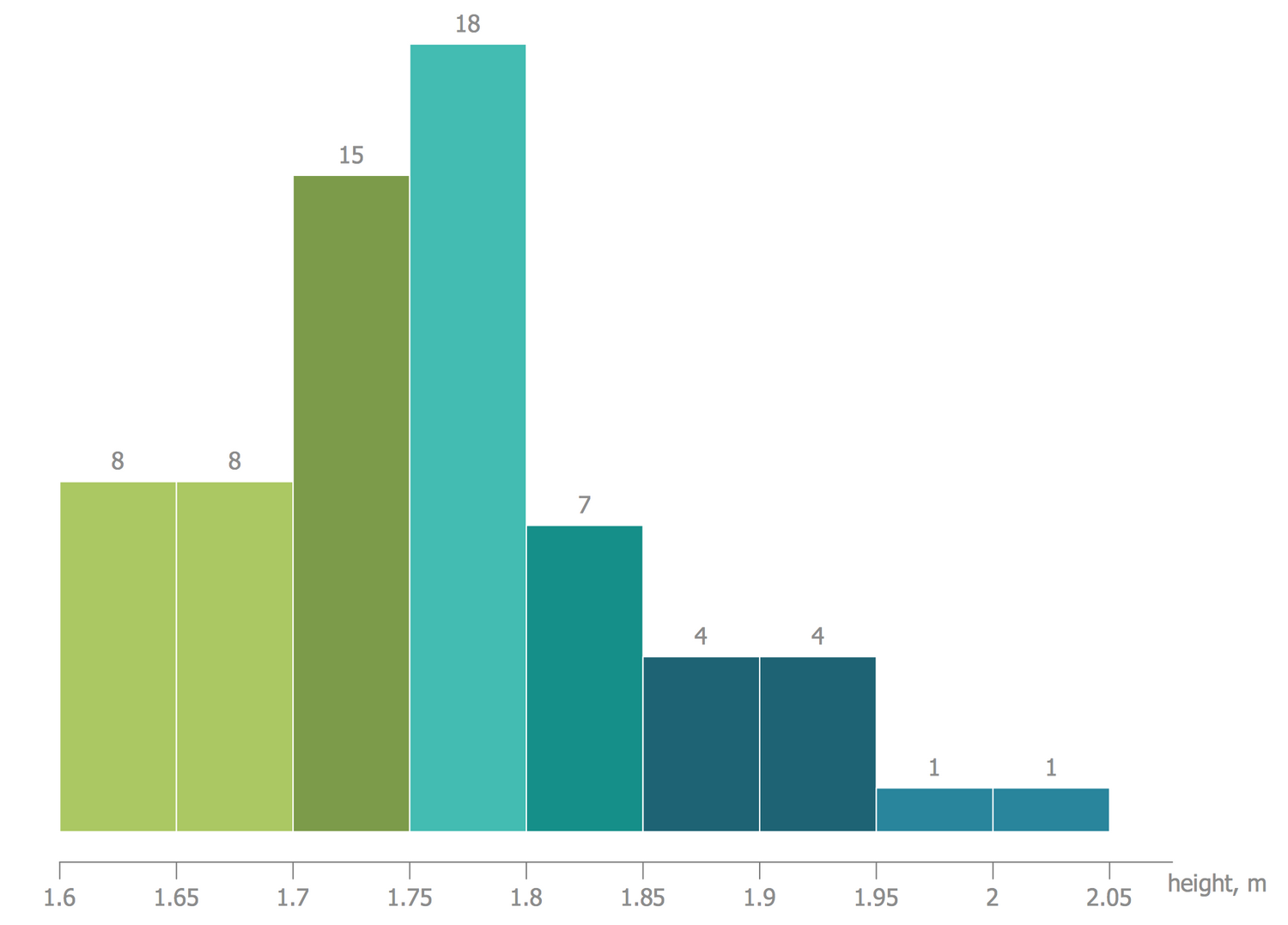
The Histograms let visually represent the density of data distribution. This Histogram sample designed on the base of Wikimedia Commons file "Histogramme taille.svg" depicts the repartition of heights for a group of the population comprising 53 persons. The use of color gradation in this Histogram adds special visibility and gives full clarity from one quick look. Within one population, the group of people having a single root, living on the same territory, the average height will be one of the key characteristics characterizing their external look. Looking at this Histogram, you can immediately note that the most common height within the considered population is in the range of 1.75 to 1.8 meters. At the same time, there are much more people with lower growth than people above this average value in a considered group. The similar diagram can be designed for any number of people living in any continent and chosen for conducting research.
Example 6: Histogram — Mixture of Two Populations
This example was created in ConceptDraw DIAGRAM using the Histograms Library from the Histograms Solution. An experienced user spent 5 minutes creating this sample.
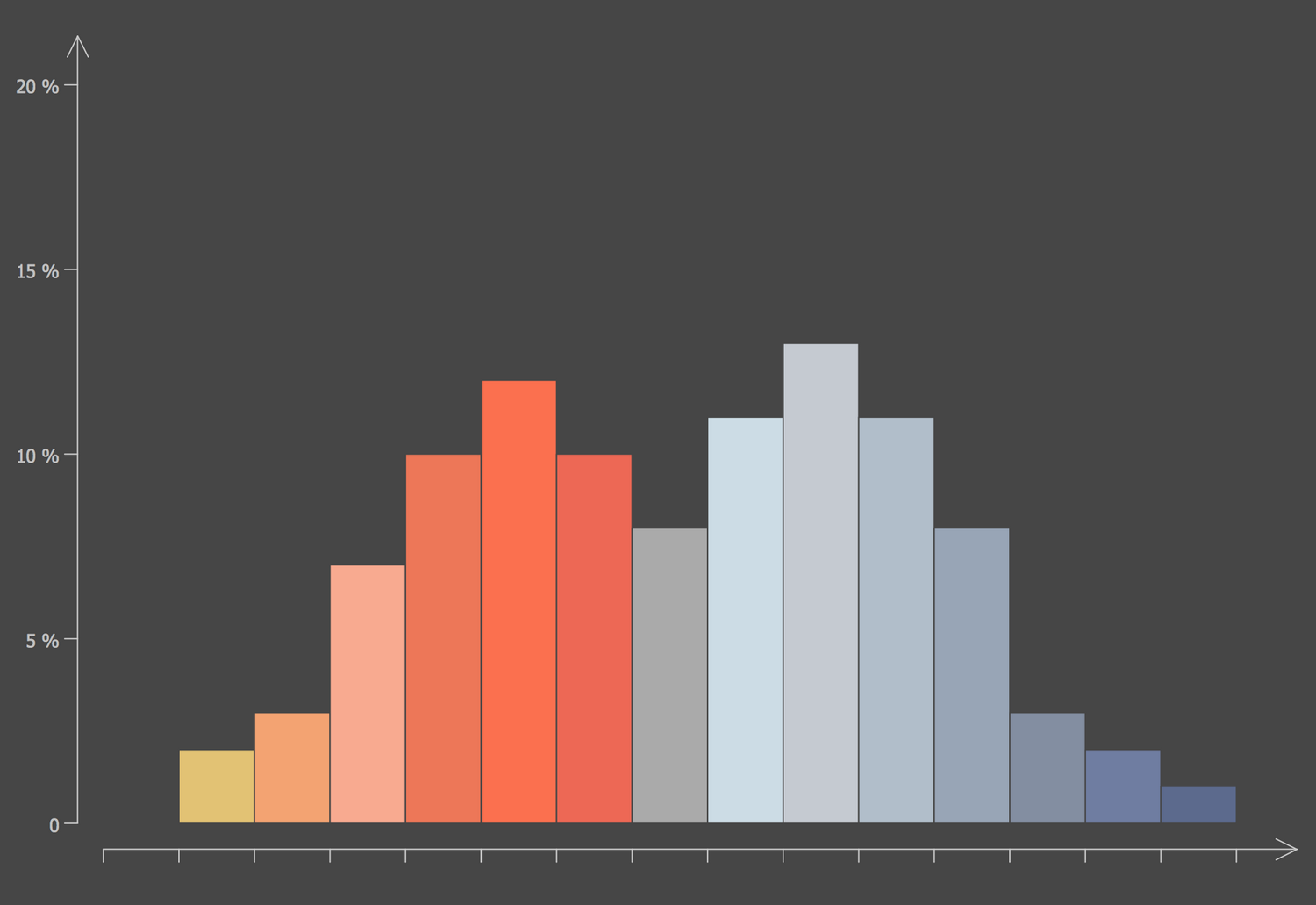
This Histogram sample was designed on the base of the Wikimedia Commons file "Histogramme proche loin.svg" and shows a mixture of two populations, each having an average remote. It is an example of Histogram depicting the mixture of two series that can have any origin. The ConceptDraw DIAGRAM software is rich on features and abilities of drawing Histograms of any design or style you prefer or suitable for the rest part of your document or presentation, this relates to the diagram's design and view 2D or 3D, as well as its color style, existence of axes and their values in the diagram, increase or decrease the number of categories, and other characteristics. The Histograms are incredibly useful due to their ability to estimate the probability density function of the underlying variable and to give an approximate sense of the density of the underlying data distribution in a visual and clear form.
Example 7: Histogram — Beetles in the River Thames
This example was created in ConceptDraw DIAGRAM using the Histograms Library from the Histograms Solution. An experienced user spent 5 minutes creating this sample.
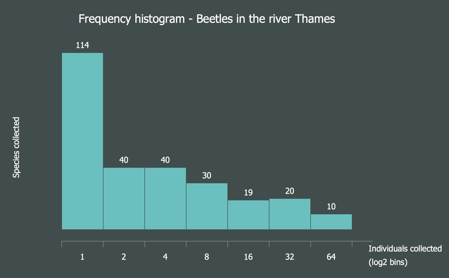
This sample represents the frequency Histogram showing the relative species abundance of beetles sampled from the river Thames. It is based on the "PrestonPlot beetles.png" file from the Wikimedia Commons that is in its turn constructed using data collected by Williams in 1964 and presented in Magurran in 2004. This relative species abundance of beetles was plotted as a frequency Histogram (log2 binned). The relative species abundance reflects how common or rare the species is in relation to other species from a particular community or location. Typically, this characteristic corresponds to certain laws of macroecology. You can observe a strong left-skew in the diagram, in other words, the most species are rare and only a few species are found in abundance in the Thames. Use all ConceptDraw DIAGRAM drawing abilities and design features when making a Histogram in this software, which offers powerful abilities in great quantity within the Histograms solution.
Example 8: Histogram — Amino Acid Length Distribution
This example was created in ConceptDraw DIAGRAM using the Histograms Library from the Histograms Solution. An experienced user spent 5 minutes creating this sample.
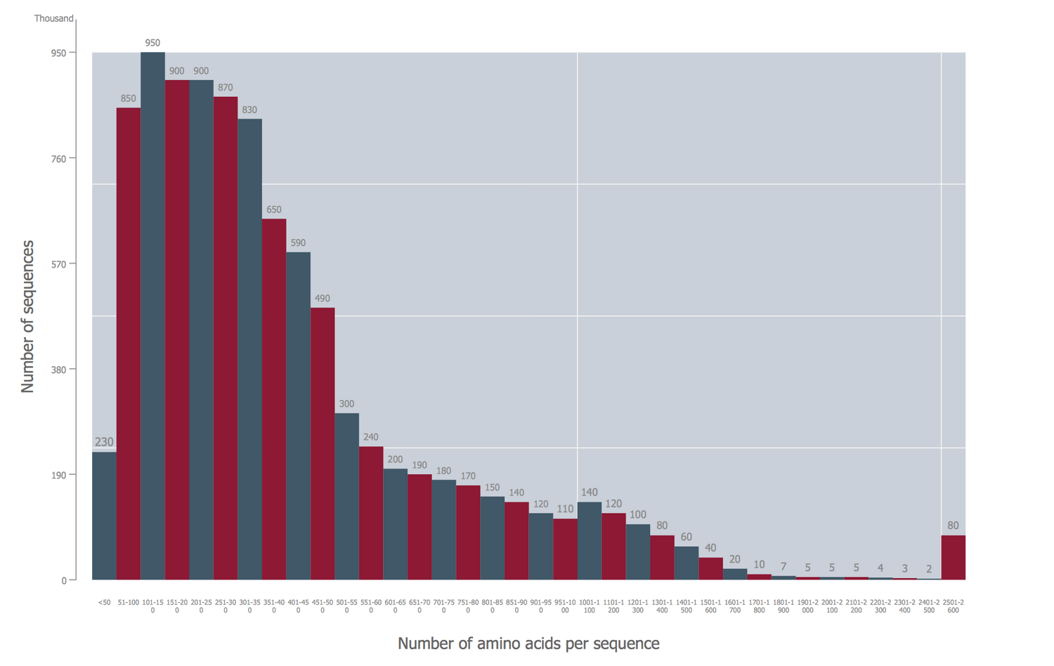
This Histogram sample represents the length distribution of amino acid sequences deposited in the UniProtKB/TrEMBL Protein Databank in 2010. Being based on the "AminoAcid length distribution 2010.svg" file published on the Wikimedia Commons, this Histogram was constructed exceptionally by means of ConceptDraw's Histograms solution tools. The proteins are large biological molecules (macromolecules) that consist of one or more chains of amino acid residues and differ by the sequence of placement of these chains. This Histogram depicts the known proteins with a certain number of amino acids. The y-axis represents the number of sequences in thousands and the x-axis depicts the number of amino acids per sequences. You can observe in a diagram that the proteins with the number of amino acids from 101 to 300 are the most common, while the minimal quantity of proteins has from 1801 to 2500 amino acids. However, the small increase in prevalence is observed in the range of 2501-2600.
Example 9: Histogram — Page Load Time
This example was created in ConceptDraw DIAGRAM using the Histograms Library from the Histograms Solution. An experienced user spent 5 minutes creating this sample.
This Histogram sample illustrates the frequency distribution of web page load time. The speed of loading and displaying in a web browser is one of the main characteristics of any web page. The information about this characteristic is incredibly important for successful optimization of the website. The faster website download speed lets reduce the power consumption of the website, contributes to attraction the larger quantity of visitors and longer retention them on it. Such factors as the browser/server cache, images optimization, and encryption way significantly influence the speed of the web page loading. This Histogram is designed on the base of ConceptDraw's 3D object and according to the statistical data. The largest number of pages (29% and 24%) are loaded 3-6 and 6-10 seconds respectively, an approximately equal number (17% and 16%) are loaded 0-3 and 10-20 seconds correspondingly, and the smallest number (14%) of websites need more than 20 seconds to load.

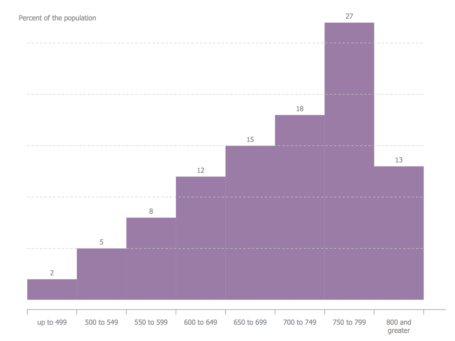
Example 10: Histogram — National Distribution of FICO Scores
This example was created in ConceptDraw DIAGRAM using the Histograms Library from the Histograms Solution. An experienced user spent 5 minutes creating this sample.
This Histogram sample shows the national distribution of FICO scores in the United States and was designed on the base of the "Fico histogram.svg" Wikimedia Commons file. First introduced in 1989 by Fair Isaac Corporation, now FICO score is well-known and prevalent credit score model, the most used in the U.S. in a banking sphere, as well as in credit sphere by the credit grantors and national credit bureaus. However, FICO scoring systems are also very popular in other countries. They are fully deployed in 22 countries around the world and can significantly reduce the credit risks of banks, improve the assessment of the creditworthiness of certain categories of customers. This model is based on the detailed quantitative analysis of the credit history, the level of current debt of the client in the total amount of credit limit, the ratio of submitted credit applications and taken negative decisions on them, the analysis of types of the early given credits.
Inside
What I Need to Get Started
After ConceptDraw DIAGRAM is installed, the Histograms solution can be purchased either from the Graphs and Charts area of ConceptDraw STORE itself or from our online store. Thus, you will be able to use the Histograms solution straight after.
How to install
First of all, make sure that both ConceptDraw STORE and ConceptDraw DIAGRAM applications are downloaded and installed on your computer. Next, install the Histograms solution from the ConceptDraw STORE to use it in the ConceptDraw DIAGRAM application.
Start Using
Start using the Histograms solution to make the professionally looking numerical data by adding the design elements taken from the stencil libraries and editing the pre-made examples that can be found there.
