- Electric and Telecom Plans Free
- Fire and Emergency Plans Free
- Floor Plans Free
- Plant Layout Plans Free
- School and Training Plans Free
- Seating Plans Free
- Security and Access Plans Free
- Site Plans Free
- Sport Field Plans Free
- Business Process Diagrams Free
- Business Process Mapping Free
- Classic Business Process Modeling Free
- Cross-Functional Flowcharts Free
- Event-driven Process Chain Diagrams Free
- IDEF Business Process Diagrams Free
- Logistics Flow Charts Free
- Workflow Diagrams Free
- ConceptDraw Dashboard for Facebook Free
- Mind Map Exchange Free
- MindTweet Free
- Note Exchange Free
- Project Exchange Free
- Social Media Response Free
- Active Directory Diagrams Free
- AWS Architecture Diagrams Free
- Azure Architecture Free
- Cisco Network Diagrams Free
- Cisco Networking Free
- Cloud Computing Diagrams Free
- Computer Network Diagrams Free
- Google Cloud Platform Free
- Interactive Voice Response Diagrams Free
- Network Layout Floor Plans Free
- Network Security Diagrams Free
- Rack Diagrams Free
- Telecommunication Network Diagrams Free
- Vehicular Networking Free
- Wireless Networks Free
- Comparison Dashboard Free
- Composition Dashboard Free
- Correlation Dashboard Free
- Frequency Distribution Dashboard Free
- Meter Dashboard Free
- Spatial Dashboard Free
- Status Dashboard Free
- Time Series Dashboard Free
- Basic Circle-Spoke Diagrams Free
- Basic Circular Arrows Diagrams Free
- Basic Venn Diagrams Free
- Block Diagrams Free
- Concept Maps Free
- Family Tree Free
- Flowcharts Free
- Basic Area Charts Free
- Basic Bar Graphs Free
- Basic Divided Bar Diagrams Free
- Basic Histograms Free
- Basic Line Graphs Free
- Basic Picture Graphs Free
- Basic Pie Charts Free
- Basic Scatter Diagrams Free
- Aerospace and Transport Free
- Artwork Free
- Audio, Video, Media Free
- Business and Finance Free
- Computers and Communications Free
- Holiday Free
- Manufacturing and Maintenance Free
- Nature Free
- People Free
- Presentation Clipart Free
- Safety and Security Free
- Analog Electronics Free
- Audio and Video Connectors Free
- Basic Circuit Diagrams Free
- Chemical and Process Engineering Free
- Digital Electronics Free
- Electrical Engineering Free
- Electron Tube Circuits Free
- Electronic Block Diagrams Free
- Fault Tree Analysis Diagrams Free
- GHS Hazard Pictograms Free
- Home Automation and Wiring Free
- Mechanical Engineering Free
- One-line Diagrams Free
- Power Сircuits Free
- Specification and Description Language (SDL) Free
- Telecom and AV Circuits Free
- Transport Hazard Pictograms Free
- Data-driven Infographics Free
- Pictorial Infographics Free
- Spatial Infographics Free
- Typography Infographics Free
- Calendars Free
- Decision Making Free
- Enterprise Architecture Diagrams Free
- Fishbone Diagrams Free
- Organizational Charts Free
- Plan-Do-Check-Act (PDCA) Free
- Seven Management and Planning Tools Free
- SWOT and TOWS Matrix Diagrams Free
- Timeline Diagrams Free
- Australia Map Free
- Continent Maps Free
- Directional Maps Free
- Germany Map Free
- Metro Map Free
- UK Map Free
- USA Maps Free
- Customer Journey Mapping Free
- Marketing Diagrams Free
- Matrices Free
- Pyramid Diagrams Free
- Sales Dashboard Free
- Sales Flowcharts Free
- Target and Circular Diagrams Free
- Cash Flow Reports Free
- Current Activities Reports Free
- Custom Excel Report Free
- Knowledge Reports Free
- MINDMAP Reports Free
- Overview Reports Free
- PM Agile Free
- PM Dashboards Free
- PM Docs Free
- PM Easy Free
- PM Meetings Free
- PM Planning Free
- PM Presentations Free
- PM Response Free
- Resource Usage Reports Free
- Visual Reports Free
- House of Quality Free
- Quality Mind Map Free
- Total Quality Management TQM Diagrams Free
- Value Stream Mapping Free
- Astronomy Free
- Biology Free
- Chemistry Free
- Language Learning Free
- Mathematics Free
- Physics Free
- Piano Sheet Music Free
- Android User Interface Free
- Class Hierarchy Tree Free
- Data Flow Diagrams (DFD) Free
- DOM Tree Free
- Entity-Relationship Diagram (ERD) Free
- EXPRESS-G data Modeling Diagram Free
- IDEF0 Diagrams Free
- iPhone User Interface Free
- Jackson Structured Programming (JSP) Diagrams Free
- macOS User Interface Free
- Object-Role Modeling (ORM) Diagrams Free
- Rapid UML Free
- SYSML Free
- Website Wireframe Free
- Windows 10 User Interface Free
Bar Graphs
The Bar Graphs are an ideal way to summarize, display information and data in a visual form that is easy for people to read, understand, analyze and memorize. The Bar Chart represents data in different categories or groups using the bars (rectangular 2D, 3D, or cylindrical) with lengths proportional to the values that they represent, and places them at a fixed distance from one another. This method is convenient for use when some properties are specified as an array of values, so each value is used sequentially for drawing the corresponding bars.
The Bar Charts provide an effective visualization of data and visual comparisons among categories. One axis of the chart represents the specific categories that may be compared and the other axis shows the discrete values. They are ideal for comparing two or more values, facts, events, or other things between different groups, to track change over the time, to display the changes of prices or other properties over a specific time period. The Bar Graphs are visual, clear, legible and attractive; because of this, they are great for use in presentations and reports, in statistics, analysis, financial sphere, science, and business. In many cases, it is much easier to make conclusions by looking at the chart than at a sequence of numbers. It is easy to see the changes in values within a single timeframe, identify the trend of price changes, determine the maximum and minimum, analyze price spikes, determine the moments of market consolidation, visually compare charts corresponding to different periods.
It is up to you, you can construct your Bar Chart both vertically and horizontally, however, the vertical form is more common. In a vertical Bar Graph, the bar’s height is a numerical value for a series of data, the higher the column, the greater its value, as in a horizontal bar chart, the longer the column, the greater its value. When knowing this dependency, you can instantly visually compare your values just by looking at the graph.
The Bar Graphs Solution enhances the ConceptDraw DIAGRAM functionality with templates, numerous professional-looking samples, and a library of vector stencils for drawing different types of Bar Graphs, such as Simple Bar Graph, Double Bar Graph, Divided Bar Graph, Horizontal Bar Graph, Vertical Bar Graph, and Column Bar Chart.
-
Buy this solution $35 -
Solution Requirements - This solution requires the following products to be installed:
ConceptDraw DIAGRAM v18 - This solution requires the following products to be installed:
-
Compatibility - Sonoma (14), Sonoma (15)
MS Windows 10, 11 - Sonoma (14), Sonoma (15)
-
Support for this Solution -
Helpdesk
There is 1 library containing 8 objects in the Bar Graphs solution.
Design Elements — Bar Charts

Related News:
CS Odessa Announces Additions to Powerful Graphs and Charts Area in ConceptDraw Solution ParkExamples
There are a few samples that you see on this page which were created in the ConceptDraw DIAGRAM application by using the Bar Graphs solution. Some of the solution's capabilities as well as the professional results which you can achieve are all demonstrated here on this page.
All source documents are vector graphic documents which are always available for modifying, reviewing and/or converting to many different formats, such as MS PowerPoint, PDF file, MS Visio, and many other graphic ones from the ConceptDraw Solution Park or ConceptDraw STORE. The Bar Graphs solution is available to all ConceptDraw DIAGRAM users to get installed and used while working in the ConceptDraw DIAGRAM diagramming and drawing software.
Template: Bar Chart
This Bar Chart template helps one create any types of Bar Charts in a few seconds. Simply fill the predefined table with your data for each category and corresponding series, and Bar Graph will be redrawn automatically. You can also change the names of columns and rows. Note that each series has its own color that is saved at the table and in the Bar Graph, the correspondence of colors you can find in a legend. At the same time, you can easily change the colors to your favorite ones, just click the column in the table and choose another color for it, and it will be automatically changed in the graph and at the legend. Using the diagram’s action button you can add/remove the category, set categories and series numbers, set max value, optimize Y scale, set vertical display of values, choose inclined, or horizontal labels, show/hide values, value axis, or table.

Example 1: Median Income by Age and Marital Status
This example was created in ConceptDraw DIAGRAM using the Bar Charts Library from the Bar Graphs Solution. An experienced user spent 5 minutes creating this sample.
This Bar Graph illustrates the differences in people's incomes depending on their age and marital status. It is a Vertical Bar Graph designed on the base of the graph from the "Income of the Aged Chartbook, 2008" article published on the website of the U.S. Social Security Administration (SSA) and U.S. Office of Retirement and Disability Policy. The horizontal axis represents the ages and vertical axis depicts incomes in thousand dollars. The statuses of people are visually marked with different colors, the correspondence of colors to married couples, non-married persons, and all units is depicted in a legend. The color accents make it easier to percept a chart and contribute to its success when used in reports, on conferences, on websites, on billboards, etc. According to the chart, the married couples at the age of 65-69 have the highest income and correspondingly the nonmarried persons of 80 or older have minimal income.

Example 2: 3D Bar Graph — Number of Members in the CNT between 1911 and 1937
This example was created in ConceptDraw DIAGRAM using the Bar Charts Library from the Bar Graphs Solution. An experienced user spent 5 minutes creating this sample.
This 3D Bar Graph was designed on the base of the "Cnt afiliats.png" Commons Wikimedia file and illustrates the number of members in the National Confederation of Labour in Spain between 1911 and 1937. The Spanish National Confederation of Labour was a confederation of anarcho-syndicalist labour unions that played the major role in the labor movement. This sample was created using the predesigned 3D cylindrical vector object. Having very few categories and plenty of space on the diagram, you can use text labels directly on an object, this allows adding more information and detail. In cases of many categories vice versa, the text labels can make a diagram complex, overloaded and hard to read. According to the graph, 1911, 1919, 1931, 1936, and 1937 years are key in a number of members. The last one counts the biggest quantity of members – 1500 thousand, the minimal number is observed in 1911.

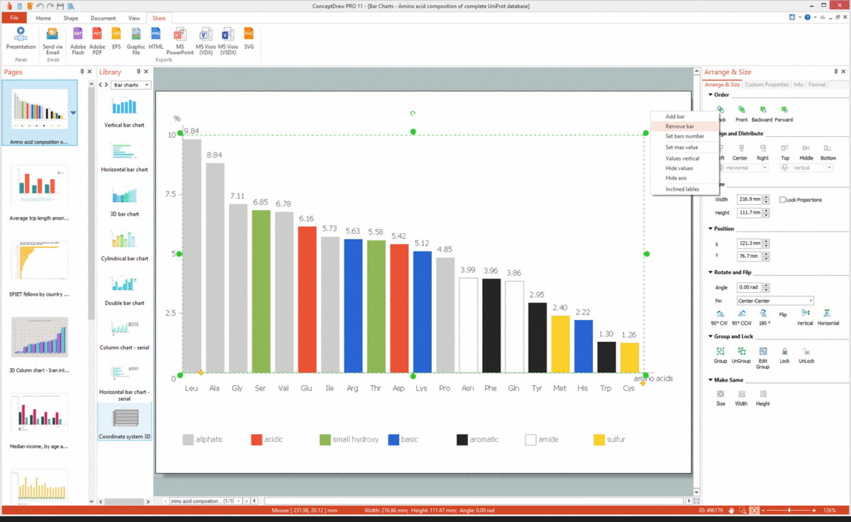
Example 3: Amino Acid Composition of Complete UniProt Database
This example was created in ConceptDraw DIAGRAM using the Bar Charts Library from the Bar Graphs Solution. An experienced user spent 10 minutes creating this sample.
This Vertical Bar Chart illustrates the amino acid composition of the UniProt database, which is a unified worldwide open database of protein sequences operating since 2003 and combining several databases (knowledge base, archive, reference clusters, and metagenomic data), covering various aspects of protein sequence analysis and containing a large amount of information about the biological functions of proteins. The sample is based on the statistic data taken from the website of the UniProt protein sequence database. The composition is represented in percent for the complete UniProtKB/TrEMBL protein database release dated 2016-07. Note that the bars are arranged in descending order of the components' percentage. Even a very simple diagram can become the cornerstone of your presentation and clearly sort data. Feel free using colors to highlight successfully your main ideas. The legend helps in the description the main designations used in your diagram. In a given chart the legend explains applied colors.

Example 4: EPIET Fellows by Country of Origin
This example was created in ConceptDraw DIAGRAM using the Bar Charts Library from the Bar Graphs Solution. An experienced user spent 10 minutes creating this sample.
The EPIET (European Programme for Intervention Epidemiology Training) fellowship conducts the training in European Union countries and gives the practical experience in intervention epidemiology for the medical practitioners, nurses, veterinarians, microbiologists, and other health specialists. This Horizontal Bar Chart represents the distribution of EPIET fellows by countries of origin based on the data collected in a decade 1995-2005 and first published on the website of the Field Epidemiology Manual (FEM) Wiki, EPIET. The vertical axis represents countries, the horizontal axis is used to denote the number of EPIET fellows. Data are arranged beginning with the country with the least value ascending to the highest one. Some countries have an equal number of EPIET fellows, so the countries' arrangement in this way is convenient to easily notice these equalities, make conclusions and conduct results analysis. It is advisable to keep a single style in your Bar Charts design within a single document or presentation.

Example 5: Percentage of U.S. High School Students
This example was created in ConceptDraw DIAGRAM using the Bar Charts Library from the Bar Graphs Solution. An experienced user spent 5 minutes creating this sample.
This Bar Chart uses the vertical bars allowing demonstrating the percentages of students studying at U.S. high school and attending the physical education classes one or more days during an average week in the period from 1991 to 2001 years. It is based on data and the Bar Graph from the "Childhood Obesity — What We Can Learn From Existing Data on Societal Trends, Part 2" article placed on the U.S. Centers for Disease Control and Prevention (CDC) website. The movement, sport, and physical education classes are important for the health and body of children of any age because they help support health, proper development of the body, and burning extra calories. Due to the growing problem of children's obesity and its adverse effects on child's health and well-being, this statistics is particularly relevant and important for health care and medicine of the United States and requires the close attention and reaction of specialists.

Example 6: Bar Chart – Average Trip Length
This example was created in ConceptDraw DIAGRAM using the Bar Charts Library from the Bar Graphs Solution. An experienced user spent 5 minutes creating this sample.
This Vertical Bar Graph sample illustrates the average trip length (in miles) in a year among U.S. children aged 5 to 15. The analysis is based on data from the National Personal Transportation Surveys for 1977 and 1990, and the National Household Travel Survey for 2001, as well as data from the U.S. Centers for Disease Control and Prevention (CDC) website and "Childhood Obesity — What We Can Learn From Existing Data on Societal Trends, Part 2" article published on it. The sport exercises and active transportation, such as walking or biking that expend a large amount of energy are useful in connection with increasing the problem of obesity among the children. The bars representing walking are colored with blue and the bars corresponding to bicycling have red coloring on the graph. So, you can see that from year to year the longer distances are overcome by children by bike than by foot.

Example 7: 3D Vertical Bar Graph – Iran Internet Users per 100 Person
This example was created in ConceptDraw DIAGRAM using the Bar Charts Library from the Bar Graphs Solution. An experienced user spent 5 minutes creating this sample.
This Bar Chart sample shows Iran Internet users per 100 person from 2000 to 2011. It is a 3D Vertical Bar Chart based on the "Iran internet users per 100 person.png" Commons Wikimedia file, the data for which were taken from the World Bank. Being connected to the Internet in 1993, Iran became the second country in the Middle East with this service and now is one of first five countries that have the highest level of development and the largest growth rate in telecommunication area. Since that time and to nowadays Iran's government that is almost entirely state-owner of the whole Iran’s telecommunications, make large efforts to develop and improve the nation's ICT infrastructure, and even was awarded by UNESCO special certificate for providing telecommunication services to rural areas. That's why, according to the graph, the number of Internet users in Iran steadily grew from 2000 to 2011 and increased from 2 persons to 22 people per every 100 Iranian residents.

Example 8: Bar Chart – Nitrate Concentration in Community Water Systems (CWS)
This example was created in ConceptDraw DIAGRAM using the Bar Charts Library from the Bar Graphs Solution. An experienced user spent 5 minutes creating this sample.
This Double Bar Chart demonstrates the nitrate concentration (mean and maximum by year) in milligrams per liter in Community Water Systems (CWS) in New Mexico in 1999-2015. It is based on data from the New Mexico's Indicator-Based Information System (NM-IBIS) website. The tracking of nitrate concentration in water is highly important because the violation of valid norms set for the composition of the drinking water is the cause of a huge number of diseases and ailments. The nitrates are highly toxic compounds that can be the cause of such diseases as intoxication, methemoglobinemia, spontaneous abortions, intrauterine growth retardation, and serious birth defects. The nitrates are especially harmful to infants younger than 4 months of age, nursing mothers, pregnant women, and people with low stomach acid conditions. It is necessary to take seriously to such characteristic symptoms as shortness of breath, bluish skin coloring around the mouth and hands, convulsions, and timely provide assistance for the most rapid removal of harmful substances from the body.
.png "Bar Chart – Nitrate Concentration in Community Water Systems (CWS)")
Example 9: Percentage with Various Levels of Family Income
This example was created in ConceptDraw DIAGRAM using the Bar Charts Library from the Bar Graphs Solution. An experienced user spent 5 minutes creating this sample.
This Bar Chart sample demonstrates the median family income for persons aged 65 or older in 2008. It was designed on the base of the illustration from the article "Income of the Aged Chartbook, 2008" published on the website of the Social Security Administration, the U.S. Office of Retirement and Disability Policy. It is a Vertical Bar Chart that visually depicts diversity in income of aged people (65 or older). You can observe the quantities of families in percent with various income levels that is represented in dollars. The largest part (14%) are people with income 50,000-74,999, slightly less percentage (12,2%) are people that had 100,000 or more, still less (10%) had income 10,000 to 14,999, the lowest percentage (2,2%) had less than 5,000 dollars in 2008. People with other incomes are distributed fairly evenly with percentages from 6,2 to 9,2%, except the decrease to 4-4,9% for incomes from 5,000 to 9,999, 40,000-44,999, and 45,000-49,999.

Example 10: Serious Crime in Cincinnati
This example was created in ConceptDraw DIAGRAM using the Bar Charts Library from the Bar Graphs Solution. An experienced user spent 5 minutes creating this sample.
This Vertical Bar Graph represents statistics according to the serious crime number in Cincinnati from 2001 to 2008. This sample was designed on the base of the "Cincinnati-Part-1-Crimes.jpg" Commons Wikimedia file. There were considered only serious crimes, such as murders, robberies, assaults, rapes, aggravated burglaries, larcenies, and auto thefts. The high crime in Cincinnati was a great problem since the 18th century. In the 20th century, the situation changed, the overall rate of serious crimes steadily decreased and reached its minimum in 2001, but the serious riot took place in Cincinnati that year and since that time the crime rate began dramatically increase again. According to the graph, the peak was in 2002, after that we observe the slow declining. At your desire, you can extend this graph using data according to the situation in Cincinnati from 2008 to the current moment. It's also possible to highlight with bright color the critical moments of increase or decrease of crime level.

Inside
What I Need to Get Started
After ConceptDraw DIAGRAM is installed, the Bar Graphs solution can be purchased either from the Statistical Charts area of ConceptDraw STORE itself or from our online store. Thus, you will be able to use the Bar Graphs solution straight after.

How to install
First of all, make sure that both ConceptDraw STORE and ConceptDraw DIAGRAM applications are downloaded and installed on your computer. Next, install the Bar Graphs solution from the ConceptDraw STORE to use it in the ConceptDraw DIAGRAM application.

Start Using
Start using the Bar Graphs solution to make the professionally looking numerical data by adding the design elements taken from the stencil libraries and editing the pre-made examples that can be found there.
