- Electric and Telecom Plans Free
- Fire and Emergency Plans Free
- Floor Plans Free
- Plant Layout Plans Free
- School and Training Plans Free
- Seating Plans Free
- Security and Access Plans Free
- Site Plans Free
- Sport Field Plans Free
- Business Process Diagrams Free
- Business Process Mapping Free
- Classic Business Process Modeling Free
- Cross-Functional Flowcharts Free
- Event-driven Process Chain Diagrams Free
- IDEF Business Process Diagrams Free
- Logistics Flow Charts Free
- Workflow Diagrams Free
- ConceptDraw Dashboard for Facebook Free
- Mind Map Exchange Free
- MindTweet Free
- Note Exchange Free
- Project Exchange Free
- Social Media Response Free
- Active Directory Diagrams Free
- AWS Architecture Diagrams Free
- Azure Architecture Free
- Cisco Network Diagrams Free
- Cisco Networking Free
- Cloud Computing Diagrams Free
- Computer Network Diagrams Free
- Google Cloud Platform Free
- Interactive Voice Response Diagrams Free
- Network Layout Floor Plans Free
- Network Security Diagrams Free
- Rack Diagrams Free
- Telecommunication Network Diagrams Free
- Vehicular Networking Free
- Wireless Networks Free
- Comparison Dashboard Free
- Composition Dashboard Free
- Correlation Dashboard Free
- Frequency Distribution Dashboard Free
- Meter Dashboard Free
- Spatial Dashboard Free
- Status Dashboard Free
- Time Series Dashboard Free
- Basic Circle-Spoke Diagrams Free
- Basic Circular Arrows Diagrams Free
- Basic Venn Diagrams Free
- Block Diagrams Free
- Concept Maps Free
- Family Tree Free
- Flowcharts Free
- Basic Area Charts Free
- Basic Bar Graphs Free
- Basic Divided Bar Diagrams Free
- Basic Histograms Free
- Basic Line Graphs Free
- Basic Picture Graphs Free
- Basic Pie Charts Free
- Basic Scatter Diagrams Free
- Aerospace and Transport Free
- Artwork Free
- Audio, Video, Media Free
- Business and Finance Free
- Computers and Communications Free
- Holiday Free
- Manufacturing and Maintenance Free
- Nature Free
- People Free
- Presentation Clipart Free
- Safety and Security Free
- Analog Electronics Free
- Audio and Video Connectors Free
- Basic Circuit Diagrams Free
- Chemical and Process Engineering Free
- Digital Electronics Free
- Electrical Engineering Free
- Electron Tube Circuits Free
- Electronic Block Diagrams Free
- Fault Tree Analysis Diagrams Free
- GHS Hazard Pictograms Free
- Home Automation and Wiring Free
- Mechanical Engineering Free
- One-line Diagrams Free
- Power Сircuits Free
- Specification and Description Language (SDL) Free
- Telecom and AV Circuits Free
- Transport Hazard Pictograms Free
- Data-driven Infographics Free
- Pictorial Infographics Free
- Spatial Infographics Free
- Typography Infographics Free
- Calendars Free
- Decision Making Free
- Enterprise Architecture Diagrams Free
- Fishbone Diagrams Free
- Organizational Charts Free
- Plan-Do-Check-Act (PDCA) Free
- Seven Management and Planning Tools Free
- SWOT and TOWS Matrix Diagrams Free
- Timeline Diagrams Free
- Australia Map Free
- Continent Maps Free
- Directional Maps Free
- Germany Map Free
- Metro Map Free
- UK Map Free
- USA Maps Free
- Customer Journey Mapping Free
- Marketing Diagrams Free
- Matrices Free
- Pyramid Diagrams Free
- Sales Dashboard Free
- Sales Flowcharts Free
- Target and Circular Diagrams Free
- Cash Flow Reports Free
- Current Activities Reports Free
- Custom Excel Report Free
- Knowledge Reports Free
- MINDMAP Reports Free
- Overview Reports Free
- PM Agile Free
- PM Dashboards Free
- PM Docs Free
- PM Easy Free
- PM Meetings Free
- PM Planning Free
- PM Presentations Free
- PM Response Free
- Resource Usage Reports Free
- Visual Reports Free
- House of Quality Free
- Quality Mind Map Free
- Total Quality Management TQM Diagrams Free
- Value Stream Mapping Free
- Astronomy Free
- Biology Free
- Chemistry Free
- Language Learning Free
- Mathematics Free
- Physics Free
- Piano Sheet Music Free
- Android User Interface Free
- Class Hierarchy Tree Free
- Data Flow Diagrams (DFD) Free
- DOM Tree Free
- Entity-Relationship Diagram (ERD) Free
- EXPRESS-G data Modeling Diagram Free
- IDEF0 Diagrams Free
- iPhone User Interface Free
- Jackson Structured Programming (JSP) Diagrams Free
- macOS User Interface Free
- Object-Role Modeling (ORM) Diagrams Free
- Rapid UML Free
- SYSML Free
- Website Wireframe Free
- Windows 10 User Interface Free
Frequency Distribution Dashboard
A frequency distribution as a term used in statistics is a graph or table that displays the frequency of different outcomes in one sample. Each of the entries in the table contains some particular frequency of the occurrences of values within some particular interval or group. Thus, in this way, the table summarizes the total distribution of different values in the same sample.
A frequency distribution can show a summarized grouping of data that is divided into mutually exclusive classes. The number of occurrences in one class may also be included in such grouping. Using this method is a way of showing the unorganized data such as the results of an election, an income of people within a certain region, sales of a product within a week, a month, etc. Some of the graphs may be pie charts, histograms, bar charts and line charts. Frequency distributions can be used for both quantitative and qualitative data.
Another definition for a term of “frequency distribution” may be a listing of all unique values in one particular set of data, including an enumeration of the number of time each value or range of values can actually be observed in that set.
Being the correspondence of a set of frequencies with the set of categories, values or intervals into which a statistical population can be classified, any frequency distribution may be described in a way of a drawing that illustrates the dependencies with the help of the ConceptDraw DIAGRAM diagramming and drawing software.
The Frequency Distribution Dashboard solution can be used while working in ConceptDraw DIAGRAM to simplify the process of creating the needed dashboards with help of the pre-made examples that can be easily edited any time it is needed.
The Frequency Distribution Dashboard solution can be useful for many specialists such as HR managers and other managers who intend to develop their business with the help of the progressive tools.
-
Install this solution Free -
What I need to get started -
Solution Requirements - This solution requires the following products to be installed:
ConceptDraw DIAGRAM v18 - This solution requires the following products to be installed:
-
Compatibility - Sonoma (14), Sonoma (15)
MS Windows 10, 11 - Sonoma (14), Sonoma (15)
-
Support for this Solution -
Helpdesk
Related News:
Examples
The samples you see on this page were obtained by connecting a sample data source to templates from the Frequency Distribution Dashboard solution, to demonstrate some of the solution's capabilities and the results you can achieve.
These documents are vector graphic documents, created in ConceptDraw DIAGRAM using ConceptDraw Live Objects technology. They are available for modifying, reviewing and/or converting to many different formats, such as MS PowerPoint, PDF file, MS Visio, and many other graphic ones from the ConceptDraw Solution Park or ConceptDraw STORE. The Frequency Distribution Dashboard solution is available to all ConceptDraw DIAGRAM users to get installed and used while working in the ConceptDraw DIAGRAM diagramming and drawing software.
You can download sample data sources for all dashboards to see how changes made to data effect dashboard appearance.
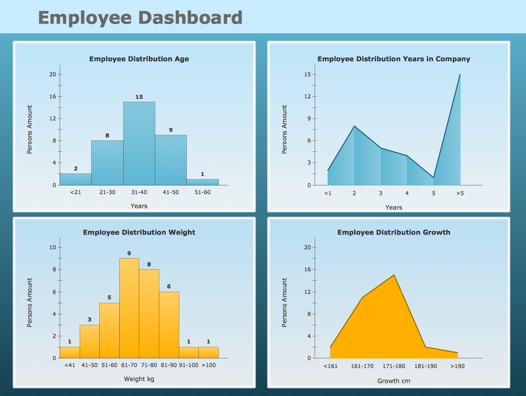
Example 1: Frequency Distribution Dashboard — Employee Dashboard
This sample was created in ConceptDraw DIAGRAM using the Frequency Distribution Dashboard solution, and demonstrates the solution's capabilities and the results you can achieve using this solution. All the charts on this page change automatically when the data source changes.
This company HR dashboard contains two histograms and two area charts. The charts show the employee distribution by age, years with company, weight and growth.

More Examples and Templates
What I need to get started
Both ConceptDraw DIAGRAM diagramming and drawing software and the Frequency Distribution Dashboard solution can help creating the visual dashboard you need. The Frequency Distribution Dashboard solution can be found in the Dashboards area of ConceptDraw STORE application that can be downloaded from this site. Make sure that both ConceptDraw DIAGRAM and ConceptDraw STORE applications are installed on your computer before you get started.
How to install
After ConceptDraw STORE and ConceptDraw DIAGRAM are downloaded and installed, you can install the Frequency Distribution Dashboard solution from the ConceptDraw STORE.

Start using
To make sure that you are doing it all right, use the pre-designed symbols from the stencil libraries from the solution to make your drawings look smart and professional. Also, the pre-made examples from this solution can be used as drafts so your own drawings can be based on them. Using the samples, you can always change their structures, colors and data.

What is Frequency Distribution Dashboard?
Why to use Frequency Distribution Dashboard?
Each Frequency Distribution Chart displays your source data to visually communicate the Frequency Distribution Comparison.
You can include Frequency Distribution Charts into your business or technical dashboards to show the distribution of items into a series of progressive numerical ranges.
Frequency Distribution Comparison
«This kind of comparison shows how many items fall into a series of progressive numerical ranges.
Gene Zelazny
<…>
Terms to look for that suggest this kind of comparison are x to y range, concentration, as well as the words frequency and distribution themselves»
Say It With Charts: The Executive's Guide to Visual Communication
4th Edition
McGraw-Hill | 2001. P. 22.
What chart should you use?
- Use Histogram for few data points, and use Scatter Chart, Line Chart or Area Chart for many data points
- Use Line Charts or Area Charts to show the shape of a distribution curve, not to show exact frequencies
- Use Histogram or Scatter Chart to compare specific frequencies of your categories
The libraries Frequency Distribution Charts consist of Live Objects, the special shapes that can change their appearance depending on the external data.