- Electric and Telecom Plans Free
- Fire and Emergency Plans Free
- Floor Plans Free
- Plant Layout Plans Free
- School and Training Plans Free
- Seating Plans Free
- Security and Access Plans Free
- Site Plans Free
- Sport Field Plans Free
- Business Process Diagrams Free
- Business Process Mapping Free
- Classic Business Process Modeling Free
- Cross-Functional Flowcharts Free
- Event-driven Process Chain Diagrams Free
- IDEF Business Process Diagrams Free
- Logistics Flow Charts Free
- Workflow Diagrams Free
- ConceptDraw Dashboard for Facebook Free
- Mind Map Exchange Free
- MindTweet Free
- Note Exchange Free
- Project Exchange Free
- Social Media Response Free
- Active Directory Diagrams Free
- AWS Architecture Diagrams Free
- Azure Architecture Free
- Cisco Network Diagrams Free
- Cisco Networking Free
- Cloud Computing Diagrams Free
- Computer Network Diagrams Free
- Google Cloud Platform Free
- Interactive Voice Response Diagrams Free
- Network Layout Floor Plans Free
- Network Security Diagrams Free
- Rack Diagrams Free
- Telecommunication Network Diagrams Free
- Vehicular Networking Free
- Wireless Networks Free
- Comparison Dashboard Free
- Composition Dashboard Free
- Correlation Dashboard Free
- Frequency Distribution Dashboard Free
- Meter Dashboard Free
- Spatial Dashboard Free
- Status Dashboard Free
- Time Series Dashboard Free
- Basic Circle-Spoke Diagrams Free
- Basic Circular Arrows Diagrams Free
- Basic Venn Diagrams Free
- Block Diagrams Free
- Concept Maps Free
- Family Tree Free
- Flowcharts Free
- Basic Area Charts Free
- Basic Bar Graphs Free
- Basic Divided Bar Diagrams Free
- Basic Histograms Free
- Basic Line Graphs Free
- Basic Picture Graphs Free
- Basic Pie Charts Free
- Basic Scatter Diagrams Free
- Aerospace and Transport Free
- Artwork Free
- Audio, Video, Media Free
- Business and Finance Free
- Computers and Communications Free
- Holiday Free
- Manufacturing and Maintenance Free
- Nature Free
- People Free
- Presentation Clipart Free
- Safety and Security Free
- Analog Electronics Free
- Audio and Video Connectors Free
- Basic Circuit Diagrams Free
- Chemical and Process Engineering Free
- Digital Electronics Free
- Electrical Engineering Free
- Electron Tube Circuits Free
- Electronic Block Diagrams Free
- Fault Tree Analysis Diagrams Free
- GHS Hazard Pictograms Free
- Home Automation and Wiring Free
- Mechanical Engineering Free
- One-line Diagrams Free
- Power Сircuits Free
- Specification and Description Language (SDL) Free
- Telecom and AV Circuits Free
- Transport Hazard Pictograms Free
- Data-driven Infographics Free
- Pictorial Infographics Free
- Spatial Infographics Free
- Typography Infographics Free
- Calendars Free
- Decision Making Free
- Enterprise Architecture Diagrams Free
- Fishbone Diagrams Free
- Organizational Charts Free
- Plan-Do-Check-Act (PDCA) Free
- Seven Management and Planning Tools Free
- SWOT and TOWS Matrix Diagrams Free
- Timeline Diagrams Free
- Australia Map Free
- Continent Maps Free
- Directional Maps Free
- Germany Map Free
- Metro Map Free
- UK Map Free
- USA Maps Free
- Customer Journey Mapping Free
- Marketing Diagrams Free
- Matrices Free
- Pyramid Diagrams Free
- Sales Dashboard Free
- Sales Flowcharts Free
- Target and Circular Diagrams Free
- Cash Flow Reports Free
- Current Activities Reports Free
- Custom Excel Report Free
- Knowledge Reports Free
- MINDMAP Reports Free
- Overview Reports Free
- PM Agile Free
- PM Dashboards Free
- PM Docs Free
- PM Easy Free
- PM Meetings Free
- PM Planning Free
- PM Presentations Free
- PM Response Free
- Resource Usage Reports Free
- Visual Reports Free
- House of Quality Free
- Quality Mind Map Free
- Total Quality Management TQM Diagrams Free
- Value Stream Mapping Free
- Astronomy Free
- Biology Free
- Chemistry Free
- Language Learning Free
- Mathematics Free
- Physics Free
- Piano Sheet Music Free
- Android User Interface Free
- Class Hierarchy Tree Free
- Data Flow Diagrams (DFD) Free
- DOM Tree Free
- Entity-Relationship Diagram (ERD) Free
- EXPRESS-G data Modeling Diagram Free
- IDEF0 Diagrams Free
- iPhone User Interface Free
- Jackson Structured Programming (JSP) Diagrams Free
- macOS User Interface Free
- Object-Role Modeling (ORM) Diagrams Free
- Rapid UML Free
- SYSML Free
- Website Wireframe Free
- Windows 10 User Interface Free
Composition Dashboard
Any dashboard can be also called as “dash”, “instrument panel” or “fascia”. Any dashboard is a control panel that can be located directly ahead of any vehicle's driver used for displaying both instrumentation and controls for the vehicle's operation.
Originally the dashboard included an array of simple instrumentation and controls for showing the speed, the oil pressure and the fuel level. The modern dashboard may accommodate many arrays of controls, information, climate control, entertainment systems and gauges.
The so-called “contemporary dashboards” may also include tachometer, odometer, fuel gauge, speedometer, turn indicators, seat belt warning light, gearshift position indicator, engine-malfunction lights and parking-brake warning light. Other features may include indicators for low fuel, low tire pressure and faults in the airbag systems, low oil pressure, glove compartment, cigarette lighter, ashtray, power outlet, heating systems, ventilation systems, lighting controls, safety systems, information systems such as navigation ones and entertainment equipment.
The Composition Dashboard solution is the one that can be used while working in the ConceptDraw DIAGRAM diagramming and drawing software creating the dashboards. Making sure the result looks professionally good, the Composition Dashboard solution can be used as it offers the pre-made examples of the Composition Charts as well as Indicators, Pie Charts, Double Divided Bar Charts, Divided Bar Charts, Horizontal Divided Bar Indicator, Mini Pie Chart Indicator and Vertical Divided Bar Indicator.
The Composition Dashboard solution may be used for creating the website dashboards and other composition dashboards by many different specialists such as IT ones, project managers, team leaders and team members, etc.
-
Install this solution Free -
What I need to get started -
Solution Requirements - This solution requires the following products to be installed:
ConceptDraw DIAGRAM v18 - This solution requires the following products to be installed:
-
Compatibility - Sonoma (14), Sonoma (15)
MS Windows 10, 11 - Sonoma (14), Sonoma (15)
-
Support for this Solution -
Helpdesk
Related News:
Dashboards, and Why Should Your Business Use One?Examples
The samples you see on this page were obtained by connecting a sample data source to templates from the Composition Dashboard solution, to demonstrate some of the solution's capabilities and the results you can achieve.
These documents are vector graphic documents, created in ConceptDraw DIAGRAM using ConceptDraw Live Objects technology. They are available for modifying, reviewing and/or converting to many different formats, such as MS PowerPoint, PDF file, MS Visio, and many other graphic ones from the ConceptDraw Solution Park or ConceptDraw STORE. The Composition Dashboard solution is available to all ConceptDraw DIAGRAM users to get installed and used while working in the ConceptDraw DIAGRAM diagramming and drawing software.
You can download sample data sources for all dashboards to see how changes made to data effect dashboard appearance.
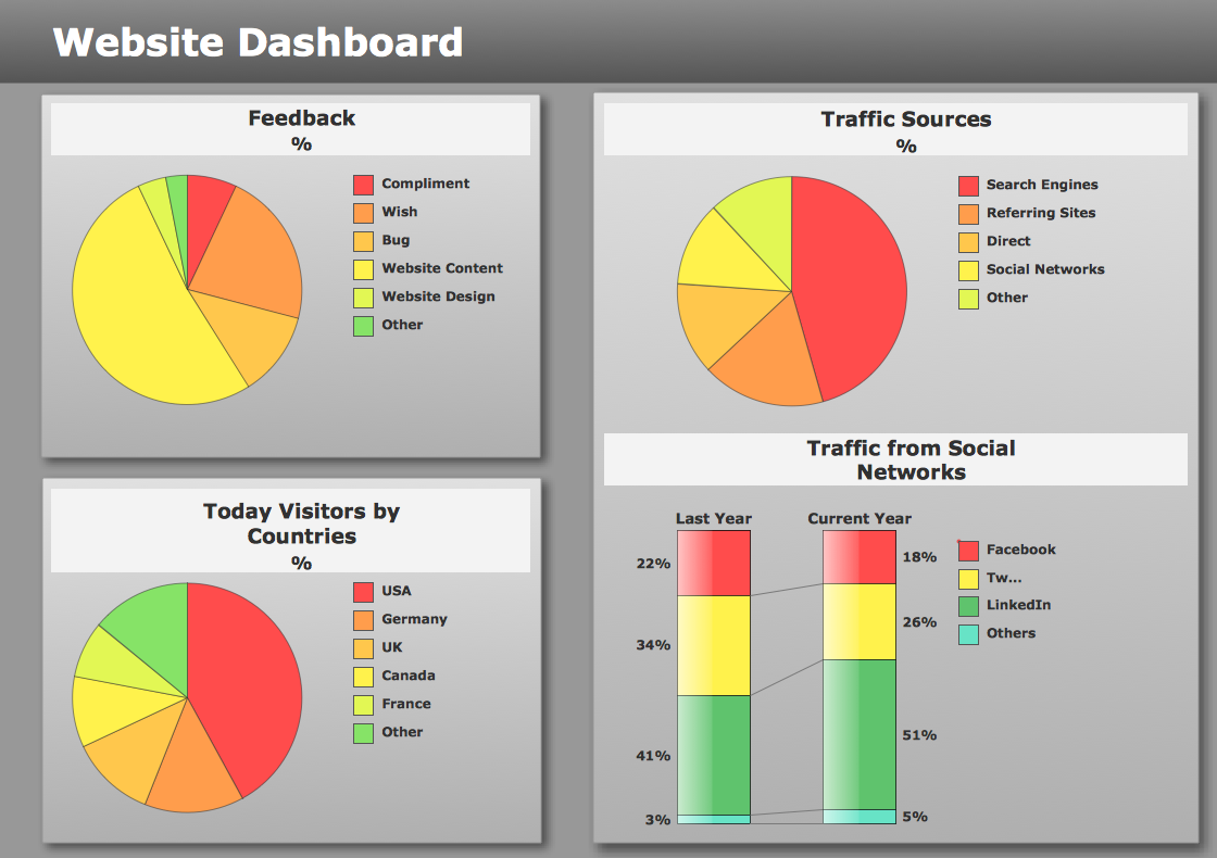
Example 1: Composition Dashboard — Website Dashboard
This sample was created in ConceptDraw DIAGRAM using the Composition Dashboard solution, and demonstrates the solution's capabilities and the results you can achieve using this solution. All the charts on this page change automatically when the data source changes.
This website performance dashboard contains three pie charts and one double divided bar chart. The pie charts show the percentage composition of feedback, traffic sources and daily visitors by countries. The double divided bar chart shows the percentage composition of traffic from social networks in the last and current year.

What I need to get started
Both ConceptDraw DIAGRAM diagramming and drawing software and the Composition Dashboard solution can help creating the visual dashboard you need. The Composition Dashboard solution can be found in the Dashboards area of ConceptDraw STORE application that can be downloaded from this site. Make sure that both ConceptDraw DIAGRAM and ConceptDraw STORE applications are installed on your computer before you get started.
How to install
After ConceptDraw STORE and ConceptDraw DIAGRAM are downloaded and installed, you can install the Composition Dashboard solution from the ConceptDraw STORE.

Start using
To make sure that you are doing it all right, use the pre-designed symbols from the stencil libraries from the solution to make your drawings look smart and professional. Also, the pre-made examples from this solution can be used as drafts so your own drawings can be based on them. Using the samples, you can always change their structures, colors and data.

What is Composition Dashboard?
|
|
Why to use Composition Charts and Indicators?
Each Composition Chart or Indicator displays your source data to visually communicate Composition Comparison.
Composition Comparison includes three tasks comparison of a percentage of:
- each component to the total,
- the components within a single total,
- the components between a few totals.
You can include Composition Charts and Indicators into your business or technical dashboards to visually communicate the relationship among the components of each total, and to compare the components of a few totals.
Composition Comparison
«In a component comparison, we are interested primarily in showing the size of each part as a percentage of the total.<…> Any time your message contains words such as share, percentage of total, accounted for X percent, you can be sure you’re dealing with a component comparison.»
Gene Zelazny
Say It With Charts: The Executive's Guide to Visual Communication
4th Edition
McGraw-Hill | 2001. P. 21.
To visualize Composition Comparison you can use Pie and Donut Charts and Indicators, Bar and Stacked Column Charts, and Divided Bar Charts and Indicators.
The libraries Composition Charts and Composition Indicators consist of Live Objects, the special shapes that can change their appearance depending on the external data.