- Electric and Telecom Plans Free
- Fire and Emergency Plans Free
- Floor Plans Free
- Plant Layout Plans Free
- School and Training Plans Free
- Seating Plans Free
- Security and Access Plans Free
- Site Plans Free
- Sport Field Plans Free
- Business Process Diagrams Free
- Business Process Mapping Free
- Classic Business Process Modeling Free
- Cross-Functional Flowcharts Free
- Event-driven Process Chain Diagrams Free
- IDEF Business Process Diagrams Free
- Logistics Flow Charts Free
- Workflow Diagrams Free
- ConceptDraw Dashboard for Facebook Free
- Mind Map Exchange Free
- MindTweet Free
- Note Exchange Free
- Project Exchange Free
- Social Media Response Free
- Active Directory Diagrams Free
- AWS Architecture Diagrams Free
- Azure Architecture Free
- Cisco Network Diagrams Free
- Cisco Networking Free
- Cloud Computing Diagrams Free
- Computer Network Diagrams Free
- Google Cloud Platform Free
- Interactive Voice Response Diagrams Free
- Network Layout Floor Plans Free
- Network Security Diagrams Free
- Rack Diagrams Free
- Telecommunication Network Diagrams Free
- Vehicular Networking Free
- Wireless Networks Free
- Comparison Dashboard Free
- Composition Dashboard Free
- Correlation Dashboard Free
- Frequency Distribution Dashboard Free
- Meter Dashboard Free
- Spatial Dashboard Free
- Status Dashboard Free
- Time Series Dashboard Free
- Basic Circle-Spoke Diagrams Free
- Basic Circular Arrows Diagrams Free
- Basic Venn Diagrams Free
- Block Diagrams Free
- Concept Maps Free
- Family Tree Free
- Flowcharts Free
- Basic Area Charts Free
- Basic Bar Graphs Free
- Basic Divided Bar Diagrams Free
- Basic Histograms Free
- Basic Line Graphs Free
- Basic Picture Graphs Free
- Basic Pie Charts Free
- Basic Scatter Diagrams Free
- Aerospace and Transport Free
- Artwork Free
- Audio, Video, Media Free
- Business and Finance Free
- Computers and Communications Free
- Holiday Free
- Manufacturing and Maintenance Free
- Nature Free
- People Free
- Presentation Clipart Free
- Safety and Security Free
- Analog Electronics Free
- Audio and Video Connectors Free
- Basic Circuit Diagrams Free
- Chemical and Process Engineering Free
- Digital Electronics Free
- Electrical Engineering Free
- Electron Tube Circuits Free
- Electronic Block Diagrams Free
- Fault Tree Analysis Diagrams Free
- GHS Hazard Pictograms Free
- Home Automation and Wiring Free
- Mechanical Engineering Free
- One-line Diagrams Free
- Power Сircuits Free
- Specification and Description Language (SDL) Free
- Telecom and AV Circuits Free
- Transport Hazard Pictograms Free
- Data-driven Infographics Free
- Pictorial Infographics Free
- Spatial Infographics Free
- Typography Infographics Free
- Calendars Free
- Decision Making Free
- Enterprise Architecture Diagrams Free
- Fishbone Diagrams Free
- Organizational Charts Free
- Plan-Do-Check-Act (PDCA) Free
- Seven Management and Planning Tools Free
- SWOT and TOWS Matrix Diagrams Free
- Timeline Diagrams Free
- Australia Map Free
- Continent Maps Free
- Directional Maps Free
- Germany Map Free
- Metro Map Free
- UK Map Free
- USA Maps Free
- Customer Journey Mapping Free
- Marketing Diagrams Free
- Matrices Free
- Pyramid Diagrams Free
- Sales Dashboard Free
- Sales Flowcharts Free
- Target and Circular Diagrams Free
- Cash Flow Reports Free
- Current Activities Reports Free
- Custom Excel Report Free
- Knowledge Reports Free
- MINDMAP Reports Free
- Overview Reports Free
- PM Agile Free
- PM Dashboards Free
- PM Docs Free
- PM Easy Free
- PM Meetings Free
- PM Planning Free
- PM Presentations Free
- PM Response Free
- Resource Usage Reports Free
- Visual Reports Free
- House of Quality Free
- Quality Mind Map Free
- Total Quality Management TQM Diagrams Free
- Value Stream Mapping Free
- Astronomy Free
- Biology Free
- Chemistry Free
- Language Learning Free
- Mathematics Free
- Physics Free
- Piano Sheet Music Free
- Android User Interface Free
- Class Hierarchy Tree Free
- Data Flow Diagrams (DFD) Free
- DOM Tree Free
- Entity-Relationship Diagram (ERD) Free
- EXPRESS-G data Modeling Diagram Free
- IDEF0 Diagrams Free
- iPhone User Interface Free
- Jackson Structured Programming (JSP) Diagrams Free
- macOS User Interface Free
- Object-Role Modeling (ORM) Diagrams Free
- Rapid UML Free
- SYSML Free
- Website Wireframe Free
- Windows 10 User Interface Free
Time Series Dashboard
The term "dashboard" can be explained as a representation of some data in a graphic way that can be displayed on a web page being linked to a database that allows such option as the report to be constantly updated.
There are lots of benefits of using digital dashboards. They include a chance to easily identify and so to correct all the negative trends, to make more informed decisions based on collected business intelligence and to generate detailed reports showing new trends.
Among other advantages of using dashboards, a simple-to-understand visual presentation of different performance measures can be mentioned as well as the prompt identification of data outliers and correlations that can be all mentioned within one drawing which can save a lot of time.
To measure both the needed efficiencies and/or inefficiencies, to align the chosen strategies and different organizational goals, to gain the total visibility of all systems at the same time can be all done by using the correct dashboards.
The Time Series Dashboard solution is the one that uses one screen to integrate the Time Series Charts, such as Line Charts, Bar Charts, Dot Plots and Column Charts while working in the ConceptDraw DIAGRAM diagramming and drawing software.
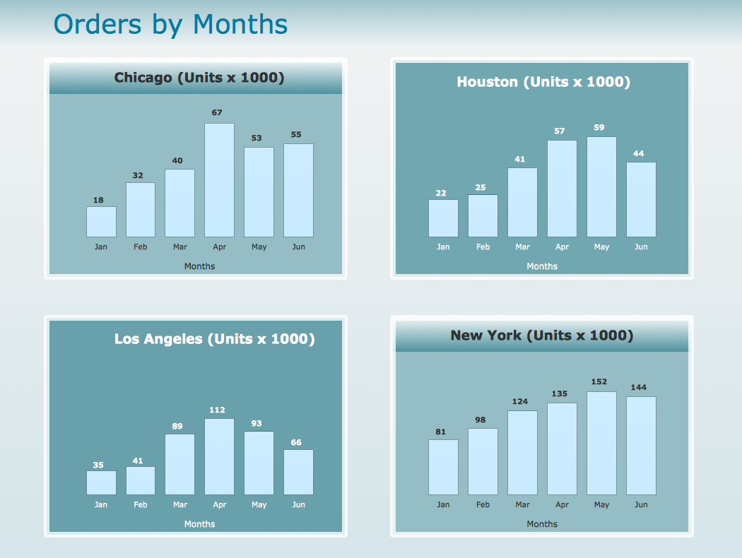
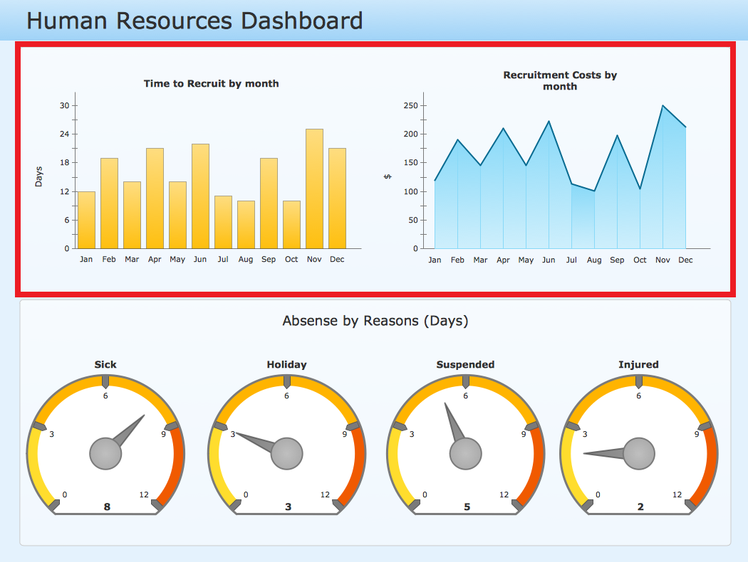
There are such pre-made examples of the Time Series Dashboards as “example 1: Time Series Dashboard — Orders by Months” and “Human Resources Dashboard” that can be useful for creating the unique-looking drawings based on the existing ones.
Being created in the ConceptDraw DIAGRAM application by using the Time Series Dashboard solution, the previously mentioned templates demonstrate this solution's capabilities as well as the results any ConceptDraw DIAGRAM user can achieve by using this particular solution.
The “Orders by Months” performance dashboard contains both horizontal and vertical bar charts as well as two line charts that can be changed any time needed. The mentioned charts show orders per month in four cities. All the charts within these dashboards get changed automatically every time the data source changes.
The Time Series Dashboard solution can be helpful in completing different tasks by the Human Resources managers, the project managers and other managers who care for their business as well as for the result they get after purchasing the right tools.-
Install this solution Free -
What I need to get started -
Solution Requirements - This solution requires the following products to be installed:
ConceptDraw DIAGRAM v18 - This solution requires the following products to be installed:
-
Compatibility - Sonoma (14), Sonoma (15)
MS Windows 10, 11 - Sonoma (14), Sonoma (15)
-
Support for this Solution -
Helpdesk
Related News:
Examples
The samples you see on this page were obtained by connecting a sample data source to templates from the Time Series Dashboard solution, to demonstrate some of the solution's capabilities and the results you can achieve.
These documents are vector graphic documents, created in ConceptDraw DIAGRAM using ConceptDraw Live Objects technology. They are available for modifying, reviewing and/or converting to many different formats, such as MS PowerPoint, PDF file, MS Visio, and many other graphic ones from the ConceptDraw Solution Park or ConceptDraw STORE. The Time Series Dashboard solution is available to all ConceptDraw DIAGRAM users to get installed and used while working in the ConceptDraw DIAGRAM diagramming and drawing software.
You can download sample data sources for all dashboards to see how changes made to data effect dashboard appearance.
Example 1: Time Series Dashboard — Orders by Months
This sample was created in ConceptDraw DIAGRAM using the Time Series Dashboard solution, and demonstrates the solution's capabilities and the results you can achieve using this solution. All the charts on this page change automatically when the data source changes.
This performance dashboard contains the vertical and horizontal bar charts and two line charts. The charts show orders per month in four cities.

More Examples and Templates
What I need to get started
Both ConceptDraw DIAGRAM diagramming and drawing software and the Time Series Dashboard solution can help creating the visual dashboard you need. The Time Series Dashboard solution can be found in the Dashboards area of ConceptDraw STORE application that can be downloaded from this site. Make sure that both ConceptDraw DIAGRAM and ConceptDraw STORE applications are installed on your computer before you get started.
How to install
After ConceptDraw STORE and ConceptDraw DIAGRAM are downloaded and installed, you can install the Time Series Dashboard solution from the ConceptDraw STORE.

Start using
To make sure that you are doing it all right, use the pre-designed symbols from the stencil libraries from the solution to make your drawings look smart and professional. Also, the pre-made examples from this solution can be used as drafts so your own drawings can be based on them. Using the samples, you can always change their structures, colors and data.

What is Time Series Dashboard?
|
Why use it?
Each Time Series Chart displays your source data to visually communicate Time Series Comparison.
You can include Time Series Charts in your business or technical dashboards to show how items change over time.
Time Series Comparison
Time Series Comparison show you changes of a trend over timeperiods.
«We’re <…> interested <…> in how they change over time, whether the trend over weeks, months, quarters, or years is increasing, decreasing, fluctuating, or remaining constant.
Gene Zelazny
<…>
Clues to look for in your message are words like change, grow, rise, decline, increase, decrease, fluctuate.»
Say It With Charts: The Executive's Guide to Visual Communication
4th Edition
McGraw-Hill | 2001. P. 22.
What chart should you use?
- Use the Column Chart for few data points, and use the Line Chart when you have many
- Use Line Charts or Area Charts to detect trends and patterns, not to show exact values
- Use Traffic Light (Racetrack Light) when the relative position of lights has its own meaning; otherwise use the Alert to save you dashboard space
- Use Bar Charts and Scatter Charts to compare specific values of your categories
The libraries of Time Series Charts consist of Live Objects, the special shapes that can change their appearance depending on the external data.