HelpDesk
How to Draw a Pie Chart

Pie Chart Word Template. Pie Chart Examples

 Pie Charts
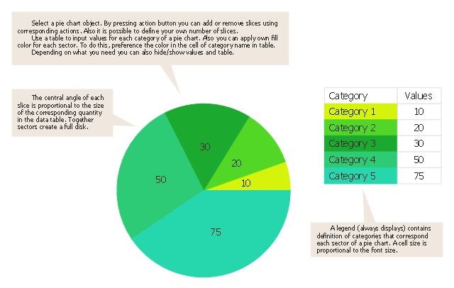
Pie Charts are extensively used in statistics and business for explaining data and work results, in mass media for comparison (i.e. to visualize the percentage for the parts of one total), and in many other fields. The Pie Charts solution for ConceptDraw DIAGRAM offers powerful drawing tools, varied templates, samples, and a library of vector stencils for simple construction and design of Pie Charts, Donut Chart, and Pie Graph Worksheets.
Business Report Pie. Pie Chart Examples

Pie Chart Software

ConceptDraw DIAGRAM software with Pie Charts solution helps to create pie and donut charts for effective displaying proportions in statistics, business and mass media for composition comparison, i.e. for visualization of part percentage inside one total.
HelpDesk
How to Draw the Different Types of Pie Charts

Chart Maker for Presentations

 Basic Pie Charts
This solution extends the capabilities of ConceptDraw DIAGRAM (or later) with templates, samples, and a library of vector stencils for drawing pie and donut charts.
Pie Donut Chart. Pie Chart Examples

The Pie Donut Chart visualizes the percentage of parts of the whole and looks like as a ring divided into sectors. Pie Donut Charts are widely used in the business, statistics, analytics, mass media.
Pie Chart

Pie Chart Examples and Templates

Pie chart examples and templates created using ConceptDraw DIAGRAM software helps you get closer with pie charts and find pie chart examples suite your needs.
How to Create a Pie Chart

Percentage Pie Chart. Pie Chart Examples

This sample shows the Pie Chart of the approximate air composition. You can see the percentage of oxygen, nitrogen and other gases in the air visualized on this Pie Chart.
"Time management is the .. process of planning and exercising conscious control over the amount of time spent on specific activities, especially to increase effectiveness, efficiency or productivity. Time management may be aided by a range of skills, tools, and techniques used to manage time when accomplishing specific tasks, projects, and goals complying with a due date. Initially, time management referred to just business or work activities, but eventually the term broadened to include personal activities as well. A time management system is a designed combination of processes, tools, techniques, and methods. Time management is usually a necessity in any project development as it determines the project completion time and scope." [Time management. Wikipedia]
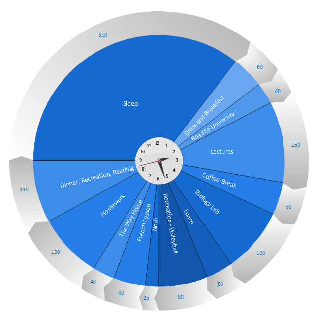
This timetable pie chart shows the plan of daily actions and its durations in minutes.
It is useful visual tool of personal time management.
This schedule pie chart example was created using the ConceptDraw PRO diagramming and vector drawing software extended with the Target and Circular Diagrams solution from the Marketing area of ConceptDraw Solution Park.
www.conceptdraw.com/ solution-park/ marketing-target-and-circular-diagrams
Daily activities pie chart
Donut Chart Templates

All these donut chart templates are included in the Pie Charts solution.
You can quickly rework these examples into your own charts by simply changing displayed data, title and legend texts.
Create Graphs and Charts

Rainfall Bar Chart

This sample was created in ConceptDraw DIAGRAM diagramming and vector drawing software using the Bar Graphs Solution from the Graphs and Charts area of ConceptDraw Solution Park.
Pie Graph Worksheets

Use this pie chart template in the ConceptDraw PRO diagramming and vector drawing software to add pie charts to your business documents, websites, presentation slides and infographics.
"An obvious flaw exhibited by pie charts is that they cannot show more than a few values without separating the visual encoding (the “slices”) from the data they represent (typically percentages). When slices become too small, pie charts have to rely on colors, textures or arrows so the reader can understand them. This makes them unsuitable for use with larger amounts of data. Pie charts also take up a larger amount of space on the page compared to the more flexible alternative of bar charts, which do not need to have separate legends, and can also display other values such as averages or targets at the same time.
Statisticians generally regard pie charts as a poor method of displaying information, and they are uncommon in scientific literature. One reason is that it is more difficult for comparisons to be made between the size of items in a chart when area is used instead of length and when different items are shown as different shapes.
Further, in research performed at AT&T Bell Laboratories, it was shown that comparison by angle was less accurate than comparison by length. This can be illustrated with the diagram to the right, showing three pie charts, and, below each of them, the corresponding bar chart representing the same data. Most subjects have difficulty ordering the slices in the pie chart by size; when the bar chart is used the comparison is much easier. Similarly, comparisons between data sets are easier using the bar chart. However, if the goal is to compare a given category (a slice of the pie) with the total (the whole pie) in a single chart and the multiple is close to 25 or 50 percent, then a pie chart can often be more effective than a bar graph." [Pie chart. Wikipedia]
The template "Pie chart" is included in the Pie Charts solution of the Graphs and Charts area in ConceptDraw Solution Park.
Circle chart
- Atmosphere air composition | Percentage Pie Chart . Pie Chart ...
- Schedule pie chart - Daily action plan | Chart Maker for ...
- Percentage Pie Chart . Pie Chart Examples | Atmosphere air ...
- How to Draw the Different Types of Pie Charts | Pie Chart Examples ...
- How to Draw the Different Types of Pie Charts | Visio Charting ...
- Business Report Pie. Pie Chart Examples | Example of ...
- New Basic Pie Charts Solution for ConceptDraw PRO
- Schedule pie chart - Daily action plan | How to Draw a Pie Chart ...
- Examples of Flowcharts, Org Charts and More | How to Draw a Pie ...
- Pie Donut Chart. Pie Chart Examples | Donut Chart | Donut Chart ...
- Competitor Analysis | Pie Donut Chart. Pie Chart Examples | Pie ...
- Pie Chart Of Human Resources
- Schedule pie chart - Daily action plan | Target and Circular ...
- Schedule pie chart - Daily action plan | Pie Charts | Time ...
- Chart Maker for Presentations | Percentage Pie Chart . Pie Chart ...
- How to Draw the Different Types of Pie Charts | Circular arrows ...
- Pie Chart Examples and Templates | Schedule pie chart - Daily ...
- Pie Charts | Prepare A Bar Chart And Pie Chart For Analysis Of ...
- Percentage Pie Chart . Pie Chart Examples
- Picture Graphs | Draw A Pie Chart To Represent The Gases That ...
- ERD | Entity Relationship Diagrams, ERD Software for Mac and Win
- Flowchart | Basic Flowchart Symbols and Meaning
- Flowchart | Flowchart Design - Symbols, Shapes, Stencils and Icons
- Flowchart | Flow Chart Symbols
- Electrical | Electrical Drawing - Wiring and Circuits Schematics
- Flowchart | Common Flowchart Symbols
- Flowchart | Common Flowchart Symbols