Donut Chart Templates
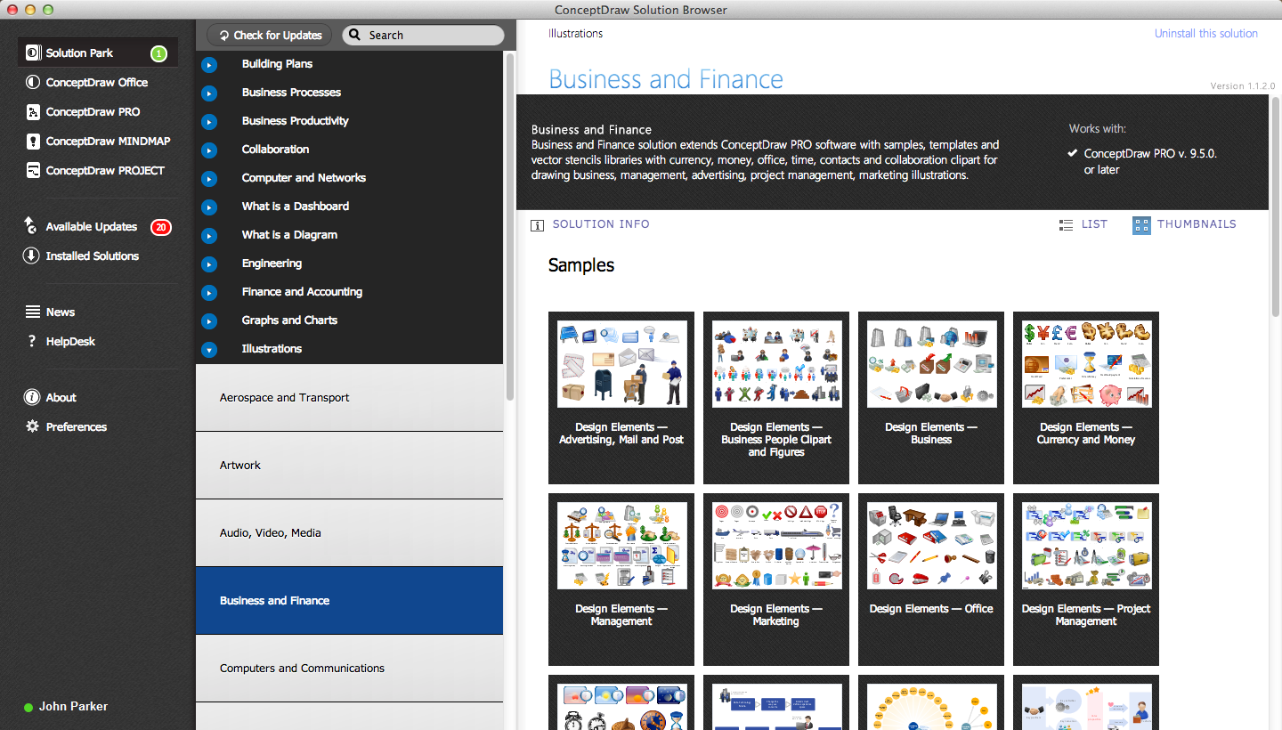
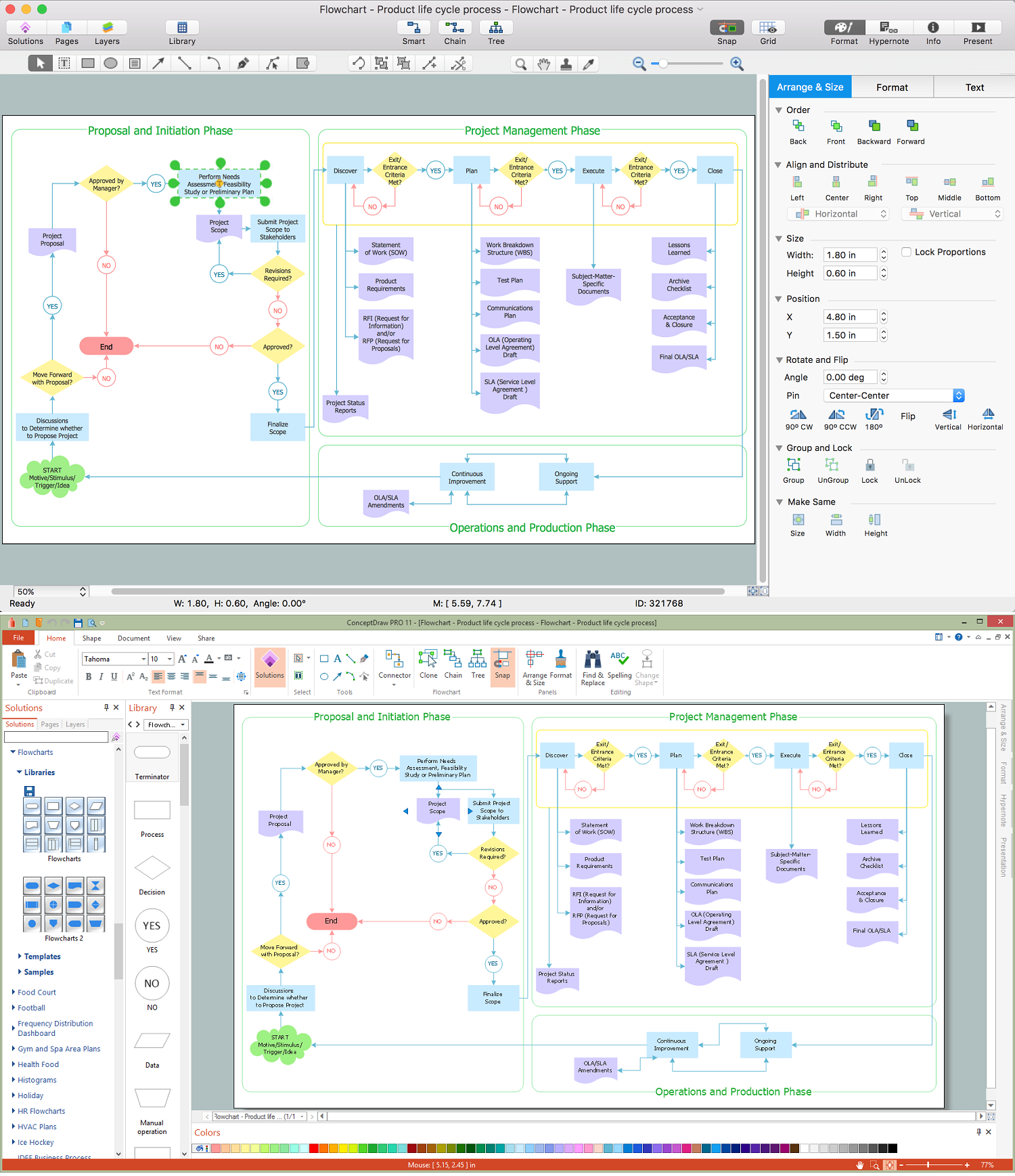
There are lots of charts, flowcharts, graphs, diagrams, maps and schemes keep being created with the help of ConceptDraw DIAGRAM diagramming and drawing software every day, including the donut charts. Having the mentioned application means a lot nowadays as it is one of the best professional tools for making smart and simply good looking charts, such as donut charts.
Any chart can also be known as “graph” or “diagram”. Chart is simply a diagrammatical illustration of some particular set of data, which can be placed on your presentation or in other business documentation among your articles. Having at least a couple of charts as part of your presentation means a lot for those who are intended to be seeing it as looking at the illustration is always more convenient in order to understand some complex data rather than trying to get what the text tells you.
Any table can be also called as “chart” or a “graph”, being similar to each other and sometimes even being considered the same. All the charts are meant to be accurately inserted in the documentation, conveying the information in an efficient way. Being viewable at the different computer screen resolutions, charts are expected to be aesthetically pleasing.
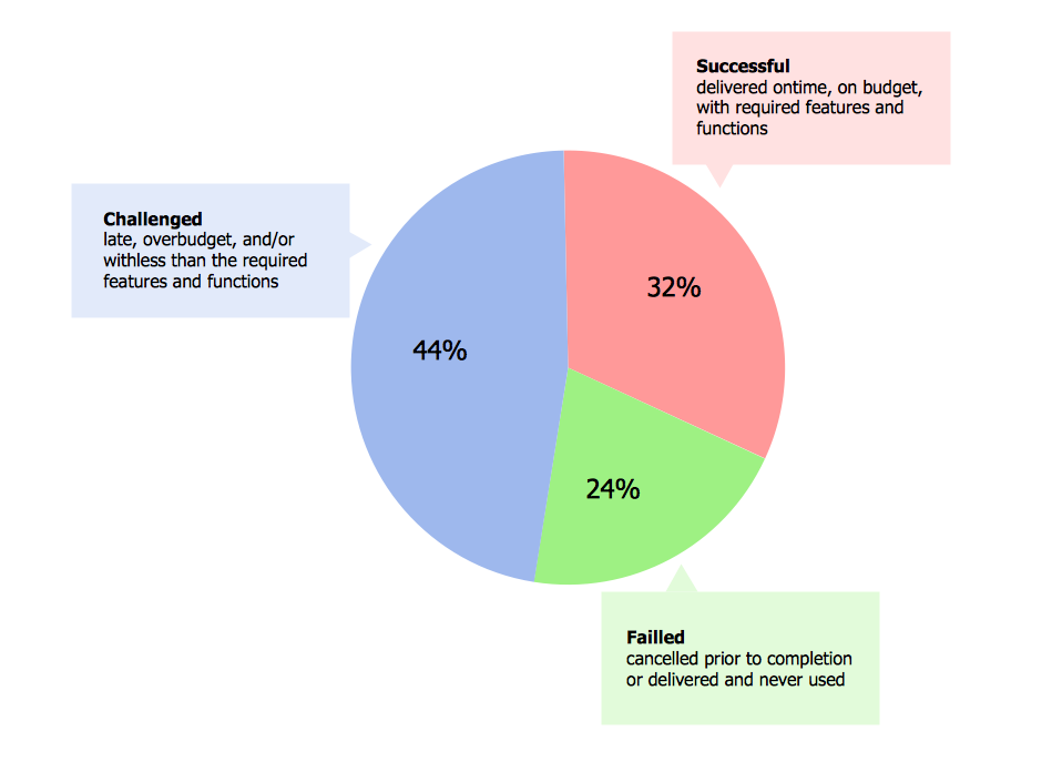
There are many types of the graphs (also sometimes called as “charts” or as “diagrams”). One of the most commonly used ones is a pie chart. A pie chart, in its turn, can be known as a “circle chart”, being a circular statistical graphic divided into different slices, usually coloured in the different colours. Donut charts are same as pie charts, apart from one special feature — they have a “hole” in the middle, so that they look like the donuts. All the donut charts as well as the pie ones are used for illustrating any needed numerical proportion.
In any created pie chart, the arc length of each of the slices is known to be proportional to the quantity which it is meant to be representing. Pie charts are named for its resemblance to the sliced pies. There are many variations on the way it can be presented, one of which is a variation of a pie chart having a hole in its middle. Being very widely as well as commonly used in the business world applied in different fields of business activity, including their usage by the mass media, pie charts, same as donut charts, are very convenient in understanding the information illustrated with the help of them.
The best way to compare the value of the different parts of data is to create a donut chart mentioning all the needed entities on it. Being replaced in most cases by other plots such as the bar charts, dot plots or box plots, donut charts are still one of the leaders among other kinds of drawing.
Being one of the alternatives of the pie chart, the donut chart is the one having a blank centre mentioned before in this article. The described centre is used for allowing some additional information about the given data to be included so there is more space for the text left. Such type of a circular graph can support different statistics at once, providing a better data intensity ratio to the standard pie charts — those, without the blank centres in the middle.
It is important to remember that to make a nice looking donut chart or a pie chart it is better to use different colours. Thus, having many different colours for each of the slices simplifies the understanding of those elements of data being different and so helps visually separate them. It needs to be done for a reason of such situation when the slices become too small and so the donut charts can rely upon their colours in explaining the different between its parts, of “slices”.
Making donut charts you can always also use different textures and arrows so the reader can understand the information better, making the drawings unsuitable for use with larger amounts of data. Although donut charts take up a larger amount of space on the page to compare to the other charts, such as more flexible bar ones, donut charts look very nice in the presentations, making them more colourful and so “alive”.
To compare to the bar charts, which do not need to have separate legends, donut charts are known to be more of a challenge to create, but with the aid of them you can display many different values such as targets or averages at the same time. So, it is always worth having enough patience to complete the already started drawing. But any time you have a need of making such charts, you can always use the pre-made tools provided by CS Odessa in a way of solutions, which were developed especially for a reason of simplifying the process of making such drawing.
In case the goal is to compare a given category in a way of a slice of the pie within a single chart, then a donut chart can often be much more effective and better for understanding to compare to other charts and graphs, such as a bar one. Being one of the most widely and commonly used types of chart, donut chart is very popular for a reason of having its sectors representing different elements and parts of data, showing the different proportions, placed with the different angles.
If you have some data, which has to be divided into the groups to show that it is separated into the different categories, then this data can always be represented in a way of a donut chart with the aid of ConceptDraw DIAGRAM diagramming and drawing software. Having your great looking chart done, it becomes obvious to see if one sector within the drawing is smaller or bigger than another and so to see which of its sectors prevail.
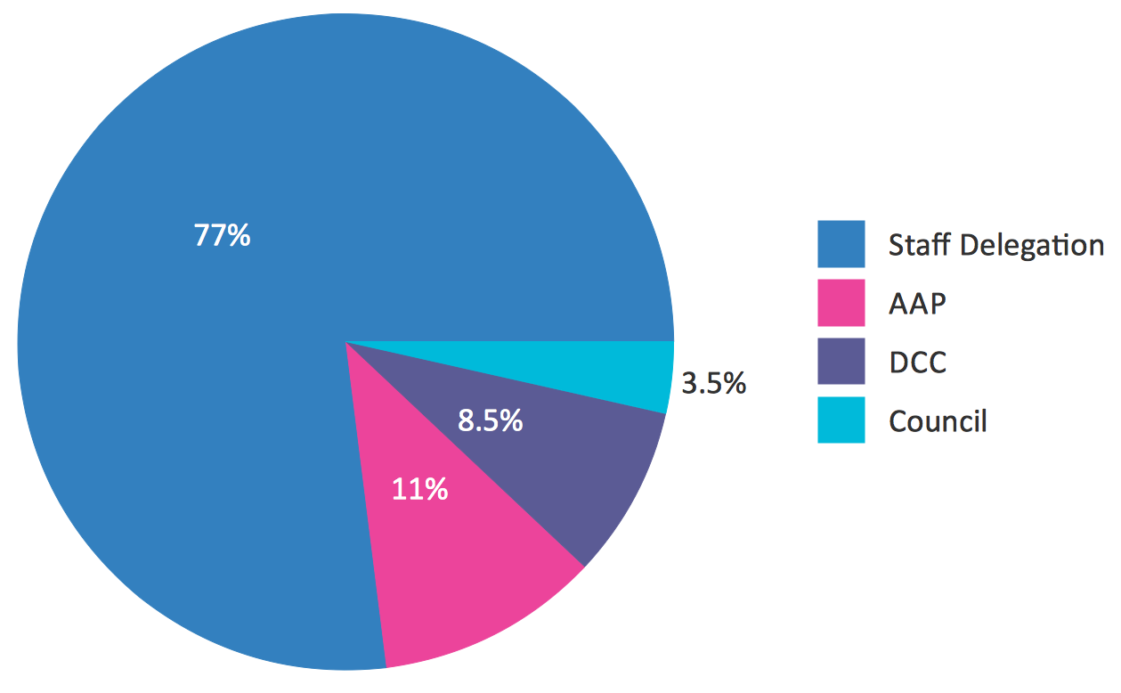
 Pie Chart
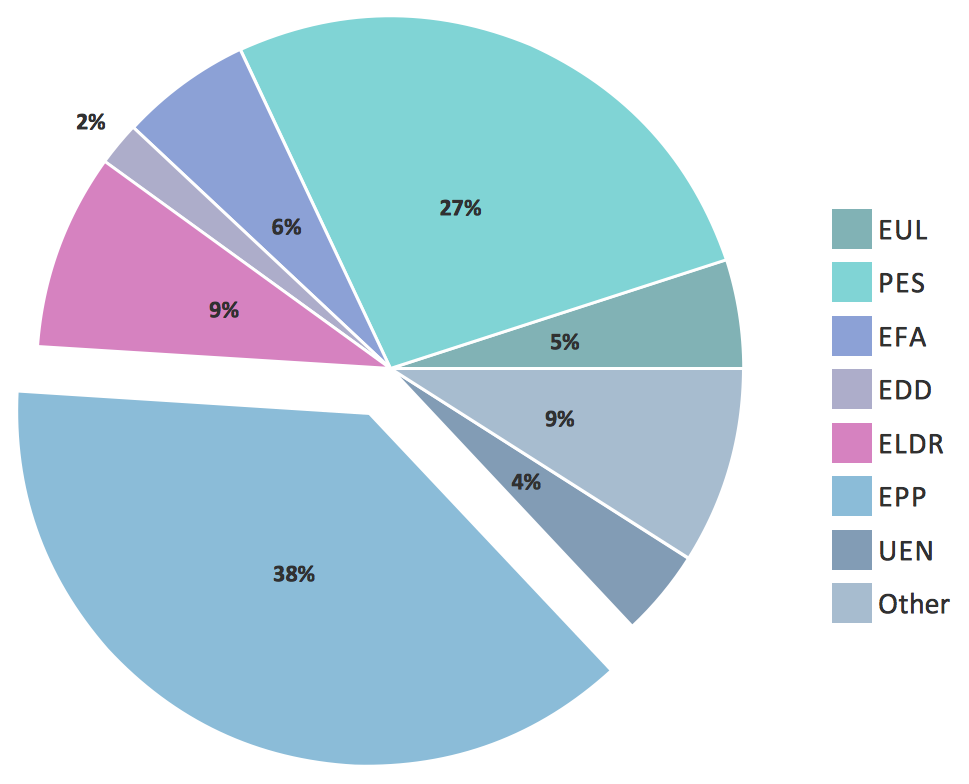 Exploded Pie Chart
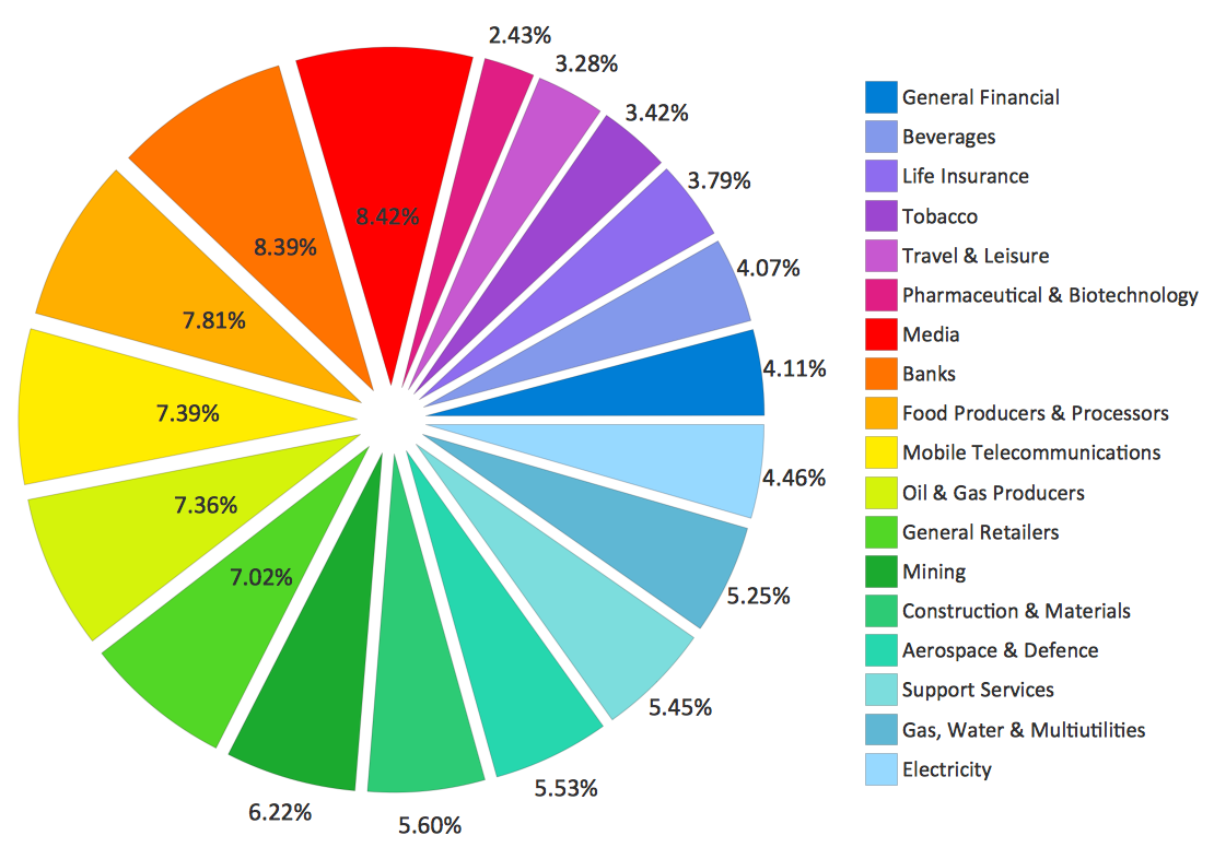
 Percentage Pie Chart
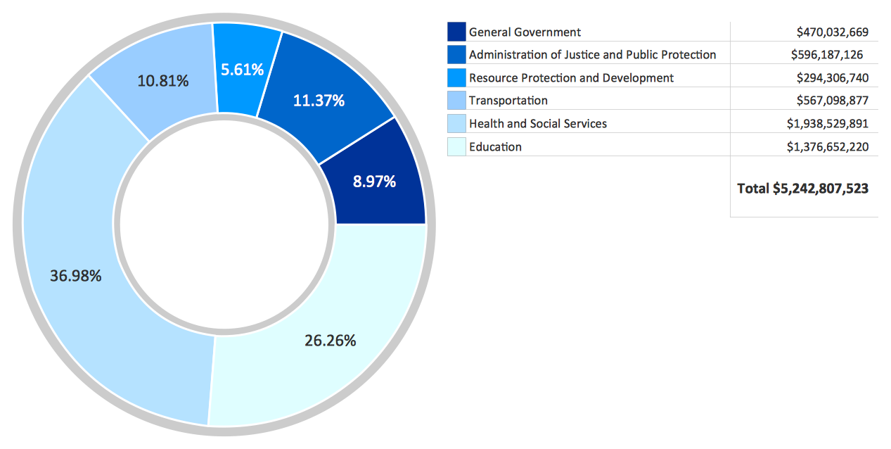 Donut Chart
 Percentage Pie Chart