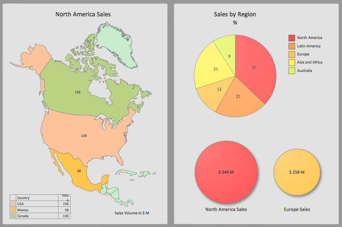
Made with
ConceptDraw
DIAGRAM 17

Bar Graph

Having Bar Graphs solution downloaded from ConceptDraw STORE software — a new product of CS Odessa — can simplify your work with creating any needed bar graphs, as it can provide all ConceptDraw DIAGRAM users with the necessary tools for making great looking drawings: graphic elements to use, pre-made templates of the bar charts, etc.

“Bar graph” and “bar chart” are known to be identical terms, used for explaining and describing such drawings where everyone can present the categorical data with the usage of the rectangular bars, where their heights or lengths are proportional to the values they are representing. The bars can be plotted either horizontally or vertically, but any vertical bar chart is also sometimes known to be called as a “line graph”, instead of “bar graph”.

Any bar graph can show the comparisons among some particular discrete categories. One axis of the chart is known to be showing the specific categories which are being compared. At the same time, the other axis can represent some measured value that has to be illustrated. Some of the bar graphs are known to be presenting the bars which are clustered in groups of more than one. Such graphs are used for showing the values of some measured variable, which is not only one, but more than one. The usage of the bar graphs is known to be worldwide. They seem to be one of the most commonly used graphs, with the help of which it becomes much simpler to show how one.

The term "graph" can be replaced with another one — “chart”, especially describing the bar graphs, which are also known as simply “bar charts”. The mentioned term is known to be having many different meanings. For example, a “data chart” is another of the numerous types of graphs, apart from bar one, used for making it simpler to arrange as well as to represent any qualitative and/or numerical data. Sometimes maps also consist a lot of different information, depending on the specific purpose. Maps can also be called as “charts”: for instance, “nautical” or “aeronautical” ones.

Charts or graphs in general are used for making it much simpler to understand some large quantities of data. It helps illustrate such data in a way of representing the relationships between a few different parts of the same data. Graphs or charts can be understood more quickly as well as more easily to compare to the raw data mentioned in a way of text, for example. In most of the cases, charts/graphs are used in lots of different fields of business activities so everyone can create them either by hand or using a computer. With ConceptDraw DIAGRAM diagramming and drawing software downloaded from this site as well as Bar Graphs Solution (from the ConceptDraw STORE) you can simplify your task of making a great looking as well as professionally looking bar graphs and bar charts within only a few minutes.

Bar Graph *

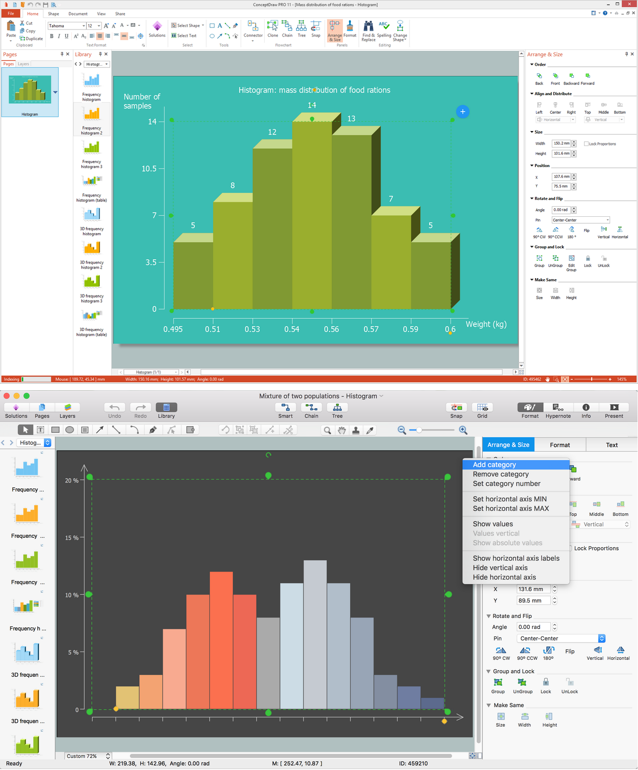
Example 1. Bar Graph in ConceptDraw DIAGRAM

Thinking about what exactly to use for representing your data, you can always consider at least one type of charts, such as bar one, for example. Depending on the specification of your data, you can always use any solution available for all the ConceptDraw DIAGRAM users in ConceptDraw STORE to illustrate the needed information. Some of the types of the charts can be more useful in some definite case comparing them to the others. Each of the charts can represent a large amount of data in many different forms, but still leaving some common features, providing those graphs with their ability to extract the needed meaning. Almost any kind of data can be always represented in a graphical form, simplifying its understanding.

With the aid of using the bar graphs it becomes much more clear what the comparison is all about for those who are meant to be seeing that chart. Generally, it is known to be easier for people to infer any meaning from such illustrations, as some meanings are usually more difficult to get from the boring text with no images or obvious structure. It is good that there are many types of charts to choose from. Any of the can be used for your data representation and all of them can be found within our solutions. Thus, being a chart or graph, that presents the grouped data in a way of using the so-called “bars” (shapes of rectangles), bar charts can be completed within a short period of time while working in ConceptDraw DIAGRAM using the Bar Graphs solution.

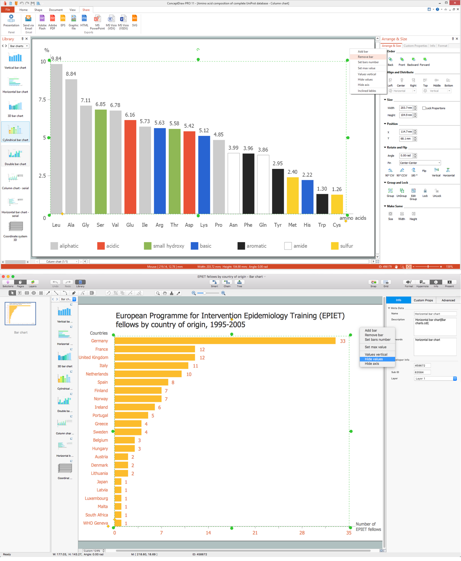
The lengths of the bar charts are known to be proportional to the values they represent and the bars - plotted in a vertical or horizontal way. The so-called “vertical bar charts” (also known as “Line graphs”) can be also always created with the help of ConceptDraw DIAGRAM diagramming and drawing software, using the needed solution for simplifying the work of drawing it. You can always use the bar graphs for more complex comparisons of data making the grouped bar graphs and/or the stacked bar graphs. The grouped bar chart is known to be having two or more than two bars within it used for each of the categorical groups.

Bar Graph - Global competitiveness index infrastructure score

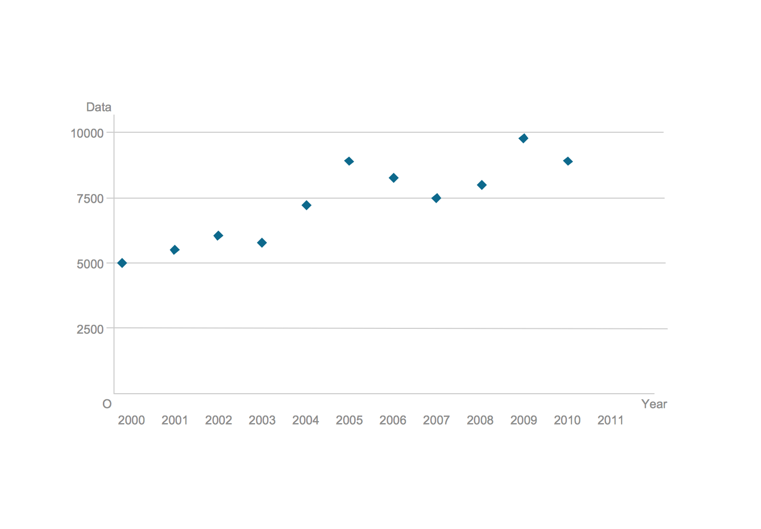
Example 2. Bar Graph — Global competitiveness index infrastructure score

The mentioned vertical bar chart is usually made as a colour-coded one so it is easier to represent some particular grouping. For instance, having a retailing business with two supermarkets involved, you can make a grouped bar chart using different colours for your “bars” within the chart for representing each of them — the data about its income, growth in customers, etc. Thus, the horizontal axis within such chart can show the years and the vertical axis can show your revenue. A stacked bar chart can also be used for representing different groups of goods which are popular with the customers, for example. You can also make a grouped bar graph for representing the information in the same order in each of the groupings.

To get the needed great looking result within only a few minutes, having all of the necessary tools available for your use, you can always get the mentioned “Bar Graphs solution” that provides all of the needed templates and samples of the pre-made graphs and charts, as well as a library full of vector stencils for quick and simple drawing of bar and column charts/graphs.


TEN RELATED HOW TO's:
This sample was created in ConceptDraw DIAGRAM diagramming and vector drawing software using the UML Sequence Diagram library of the Rapid UML Solution from the Software Development area of ConceptDraw Solution Park. This sample shows the interactions of the customer with the system and is used at the registration on the sites.UML Sequence Diagram Example. SVG Vectored UML Diagrams Tools *
Picture: UML Sequence Diagram Example. SVG Vectored UML Diagrams Tools
Related Solution:
Any histogram is known to be an accurate representation of the distribution of numerical data. Being an estimate of the probability distribution of a continuous variable, the histogram was first introduced by Karl Pearson as a kind of a bar graph. To make a histogram, you need to divide the range of values into a series of intervals and then to count how many of the values fall into each of the intervals.Histogram *
Picture: Histogram
Related Solution:
The Pie Chart visualizes the data as the proportional parts of a whole and looks like a disk divided into sectors. The pie chart is type of graph, pie chart looks as circle devided into sectors. Pie Charts are widely used in the business, statistics, analytics, mass media. It’s very effective way of displaying relative sizes of parts, the proportion of the whole thing.Pie Chart Word Template. <br>Pie Chart Examples *
Picture: Pie Chart Word Template. Pie Chart Examples
Related Solution:
How do you make a histogram usually? Drawing of histogram is quite complex and lengthy process. Usually you have a set of data and you draw free-hand your diagram according to these data. But now thanks to the ConceptDraw DIAGRAM diagramming and vector drawing software extended with Histograms solution from the Graphs and Charts Area of ConceptDraw Solution Park this process became simple and fast.How Do You Make a Histogram? *
Picture: How Do You Make a Histogram?
Related Solution:
This sample was created in ConceptDraw DIAGRAM diagramming and vector drawing software using the Line Graphs Solution from Graphs and Charts area of ConceptDraw Solution Park. This sample shows the Line Chart of annual percentage change. The Line Chart allows you to clearly see the changes of data over the time.Line Chart Template for Word *
Picture: Line Chart Template for Word
Related Solution:
The Affinity Diagram shows the structure of large, complex factors that have an influence on a problem, and then divides them up into a smaller and simpler structure. The Affinity Diagram does not show a causal relationship between the factors. This diagram is designed to prepare the data for further analysis of the cause-effect relationships. A typical size for an Affinity Diagram is approximately 40-50 topics in a chart.Affinity Diagram *
Picture: Affinity Diagram
Related Solution:
Sometimes it's difficult to find a path in work processes or to understand the requirements, especially when you are a newcomer. To get your thoughts straight, create a workflow diagram, and put everything on it. This will not only help you to get into the workflow, but also show it’s weaknesses. This illustration captures the workflow process of payment an invoice for the electricity consumed by certain enterprise. It was drawn in ConceptDraw DIAGRAM using its solution for Workflow Diagrams. Making a workflow charts means that you need to depict consistently all processes engaged to the workflow process. Then, you should connect them with symbols meaning study and analysis. Next, add symbols of decisions. A work flow diagram made precisely and correctly can help to clarify your work flow to any person.Workflow Diagram *
Picture: Workflow Diagram
Related Solution:
When trying to figure out the nature of the problems occurring within a project, there are many ways to develop such understanding. One of the most common ways to document processes for further improvement is to draw a process flowchart, which depicts the activities of the process arranged in sequential order — this is business process management. ConceptDraw DIAGRAM is business process mapping software with impressive range of productivity features for business process management and classic project management. This business process management software is helpful for many purposes from different payment processes, or manufacturing processes to chemical processes. Business process mapping flowcharts helps clarify the actual workflow of different people engaged in the same process. This samples were made with ConceptDraw DIAGRAM — business process mapping software for flowcharting and used as classic visio alternative because its briefly named "visio for mac" and for windows, this sort of software named the business process management tools. This flowchart diagram shows a process flow of project management. The diagram that is presented here depicts the project life cycle that is basic for the most of project management methods. Breaking a project into phases allows to track it in the proper manner. Through separation on phases, the total workflow of a project is divided into some foreseeable components, thus making it easier to follow the project status. A project life cycle commonly includes: initiation, definition, design, development and implementation phases. Distinguished method to show parallel and interdependent processes, as well as project life cycle relationships. A flowchart diagram is often used as visual guide to project. For instance, it used by marketing project management software for visualizing stages of marketing activities or as project management workflow tools. Created with ConceptDraw DIAGRAM — business process mapping software which is flowcharting visio alternative or shortly its visio for mac, this sort of software platform often named the business process management tools.Process Flowchart
Picture: Process Flowchart
Related Solution:
Any information system receives data flows from external sources. In order to visualize them there is a list of data flow diagram symbols that describes how the system components cooperate. If you want to create a data flow diagram, ConceptDraw DIAGRAM Solution Park has DFD Library that contains both Yourdon and Gane-Sarson notations. This figure shows the content of vector libraries, delivered with ConceptDraw solution for data flow diagram (DFD). There are three libraries composed from about 50 vector objects used to make data flow diagrams. They include a complete set of objects utilized by Yourdon-Coad and Gane-Sarson notations - two primary notations that are apply for data flow diagramming. Also, one can discover additional "Data flow diagram (DFD)" library that provides a data flow diagram elements for designing level 1 and context-level data flow diagrams.Data Flow Diagram Symbols. DFD Library *
Picture: Data Flow Diagram Symbols. DFD Library
Related Solution:
ConceptDraw
DIAGRAM 17