HelpDesk
How to Draw the Different Types of Pie Charts
Percentage Pie Chart. Pie Chart Examples

Pie Chart Software

Pie Chart Examples and Templates

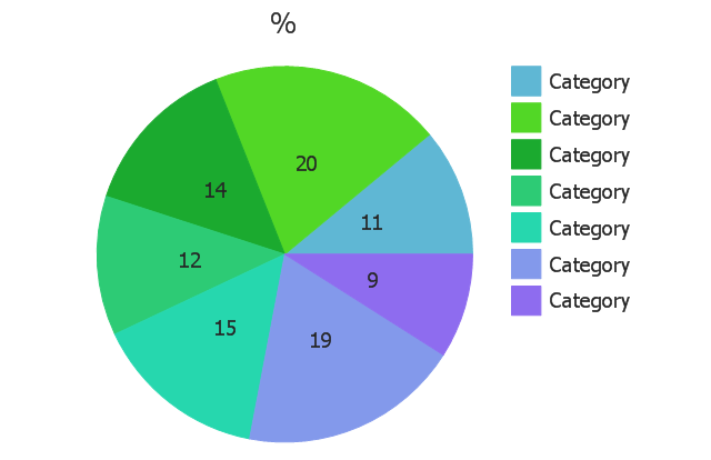
This pie chart sample shows the make up of the top one percent of United States wage earners, grouped by occupation. Data for this graph is sourced from the November 2010 report written by Jon Bakija, Adam Cole, and Bradley T. Heim titled "Jobs and Income Growth of Top Earners and the Causes of Changing Income Inequality: Evidence from U.S. Tax Return Data", column "2005" in table 2, titled "Percentage of primary taxpayers in top one percent of the distribution of income (excluding capital gains) that are in each occupation", on page 50.
This pie chart sample was redesigned from the Wikimedia Commons file: Percentage of the top 1% wage earners in the United States by occupation (pie chart).svg.
[commons.wikimedia.org/ wiki/ File:Percentage_ of_ the_ top_ 1%25_ wage_ earners_ in_ the_ United_ States_ by_ occupation_ (pie_ chart).svg]
This file is licensed under the Creative Commons Attribution-Share Alike 3.0 Unported license. [creativecommons.org/ licenses/ by-sa/ 3.0/ deed.en]
"The distribution of wealth is a comparison of the wealth of various members or groups in a society. It differs from the distribution of income in that it looks at the distribution of ownership of the assets in a society, rather than the current income of members of that society." [Distribution of wealth. Wikipedia]
The pie chart example "Percentage of the top 1% wage earners in the US by occupation" was created using the ConceptDraw PRO diagramming and vector drawing software extended with the Pie Charts solutiton of the Graphs and Charts area in ConceptDraw Solution Park.
Pie chart

Pie Graph Worksheets

Chart Templates

 Pie Charts
Pie Charts are extensively used in statistics and business for explaining data and work results, in mass media for comparison (i.e. to visualize the percentage for the parts of one total), and in many other fields. The Pie Charts solution for ConceptDraw PRO v10 offers powerful drawing tools, varied templates, samples, and a library of vector stencils for simple construction and design of Pie Charts, Donut Chart, and Pie Graph Worksheets.
The vector stencils library "Composition charts" contains 6 templates: 2 pie charts, 2 divided bar charts and 2 double divided bar charts.
The vector stencils library "Composition indicators" contains 6 templates of visual indicators.
Use these design elements to visualize composition comparison of your data in your visual dashboard created using the ConceptDraw PRO diagramming and vector drawing software.
"A pie chart (or a circle graph) is a circular chart divided into sectors, illustrating numerical proportion. In a pie chart, the arc length of each sector (and consequently its central angle and area), is proportional to the quantity it represents. While it is named for its resemblance to a pie which has been sliced, there are variations on the way it can be presented. ...
An obvious flaw exhibited by pie charts is that they cannot show more than a few values without separating the visual encoding (the “slices”) from the data they represent (typically percentages). When slices become too small, pie charts have to rely on colors, textures or arrows so the reader can understand them. This makes them unsuitable for use with larger amounts of data. Pie charts also take up a larger amount of space on the page compared to the more flexible alternative of bar charts, which do not need to have separate legends, and can also display other values such as averages or targets at the same time. ...
Most subjects have difficulty ordering the slices in the pie chart by size; when the bar chart is used the comparison is much easier. Similarly, comparisons between data sets are easier using the bar chart. However, if the goal is to compare a given category (a slice of the pie) with the total (the whole pie) in a single chart and the multiple is close to 25 or 50 percent, then a pie chart can often be more effective than a bar graph." [Pie chart. Wikipedia]
The example "Design elements - Composition charts and indicators" is included in the Composition Dashboard solution from the area "What is a Dashboard" of ConceptDraw Solution Park.
Composition charts and visual indicators

Chart Examples

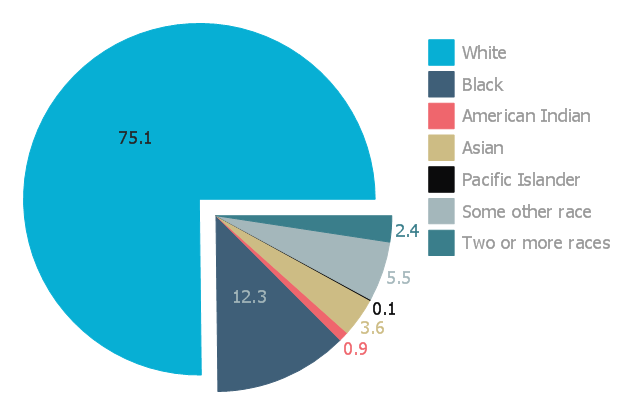
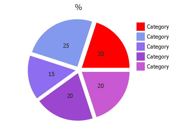
This exploded pie chart sample shows the racial make-up of the U.S. in 2000. It was designed on the base of the Wikimedia Commons file: Percentages of the us population by race - 2000.png.
[commons.wikimedia.org/ wiki/ File:Percentages_ of_ the_ us_ population_ by_ race_ -_ 2000.png]
"The United States Census Bureau defines White people as those having origins in any of the original peoples of Europe, the Middle East, or North Africa. It includes people who reported "White" or wrote in entries such as Irish, German, Italian, Lebanese, Near Easterner, Arab, or Polish. Whites constitute the majority of the U.S. population, with a total of about 245,532,000 or 77.7% of the population as of 2013. There are 62.6% Whites when Hispanics who describe themselves as "white" are taken out of the calculation. Despite major changes due to illegal and legal immigration since the 1960s and the higher birth-rates of nonwhites, the overall current majority of American citizens are still white, and English-speaking, though regional differences exist." [Demography of the United States. Wikipedia]
The exploded pie chart example "Percentages of the U.S. population by race" was created using the ConceptDraw PRO diagramming and vector drawing software extended with the Pie Charts solutiton of the Graphs and Charts area in ConceptDraw Solution Park.
Exploded pie chart
Use this exploded pie chart template in the ConceptDraw PRO diagramming and vector drawing software to visualize data as percentages of the whole, especially when small values are represented by narrow slices.
"A chart with one or more sectors separated from the rest of the disk is known as an exploded pie chart. This effect is used to either highlight a sector, or to highlight smaller segments of the chart with small proportions." [Pie chart. Wikipedia]
The template "Exploded pie chart" is included in the Pie Charts solution of the Graphs and Charts area in ConceptDraw Solution Park.
Circle chart
Percentage Spider Chart

Use this circle chart template to design your sector diagrams.
"A chart is a graphical representation of data, in which the data is represented by symbols, such as ... slices in a pie chart. ... Charts are often used to ease understanding ... the relationships between parts of the data. ... For example, data that presents percentages in different groups (such as "satisfied, not satisfied, unsure") are often displayed in a pie chart ... A pie chart shows percentage values as a slice of a pie." [Chart. Wikipedia]
The template "Sector diagram" for the ConceptDraw PRO diagramming and vector drawing software is included in the Pie Charts solution of the Graphs and Charts area in ConceptDraw Solution Park.
Circle chart
The vector stencils library "Pie charts" contains 30 templates of pie and donut (doughnut, ring) charts for visualizing percentage for parts of one total, or compare parts of few totals.
Drag a template from the library into your document and enter your data.
Use these shapes to draw your pie charts and donut charts in the ConceptDraw PRO diagramming and vector drawing software.
The vector stencils library "Pie charts" is included in the Pie Charts solution of the Graphs and Charts area in ConceptDraw Solution Park.
Pie chart (table)
-pie-charts---vector-stencils-library.png--diagram-flowchart-example.png)
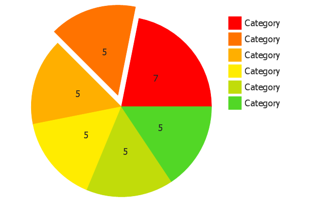
Pie chart
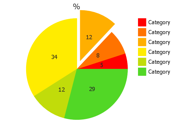
Percentage pie chart
Pie chart, control dots
Separated pie chart
Percentage separated pie chart
Pie chart with shifted slices
Percentage pie chart with shifted slices
Ring chart (table)
-pie-charts---vector-stencils-library.png--diagram-flowchart-example.png)
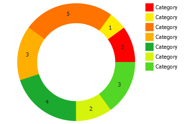
Ring chart
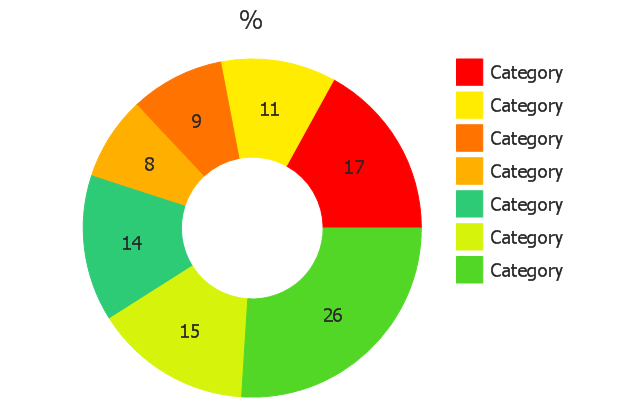
Percentage ring chart
Ring chart 2
Percentage ring chart 2
Ring chart, control dots
Arrow ring chart
Percentage arrow ring chart
Pie chart (light)
-pie-charts---vector-stencils-library.png--diagram-flowchart-example.png)
Percentage pie chart (light)
-pie-charts---vector-stencils-library.png--diagram-flowchart-example.png)
Pie chart (light), control dots
,-control-dots-pie-charts---vector-stencils-library.png--diagram-flowchart-example.png)
Separated pie chart (light)
-pie-charts---vector-stencils-library.png--diagram-flowchart-example.png)
Percentage separated pie chart (light)
-pie-charts---vector-stencils-library.png--diagram-flowchart-example.png)
Pie chart with shifted slices (light)
-pie-charts---vector-stencils-library.png--diagram-flowchart-example.png)
Percentage pie chart with shifted slices (light)
-pie-charts---vector-stencils-library.png--diagram-flowchart-example.png)
Ring chart (light)
-pie-charts---vector-stencils-library.png--diagram-flowchart-example.png)
Percentage ring chart (light)
-pie-charts---vector-stencils-library.png--diagram-flowchart-example.png)
Ring chart (light) 2
-2-pie-charts---vector-stencils-library.png--diagram-flowchart-example.png)
Percentage ring chart (light) 2
-2-pie-charts---vector-stencils-library.png--diagram-flowchart-example.png)
Ring chart (light), control dots
,-control-dots-pie-charts---vector-stencils-library.png--diagram-flowchart-example.png)
Arrow ring chart (light)
Percentage arrow ring chart (light)
- Percentage Pie Chart . Pie Chart Examples | Atmosphere air ...
- Percentages of the U.S. population by race | Pie Charts | Pyramid ...
- Atmosphere air composition | Percentage Pie Chart . Pie Chart ...
- Sector diagram - Template | Percentage Pie Chart . Pie Chart ...
- Draw A Pie Chart Showing Different Gases And Their Percentage In
- How to Draw the Different Types of Pie Charts | Percentage Pie ...
- Percentage Pie Chart . Pie Chart Examples | How to Draw the ...
- Chart Maker for Presentations | Percentage Pie Chart . Pie Chart ...
- Percentage Pie Chart . Pie Chart Examples | Exploded pie chart ...
- Percentage Pie Chart . Pie Chart Examples | Percentage of the top 1 ...
- Pie charts - Vector stencils library | Percentage Spider Chart | Data ...
- Percentage Pie Chart . Pie Chart Examples | Percentages of the U.S. ...
- How To Display Percentages In Pie Chart
- Chart Templates | Pie Charts | Chart Examples | Percentage Chart Png
- Pie Charts | Pie Chart Software | Percentage Pie Chart . Pie Chart ...
- Free Pie Chart Maker With Percentages
- Various Occupation Percentages In The US On A Pie Chart
- Chart Maker for Presentations | Business Report Pie. Pie Chart ...
- Top 1 Percent Pie Chart
- Data-driven charts - Vector stencils library | Pie Chart Software ...