Percentage Pie Chart. Pie Chart Examples

This pie chart sample shows the make up of the top one percent of United States wage earners, grouped by occupation. Data for this graph is sourced from the November 2010 report written by Jon Bakija, Adam Cole, and Bradley T. Heim titled "Jobs and Income Growth of Top Earners and the Causes of Changing Income Inequality: Evidence from U.S. Tax Return Data", column "2005" in table 2, titled "Percentage of primary taxpayers in top one percent of the distribution of income (excluding capital gains) that are in each occupation", on page 50.
This pie chart sample was redesigned from the Wikimedia Commons file: Percentage of the top 1% wage earners in the United States by occupation (pie chart).svg.
[commons.wikimedia.org/ wiki/ File:Percentage_ of_ the_ top_ 1%25_ wage_ earners_ in_ the_ United_ States_ by_ occupation_ (pie_ chart).svg]
This file is licensed under the Creative Commons Attribution-Share Alike 3.0 Unported license. [creativecommons.org/ licenses/ by-sa/ 3.0/ deed.en]
"The distribution of wealth is a comparison of the wealth of various members or groups in a society. It differs from the distribution of income in that it looks at the distribution of ownership of the assets in a society, rather than the current income of members of that society." [Distribution of wealth. Wikipedia]
The pie chart example "Percentage of the top 1% wage earners in the US by occupation" was created using the ConceptDraw PRO diagramming and vector drawing software extended with the Pie Charts solutiton of the Graphs and Charts area in ConceptDraw Solution Park.
Pie chart

HelpDesk
How to Draw the Different Types of Pie Charts
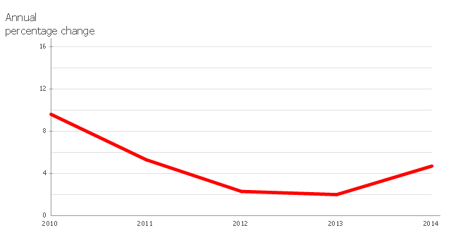
This line chart sample depicts data from the European Economic Forecast (EUROPEAN ECONOMY 1|2013, Economic and Financial Affairs Winter 2013, European Commission).
[ec.europa.eu/ economy_ finance/ publications/ european_ economy/ 2013/ pdf/ ee1_ en.pdf]
"Exports in France decreased to 36526 EUR Million in October of 2013 from 36637 EUR Million in September of 2013. Exports in France is reported by the Ministère de l'Économie et des Finances. Exports in France averaged 17102.29 EUR Million from 1970 until 2013, reaching an all time high of 37964 EUR Million in August of 2012 and a record low of 1165.60 EUR Million in May of 1970. France is one of the largest exporters of luxury goods and agricultural products in the world. France main exports are: aircrafts (10.1 percent of total exports), food (9.7 percent), chemicals (9.5 percent), industrial machinery (8.3 percent), iron and steel (7.9 percent), electronics (6.7 percent), motor vehicles (6.3 percent) and pharmaceuticals (6.1 percent). Trade outflows to Europe account for 70 percent of total exports. Main export partners are: Germany (16.6 percent of total exports), Italy (8.2 percent), Spain (7.3 percent), Belgium (7.2 percent), the United Kingdom (6.6 percent), the United States (5.6 percent), Netherlands and China. This page contains - France Exports - actual values, historical data, forecast, chart, statistics, economic calendar and news." [tradingeconomics.com/ france/ exports]
The line graph example "France exports of goods and services" was created using ConceptDraw PRO diagramming and vector drawing software extended with Line Graphs solution from Graphs and Charts area of ConceptDraw Solution Park.
Line chart
 Line Graphs
How to draw a Line Graph with ease? The Line Graphs solution extends the capabilities of ConceptDraw PRO v10 with professionally designed templates, samples, and a library of vector stencils for drawing perfect Line Graphs.
 Pie Charts
Pie Charts are extensively used in statistics and business for explaining data and work results, in mass media for comparison (i.e. to visualize the percentage for the parts of one total), and in many other fields. The Pie Charts solution for ConceptDraw PRO v10 offers powerful drawing tools, varied templates, samples, and a library of vector stencils for simple construction and design of Pie Charts, Donut Chart, and Pie Graph Worksheets.
 Area Charts
Area Charts are used to display the cumulative totals over time using numbers or percentages; or to show trends over time among related attributes. The Area Chart is effective when comparing two or more quantities. Each series of data is typically represented with a different color, the use of color transparency in an object’s transparency shows overlapped areas and smaller areas hidden behind larger areas.
Chart Examples

 Composition Dashboard
Composition dashboard solution extends ConceptDraw PRO software with templates, samples and vector stencils library with charts and indicators for drawing visual dashboards showing data composition.
Chart Templates

HelpDesk
What Information can be Displayed in the Multiproject Dashboard View

This example was created on the base of thematic map "Germany: Sugarbeets. Percent of total area by state" from the website of the U.S. Department of Agriculture. [usda.gov/ oce/ weather/ pubs/ Other/ MWCACP/ Graphs/ eur/ grmsugb.gif]
"Sugar beet, cultivated Beta vulgaris, is a plant whose root contains a high concentration of sucrose. It is grown commercially for sugar production.
In 2011, France, the United States, Germany, Russia, and Ukraine were the world's five largest sugar beet producers by mass, whilst by value Turkey takes the place of Ukraine. However, in 2010–2011, North America, Western Europe, and Eastern Europe did not produce enough sugar from sugar beets to meet overall demand for sugar, and were all net importers of sugar. ... In 2009, sugar beets accounted for 20% of the world's sugar production." [Sugar beet. Wikipedia]
The thematic map example "Germany crop areas map - Sugar beets" was designed using the ConceptDraw PRO software extended with the Map of Germany solution from the Maps area of ConceptDraw Solution Park.
Germany thematic map example

Line Chart Template for Word

 Divided Bar Diagrams
The Divided Bar Diagrams Solution extends the capabilities of ConceptDraw PRO v10 with templates, samples, and a library of vector stencils for drawing high impact and professional Divided Bar Diagrams and Graphs, Bar Diagram Math, and Stacked Graph.
Geo Map - Africa - Niger

- Percent Solution For Graph
- Percentage Bar Diagrams Solutions
- Percentage Pie Chart. Pie Chart Examples | Atmosphere air ...
- Pie Chart Examples and Templates | Percentage Pie Chart. Pie ...
- Atmosphere air composition | Percentage Pie Chart. Pie Chart ...
- Percent of students achieved a 36 on ACT | Percent of Students ...
- Percentage Pie Chart . Pie Chart Examples
- Sector diagram - Template | Percentage Pie Chart. Pie Chart ...
- Atmosphere air composition | Percentage Pie Chart. Pie Chart ...
- Percentage Vs Year Graph
- Percentage Pie Chart. Pie Chart Examples | How to Draw the ...
- Percent of Students achieved a 36 on ACT | Percentage of U.S. high ...
- Percentage Pie Chart. Pie Chart Examples | How to Draw the ...
- U.S. Population, percent change, 2010 to 2013 | Qfd Wikipedia
- How to Draw the Different Types of Pie Charts | Percentage Pie ...
- Chart Templates | Pie Charts | Chart Examples | Percentage Chart Png
- Think and act effectively | Percent of students achieved a 36 on ACT ...
- Percentage Pie Chart. Pie Chart Examples | Exploded pie chart ...
- HR symbols - Vector stencils library | Company's organizational ...