HelpDesk
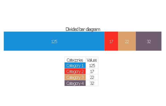
How to Draw a Divided Bar Chart in ConceptDraw PRO

Pie Chart Software

ConceptDraw PRO software with Pie Charts solution helps to create pie and donut charts for effective displaying proportions in statistics, business and mass media for composition comparison, i.e. for visualization of part percentage inside one total.
 Composition Dashboard
Composition dashboard solution extends ConceptDraw PRO software with templates, samples and vector stencils library with charts and indicators for drawing visual dashboards showing data composition.
Chart Examples

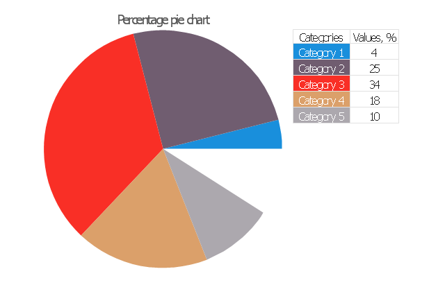
Percentage Pie Chart. Pie Chart Examples

This sample shows the Pie Chart of the approximate air composition. You can see the percentage of oxygen, nitrogen and other gases in the air visualized on this Pie Chart.
Chart Templates

Donut Chart Templates

All these donut chart templates are included in the Pie Charts solution.
You can quickly rework these examples into your own charts by simply changing displayed data, title and legend texts.
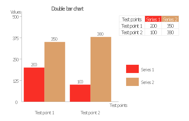
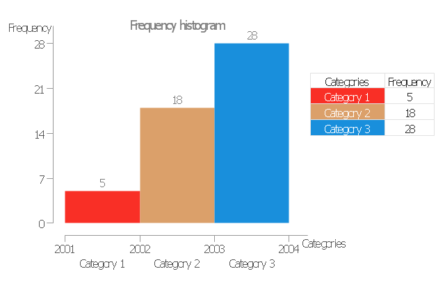
The vector stencils library "Data-driven charts" contains 13 data-driven graphs and charts: area chart, divided bar diagram, double bar graph, frequency histogram, horizontal bar chart, line graph, percentage ring chart, percentage pie chart, scatter plot, column chart, waterfall chart.
Use it to visualize quantitative data in your data-driven infographics.
The graphs example "Data-driven charts - Vector stencils library" was created using the ConceptDraw PRO diagramming and vector graphics software extended with the Data-driven Infographics solution from the area "What is infographics" of ConceptDraw Solution Park.
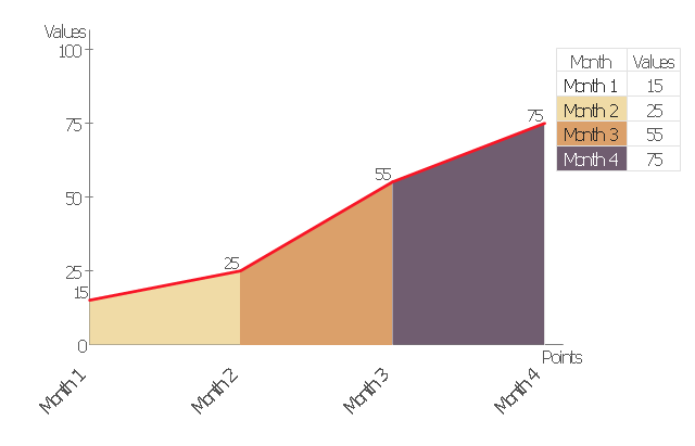
Area chart
Divided bar diagram
Double bar graph
Frequency histogram
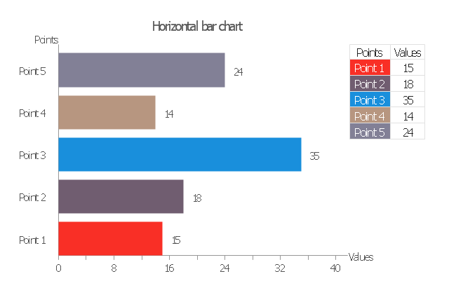
Horizontal bar graph
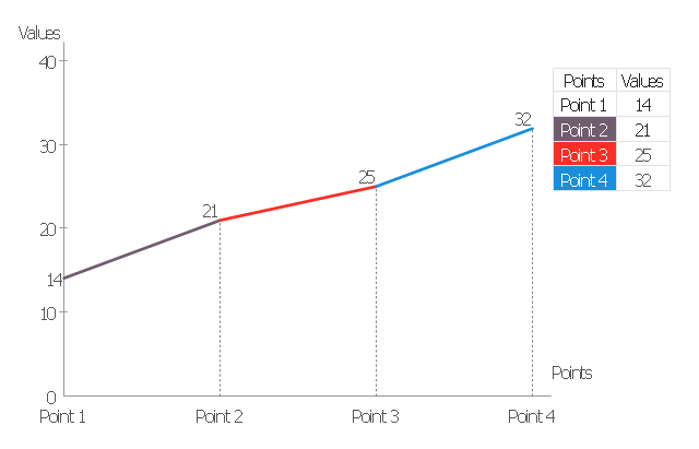
Line graph
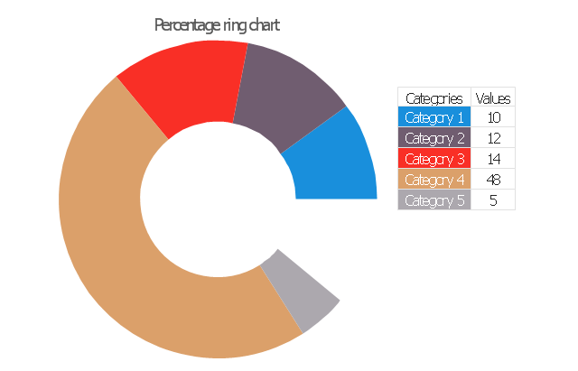
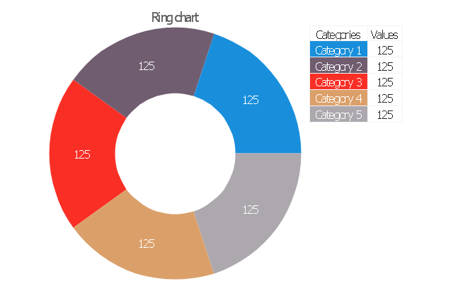
Percentage ring chart
Pie chart

Percentage pie chart
Ring chart
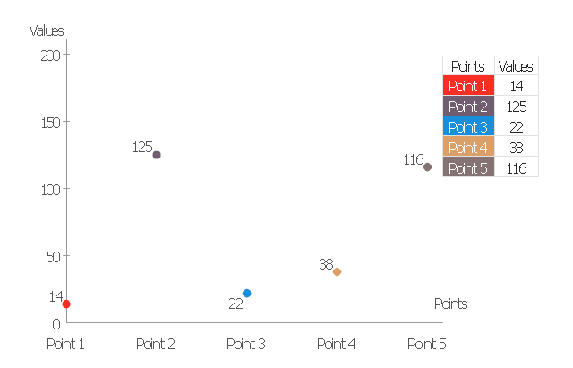
Scatter plot
Column chart (vertical bar graph)
-data-driven-charts---vector-stencils-library.png--diagram-flowchart-example.png)
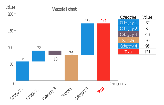
Waterfall chart
How to Create a Pie Chart

Basic Diagramming

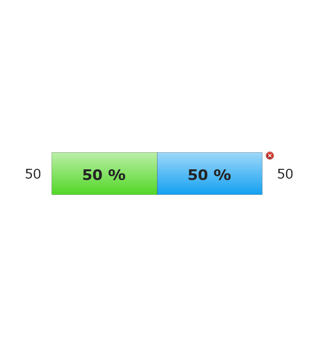
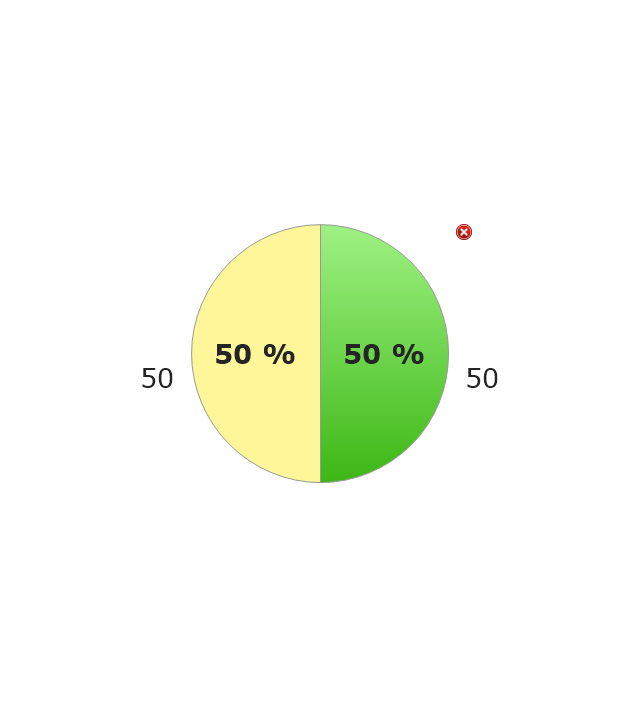
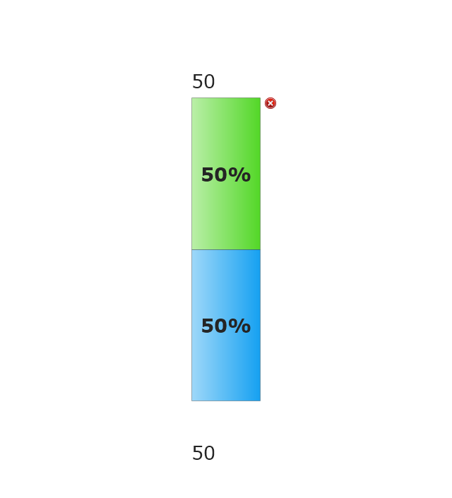
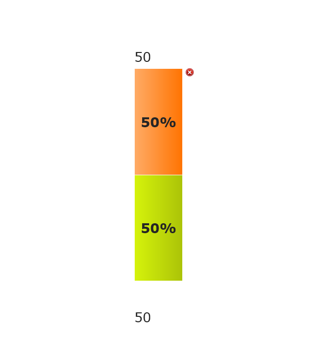
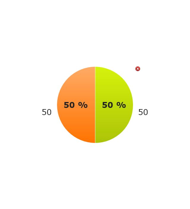
The vector stencils library "Composition indicators" contains 6 dashboard graphic indicators: 2 horizontal divided bars, 2 vertical divided bars, and 2 mini pie charts.
Composition Indicators are Live Objects which show the percentage of two parts of one total.
Composition Indicators useful for:
• comparison of one part with the total
• comparison of two parts of one total.
Use this library for drawing visual dashboards in the ConceptDraw PRO diagramming and vector drawing software extended with the Composition Dashboard solution from the area "What is a Dashboard" of ConceptDraw Solution Park.
www.conceptdraw.com/ solution-park/ composition-dashboard
Horizontal Divided Bar Indicator 1
Mini Pie Chart Indicator 1
Vertical Divided Bar Indicator 1
Horizontal Divided Bar Indicator 2
Vertical Divided Bar Indicator 2
Mini Pie Chart Indicator 2
Pie Chart Word Template. Pie Chart Examples

Pie Donut Chart. Pie Chart Examples

The Pie Donut Chart visualizes the percentage of parts of the whole and looks like as a ring divided into sectors. Pie Donut Charts are widely used in the business, statistics, analytics, mass media.
Bar Chart Template for Word

You can quickly rework these bar graph templates into your own charts by simply changing displayed data, title and legend texts.
Spider Chart Template

- Percentage Bar Chart
- Example Of A Percentage Bar Diagram
- Percentage Bar Graph Illustration
- Percentage Bar Diagram Examples
- Percentage Bar Chart Example With Solution
- Show Percentage In Pie Template
- Percentage Bar Chart Example
- Percentage Pie Chart. Pie Chart Examples | Pie Graph Worksheets ...
- Pie Chart Examples and Templates | Percentage Pie Chart. Pie ...
- Example Percentage Bar Chart
- How to Draw the Different Types of Pie Charts | Percentage Pie ...
- Percentage Pie Chart
- Bar Chart Software | Bar Graphs | Chart Maker for Presentations ...
- Chart Maker for Presentations | Basic Diagramming | Percentage Pie ...
- Chart Maker for Presentations | Sales Growth. Bar Graphs Example ...
- Sales Growth. Bar Graphs Example
- Percent Solutions
- Percentage Vs Year Graph
- Percentage Pie Chart. Pie Chart Examples | Pie Graph Worksheets ...