Feature Comparison Chart Software
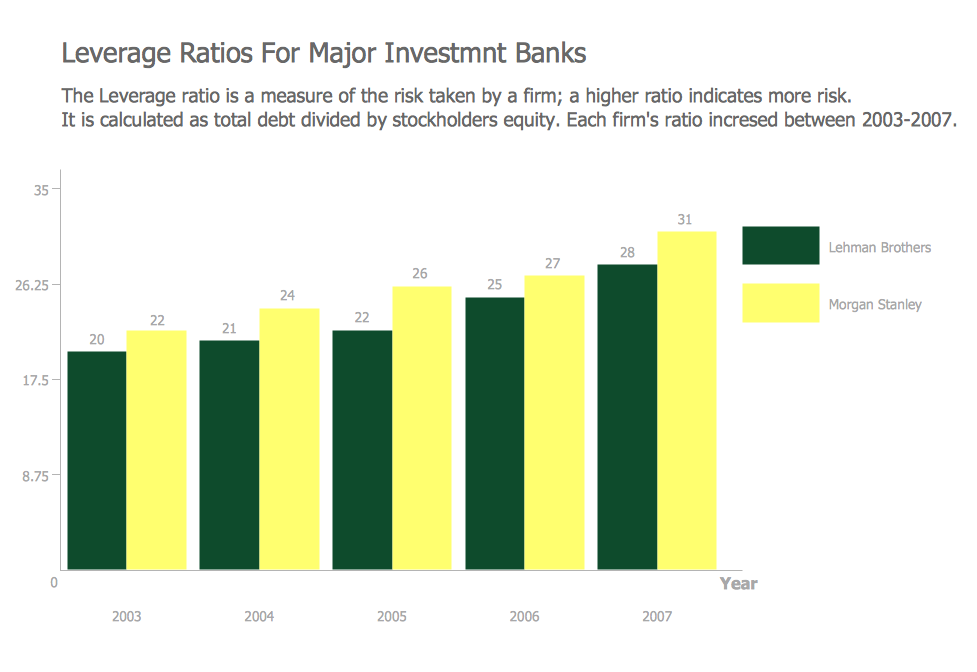
Financial Comparison Chart
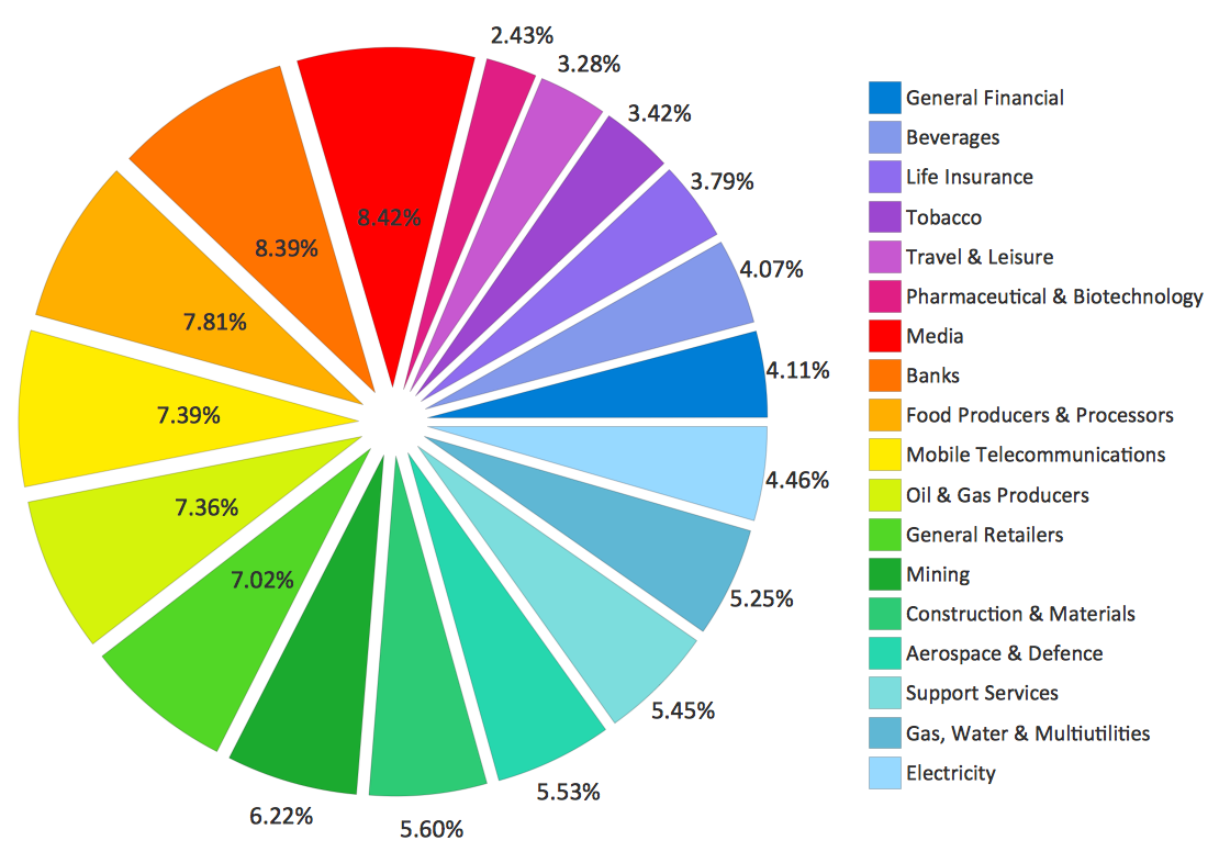
Pie Chart Examples and Templates
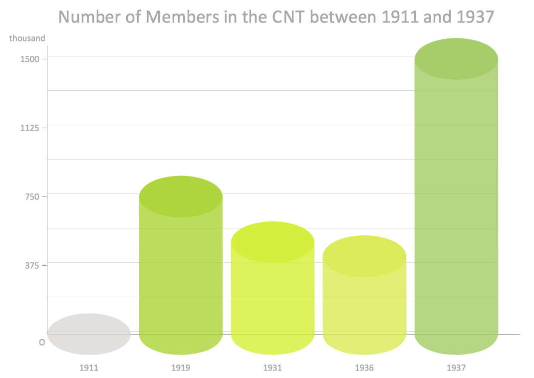
Column Chart Examples
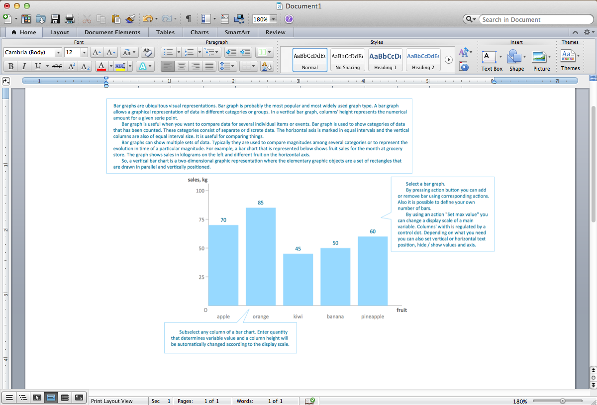
Sales Growth. Bar Graphs Example

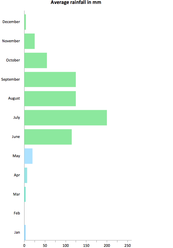
Rainfall Bar Chart
Bar Chart Template for Word
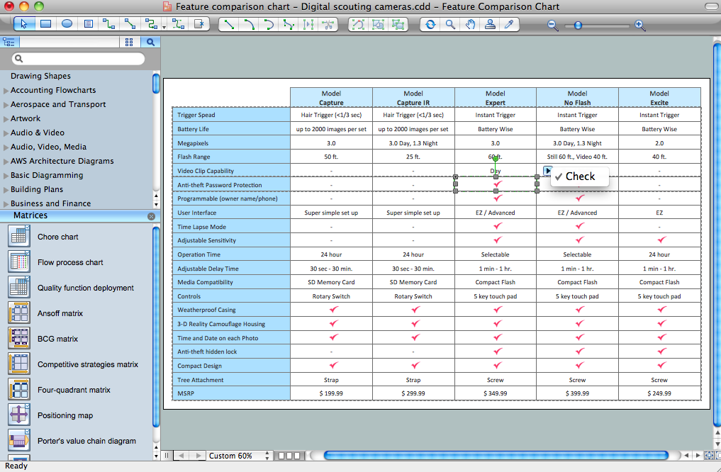
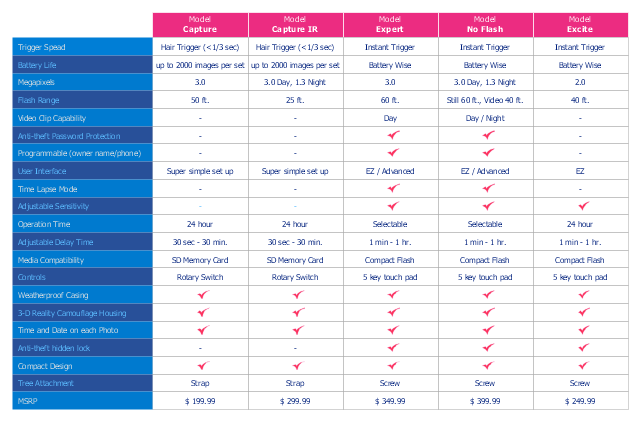
Competitive Feature Comparison Matrix is a tool to compare the features and functionality of competitive products or services in side-by-side table.
The feature comparison matrices are used for feature comparison analysis of competitive products and services.
This competitive feature comparison matrix chart example was created using the ConceptDraw PRO diagramming and vector drawing software extended with the Matrices solution from the Marketing area of ConceptDraw Solution Park.
Feature comparison chart
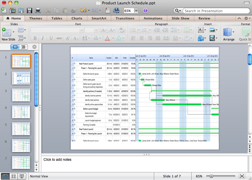
How to Create Presentation of Your Project Gantt Chart
Purchasing Flow Chart. Purchasing Flowchart Example
Relative Value Chart Software

Bar Chart Examples
HelpDesk
How to Draw an Area Chart

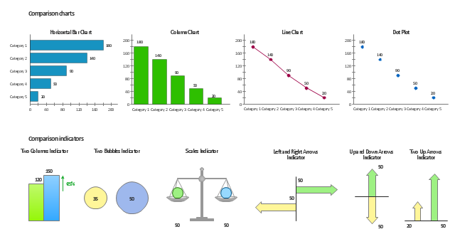
The vector stencils library Comparison charts contains 4 Live Objects: Horizontal bar chart, Column chart (Vertical bar chart), Line chart and Dot plot (Scatter chart).
The vector stencils library Comparison indicators contains 7 Live Objects:
Two column indicator, Two bubbles indicator, Scales indicator, Left and right arrows indicator, Up and down arrows indicator, Two up arrows indicator.
The ConceptDraw Live Objects are ready-to-use templates of charts and visual indicators for dashboard design. You can set data source file for Each Live Object, and your charts or indicators will represents actual data from the data source files, and change their appearance with changing of the data in source files. The comparison charts and indicators are useful to compare and rank of your data by categories.
Use the design elements libraries "Comparison charts" and "Comparison indicators" to create your own business visual dashboards using the ConceptDraw PRO diagramming and vector drawing software.
The example "Design elements - Comparison charts and indicators" is included in the Comparison Dashboard solution from the area "What is a Dashboard" of ConceptDraw Solution Park.
Data comparison charts and visual indicators
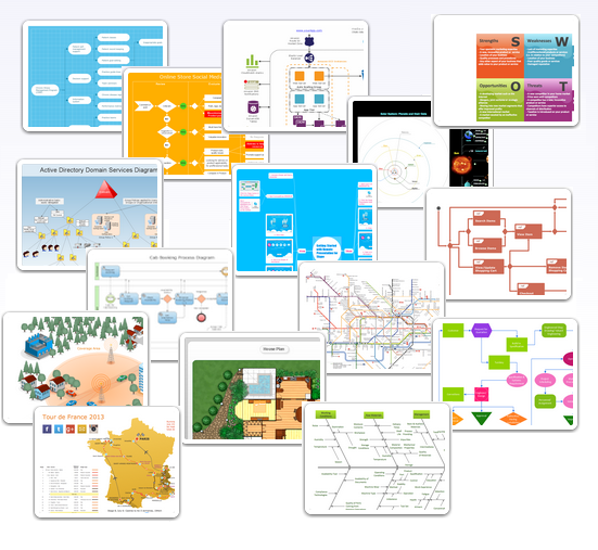
Examples of Flowcharts, Org Charts and More
- Comparison Chart Example
- Feature Comparison Chart Software | Competitive feature ...
- Competitive feature comparison matrix chart - Digital scouting ...
- Comparative Chart Meaning And Example
- Sales Growth. Bar Graphs Example | Financial Comparison Chart ...
- Comparison Dashboard | Feature Comparison Chart Software ...
- Feature Comparison Chart Software | Bar Chart Template for Word ...
- Feature Comparison Chart Software | How To Create a Prioritization ...
- Online Marketing Comparative Chart
- Feature Comparison Chart Software | Financial Comparison Chart ...
- Examples Of A Matrix Chart To Compare
- Financial Comparison Chart | Design elements - Financial charts ...
- Comparative Response Matrix Example
- Competitor Analysis | Feature Comparison Chart Software ...
- Eg Of A Comparative Bar Chart Template
- Feature Comparison Chart Software | Financial Comparison Chart ...
- Comparison Dashboard | Financial Comparison Chart | SWOT ...
- Marketing | Financial Comparison Chart | Feature Comparison Chart ...
- Feature Comparison Chart Software | How to Track Your Project ...