Column Chart Template
|
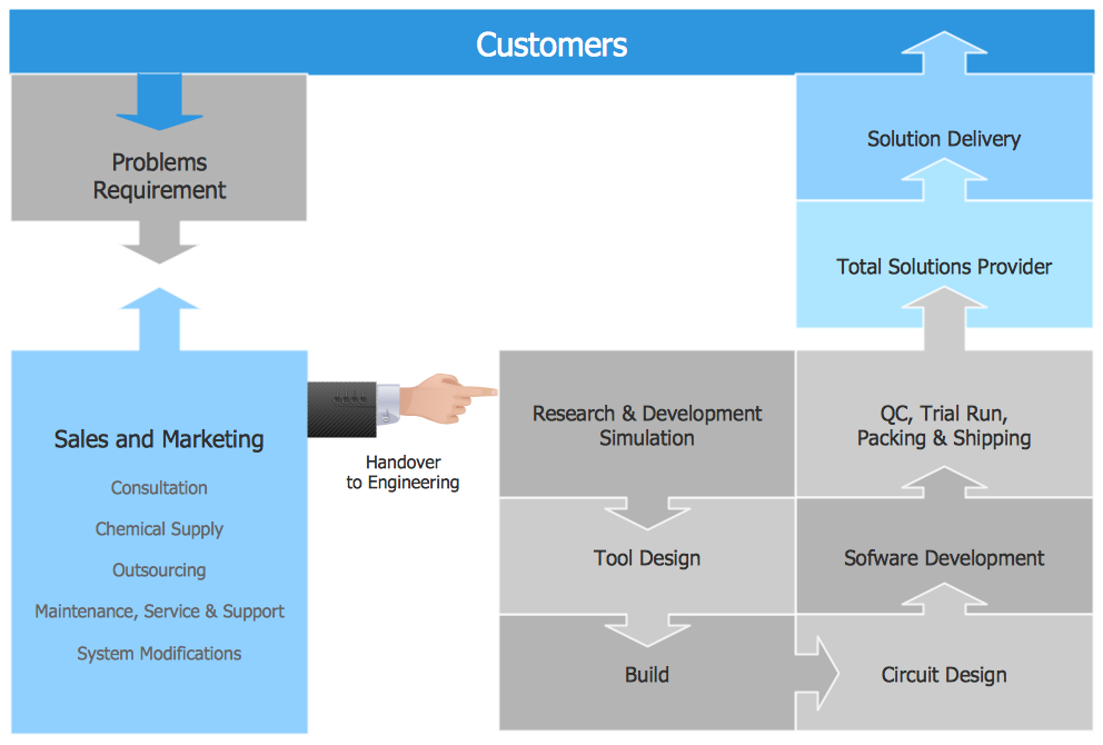
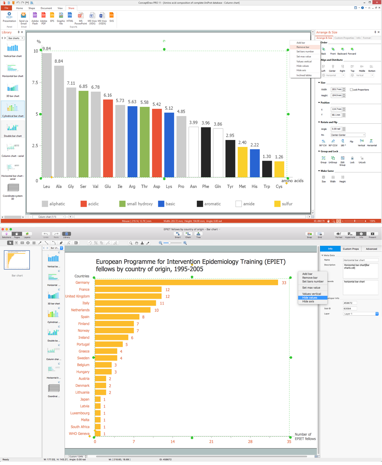
Any bar chart can be also called as a bar graph or a column chart or graph. Being a chart or a graph that is commonly used for presenting some categorical data with the rectangular bars having their lengths or heights proportional to the values that they represent, such drawings can be made with the help of the ConceptDraw DIAGRAM diagramming and drawing software. The created bars can be plotted either vertically or horizontally and any vertical bar chart can be also sometimes called as a line graph. Making graphs can be obviously a challenge. Making them look professionally good is another challenge that can be faced with an easiness as long as there is the ConceptDraw STORE application installed on your desktop enabling to use the Bar Graphs solution. The Bar Graphs solution was developed, especially in order to make it simpler to create any needed column chart offering the templates that can be used as drafts for the unique looking drawings.  A bar graph shows different comparisons among the discrete categories. One of the axises of the chart can show some specific categories that are in a process of their comparison, and the other one can represent some measured value. Some of the column graphs can present such bars that are clustered in groups of more than one. In this way, it is simpler to show those values that have more than one measured variable. Making column chart can be a fun and entertaining process. Instead of creating the needed drawing from a scratch, you can simply make it out of the already previously made template by changing the already existing values, colours, type of chart, etc. yourself using the ConceptDraw DIAGRAM diagramming and drawing application. Column charts have a discrete domain of different categories, being usually scaled the way so that all the data can fit on the same chart. When there is no natural order for the categories that are being compared, then the columns on the chart may be arranged in any needed order. Column charts that are arranged from the highest to the lowest incidence can be still called as the “Pareto charts”. Any needed Pareto chart can be also made within the ConceptDraw DIAGRAM diagramming and drawing application. A “Pareto chart” was named after Vilfredo Pareto being a type of chart that contains both columns and a line graph. The individual values within the previously mentioned chart are represented in descending order by columns. The cumulative total can be represented within such chart by the line. The left vertical axis is known to be the frequency of occurrence, when the right vertical axis is simply the cumulative percentage of the total number of occurrences, total of the particular unit of measure or total cost. The left vertical axis can also be used for representing the cost or another important unit of measure. The purpose of using the Pareto chart is to highlight the most important issues among that given set of different factors. The Pareto chart in quality control can represent the most common sources of defects, the most frequent reasons for customer complaints, the highest occurring type of defect. In 2006 Wilkinson devised an algorithm used for producing the statistically based acceptance limits for each of the columns within the Pareto chart. Being one of the seven basic tools of quality control, the Pareto chart is one of the most commonly used column charts nowadays. The mentioned charts can be generated by many different programs and online quality charts generators, but one of the most popular ones is the ConceptDraw DIAGRAM diagramming and drawing one.  Column Chart Column Chart
 3D Column Chart 3D Column Chart
 Cylindrical Column Chart Cylindrical Column Chart
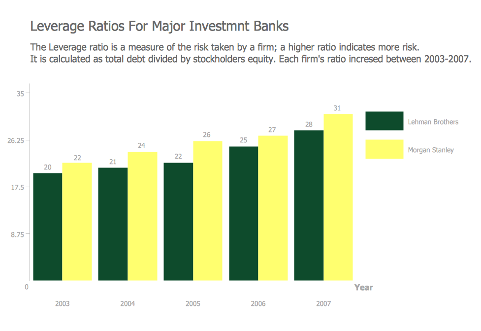
Column graphs/charts provide a visual presentation of categorical data. “Categorical data” can be a name for some grouping of data done into the discrete groups, such as months of the year, age group, animals, shoe sizes, etc. The mentioned categories are usually known to be qualitative. In any column chart, the categories are known to be appearing along the horizontal axis. The height of the column corresponds to the value of each of the categories. Column graphs can also be used for more complex comparisons of data with the grouped column charts and stacked column charts. In any grouped column chart, for each of the categorical groups, there are two or more columns. The mentioned columns can be color-coded meaning there is an opportunity to use different colours for representing some particular grouping. An example can be a business owner having two businesses making a grouped column chart using different colored columns in order to represent each of them. The horizontal axis of such column chart can show the months of the year as well as the vertical axis showing the revenue. Also, a stacked column chart can be used for describing the business. The stacked bar chart stacks columns that represent different groups on top of each other. The height of the resulting column shows the combined result of all the groups, but the stacked column charts cannot be used to datasets where some of the groups have the negative values, that is why the grouped column charts can be used instead. |

Example 1. Column Chart Template
Grouped column graphs, same as the stacked ones, can also be known as graphs and created with the aid of the ConceptDraw DIAGRAM diagramming and drawing software as well as the ConceptDraw STORE application that includes the so simple in use and so useful solution — the Bar Graphs one. Having the professionally created templates of the graphs, you can always create any needed column chart within only a very short period of time.


_Win_Mac.png)