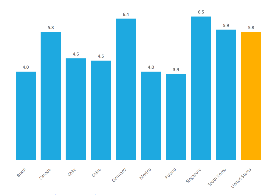
Column Chart Template

Column Chart Software
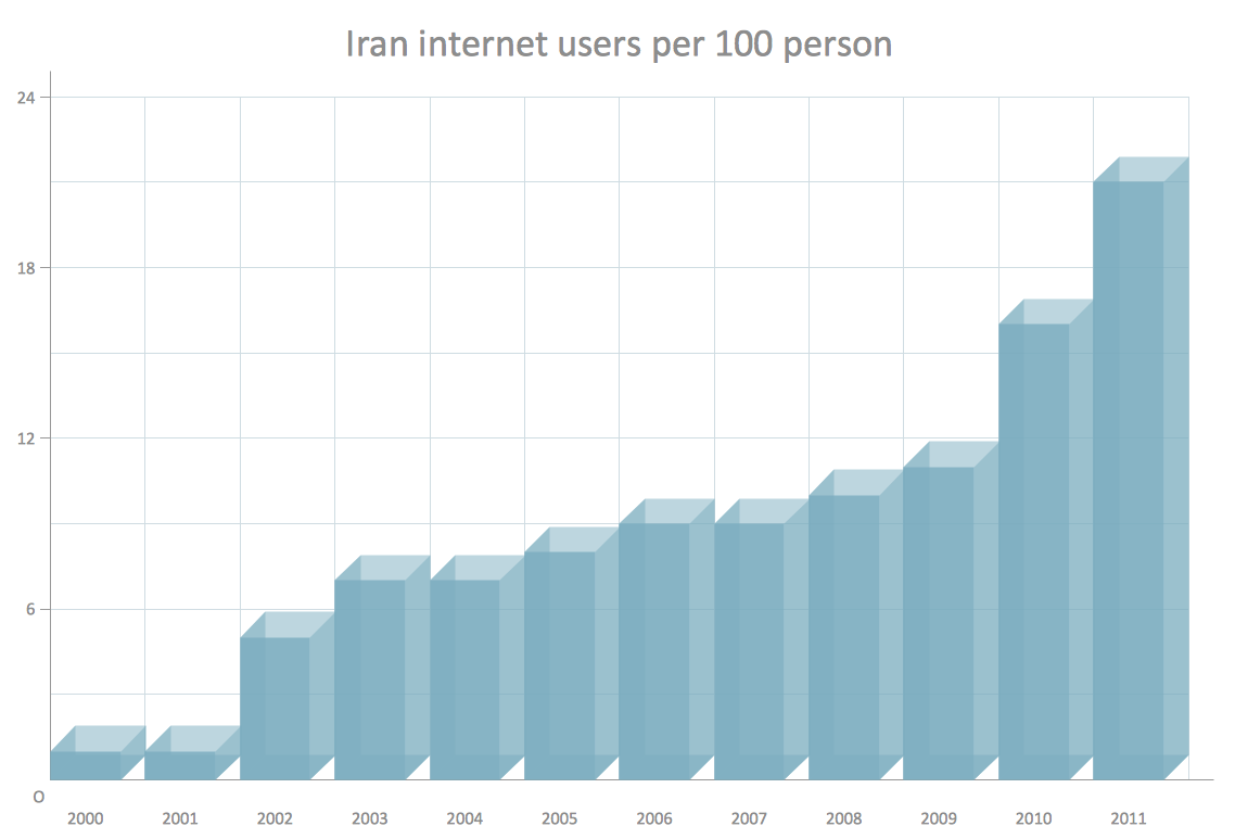
Chart Maker for Presentations

The 3D vertical bar graph sample shows the Iran internet users per 100 person from 2000 to 2011. It was designed on the base of the Commons Wikimedia file: Iran internet users per 100 person.png.
[commons.wikimedia.org/ wiki/ File:Iran_ internet_ users_ per_ 100_ person.png]
This file is licensed under the Creative Commons Attribution-Share Alike 3.0 Unported license. [creativecommons.org/ licenses/ by-sa/ 3.0/ deed.en]
The data source is World Bank: [data.worldbank.org/ country/ iran-islamic-republic]
"In 1993 Iran became the second country in the Middle East to be connected to the Internet, and since then the government has made significant efforts to improve the nation's ICT infrastructure. Iran's national Internet connectivity infrastructure is based on two major networks: the public switched telephone network (PSTN) and the public data network. The PSTN provides a connection for end-users to Internet service providers (ISPs) over mostly digital lines and supports modem-based connections. The Data Communication Company of Iran (DCI), a subsidiary of TCI, operates the public data network." [Internet in Iran. Wikipedia]
The 3D column chart example "Iran internet users per 100 person" was created using the ConceptDraw PRO diagramming and vector drawing software extended with the Bar Graphs solution from the Graphs and Charts area of ConceptDraw Solution Park.
3D Column chart
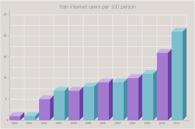
Chart Examples
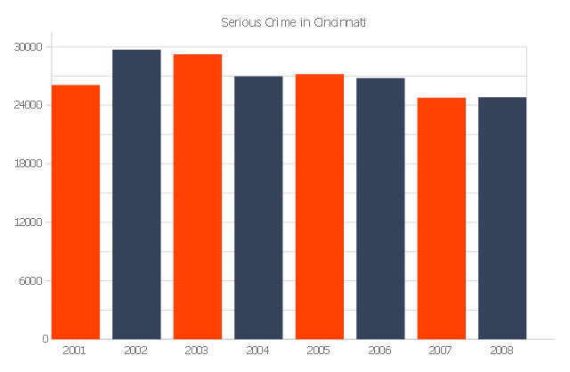
The vertical bar graph sample shows the serious crime number in Cincinnati from 2001 to 2008. It was designed on the base of the Commons Wikimedia file: Cincinnati-Part-1-Crimes.jpg.
[commons.wikimedia.org/ wiki/ File:Cincinnati-Part-1-Crimes.jpg]
"Before the riot of 2001, Cincinnati's overall crime rate was dropping dramatically and had reached its lowest point since 1992. After the riot violent crime increased. Reflecting national trends, crime rates in Cincinnati have dropped in all categories from 2006 to 2010." [Crime in Cincinnati. Wikipedia]
The column chart example "Serious crime in Cincinnati" was created using the ConceptDraw PRO diagramming and vector drawing software extended with the Bar Graphs solution from the Graphs and Charts area of ConceptDraw Solution Park.
Column graph
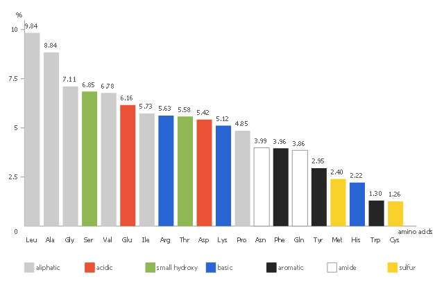
This vertical bar chart sample shows the amino acid composition in percent for the complete UniProtKB/ TrEMBL protein database release 2016_ 07. It was designed using statistic data from the website of UniProt protein sequence database. [ebi.ac.uk/ uniprot/ TrEMBLstats]
"The mission of UniProt is to provide the scientific community with a comprehensive, high quality and freely accessible resource of protein sequence and functional information." [ebi.ac.uk/ uniprot]
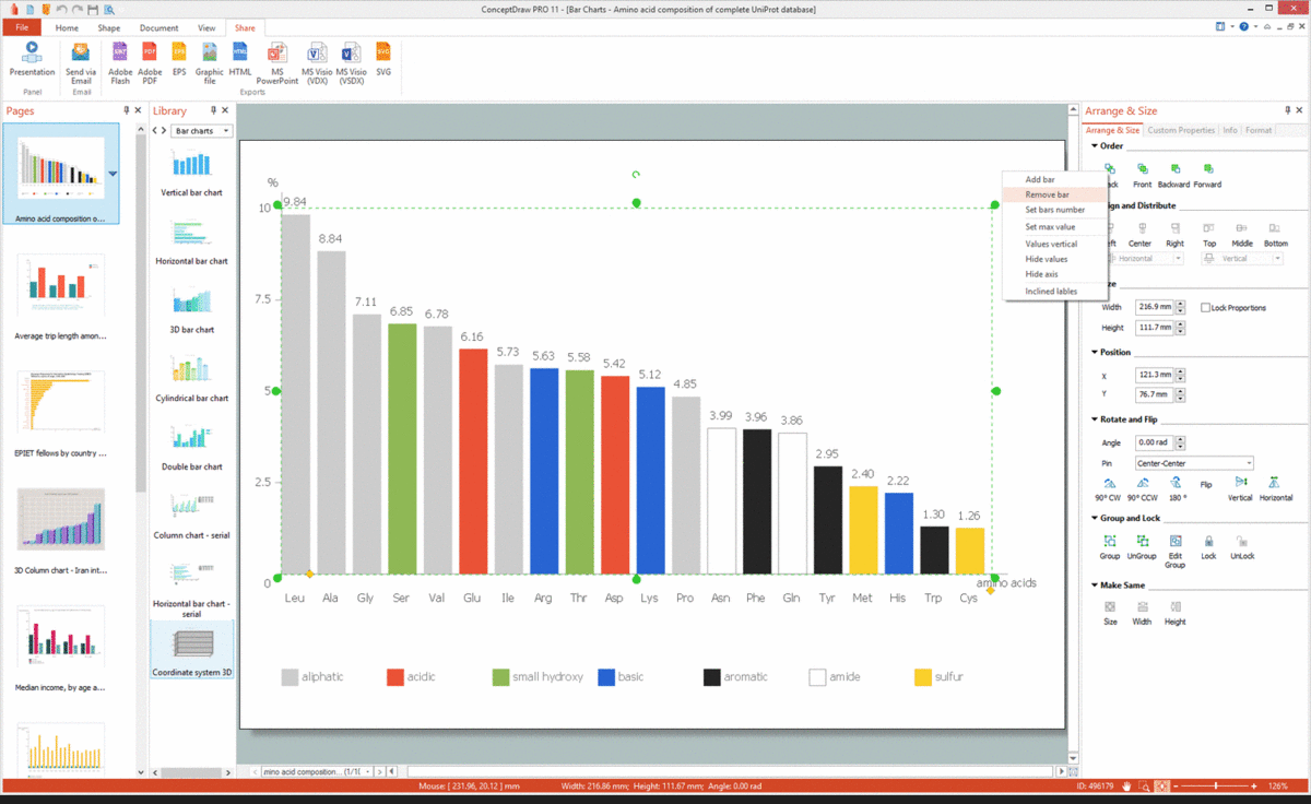
The column chart example "Amino acid composition of complete UniProt database" was created using the ConceptDraw PRO diagramming and vector drawing software extended with the Bar Graphs solution from the Graphs and Charts area of ConceptDraw Solution Park.
"The mission of UniProt is to provide the scientific community with a comprehensive, high quality and freely accessible resource of protein sequence and functional information." [ebi.ac.uk/ uniprot]
The column chart example "Amino acid composition of complete UniProt database" was created using the ConceptDraw PRO diagramming and vector drawing software extended with the Bar Graphs solution from the Graphs and Charts area of ConceptDraw Solution Park.
Column chart
Bar Chart Software
"A chart can take a large variety of forms, however there are common features that provide the chart with its ability to extract meaning from data.
Typically the data in a chart is represented graphically, since humans are generally able to infer meaning from pictures quicker than from text. Text is generally used only to annotate the data.
One of the more important uses of text in a graph is the title. A graph's title usually appears above the main graphic and provides a succinct description of what the data in the graph refers to.
Dimensions in the data are often displayed on axes. If a horizontal and a vertical axis are used, they are usually referred to as the x-axis and y-axis respectively. Each axis will have a scale, denoted by periodic graduations and usually accompanied by numerical or categorical indications. Each axis will typically also have a label displayed outside or beside it, briefly describing the dimension represented. If the scale is numerical, the label will often be suffixed with the unit of that scale in parentheses. ...
Within the graph a grid of lines may appear to aid in the visual alignment of data. The grid can be enhanced by visually emphasizing the lines at regular or significant graduations. The emphasized lines are then called major grid lines and the remainder are minor grid lines.
The data of a chart can appear in all manner of formats, and may include individual textual labels describing the datum associated with the indicated position in the chart. The data may appear as dots or shapes, connected or unconnected, and in any combination of colors and patterns. Inferences or points of interest can be overlaid directly on the graph to further aid information extraction.
When the data appearing in a chart contains multiple variables, the chart may include a legend (also known as a key). A legend contains a list of the variables appearing in the chart and an example of their appearance. This information allows the data from each variable to be identified in the chart." [Chart. Wikipedia]
The vector stencils library "Time series charts" contains 10 templates: 3 column charts, 3 bar charts, 2 line graphs and 2 dot plots. All these charts are Live Objects displaying the data from external data source files.
Use these chart templates to design your business performance digital dashboards using the ConceptDraw PRO diagramming and vector drawing software.
The example "Design elements - Time series charts" is included in the Time Series Dashboard solution from the area "What is a Dashboard" of ConceptDraw Solution Park.
Time series charts
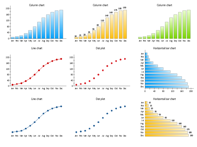
Chart Software for Better Presentations
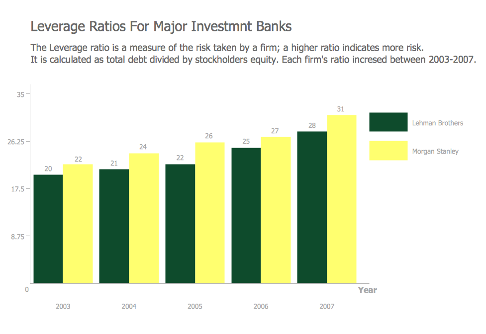
Bar Chart Examples
Sales Growth. Bar Graphs Example

Financial Comparison Chart
Line Graph Charting Software

Line Chart Template for Word

Bar Diagrams for Problem Solving. Create economics and financial bar charts with Bar Graphs Solution
Step Area Graph
Scatter Chart Analysis. Scatter Chart Example
Polar Graph

Pyramid Diagram and Pyramid Chart

- Column Chart Examples
- Column Chart Examples - Conceptdraw.com
- Column Chart Software | How to Create a Column Chart | Bar Chart ...
- Column Chart Template
- Bar Graphs | Column Chart Software | Bar Chart Examples |
- Column Chart Software
- Column Chart Examples | Bar Chart Software | The Best Drawing ...
- The Best Drawing Program for Mac | Bar Chart Software | Column ...
- Design elements - Picture graphs | Bar Chart Software | Column ...
- Bar Chart Software | Sales Growth. Bar Graphs Example | Column ...
- Double bar graph template | Bar Chart Software | Column Chart ...
- Bar Chart Software | Bar Chart Examples | Column Chart Software
- Bar Chart Software | Column Chart Software ... - Conceptdraw.com
- Bar Chart Software | Column Chart Software ... - Conceptdraw.com
- Bar Chart Software | Column Chart Software | Design elements - Bar ...
- Bar Chart Software | Bar Chart Examples | Column Chart Software
- Chart Examples | Column Chart Software | Bar Chart Template |
- Line Graph Charting Software | Bar Chart Software | Column Chart ...
- Column Chart Examples | Bar Chart Software | Bar Chart Examples
- Bar Chart Software | Column Chart Software | Pyramid Diagram and ...