Bar Chart Software
Bar charts
A term “chart” or a “graph” is known to be a graphical representation of data, where this data is represented by the symbols. These symbols can be bars, used in the so-called “bar charts”, slices in the “pie charts” and lines in the “line charts”. Any kind of a chart can represent data, which is usually both tabular and numeric. It can also represent any kind of qualitative structure, the functions, providing the different info.
In general, this "chart" term has multiple meanings, as, for example, a data chart is one of the types of graphs or diagrams, with the help of which it is simpler to organize and represent any numerical as well as qualitative data. Sometimes even some domain specific constructs can be called “charts”: for example, so-called “chord chart” is used in the music notation, as well as a “record chart”. Maps can also contain lots of different information, following the specific purpose: they are also often known as “charts”, being called “aeronautical” or “nautical” charts.
Charts can be also used for easing the understanding of large quantities of data. They are also commonly utilized in order to illustrate the relationships between a few different parts of the same data. Charts can be read more quickly than the raw data, that is why they are so very popular: they are used in a wide variety of fields and everyone can create them simply by hand or using a computer with ConceptDraw DIAGRAM software downloaded to it.
Thinking about what exact types of charts to use, you have to take into consideration the specification of your data, which has to be illustrated with their aid, because some of them can be more useful in order to present a given data set, to compare to the others, taking a large variety of forms, but still having some common features that provide those charts with their ability to extract the needed meaning from some data. As any data, mentioned in a chart, is represented in a graphical form, it simplifies its understanding, as, in general, it is simpler for people to infer any meaning from the pictures to compare to the text, as the last one is more commonly used only for annotating the data.
A grid of lines may appear in order to aid in the visual alignment of data within the graph. This grid can be enhanced in a way of visually emphasizing the lines at significant or regular graduations and the emphasized lines are then can be called as “major grid lines”. At the same time the “remainder” can be called the “minor grid lines”. The data within a chart can appear in almost any possible format, including the individual textual labels, which describe the datum within the chart. The data may also appear as shapes or dots and it can be either connected or unconnected. It can also appear in any possible combination of colours as well as patterns.
There are a few types of charts, which can be applied to your data representation, and one of them is a “bar chart”, also known as “bar graph”, being a chart or graph that presents the grouped data in a way of the bars, usually in the shapes of rectangles. The lengths of such charts are usually proportional to the values, which they represent and those bars can be plotted either horizontally or vertically. A “vertical bar chart” has another name and it can be known as a “Line graph” as well.
In general, any bar graph uses horizontal or vertical bars, as it was mentioned before, in order to show the comparisons among the different categories. Each axis of the chart shows the specific categories, which are being compared. At the same time the other axis represents a discrete value. Some bar graphs represent bars categorized and separated into groups of over one and most of them have a discrete range, being scaled, so that all of the data can fit in one chart. The bars, used within the chart, may be arranged in any needed or wanted order. The bar charts, which are arranged from the highest to the lowest incidence are known to be the “Pareto charts”. The bars, which show the frequency, are usually arranged in the chronological sequence.
With the help of bar charts you have a chance to visually present any categorical data, which is a grouping of data into discrete groups (for example, age group, months of the year, shoe sizes, etc). The categories can be qualitative, appearing along the horizontal axis. It is common to mention the height of the bar corresponding to the value of each of the mentioned categories.
But, really, it does not much matter what type of chart you want to create: once you have to make any of the described before graphs, then you can simply download the needed software, which is ConceptDraw DIAGRAM in order to create great looking and truly smart, professional charts, including the “bar” ones. Having “Bar Graphs solution” downloaded from the “Graphs and Charts area” of ConceptDraw Solution Park from this site or from ConceptDraw STORE is the best thing to have in order to succeed: to get the needed great looking result within only a few hours or even minutes, having all of the necessary tools available for your use, as the mentioned “Bar Graphs solution” provides all of the needed templates and samples of pre-made charts, as well as a library of vector stencils for quick and simple drawing of both bar and column charts and graphs.
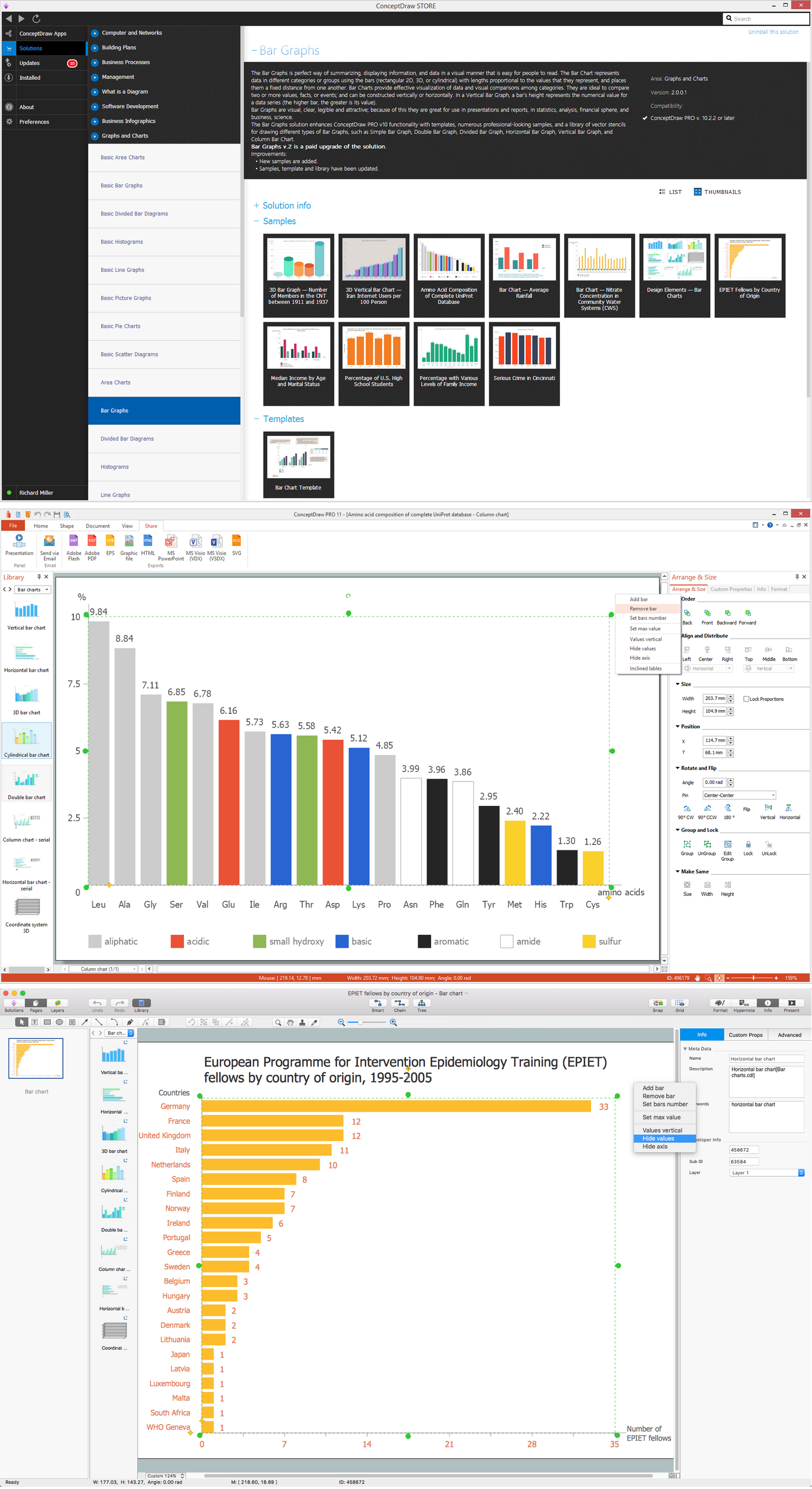
Example 1. Bar chart software
Bar chart library objects:
The vector stencils library Bar charts contains 8 ready-to-use bar graphs you can simply drag and drop into your document, and set data and title.
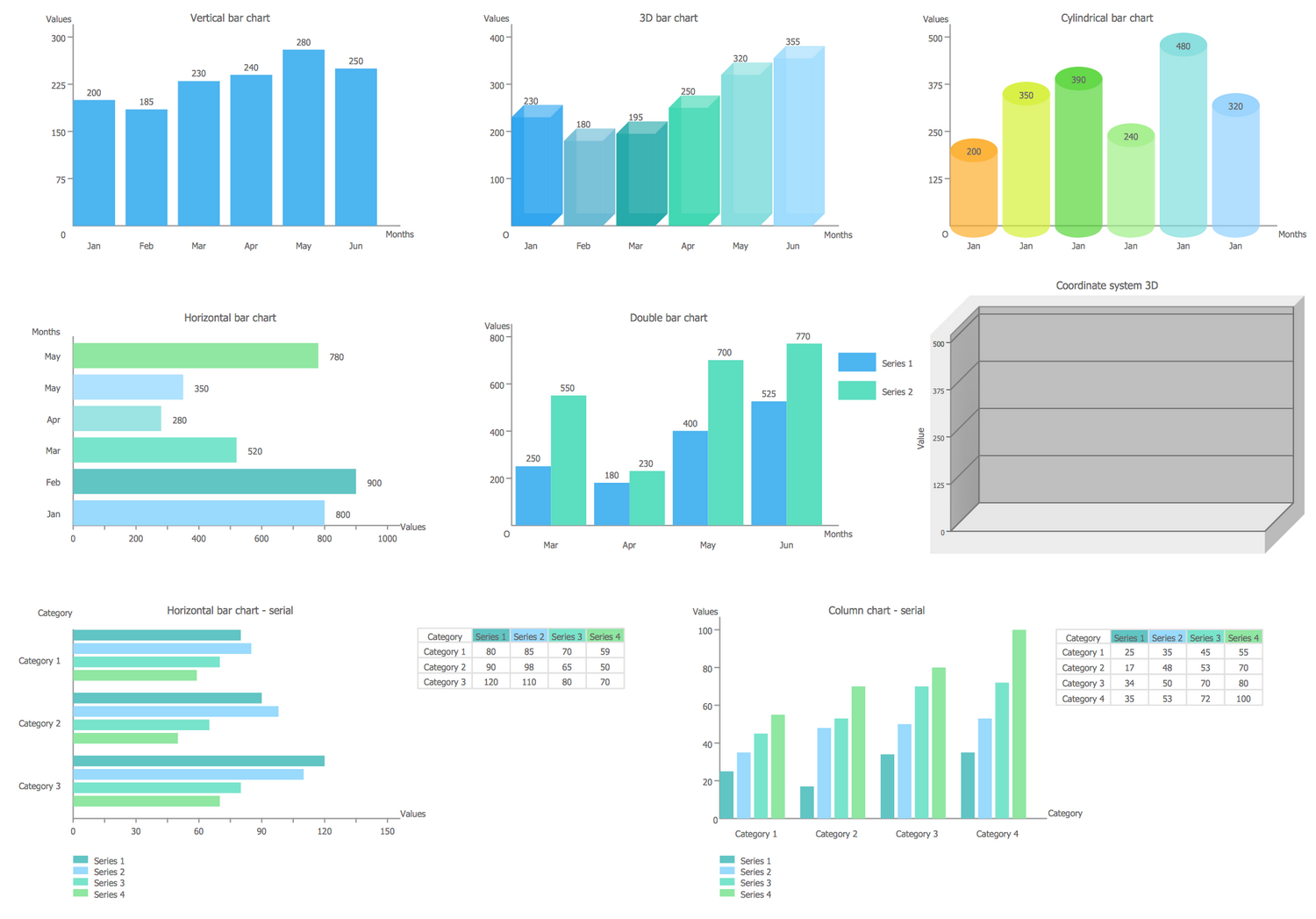
Example 2. Bar chart library objects
Vertical Bar Chart
The vertical bar graph is also known as column chart.
Horizontal Bar Chart
Horizontal bar graph is useful for comparison of many categories by one metric.
Double Bar Chart
Double bar graph is used for visualizing two data series.
3D Bar Chart
3D Bar graph is design variant of vertical bar graph.
Culindrical Bar Chart
Culindrical bar graph is another design variant of vertical bar graph.
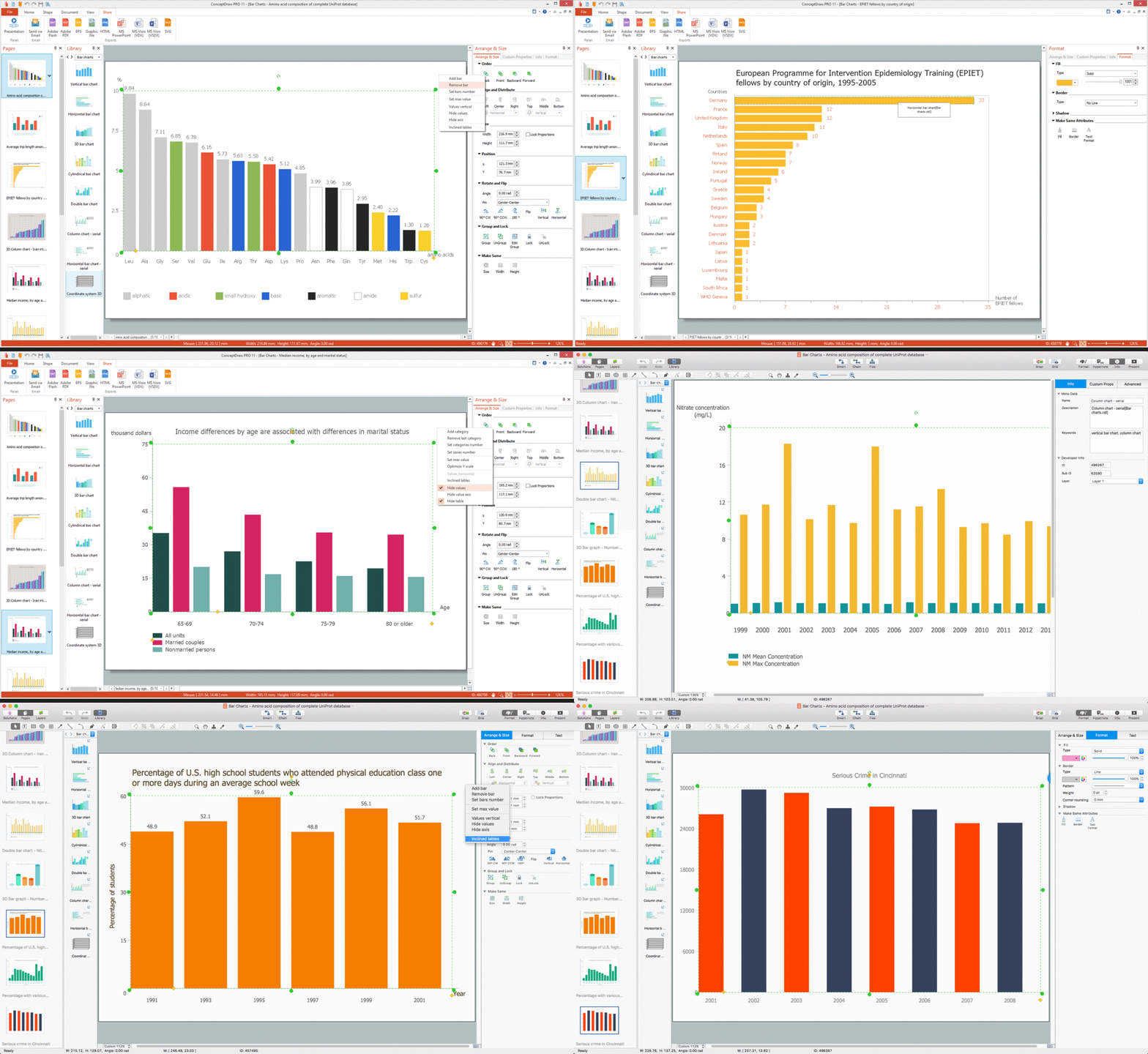
Example 3. Bar chart examples
You can also use the bar graphs for more complex comparisons of data with the grouped bar charts as well as the stacked bar charts. In the first case, the grouped bar chart have two or more bars for each categorical group. These bars are color-coded in order to be able to represent a particular grouping. As an example there can be a business owner having two shops making a grouped bar chart using different coloured bars for representing each of the shops. In this case, the horizontal axis would show, for example, the weeks of the months and the vertical axis would show the revenue of this business owner. In this example a stacked bar chart could be used as well, though, representing the different groups on top of each other. There can be used grouped bar graphs as well, presenting the information in the same order in each grouping, when stacked bar graphs present the information in the same sequence on each bar.
More Related Diagrams:
- Line Graph Charting Software
- Pie Chart Software
- Pyramid Diagram and Pyramid Chart
- Scatter Graph Charting Software
- Column Chart Software