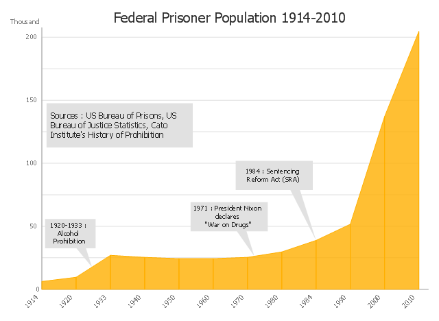
This area chart sample shows the US federal prisoner population changes from 1914 to 2010.
"The Federal Bureau of Prisons (BOP) is a United States federal law enforcement agency. A subdivision of the U.S. Department of Justice, the Bureau is responsible for the administration of the federal prison system. The system also handles prisoners who committed acts considered felonies under the District of Columbia's law. The Bureau was established in 1930 to provide more progressive and humane care for federal inmates, to professionalize the prison service, and to ensure consistent and centralized administration of the 11 federal prisons in operation at the time.
According to its official web site, the Bureau consists of more than 116 institutions, six regional offices, its headquarters office in Washington, D.C., two staff training centers, and 22 community corrections offices, and is responsible for the custody and care of approximately 210,000 federal offenders. Approximately 82 percent of these inmates are confined in Bureau-operated correctional facilities or detention centers. The remainder are confined through agreements with state and local governments or through contracts with privately operated community corrections centers, detention centers, prisons, and juvenile facilities." [Federal Bureau of Prisons. Wikipedia]
This area graph sample was redesigned from the Wikimedia Commons file: Federal timeline US prisoners.gif. [commons.wikimedia.org/ wiki/ File:Federal_ timeline_ US_ prisoners.gif]
The area chart example "Federal timeline US prisoners" was created using the ConceptDraw PRO diagramming and vector drawing software extended with the Area Charts solution from the Graphs and Charts area of ConceptDraw Solution Park.
Area graph
Pyramid Diagram

Bar Diagrams for Problem Solving. Create manufacturing and economics bar charts with Bar Graphs Solution

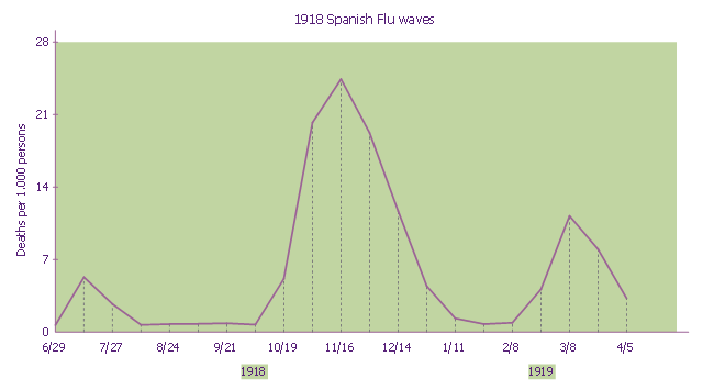
This line graph sample shows three pandemic waves: weekly combined influenza and pneumonia mortality, United Kingdom, 1918–1919. It was designed on the base of the Wikimedia Commons file: 1918 spanish flu waves.gif. [commons.wikimedia.org/ wiki/ File:1918_ spanish_ flu_ waves.gif]
"The 1918 flu pandemic (January 1918 – December 1920) was an unusually deadly influenza pandemic, the first of the two pandemics involving H1N1 influenza virus. It infected 500 million people across the world, including remote Pacific islands and the Arctic, and resulted in the deaths of 50 to 100 million (three to five percent of the world's population), making it one of the deadliest natural disasters in human history." [1918 flu pandemic. Wikipedia]
The line chart example "1918 Spanish Flu waves" was created using the ConceptDraw PRO diagramming and vector drawing software extended with the Line Graphs solution from the Graphs and Charts area of ConceptDraw Solution Park.
Line chart
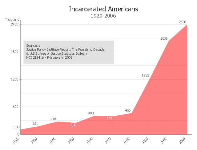
This area chart sample shows the timeline of total number of inmates in U.S. prisons, jails, and juvenile facilities from 1920 to 2006. It was redesigned from the Wikimedia Commons file: US incarceration timeline-clean.gif. [commons.wikimedia.org/ wiki/ File:US_ incarceration_ timeline-clean.gif]
"Incarceration in the United States of America is one of the main forms of punishment, rehabilitation, or both for the commission of felony and other offenses. The United States has the highest documented incarceration rate in the world. At year-end 2009, it was 743 adults incarcerated per 100,000 population.
According to the U.S. Bureau of Justice Statistics (BJS), 2,266,800 adults were incarcerated in U.S. federal and state prisons, and county jails at year-end 2011 – about 0.94% of adults in the U.S. resident population. Additionally, 4,814,200 adults at year-end 2011 were on probation or on parole. In total, 6,977,700 adults were under correctional supervision (probation, parole, jail, or prison) in 2011 – about 2.9% of adults in the U.S. resident population.
In addition, there were 70,792 juveniles in juvenile detention in 2010.
Although debtor's prisons no longer exist in the United States, residents of some U.S. states can still be incarcerated for debt as of 2014." [Incarceration in the United States. Wikipedia]
The area graph example "US incarceration timeline-clean" was created using the ConceptDraw PRO diagramming and vector drawing software extended with the Area Charts solution from the Graphs and Charts area of ConceptDraw Solution Park.
Area graph
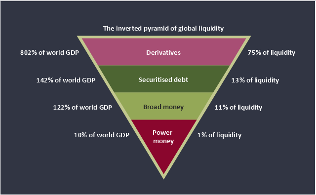
This inverted pyramid diagram of global liquidity shows world GDP and liquidity for 4 levels: derivatives, securitised debt, broad money, and power money.
"In business, economics or investment, market liquidity is a market's ability to facilitate an asset being sold quickly without having to reduce its price very much (or even at all). Equivalently, an asset's market liquidity (or simply "an asset's liquidity") is the asset's ability to sell quickly without having to reduce its price very much. Liquidity is about how big the trade-off is between the speed of the sale and the price it can be sold for. In a liquid market, the trade-off is mild: selling quickly will not reduce the price much. In a relatively illiquid market, selling it quickly will require cutting its price by some amount.
Money, or cash, is the most liquid asset, because it can be "sold" for goods and services instantly with no loss of value. There is no wait for a suitable buyer of the cash. There is no trade-off between speed and value. It can be used immediately to perform economic actions like buying, selling, or paying debt, meeting immediate wants and needs.
If an asset is moderately (or very) liquid, it has moderate (or high) liquidity. In an alternative definition, liquidity can mean the amount of highly liquid assets. If a business has moderate liquidity, it has a moderate amount of very liquid assets. If a business has sufficient liquidity, it has a sufficient amount of very liquid assets and the ability to meet its payment obligations." [Market liquidity. Wikipedia]
This inverted triangle diagram was redesigned using the ConceptDraw PRO diagramming and vector drawing software from Wikimedia Commons file The inverted pyramid of global liquidity.gif. [commons.wikimedia.org/ wiki/ File:The_ inverted_ pyramid_ of_ global_ liquidity.gif]
This triangular chart example is included in the Pyramid Diagrams solution from the Marketing area of ConceptDraw Solution Park.
Inverted pyramid diagram
Scrum process work items and workflow

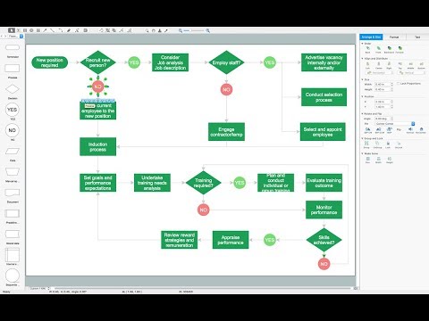
Flow Chart Diagram Examples

How to draw Metro Map style infographics? Moscow, New York, Los Angeles, London

Basic Flowchart Symbols and Meaning

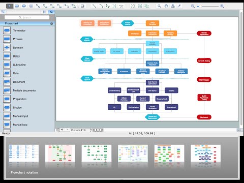
How to Build a Flowchart

Pie Chart Software

Business Process Modeling Notation Template
 B2B process diagram BPMN 2.0 - Cab booking process")
Types of Flowcharts

- Gif For Chart
- Loading Bar Gif
- Step Area Graph | US incarceration timeline-clean - Area graph ...
- Sales dashboard - Vector stencils library | Loading Bar Gif Transparent
- Federal timeline US prisoners - Area chart | Organizational Chart For ...
- World Gif
- Example Of Timeline Chart
- Step Area Graph | US incarceration timeline-clean - Area graph | US ...
- US incarceration timeline-clean - Area graph | US incarceration ...
- How to Make a Timeline | Federal timeline US prisoners - Area chart ...
- Pyramid Charts | Pyramid Diagram and Pyramid Chart | Global ...
- Global liquidity inverted pyramid diagram | Purchase Process Flow ...
- Process Flowchart | How To use House Electrical Plan Software ...
- Process Flowchart | Basic Flowchart Symbols and Meaning ...
- Process Flowchart | Gif загрузка
- Area charts - Vector stencils library | How to Draw an Area Chart in ...
- Process Flowchart | Animated Gif Images Progress Bar
- Area Chart | Basic Area Charts | Area Charts | Diagram Of ...
- Design elements - Area charts | Area Charts | Basic Area Charts ...
- Inverted Triangle Chart