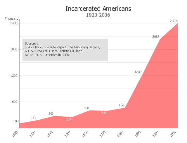
This area chart sample shows the timeline of total number of inmates in U.S. prisons, jails, and juvenile facilities from 1920 to 2006. It was redesigned from the Wikimedia Commons file: US incarceration timeline-clean.gif. [commons.wikimedia.org/ wiki/ File:US_ incarceration_ timeline-clean.gif]
"Incarceration in the United States of America is one of the main forms of punishment, rehabilitation, or both for the commission of felony and other offenses. The United States has the highest documented incarceration rate in the world. At year-end 2009, it was 743 adults incarcerated per 100,000 population.
According to the U.S. Bureau of Justice Statistics (BJS), 2,266,800 adults were incarcerated in U.S. federal and state prisons, and county jails at year-end 2011 – about 0.94% of adults in the U.S. resident population. Additionally, 4,814,200 adults at year-end 2011 were on probation or on parole. In total, 6,977,700 adults were under correctional supervision (probation, parole, jail, or prison) in 2011 – about 2.9% of adults in the U.S. resident population.
In addition, there were 70,792 juveniles in juvenile detention in 2010.
Although debtor's prisons no longer exist in the United States, residents of some U.S. states can still be incarcerated for debt as of 2014." [Incarceration in the United States. Wikipedia]
The area graph example "US incarceration timeline-clean" was created using the ConceptDraw PRO diagramming and vector drawing software extended with the Area Charts solution from the Graphs and Charts area of ConceptDraw Solution Park.
Area graph
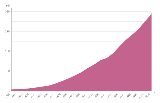
This area chart sample shows the U.S. population (1790-2010). The reference points were obtained from official United States Census data. This area chart sample was designed on the base of the Wikimedia Commons file: US Census Population Graph from 1790.svg. [commons.wikimedia.org/ wiki/ File:US_ Census_ Population_ Graph_ from_ 1790.svg]
This file is licensed under the Creative Commons Attribution-Share Alike 3.0 Unported license. [creativecommons.org/ licenses/ by-sa/ 3.0/ deed.en]
"As of April 30, 2016, the United States has a total resident population of 323,730,000, making it the third most populous country in the world. It is very urbanized, with 81% residing in cities and suburbs as of 2014 (the worldwide urban rate is 54%). California and Texas are the most populous states, as the mean center of U.S. population has consistently shifted westward and southward. New York City is the most populous city in the United States." [Demography of the United States. Wikipedia]
The area graph example "US Census Population Graph from 1790" was created using the ConceptDraw PRO diagramming and vector drawing software extended with the Area Charts solution from the Graphs and Charts area of ConceptDraw Solution Park.
Area chart
 Area Charts
Area Charts are used to display the cumulative totals over time using numbers or percentages; or to show trends over time among related attributes. The Area Chart is effective when comparing two or more quantities. Each series of data is typically represented with a different color, the use of color transparency in an object’s transparency shows overlapped areas and smaller areas hidden behind larger areas.
This area chart sample shows the population growth of San Francisco, California from 1850-2005. It was redesigned from the Wikimedia Commons file: San Francisco CA Population Growth.svg. [commons.wikimedia.org/ wiki/ File:San_ Francisco_ CA_ Population_ Growth.svg]
"The San Francisco Bay Area, commonly known as the Bay Area, is a populated region that surrounds the San Francisco and San Pablo estuaries in Northern California, United States. The region encompasses the major cities and metropolitan areas of San Francisco, Oakland, and San Jose, along with smaller urban and rural areas. The Bay Area's nine counties are Alameda, Contra Costa, Marin, Napa, San Francisco, San Mateo, Santa Clara, Solano, and Sonoma. Home to approximately 7.44 million people, the nine-county Bay Area contains many cities, towns, airports, and associated regional, state, and national parks, connected by a network of roads, highways, railroads, bridges, tunnels and commuter rail. The combined urban area of San Francisco and San Jose is the second largest in California (after the Greater Los Angeles area), the fifth largest in the United States, and the 56th largest urban area in the world." [San Francisco Bay Area. Wikipedia]
The area graph example "San Francisco CA Population Growth" was created using the ConceptDraw PRO diagramming and vector drawing software extended with the Area Charts solution from the Graphs and Charts area of ConceptDraw Solution Park.
Area chart
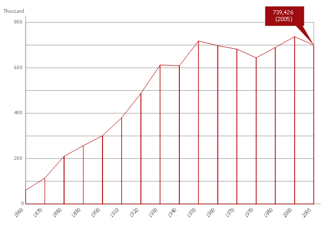
This area chart sample shows the San Francisco population changes from 1860 to 2010.
"San Francisco ..., officially the City and County of San Francisco, is the leading financial and cultural center of Northern California and the San Francisco Bay Area.
The only consolidated city-county in California, San Francisco encompasses a land area of about 46.9 square miles (121 km2) on the northern end of the San Francisco Peninsula, giving it a density of about 17,620 people per square mile (6,803 people per km2). It is the most densely settled large city (population greater than 200,000) in the state of California and the second-most densely populated major city in the United States after New York City. San Francisco is the fourth most populous city in California, after Los Angeles, San Diego and San Jose, and the 14th most populous city in the United States—with a Census-estimated 2012 population of 825,863. The city is also the financial and cultural hub of the larger San Jose-San Francisco-Oakland metropolitan area, with a population of 8.4 million." [San Francisco. Wikipedia]
The area graph example "San Francisco population history" was created using the ConceptDraw PRO diagramming and vector drawing software extended with the Area Charts solution from the Graphs and Charts area of ConceptDraw Solution Park.
Area chart
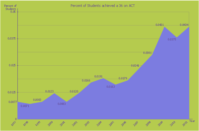
This area chart sample shows the percent of students achieved a 36 on ACT from 1997 to 2011. It was designed on the base of the Wikimedia Commons file: ACT-36-1997 to 2011.png. [commons.wikimedia.org/ wiki/ File:ACT-36-1997_ to_ 2011.png]
This file is licensed under the Creative Commons Attribution-Share Alike 3.0 Unported license. [creativecommons.org/ licenses/ by-sa/ 3.0/ deed.en]
"The ACT (originally an abbreviation of American College Testing) college readiness assessment is a standardized test for high school achievement and college admissions in the United States produced by ACT, Inc. ...
The required portion of the ACT is divided into four multiple choice subject tests: English, mathematics, reading, and science reasoning. Subject test scores range from 1 to 36; all scores are integers. The English, mathematics, and reading tests also have subscores ranging from 1 to 18. (The subject score is not the sum of the subscores.) The composite score is the average of all four tests. In addition, students taking the optional writing test receive a writing score ranging from 1 to 36 (This is a change from the previous 2–12 score range). The writing score does not affect the composite score." [ACT (test). Wikipedia]
The area graph example "Persent of Students achieved a 36 on ACT" was created using the ConceptDraw PRO diagramming and vector drawing software extended with the Area Charts solution from the Graphs and Charts area of ConceptDraw Solution Park.
Area chart
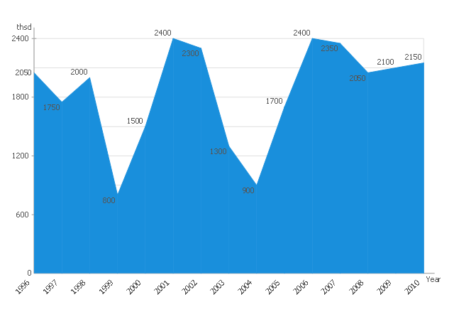
This area chart sample shows the Annual ridership of the Detroit People Mover by year: 1996-2010. It was designed on the base of the Wikimedia Commons file: File DPMridership.jpg. [commons.wikimedia.org/ wiki/ File:File_ DPMridership.jpg]
This file is licensed under the Creative Commons Attribution-Share Alike 3.0 Unported license. [creativecommons.org/ licenses/ by-sa/ 3.0/ deed.en]
"The Detroit People Mover is a 2.94-mile (4.73 km) automated people mover system which operates on a single track, and encircles Downtown Detroit, Michigan.
The Woodward Avenue Light Rail line, later officially named the "Qline", beginning construction in late July 2014, will serve as a link between the Detroit People Mover and New Center Amtrak station with its current service and proposed SEMCOG Commuter Rail, plus additional access to DDOT and SMART bus routes as part of a comprehensive network of transportation in metropolitan Detroit." [Detroit People Mover. Wikipedia]
The area graph example "Detroit People Mover ridership" was created using the ConceptDraw PRO diagramming and vector drawing software extended with the Area Charts solution from the Graphs and Charts area of ConceptDraw Solution Park.
Area graph
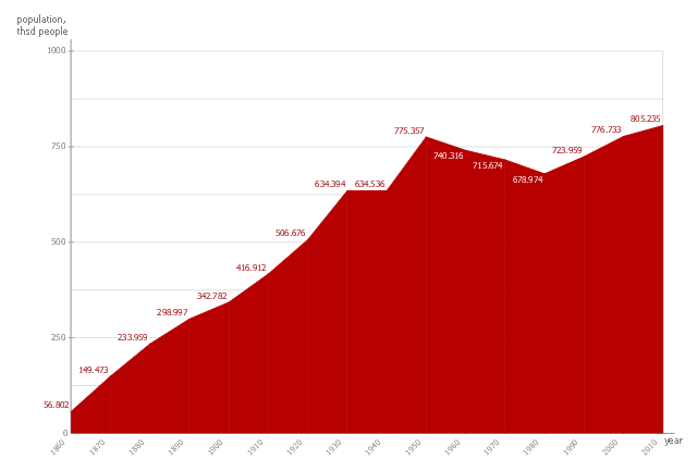
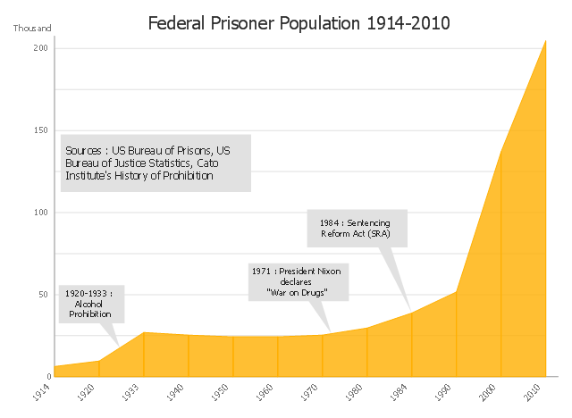
This area chart sample shows the US federal prisoner population changes from 1914 to 2010.
"The Federal Bureau of Prisons (BOP) is a United States federal law enforcement agency. A subdivision of the U.S. Department of Justice, the Bureau is responsible for the administration of the federal prison system. The system also handles prisoners who committed acts considered felonies under the District of Columbia's law. The Bureau was established in 1930 to provide more progressive and humane care for federal inmates, to professionalize the prison service, and to ensure consistent and centralized administration of the 11 federal prisons in operation at the time.
According to its official web site, the Bureau consists of more than 116 institutions, six regional offices, its headquarters office in Washington, D.C., two staff training centers, and 22 community corrections offices, and is responsible for the custody and care of approximately 210,000 federal offenders. Approximately 82 percent of these inmates are confined in Bureau-operated correctional facilities or detention centers. The remainder are confined through agreements with state and local governments or through contracts with privately operated community corrections centers, detention centers, prisons, and juvenile facilities." [Federal Bureau of Prisons. Wikipedia]
This area graph sample was redesigned from the Wikimedia Commons file: Federal timeline US prisoners.gif. [commons.wikimedia.org/ wiki/ File:Federal_ timeline_ US_ prisoners.gif]
The area chart example "Federal timeline US prisoners" was created using the ConceptDraw PRO diagramming and vector drawing software extended with the Area Charts solution from the Graphs and Charts area of ConceptDraw Solution Park.
Area graph
- The Drawing Of Area Graph
- Step Area Graph | Line Chart Examples | Local area network (LAN ...
- Area Graph Template
- Step Area Graph | Process Flowchart | Basic Diagramming | Step ...
- US incarceration timeline-clean - Area graph | Step Area Graph ...
- Polar Graph | Polar Area Chart
- Line Graph | Line Chart Examples | Area Chart | Bar Graphs Of Over ...
- US incarceration timeline-clean - Area graph | US incarceration ...
- Draw Sample Area Chart