Scatter Chart Examples

Blank Scatter Plot

Percentage Pie Chart. Pie Chart Examples

Line Chart Examples

Pie Donut Chart. Pie Chart Examples

Scatter Graph Charting Software

 Scatter Diagrams
The Scatter Diagrams solution extends ConceptDraw PRO v10 functionality with templates, samples, and a library of vector stencils that make construction of a Scatter Plot easy. The Scatter Chart Solution makes it easy to design attractive Scatter Diagrams used in various fields of science, work, and life activities. ConceptDraw PRO lets you enter the data to the table and construct the Scatter Plot Graph automatically according to these data.
Chart Examples

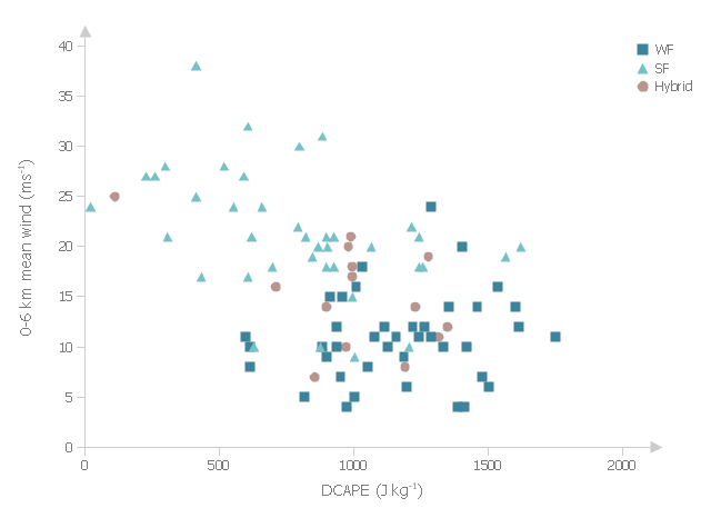
This example was drawn on the base of fig. 13 "Scatter plot of DCAPE versus 0-6 km mean wind" from the article "Examination of Derecho Environments Using Proximity Soundings" by Jeffry S. Evans on the website of Storm Prediction Center, National Oceanic and Atmospheric Administration.
"Figure 13 suggests the existence of an inverse relationship between DCAPE and mean wind when considering all derechos. Careful examination of this figure shows that this is the result of the separation into SF, WF, and hybrid categories; the SF cases are found in the upper left part of the figure, the WF cases are found in the lower right part, and the hybrid cases are in between, with some hint that they are more like the WF cases than the SF cases." [spc.noaa.gov/ publications/ evans/ bowpaper/ bowpaper.htm]
"In stratified sampling, the population is partitioned into non-overlapping groups, called strata and a sample is selected by some design within each stratum. ...
The principal reasons for using stratified random sampling rather than simple random sampling include:
1. Stratification may produce a smaller error of estimation than would be produced by a simple random sample of the same size. This result is particularly true if measurements within strata are very homogeneous.
2. The cost per observation in the survey may be reduced by stratification of the population elements into convenient groupings.
3. Estimates of population parameters may be desired for subgroups of the population. These subgroups should then be identified." [onlinecourses.science.psu.edu/ stat506/ node/ 27]
The multiserial scatterplot "Starification diagram example" was created using the ConceptDraw PRO software extended with the Seven Basic Tools of Quality solution from the Quality area of ConceptDraw Solution Park.
Multiserial scatterplot
Scatter Plot

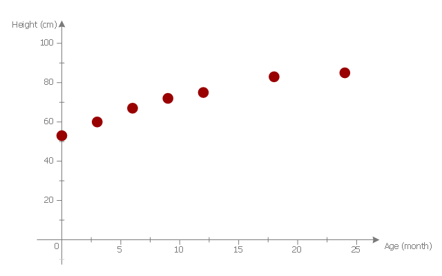
This scatter graph example visualize correlation between baby height and age.
"Human height is the distance from the bottom of the feet to the top of the head in a human body, standing erect. It is usually measured in centimetres when using the metric system, and feet and inches when using the imperial system. Human height has varied from under 60 centimetres (2 ft 0 in) to over 260 centimetres (8 ft 6 in). On average, males are taller than females. ...
Growth in stature, determined by its various factors, results from the lengthening of bones via cellular divisions chiefly regulated by somatotropin (human growth hormone (hGH)) secreted by the anterior pituitary gland. ...
The majority of linear growth occurs as growth of cartilage at the epiphysis (ends) of the long bones which gradually ossify to form hard bone. The legs compose approximately half of adult human height, and leg length is a somewhat sexually dimorphic trait. Some of this growth occurs after the growth spurt of the long bones has ceased or slowed. The majority of growth during growth spurts is of the long bones. Additionally, the variation in height between populations and across time is largely due to changes in leg length. The remainder of height consists of the cranium. Height is sexually dimorphic and statistically it is more or less normally distributed, but with heavy tails." [Human height. Wikipedia]
The scatter plot example "Baby height by age" was created using the ConceptDraw PRO diagramming and vector drawing software extended with the Scatter Diagrams solution from the Graphs and Charts area of ConceptDraw Solution Park.
Scatter diagram
Business Report Pie. Pie Chart Examples


Pie Chart Word Template. Pie Chart Examples

Basic Diagramming

- Scatter Chart Examples | Blank Scatter Plot | How to Draw a Scatter ...
- Scatter Chart Examples | Blank Scatter Plot | Scatter Chart Analysis ...
- Scatter Chart Examples | Scatter graph - Template | Scatter graphs ...
- Scatter Chart Examples | Create Graphs and Charts | How to Draw ...
- Scatter graphs - Vector stencils library | Design elements - Scatter ...
- How to Draw a Scatter Diagram Using ConceptDraw PRO | Blank ...
- Scatter Graph Charting Software | Scatter Chart Examples | Scatter ...
- Scatter Chart Examples | Scatter Plot Graph | Scatter Graph Charting ...
- Scatter Graph Charting Software | Scatter Chart Examples | Blank ...
- Scatter Diagrams | How to Draw a Scatter Diagram Using ...
- Scatter Graph Charting Software | Scatter Plot Graph | Scatter Chart ...
- Scatter Chart Examples | Scatter Diagram | Blank Scatter Plot ...
- Blank Scatter Plot | Scatter Chart Examples | Scatter Plot | How To ...
- Design elements - Correlation charts | Line Chart Examples | Scatter ...
- Bubble Plot | Matrices | Competitor Analysis | Sample Scatter Graph ...
- Scatter graphs - Vector stencils library | Scatter Graph Charting ...
- Scatter Chart Examples
- Bubble Plot | Spider Chart Template | Blank Scatter Plot | Plot ...
- Blank Scatter Plot | Scatter Chart Examples | Scatter Plot | Scatter Plot
- Make a Scatter Plot | Scatter Plot Graph | Scatter Chart Examples ...