Scatter Chart Examples
Scatter plot examples
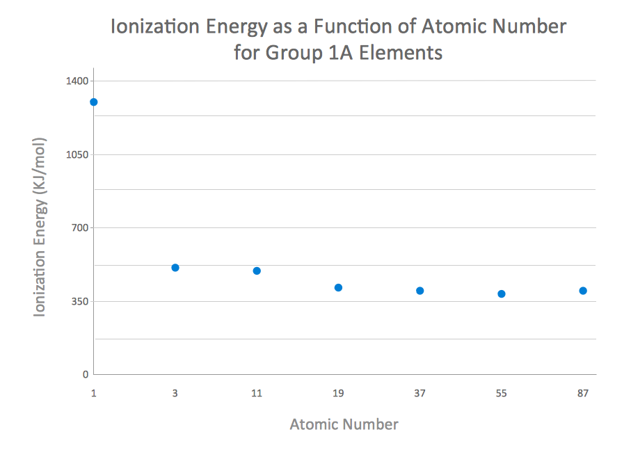
Working in ConceptDraw DIAGRAM diagramming and drawing software you can always make any needed charts, such as, for example, a scatter one, which is known to be one of the seven basic tools within the so called “quality control”.
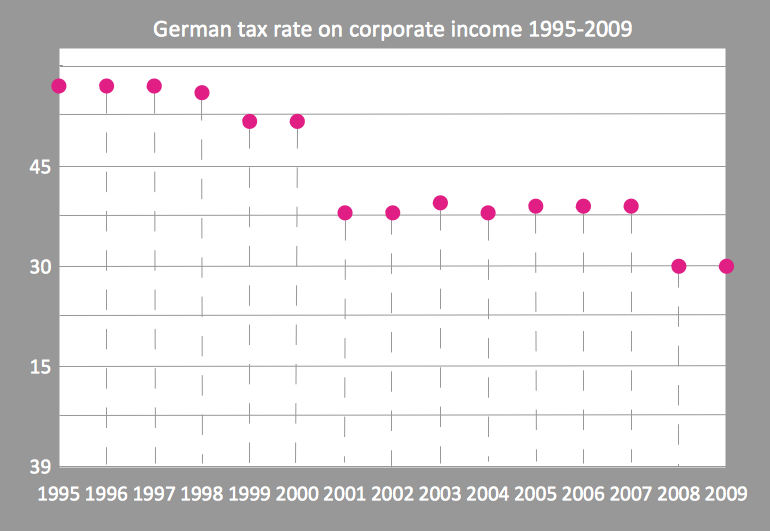
The mentioned scatter chart can be also known as “scatter plot”. Other names for it are “scatter graph”, “scattergram” and “scatter diagram”. It is simply one of the types of plot diagram, also known as “mathematical diagram”. Scatter plot is different from any line graph because of using the so called “Cartesian coordinates”. The mentioned coordinates are used for displaying the values for two variables. In case the points are colour-coded, the one of the additional variables can be easily displayed. The data itself is displayed within such scatter charts as a collection of points. Each of the points has the value of one variable. Such variable determines the position on the horizontal axis as well as the value of the other variable, which determines the position on the vertical axis.
Any scatter plot can be simply used when both of the continuous variables are simply independent. If a certain parameter exists, being systematically incremented or/and decremented by the other, then it’s called as the “control parameter”. Another name for it can be an “independent variable”. It is usually plotted along the horizontal axis on the graph. The dependent or so called “measured variable” is usually plotted along the vertical axis on the scatter graph, so if there are no dependent variable exists, then another type of variable can be plotted on axis. In this case, a scatter plot will represent only the degree of correlation between two variables.
Lots of kinds of correlations can be applied within any scatter plot. These correlations are known to be mentioned between variables, having a certain confidence interval, which in statistics can be explained as a type of interval estimate of a population parameter, computed from the observed data.
For a linear correlation, the best-fit procedure is known to be called as a “linear regression”. It is guaranteed to be able to generate a correct solution in a certain finite time. There are no universal best-fit procedures which can be guaranteed for generating a correct solution for the arbitrary relationship within any scatter plot, but it is still very useful in case it’s needed to see the way how two comparable data sets agree to show the so called non-linear relationships between the variables. It is always possible to do it by simply adding a smooth line. An example of such “smooth line” can be “LOESS,” or simply “locally weighted scatter plot smoothing”, used in the regression analysis, being simply one of the non-parametric regression methods, used for combining the multiple regression models in a so called “k-nearest-neighbour-based” meta-model. It is also quite important to mention, that once some the data is represented by a mixture model of a few simple relationships, then these mentioned relationships will be visually evident as the “superimposed patterns”.
The Cartesian coordinates are widely used for displaying different values for a set of data illustrated with help of scatter chart. Such Cartesian coordinate system is a coordinate one, specifying each point uniquely in a plane by a pair of the numerical coordinates. The mentioned numerical coordinates are known to be the signed distances to the point from two perpendicular directed lines, being fixed and measured in the very same unit of length. Each of the reference lines is known to be called as a “coordinate axis” of the system. The point where two lines meet is called the “origin”. The mentioned coordinates are basically the positions of the perpendicular projections of the point on the two mentioned axes.
Everyone can use the same principle for specifying the position of any point in three-dimensional space by three different Cartesian coordinates, signing distances to the mutually perpendicular planes. Thus, n Cartesian coordinates are known to be specifying the point in a so called “n-dimensional Euclidean space” within any n dimension. The mentioned coordinates are equal to distances from the point to n mutually perpendicular hyperplanes, being very widely used for many different diagrams and charts.
Free Download Scatter Chart Software and View All Examples
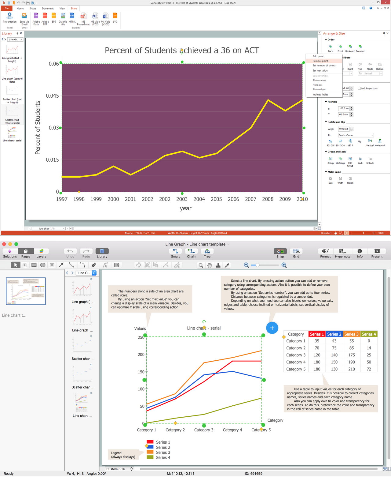
Making the described chart, you will find it very useful to have the Line Graphs solution, available in the ConceptDraw DIAGRAM diagramming and drawing software. Having the mentioned solution will enable you making it possible to draw the great looking charts, having all the needed tools for that, such as the pre-made examples of the charts, including the scatter ones. Thus, having all the previously created templates of the scatter charts can make it much simpler for you to make your own smart looking ones, as having the professionally made graphs can enable you to edit them the way you want to see the final result and so to get it much sooner than if you started to draw your own chart from a scratch.

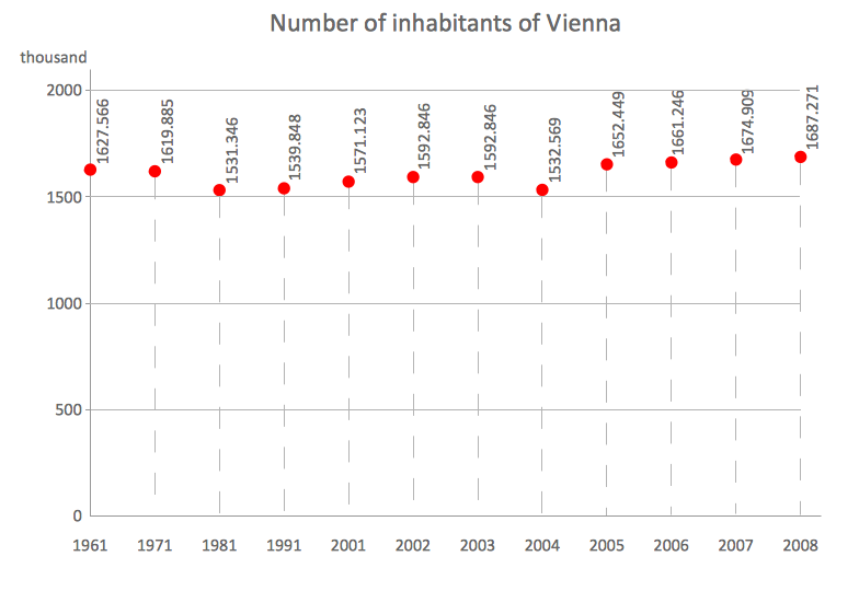
Example 1. Scatter chart example — Number of inhabitants of Vienna
Being of the seven basic tools of quality control, along with cause-and-effect diagram (or "fishbone", or “Ishikawa” one), check sheet, control chart, histogram, Pareto chart and run chart, the scatter one is very widely used and it can be created in ConceptDraw DIAGRAM diagramming and drawing software as well as other diagrams, charts, maps, flowcharts and many other schematics. Having the Line Graphs solution will simplify your work with drawing the needed graph, including the scatter one, so you can use it for your business documentation, for your site or for other reasons, such as while making presentations mentioning the data you want to explain about in a way of a diagram, a scatter one.
See Also:
- Bar Chart Examples
- Line Chart Examples
- Pie Chart Examples
- Pyramid Chart Examples
- Column Chart Examples
TEN RELATED HOW TO's:
Growth-Share Matrix Software →
Growth-Share Matrix Software - ConceptDraw DIAGRAM is a powerful diagramming and vector drawing software for creating professional looking Growth–Share Matrices. For simple and quick creating the Growth–Share Matrix ConceptDraw DIAGRAM offers the Matrices Solution from the Marketing Area of ConceptDraw Solution Park. The Matrices Solution also provides a wide variety of templates and samples that will help you to create the Matrix diagrams of any difficulty.
Six Markets Model Chart →
This sample shows the Six Markets Model Chart. It was created in ConceptDraw DIAGRAM diagramming and vector drawing software using the Marketing Diagrams Solution from the Marketing area of ConceptDraw Solution Park. The six markets model defines six markets that take the central place in the relationship marketing: internal markets, supplier markets, recruitment markets, referral markets, influence markets and customer markets. The six markets model allows the organization to analyze the stakeholders and key market domains that can be important to it.
Account Flowchart. Flowchart Examples →
Create your own flow charts of computer or network system account processing using the ConceptDraw DIAGRAM diagramming and vector drawing software extended with the Cross-Functional Flowcharts solution from the Business Processes area of ConceptDraw Solution Park. The flow chart example shows the computer network system account processing.
Electrical Symbols — Thermo →
A thermocouple is an electrical device consisting of two different conductors forming electrical junctions at differing temperatures. A thermocouple produces a temperature-dependent voltage as a result of the thermoelectric effect, and this voltage can be interpreted to measure temperature. Thermocouples are a widely used type of temperature sensor. 26 libraries of the Electrical Engineering Solution of ConceptDraw DIAGRAM make your electrical diagramming simple, efficient, and effective. You can simply and quickly drop the ready-to-use objects from libraries into your document to create the electrical diagram.
Flow Chart Symbols →
ConceptDraw DIAGRAM software extended with Flowcharts Solution from the "Diagrams" Area is a powerful software that will help you design the flowcharts for any business and technical processes, and software algorithms thanks to the predesigned flow chart symbols. Flowcharts solution offers 2 libraries with large collection of vector flow chart symbols: Flowchart Library, Flowcharts Rapid Draw Library that you can use to create your flowcharts quick and easy. Flowchart Solution is number of diagraming stencils including special set of flow chart symbols such as: terminator, process, decision which indicates a decision points between two or more paths in a flowchart, symbol of delay. Major symbols includes symbol of data, document or multiple documents, subroutine, preparation for processing of documents. Also includes symbols: display, manual input, manual loop, loop limit, stored data,connectors and suming junctions, sort and merge operations, symbols of database and internal stor
Sales Growth. Bar Graphs Example →
This sample was created in ConceptDraw DIAGRAM diagramming and vector drawing software using the Bar Graphs Solution from Graphs and Charts area of ConceptDraw Solution Park. It is Bar Graphs example, Sales Growth example, Column Chart Example - Sales Report.
How to Draw EPC Diagram Quickly →
An event-driven process chain diagram is a flowchart used in business process analysis. It evolved from Architecture of Integrated Information Systems (ARIS) and utilised in the business process improvement and analysis. It is also used to facilitate enterprise resource planning. An EPC diagram is a complex flowchart that shows different business processes through various workflows. The workflows are seen as functions and events that are connected by different teams or people, as well as tasks that allow business processes to be executed. ConceptDraw DIAGRAM is a software for making EPC diagrams that allows managers visually present business process models for making decisions for business.