Scatter Plot
A scatter plot is also known to be called as a scatter graph, scatterplot, scatter chart, scatter diagram or scattergram. It is a type of a plot or mathematical diagram and to make it the Cartesian coordinates can be used for displaying the numeral values for usually two variables for one set of data.
In case the points are colour-coded, then one variable can be displayed in addition. The data that are being displayed is represented as a collection of points, each of which has the value of one variable determining the position on the horizontal axis. Another value of the other variable is known to be determining the position on the vertical axis within a scatter plot.
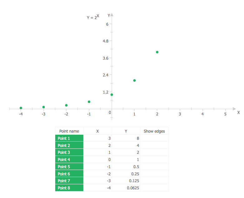
Example 1. Scatter Plot — 2^x function
A scatter plot can be used when one continuous variable that is controlled by the experimenter and the other depends on it or when both of the continuous variables are independent. In case some of the parameters that exist is being systematically decremented andor incremented by the others, then it is known to be called as a “control parameter” or an “independent variable” being customarily plotted all the way along the horizontal axis.
The so-called dependent or measured variable is known to be customarily plotted all along the vertical axis. In case there is no dependent variable that exists, then any type of variable can be plotted on any axis and a scatter plot can illustrate only a degree of correlation between two of the variables.
In statistics, association or dependence is any statistical relationship, whether it is causal or not, between bivariate data or two variables. Correlation is known to be any of a broad class of the statistical relationships that involves dependence. Although, in a common usage, a correlation usually can be referred to how close two variables are for having a linear relationship with each other.
The familiar examples of the dependent phenomena may include the correlation between the demand for a product and its price, for example.
Correlations are known to be very useful because they can indicate some predictive relationship that can be exploited in practice. An electrical utility may produce less power on a mild day being based on the correlation between weather and electricity demand. In this example of a causal relationship, because of the extreme weather conditions, people may use more electricity for either cooling or heating. Although, usually, the presence of some correlation is known to be insufficient for inferring the presence of some causal relationship.
The random variables are known to be dependent in case they cannot satisfy some mathematical property of the probabilistic independence. The correlation in informal parlance is simply synonymous with dependence. Although, being used in a technical sense, a correlation may be referring to any of a few specific types of relationship between different mean values.

Example 2. Scatter Plot — Widgets price scatter
There are a few correlation coefficients used measuring the degree of correlation. The most common is the so-called “Pearson correlation coefficient” — the sensitive only to a linear relationship between two variables one. Other correlation coefficients are known to have been developed in order to be more robust than the mentioned Pearson correlation. By the way, any mutual information can also be applied for measuring the dependence between two variables. A scatter plot can suggest many different kinds of correlations between different variables with some certain confidence interval. Weight and height, for example, height would be on the x-axis and weight would be on y-axis. Correlations may be either positive (or “rising”), negative (or “falling”), or null (or simply “uncorrelated”). In case the pattern of dots slopes from lower left to upper right, then it can indicate a positive correlation between the variables being studied.
A line of best fit that is known to be also called as a “trendline” can be drawn for being used to study the relationship between different variables. An equation for any correlation between different variables can be determined by the established best-fit procedures.
For any linear correlation, the best procedure is the so-called “linear regression”. The mentioned regression can be guaranteed one for generating some correct solution in a finite time. There is no universal best-fit procedure that is guaranteed for generating a correct solution for any arbitrary relationships. A scatter plot that can be created with the help of ConceptDraw DIAGRAM and so the Scatter Diagrams solution can be also very useful when we want to see the way how two comparable data sets agree to show the so-called “nonlinear relationships” between different variables.
The scatter diagram can be also used as one of the seven basic tools of quality control and the scatter charts can be built in the form of a marker, bubble or/and line charts either with the aid of the pre-designed templated that are provided in the Scatter Diagrams solution or from a scratch.

Example 3. Scatter Plot — Cars price depending on age
A so-called “generalized scatter plot matrix” can also be created in ConceptDraw DIAGRAM diagramming and drawing application, knowing to be offering a range of displays of the paired combinations of both quantitative and categorical variables. A fluctuation diagram, faceted bar chart or a mosaic plot may be all used for displaying two different categorical variables. Other plots can be used for one quantitative and one categorical variables.