HelpDesk
How to Create a Bar Chart

Business diagrams & Org Charts with ConceptDraw DIAGRAM
HelpDesk
How to Draw a Divided Bar Chart

 Bar Graphs
The Bar Graphs solution enhances ConceptDraw DIAGRAM functionality with templates, numerous professional-looking samples, and a library of vector stencils for drawing different types of Bar Graphs, such as Simple Bar Graph, Double Bar Graph, Divided Bar Graph, Horizontal Bar Graph, Vertical Bar Graph, and Column Bar Chart.
HelpDesk
How to Draw a Pareto Chart

HelpDesk
How to Draw a Histogram

 ConceptDraw Solution Park
ConceptDraw Solution Park collects graphic extensions, examples and learning materials
HelpDesk
How to Create a Time Series Dashboard

HelpDesk
How to Connect a Live Object to a Text Data Source

 Divided Bar Diagrams
The Divided Bar Diagrams Solution extends the capabilities of ConceptDraw DIAGRAM with templates, samples, and a library of vector stencils for drawing high impact and professional Divided Bar Diagrams and Graphs, Bar Diagram Math, and Stacked Graph.
HelpDesk
How to Create Management Infographics

HelpDesk
How to Create a Sales Dashboard

 Office Layout Plans
Office layouts and office plans are a special category of building plans and are often an obligatory requirement for precise and correct construction, design and exploitation office premises and business buildings. Designers and architects strive to make office plans and office floor plans simple and accurate, but at the same time unique, elegant, creative, and even extraordinary to easily increase the effectiveness of the work while attracting a large number of clients.
HelpDesk
How to Create Education Infographics

 Pie Charts
Pie Charts are extensively used in statistics and business for explaining data and work results, in mass media for comparison (i.e. to visualize the percentage for the parts of one total), and in many other fields. The Pie Charts solution for ConceptDraw DIAGRAM offers powerful drawing tools, varied templates, samples, and a library of vector stencils for simple construction and design of Pie Charts, Donut Chart, and Pie Graph Worksheets.
- Bar Chart Software | ConceptDraw PRO The best Business Drawing ...
- How to Draw an Organization Chart | Pie Chart Examples and ...
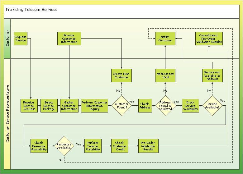
- How to Draw an Organization Chart | Cross-Functional Flowcharts ...
- Sales Growth. Bar Graphs Example | Bar Chart Examples | Create ...
- Process Flowchart | How to Draw an Organization Chart | Waterfall ...
- Business Chart Example
- Pie Chart Software | Bar Chart Software | ConceptDraw PRO ...
- Sales Growth. Bar Graphs Example | Business Report Pie. Pie Chart ...
- Business Marketing Bar Chart
- How to Draw an Organization Chart | How to Draw a Flowchart ...
- Draw Up An Example Of Bar Graph
- How to Draw an Organization Chart | ConceptDraw PRO ...
- Business and Finance | Picture Graphs | How to Create a Picture ...
- Army Flow Charts | Gant Chart in Project Management | How to ...
- Chart Maker for Presentations | Chart Software for Better ...
- How to Draw a Histogram in ConceptDraw PRO | Chart Examples ...
- Using Fishbone Diagrams for Problem Solving | Bar Diagrams for ...
- Bar Diagrams for Problem Solving. Create space science bar charts ...
- PERT chart - Project management plan | Bar Diagrams for Problem ...