The vector stencils library "Android system icons - action, alert" contains 164 system icons of actions and alerts.
Use this icon set to design user interface of your Android application.
The icons example "Design elements - Android system icons (action, alert)" was created using the ConceptDraw PRO diagramming and vector drawing software extended with the "Android 5 UI" solution from the "Software Development" area of ConceptDraw Solution Park.
System icons of actions and alerts
.png--diagram-flowchart-example.png)
How to Create a Bar Chart

How to Create a Pie Chart

How to Create a Scatter Chart

How to Create a Line Chart

How to Create a Column Chart

The vector stencils library "IVR people" contains 9 interactive voice response (IVR) people icons. Use it to design your IVR diagrams with ConceptDraw PRO diagramming and vector drawing software.
"Icon design is the process of designing a graphic symbol that represents some real, fantasy or abstract motive, entity or action. ... Icon designs can be simple, with flat two-dimensional drawing or a black silhouette, or complex, presenting a combination of graphic design elements such as one or more linear and radial color gradients, projected shadows, contour shades, and three-dimensional perspective effects." [Icon design. Wikipedia]
The IVR diagram symbols example "Design elements - IVR people" is included in the Interactive Voice Response Diagrams solution from the Computer and Networks area of ConceptDraw Solution Park.
Interactive voice response icons
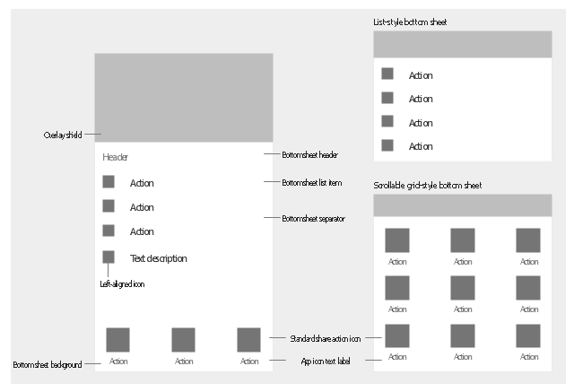
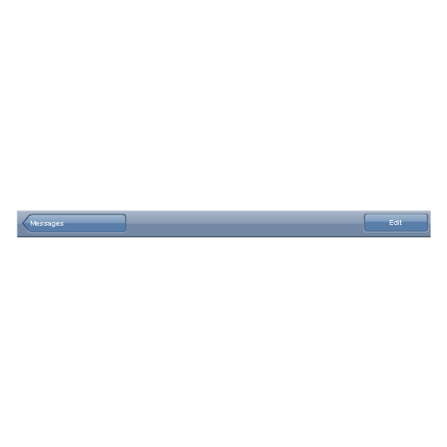
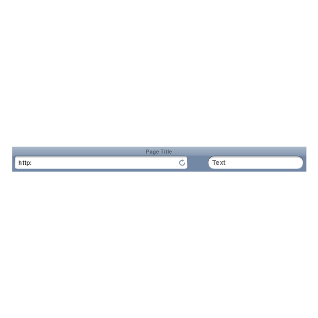
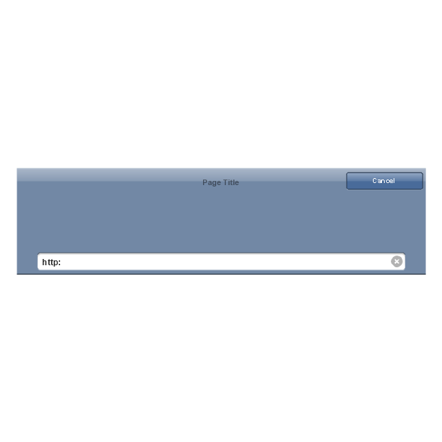
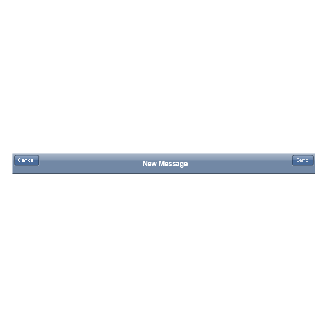
The vector stencils library "Android bottom sheets" contains 11 bottom sheet elements.
Use it to design user interface of your Android application.
The shapes example "Design elements - Android bottom sheets" was created using the ConceptDraw PRO diagramming and vector drawing software extended with the "Android user interface" solution from the "Software Development" area of ConceptDraw Solution Park.
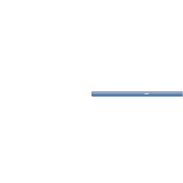
Bottom sheet elements
How to Create a Pyramid Diagram

How to create a UML Diagram

Process Flowchart Symbols

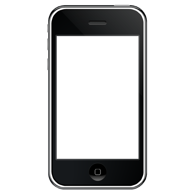
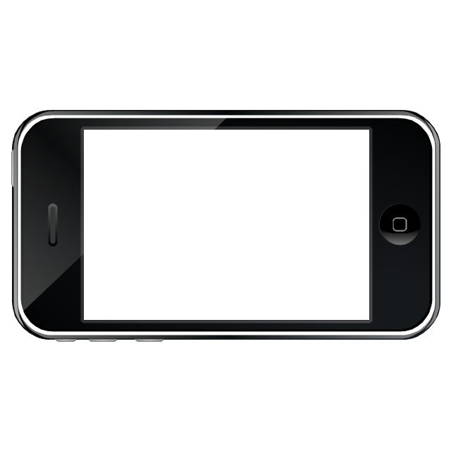
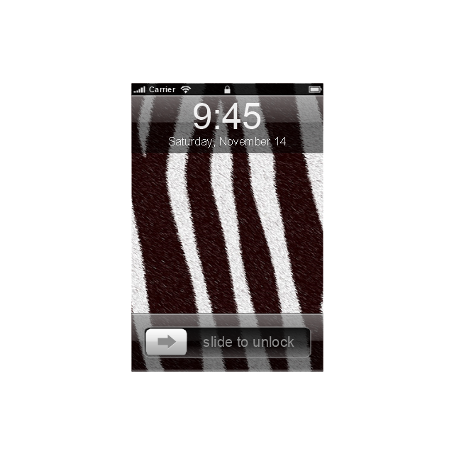
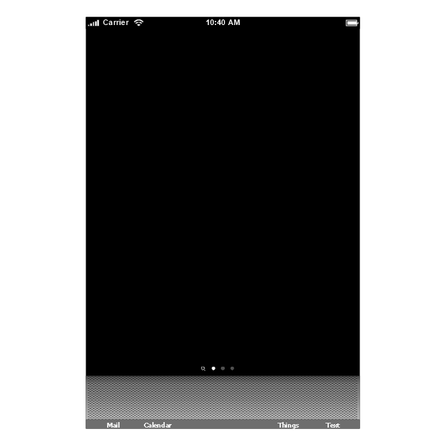
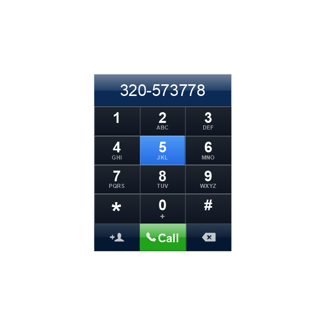
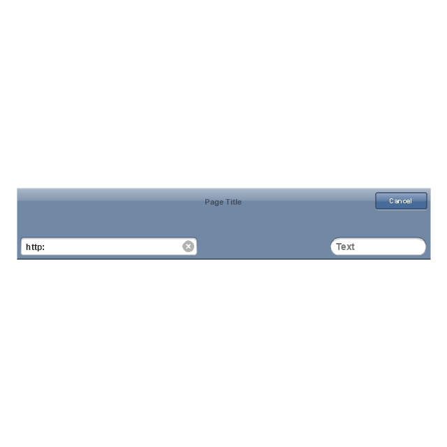
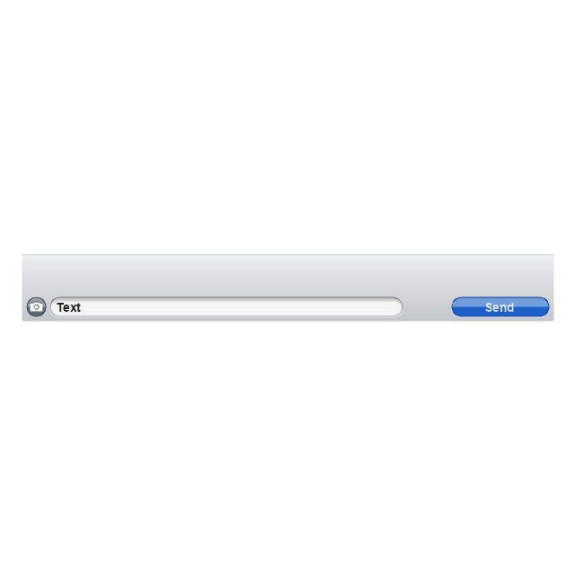
The vector stencils library "iPhone interface" contains 119 iPhone UI design elements.
Use it for development of graphic user interface (GUI) for iPhone software applications in the ConceptDraw PRO diagramming and vector drawing software extended with the Graphic User Interface solution from the Software Development area of ConceptDraw Solution Park.
Use it for development of graphic user interface (GUI) for iPhone software applications in the ConceptDraw PRO diagramming and vector drawing software extended with the Graphic User Interface solution from the Software Development area of ConceptDraw Solution Park.
iPhone case
iPhone case, horizontal
Display
Screen

Home screen
Keypad control
Status bar
Navigation bar
Navigation bar with buttons
Navigation bar with controls
Navigation bar with controls
Navigation bar with buttons, horizontal
Navigation bar with controls, horizontal
Modal view
Search bar
Text field 1

Text field 2
Text field, varying
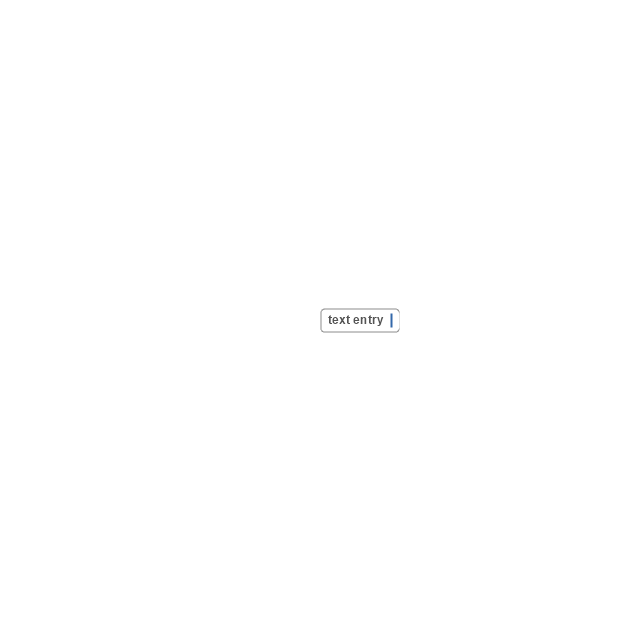
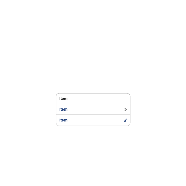
Table row
Table view row
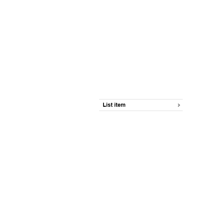
Table view (simple list)
-iphone-interface---vector-stencils-library.png--diagram-flowchart-example.png)
Table view (with header)
-iphone-interface---vector-stencils-library.png--diagram-flowchart-example.png)
Action list
Control button
Navigational control button

Add button
Navigation toolbar
Tab bar

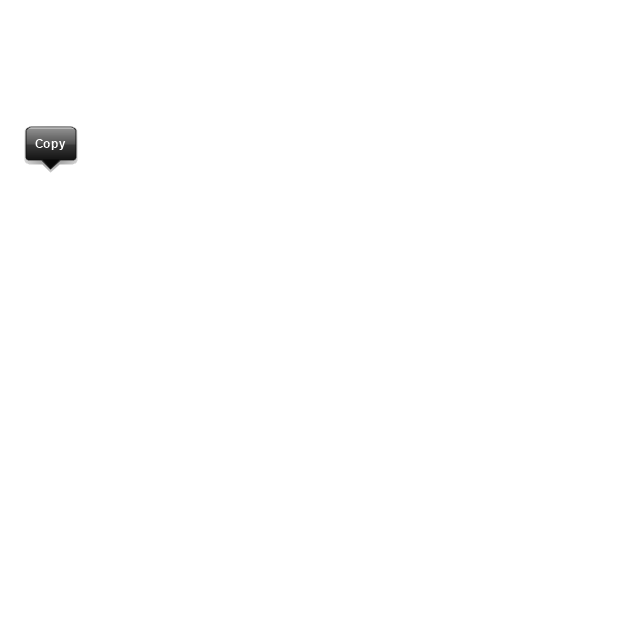
Action sheet

Choice button
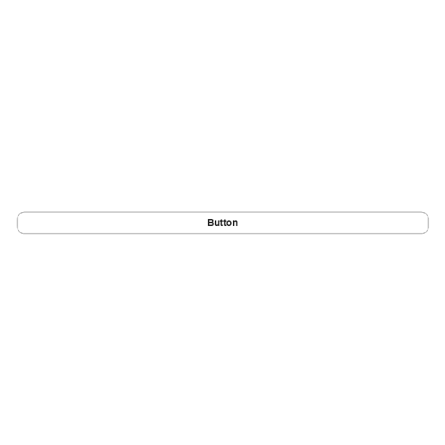
Rounded rectangle button
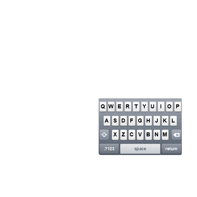
Keyboard control
Keyboard literal button
Keyboard button, pressed
Keyboard label button
Selection frame 1

Selection frame 2
Loupe
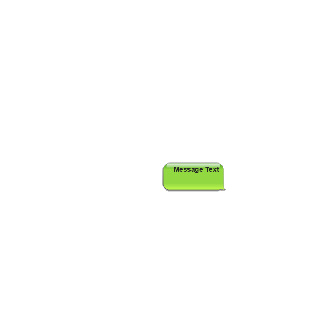
Message box 1
Message box 2
Progress view

Progress view

Progress view

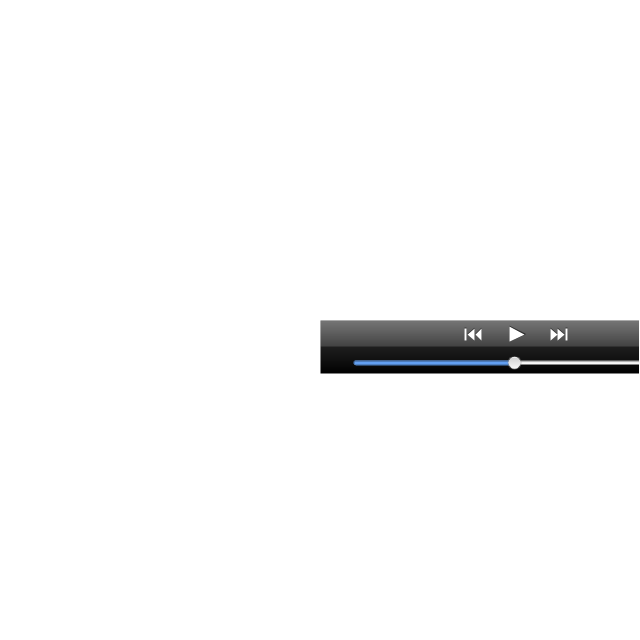
Player control
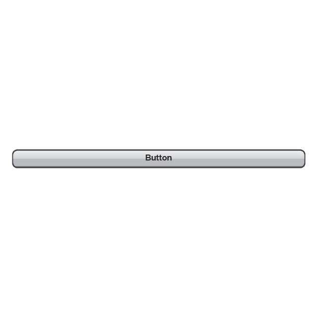
Label button
Back button
Forward button
Option button
Checkbox

Radio button

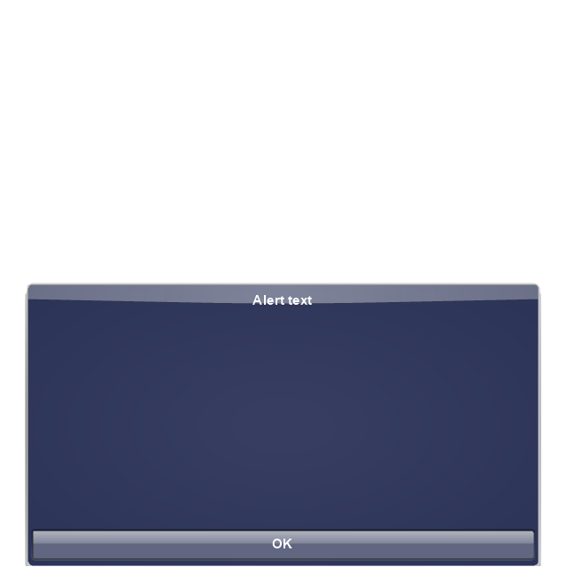
Alert
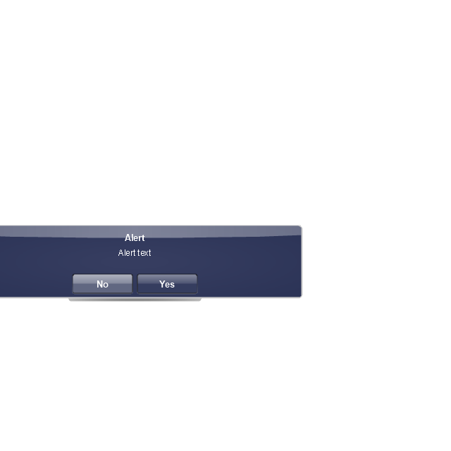
Two-button alert
Two-button alert (v 3.0)
-iphone-interface---vector-stencils-library.png--diagram-flowchart-example.png)
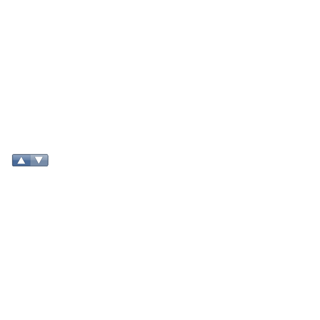
Up-Down control
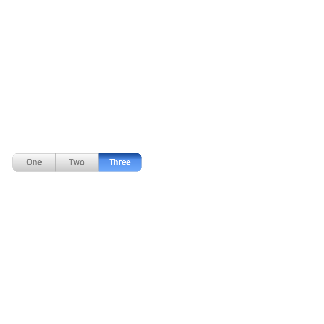
Segmented control
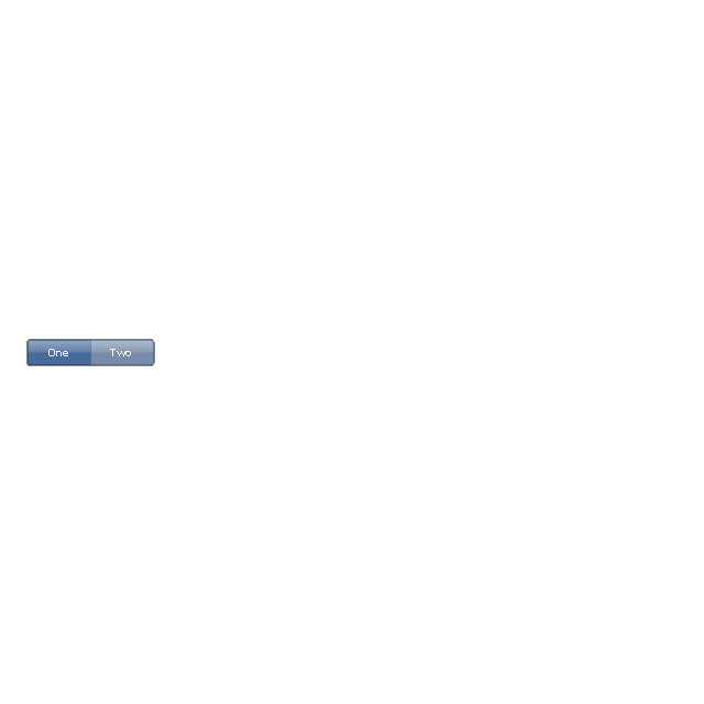
Segmented control
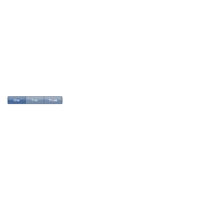
Segmented control
Segmented control
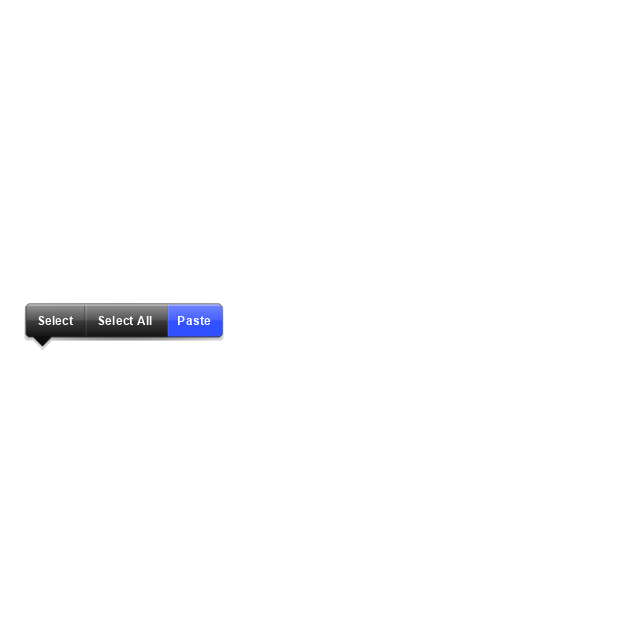
Pop-up menu button
Popup menu
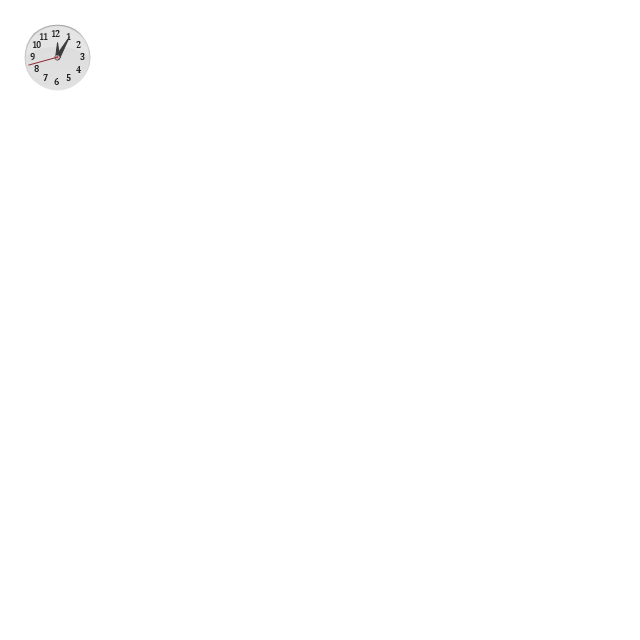
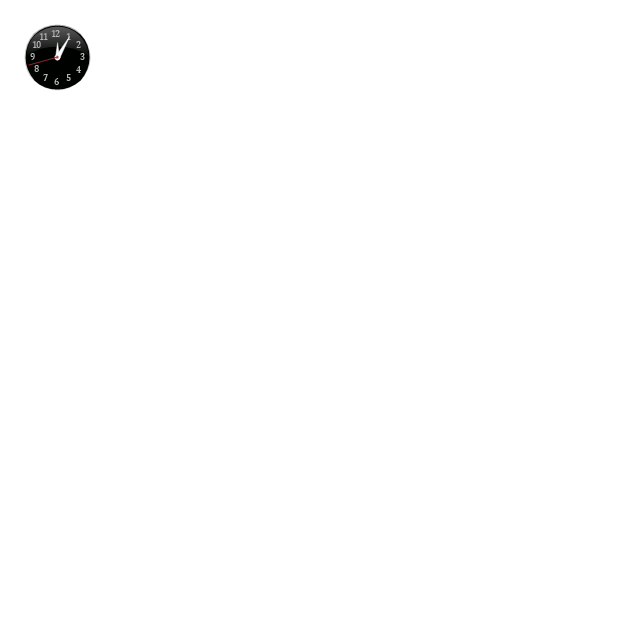
Clock, white
Clock, black
Clock application table

Date and time picker (1/2 parts)
-iphone-interface---vector-stencils-library.png--diagram-flowchart-example.png)
Date and time picker (3 parts)
-iphone-interface---vector-stencils-library.png--diagram-flowchart-example.png)
Date and time picker (4 parts)
-iphone-interface---vector-stencils-library.png--diagram-flowchart-example.png)
Date and time picker (v 3.0)
-iphone-interface---vector-stencils-library.png--diagram-flowchart-example.png)
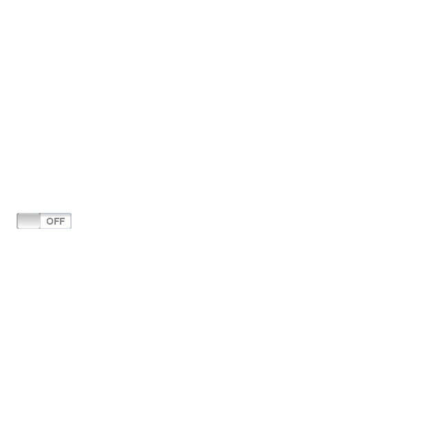
Switch control
System button
Reply button

Organize button

Remove button

Refresh button

Play button

FastForward button

Pause button

Rewind button

Backward icon
Forward icon
Share button

Camera button

Compose button

Bookmarks button

Search button

Add button

Trash button

Bookmarks tab icon
Contacts tab icon
Downloads tab icon
Favorites tab icon
Featured tab icon
History tab icon
MostRecent tab icon
MostViewed tab icon
Search tab icon
More tab icon
SMS tab icon
Mail tab icon
Charts tab icon
World clock tab icon
Alarm tab icon
Stopwatch tab icon
Timer tab icon
Badge
Delete button control

Checkmark
Delete button
Insert

Disclosure indicator

Clear button

Bookmarks badge
Badge with varying width 1
Badge with varying width 2
Badge with varying width 3
Activity indicator

Network activity indicator

Page control

Search badge
Slider
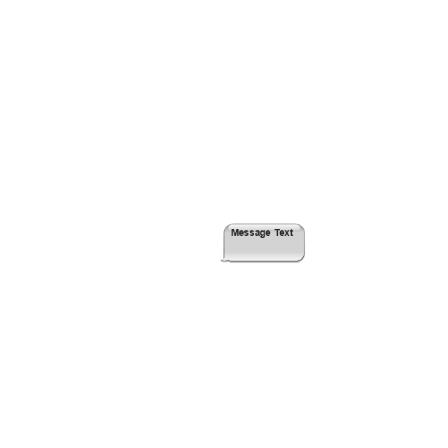
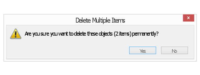
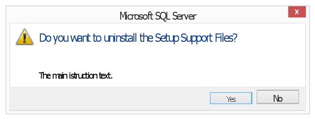
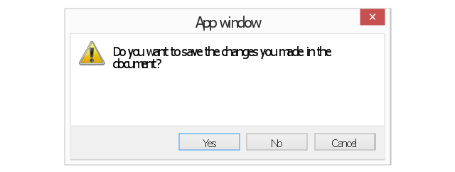
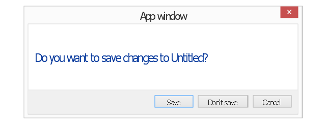
The vector stencils library "Messages" contains 10 Message dialog elements.
Use this notification dialog UI icon set to design graphic user interface (GUI) of your Windows 8 software application.
"A message dialog is an overlay UI element that provides a stable and contextual surface that is always modal and explicitly dismissed. Message dialogs appear at a consistent location on the screen. ...
Error messages that apply to the overall app context use message dialogs. ...
- Use message dialogs to convey urgent information that the user must see and acknowledge before continuing. ...
- Use message dialogs to present blocking questions that require the user's input. A blocking question is a question where the application cannot make a choice on the user's behalf, and cannot continue to fulfill it's value proposition to the user. A blocking question should present clear choices to the user. It is not a question that can be ignored or postponed.
- Use message dialogs to ask for explicit action from the user or to deliver a message that is important for the user to acknowledge. ...
- Use custom dialogs when the app or the system must invest a significant amount of time in the ensuing actions such that an accidental dismiss would be detrimental to the user's confidence.
- All dialogs should clearly identify the user's objective in the first line of the dialog's text (with or without a title).
- Don't use message dialogs when the app needs to confirm the user's intention for an action that the user has taken. Instead, a flyout is the appropriate surface. ...
- Don't use message dialogs for errors that are contextual to a specific place on the page, such as validation errors (in password fields, for example), use the app's canvas itself to show inline errors." [msdn.microsoft.com/ en-us/ library/ windows/ apps/ hh738363.aspx]
The notification dialogs example "Messages - Vector stencils library" was created using the ConceptDraw PRO diagramming and vector drawing software extended with the Windows 8 User Interface solution from the Software Development area of ConceptDraw Solution Park.
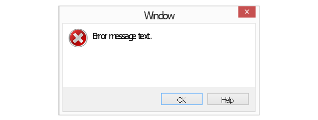
Error message
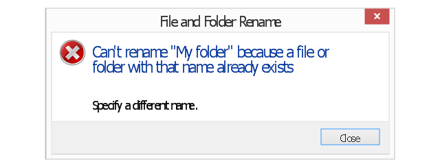
Error message - two commit buttons
Warning message
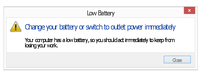
Warning message 2
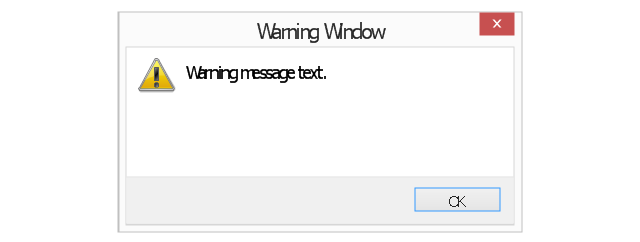
Warning message 3
Warning message - two commit buttons
Warning message - three commit buttons
Typical confirmation
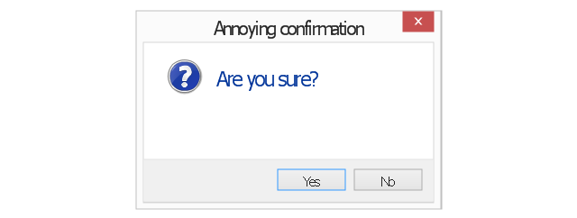
Annoying confirmation
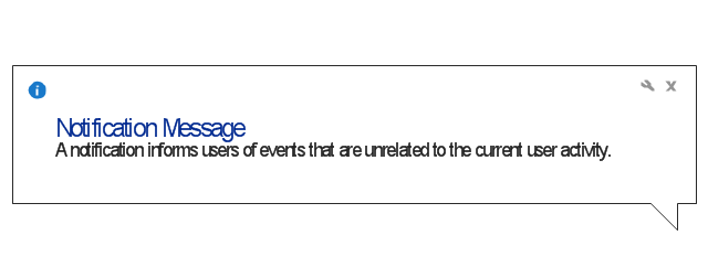
Notification
Basic Flowchart Symbols and Meaning

The vector stencils library "Toolbar control elements" contains 42 toolbar graphical control elements.
Use this tool bar control element UI icon set to design graphic user interface (GUI) of your software application for OS X 10.10 Yosemite Apple Mac operating system.
The example "Toolbar control elements - Vector stencils library" was created using the ConceptDraw PRO diagramming and vector drawing software extended with the Mac OS User Interface solution from the Software Development area of ConceptDraw Solution Park.
Drop-down button

Drop-down button - ON press left

Drop-down button - ON press right

Tool bar button

Tool bar button - ON press

Tool bar button - selected

Left segment

Left segment - ON press

Left segment - selected

Middle segment

Middle segment - ON press

Middle segment - selected

Right segment

Right segment - ON press

Right segment - selected

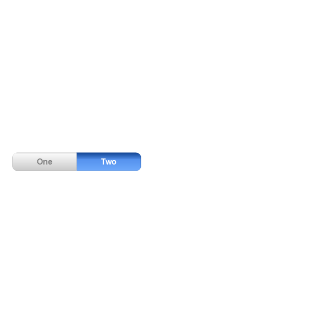
Segmented control - 2 buttons

Segmented control - 3 buttons
Segmented control - 4 buttons

Small button toggle
Back - Forward button

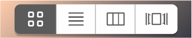
List/Icons view control
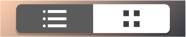
Arrange button

Action menu

Downloads button

Copy button

Share button

Edit tags button

Sidebar button

Slider element

Tool bar button 2

Tool bar button 2 - ON press

Tool bar button 2 - selected

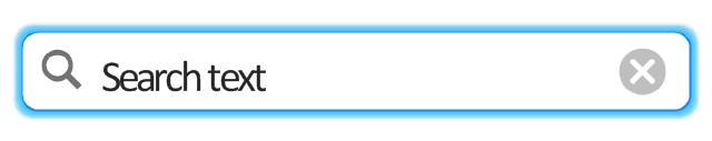
Search field

Search field - active
"Stoplights" control
Close button

Minimize button

Maximize button

Close button - hover

Minimize button - hover

Maximize button - hover

Action button - inactive

- Design elements - Android system icons ( action , alert) | Android 5.0 ...
- Design elements - Android system icons ( action , alert) | Design ...
- Ivr Icons
- Design elements - IVR people | Network Icons | AWS Simple Icons ...
- Motive Icon
- Ivr Icon
- Cisco People. Cisco icons , shapes, stencils and symbols | Design ...
- Design elements - IVR people | Cisco Network Design. Cisco icons ...
- Design Element: IVR for Network Diagrams | Network Diagramming ...
- Cisco Multimedia, Voice, Phone. Cisco icons , shapes, stencils and ...
- Share Icon Png
- Android System Icons List
- Flat Design Icon Png
- Cisco People. Cisco icons , shapes, stencils and symbols | Design ...
- Ios Clock Icon Images
- Process Flowchart | Total Quality Management Value | Design ...
- Top 5 Android Flow Chart Apps | Android UI Design Tool | Android ...
- What is IVR? | Interactive Voice Response System | IVR Systems | Ivr ...
- People Icon Png
- People | Cisco People. Cisco icons , shapes, stencils and symbols ...