Made with
ConceptDraw
DIAGRAM 17

Bar Chart Template

Either working for a company or having your own business, you might need to create different drawings from time to time, such as the bar charts. Having the bar charts examples on the Internet usually means you cannot use them as your own drafts and so you cannot create any bar graph by using any of them. At the same time, if you have the ConceptDraw DIAGRAM diagramming and drawings software, it means you can make any needed diagram, flowchart, scheme or chart, such as a bar one, easily having no doubts in getting the smart and the good-looking result.

Developing the ConceptDraw DIAGRAM diagramming and drawing software, the team of the IT specialists of CS Odessa tried to make it much simpler to make the needed drawing rather than using any other application. The mentioned one seems to be one of the best nowadays for drawing different charts, including the bar ones. In case there are samples you can use from another product of CS Odessa – the ConceptDraw STORE application – installed from one of the available to all the ConceptDraw DIAGRAM users’ solutions, then it can double your chances to make truly unique as well as the professionally looking chart or graph, such as a bar one.

Bar Chart Solution

Pic. 1. Bar Chart Solution

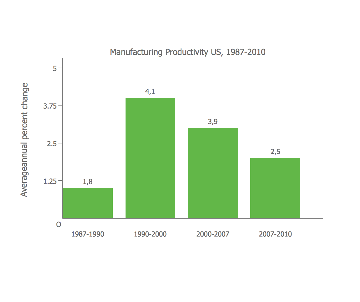
Known to be is the charts or graphs that are widely used for representing the categorical data using the rectangular bars where their heights or lengths are proportional to the values that they represent, the bar charts (or “bar graphs”) are very common for being used in most of the fields of the business activity. Those bars that you can always create within your drawing can be plotted in two ways: either in a vertical one or in a horizontal one. It may be also important to know that any vertical bar chart can be also sometimes called as a “line graph”.

A bar graph is a widely used drawing that can be made especially for a reason of showing all the needed comparisons among different discrete categories with mentioning such categories within the same drawing on the chart or next to it, illustrating only the bars themselves. One of two axises within the chart can be used for showing some specific categories that have to be compared. At the same time, another axis can be used for representing some particular measured value.

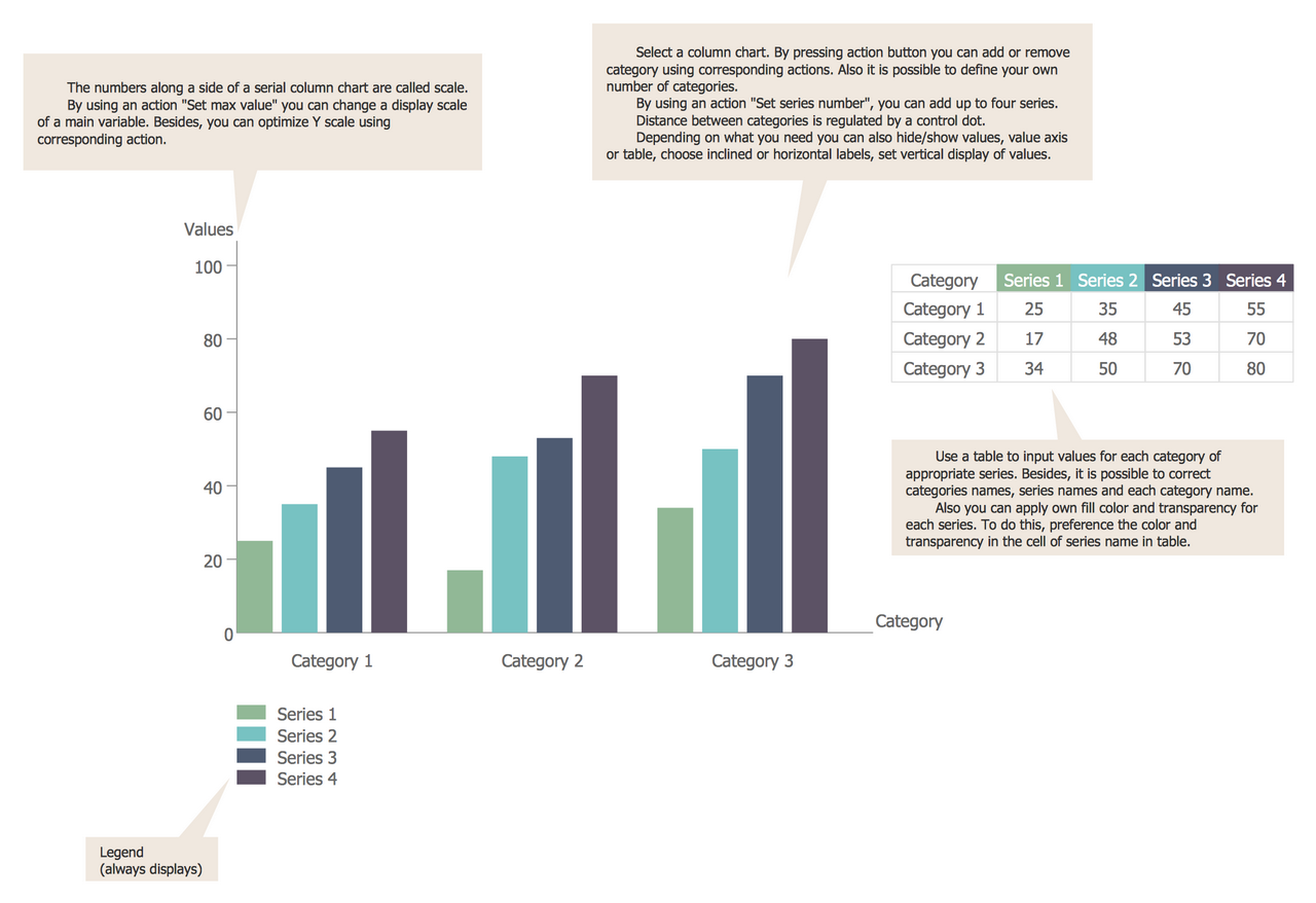
Some of the bar graphs (or “bar charts”) are known to be representing the data by using the bars that can be clustered in groups of several of them. It can be done in order to show all the values of more than one measured variable. To make such chart or a usual bar chart, you can always use any of the available templates within one of the solutions from the ConceptDraw STORE application as long as you are one of so many users of the ConceptDraw DIAGRAM software.

Thus, there are several solutions that can be used for creating the bar charts. One of them is called same way — the “Bar Graphs” solution, offering either design objects in its stencil library: “Vertical bar chart”, “3D bar chart”, “Horizontal bar chart”, “Cylindrical bar chart”, “Double bar chart” and other elements. There are also different templates that all were made by the specialists in such drawings who work for CS Odessa developing the design of the icons, design elements and samples of the drawings.

First template is simply called as the “Bar Chart”, providing all the ConceptDraw DIAGRAM users with the needed information. In this sample, you can find three different categories of data separated by a gap in between them and each of the categories has four series of data coloured in green, light blue, grey and brown each. Taking a look on this drawing it becomes obvious that there is a cardinal difference in values within each of the categories so the needed result can be understood easily by only viewing this bar chart and this is why such bar graphs are so popular: it becomes clear of what its author wanted to say straight away.

Next example that is available to be both viewed and used after the Bar Graphs solution is installed to your desktop is called as the “Median Income by Age and Material Status”. Having the mentioned template, you can see the income differences by age being associated with differences in marital status. This Bar Graph is the one that illustrated the differences in people’s incomes which all depend on their marital status and age. The statuses of those people are marked with different colors on this chart and the color accents make it much easier and more obvious to see the difference.

Bar Chart Template *

Pic. 1. Bar Chart Template

Another example that can be also used by the ConceptDraw DIAGRAM users who are willing to try the Bar Graphs solution, is the “3D Bar Graph – Number of Members in the CNT between 1911 and 1937” one. It was created in the ConceptDraw DIAGRAM diagramming and drawing software by using the Bar Charts stencil library from the Bar Charts solution where the pre-made 3D cylindrical vector objects are. “Amino Acid Composition of Complete UniProt Database” is another template available to be edited any time needed, such as changing the colours of the bars which originally are grey, green, orange, blue, black and yellow. This particular example shows the amino acid composition of the UniProt database. The mentioned database was unified being used all over the world known as the worldwide database of protein sequence and function.

The “EPIET Fellows by Country of Origin” is the fourth example that can be also found in the Bar Charts solution. This template was made with the help of the Bar Charts library and it took only ten minutes for the experienced ConceptDraw DIAGRAM user to create it.

Another one if the “Percentage of U.S. High School Students” example that uses the vertical bars in order to illustrate the percentage of all the students who study at the U.S. school which they attended for the physical education classes, going there once or more often during an average week at the period from 1991 to 2001 years.

See Also:


FIVE RELATED HOW TO's:
All these bar chart templates are included in the Bar Graphs solution. You can quickly rework these bar graph templates into your own charts by simply changing displayed data, title and legend texts.Bar Chart Template for Word *
Picture: Bar Chart Template for Word
Related Solution:
The question how to create a column chart have a simple answer. Use ConceptDraw tips to find out how to create a column chart depicts your data the best way.How to Create a Column Chart *
Picture: How to Create a Column Chart
Related Solution:
You need to draw the Bar Graph? The automated tool can be useful for you. ConceptDraw DIAGRAM diagramming and vector drawing software extended with Bar Graphs solution from Graphs and Charts area of ConceptDraw Solution Park will help you create any Bar Graph.Bar Graph *
Picture: Bar Graph
Related Solution:
This sample was created in ConceptDraw DIAGRAM diagramming and vector drawing software using the Line Graphs Solution from Graphs and Charts area of ConceptDraw Solution Park. This sample shows the Line Chart of annual percentage change. The Line Chart allows you to clearly see the changes of data over the time.Line Chart Template for Word *
Picture: Line Chart Template for Word
Related Solution:
ConceptDraw DIAGRAM extended with Bar Graphs solution from Graphs and Charts area of ConceptDraw Solution Park is ideal software for quick and simple drawing bar chart of any complexity graph.Bar Chart *
Picture: Bar Chart
Related Solution:
ConceptDraw
DIAGRAM 17