This site uses cookies. By continuing to browse the ConceptDraw site you are agreeing to our Use of Site Cookies.
HelpDesk

How to Create Data-driven Infographics

Data-driven infographics are used in wildly disparate areas of business and commerce. To make effective Data-driven infographics, it's useful to have a wide variety of graphical elements — icons, clipart, stencils, charts and graphs — to illustrate your diagram. ConceptDraw Data-driven Infographics solution provides all the tools you need to present data as described by this article — as well as the charts mentioned previously, you can find histograms, divided bar charts, ring charts, line graphs and area charts — meaning you can find the perfect medium for displaying a certain type of data. It allows you to draw data driven infographics quickly and easily using the special templates and vector stencils libraries.It can be used to quickly communicate a message, to simplify the presentation of large amounts of data, to see data patterns and relationships, and to monitor changes in variables over time.
HelpDesk

How to Add Data-driven Infographics to a MS Word Document Using ConceptDraw PRO

Infographics ae usually used as an effective way of showing a certain portion of information . There are a wide of range of subjects that can be represented in a such way. One of the most simple usage for the infographics, in business diagrams. Sales staff can use it as an effective method of sharing the sales results with the entire team and stakeholders. ConceptDraw Data-driven Infographics solution gives all the tools one need to present a certain type of data. ConceptDraw PRO allows you to easily create data-driven infographics and then insert them into a MS Word document.
HelpDesk

How to Create PowerPoint Presentation from Data Driven Infographics Using ConceptDraw PRO

ConceptDraw PRO can be used as a tool for creating data-driven infographics. It allows you to draw data driven using the special templates and vector stencils libraries. ConceptDraw PRO allows you to make a MS PowerPoint Presentation from your Data-driven infographics in a few simple steps.

Spatial infographics Design Elements: Transport Map

Do you like infographics and data visualization? Creating infographics is super-easy with ConceptDraw.

Infographic Maker

Infographic is a visual way of representing various information, data, knowledge in statistics, geography, journalism, education, and much more areas. ConceptDraw PRO supplied with Pictorial Infographics Solution from the “What are Infographics” Area, provides a set of powerful pictorial infographics tools. Thanks to them it is the best Infographic Maker.

Informative and Well-Designed Infographics

Informative and well-designed Infographics allows visually present various map containing information.
HelpDesk

How to Create Management Infographics Using ConceptDraw PRO

Management might want to communicate a basic workflow for each division of the company, visualise business strategy and decision processes, or display a certain business training concept. In this case, an infographic can be more text heavy, and use illustrations to establish a timeline, process, or step-by-step sequence of events.
ConceptDraw PRO can be used as a tool for creating management infographics. It allows you to draw infographics quickly and easily using the special templates and vector stencils libraries. Infographics can be used to quickly communicate a message, to simplify the presentation of large amounts of data, to see data patterns and relationships, and to monitor changes in variables over time. It can contain bar graphs, pie charts, histograms, line charts, e.t.c.
HelpDesk

How to Create Education Infographics

Education Infographics is used to display a lot of education-related information in a single, visually-appealing graphic. Infographics, created for education purposes can contain different illustrations, detailed charts, and data. ConceptDraw PRO can be used as a tool for creating education infographics. It allows you to draw infographics quickly and easily using the special templates and vector stencils libraries. Infographics can be used to quickly communicate a message, to simplify the presentation of large amounts of data, to see data patterns and relationships, and to monitor changes in variables over time. It can contain bar graphs, pie charts, histograms, line charts, e.t.c.
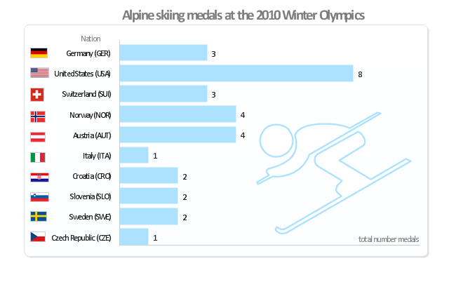
"Alpine skiing at the 2010 Winter Olympics was held at Whistler Creekside in Whistler, British Columbia, Canada. The ten events were scheduled for 13–27 February, 2010; weather delayed the first event, the men's downhill, two days until Monday, 15 February. ... Notably absent from the medals in these Olympics were the Austrian men, who had won 8 medals in 2006 and 7 in 2002. France and host Canada were shut out from the podium, as were the German men and the Swiss and Italian women. The U.S. had its best Olympics ever with eight alpine medals, only the fourth nation to achieve that total in a single Olympics (Austria, France, Switzerland). Individually, three men and five women won multiple medals; triple medalists were Bode Miller of the U.S. and Aksel Lund Svindal of Norway, who both won a medal of each color. The sole double gold medalist was Maria Riesch of Germany." [Alpine skiing at the 2010 Winter Olympics. wikipedia]
This medal bar chart example "Alpine skiing at the 2010 Winter Olympics" was created using the ConceptDraw PRO diagramming and vector drawing software extended with the Winter Sports solution.
The Winter Sports solution from the Sport area of ConceptDraw Solution Park contains the vector stencils library "Winter sports pictograms" and examples of diagrams and infographics.
Medal bar chart
Medal bar chart, alpine skiing, United States, USA, Switzerland, Sweden, Slovenia, Norway, Italy, Germany, Czech Republic, Croatia, Austria,
The vector stencils library "Financial charts" contains 12 charts and graphs.
"A chart, also called a graph, is a graphical representation of data, in which the data is represented by symbols, such as bars in a bar chart, lines in a line chart, or slices in a pie chart". A chart can represent tabular numeric data, functions or some kinds of qualitative structure and provides different info." [Chart. Wikipedia]
Use it to design your financial infographics.
Infographic elements
Infographic elements, vertical bar chart, column chart, serial line chart, line graph, scatter plot, ring chart, donut chart, pie chart, horizontal bar chart, frequency histogram, divided bar diagram, area chart,

Tools to Create Your Own Infographics

Over the past few centuries, data visualization has evolved so much that we use it every day in all areas of our lives. Many believe that infographic is an effective tool of storytelling, as well as analytics, and that it is able to overcome most of the language and educational barriers. Understanding the mechanisms of human perception will help you to understand how abstract forms and colors used in data visualization can transmit information more efficient than long paragraphs of text.

Social Media Marketing Infographic

How to create Social Media Marketing Infographic? It’s very easy! All that you need is a powerful marketing infographics software. Never before creation of Social Media Marketing Infographic wasn’t so easy as now with tools of Marketing Infographics Solution from the Business Infographics Area for ConceptDraw Solution Park.
HelpDesk

How to Connect Text Data to a Time Series Chart on Your Live Dashboard

Time Series Dashboard means an integration of some type of diagrams: Line Charts, Bar Charts, Column Charts, and Dot Plots on a single space. The ConceptDraw Time Series Dashboard solution can be used to create the interactive Time Series dashboard. The libraries of Time Series Charts solution contain the Live Objects, that can change their appearance depending on the external data. Each chart from the Time Series dashboard displays particular source data. You can include Time Series Charts in your business or technical dashboards to show and compare the items changing over time.
ConceptDraw Live Visual Dashboards
HelpDesk

How to Create a Bar Chart in ConceptDraw PRO

Bar charts (bar graphs) are diagrams displaying data as horizontal or vertical bars of certain heights.
Bar charts are widely used to show and compare the values of the same parameters for different data groups.
The bar graph can be vertical or horizontal. This depends on the amount of categories. There are many methods in which bar graph can be built and this makes it a very often used chart type. Usually, a bar chart is created so that the bars are placed vertically. Such arrangement means that the bar's height value is proportional to the category value. Nevertheless, a bar chart can be also drawn horizontally. This means that the longer the bar, the bigger the category. Thus, a bar chart is a good way to present the relative values of different measured items. The ConceptDraw Bar Graphs solution allows you to draw a bar chart quickly using a vector library, containing the set of various bar charts objects.