HelpDesk
How to Draw a Divided Bar Chart

HelpDesk
How to Create a Bar Chart

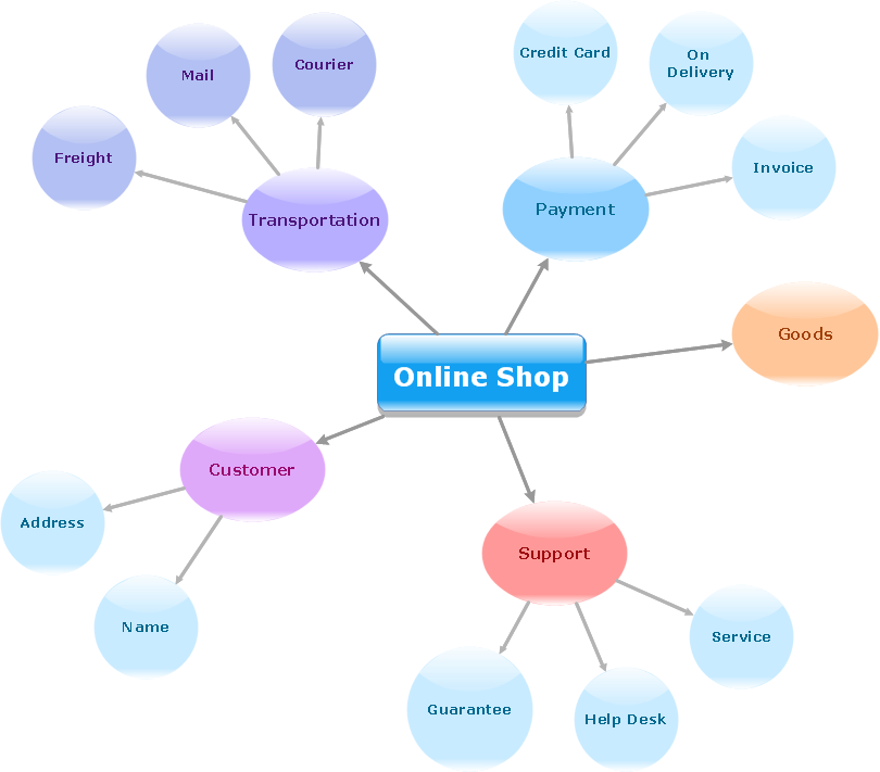
Simple Diagramming
 ConceptDraw Solution Park
ConceptDraw Solution Park collects graphic extensions, examples and learning materials
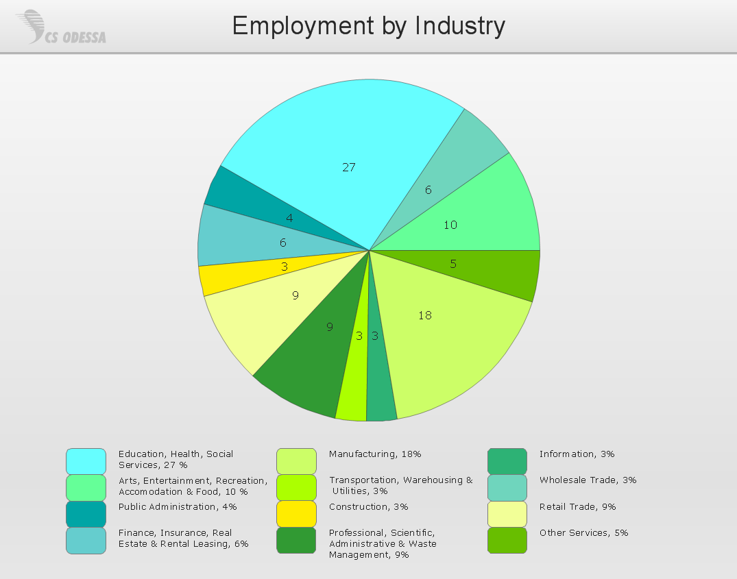
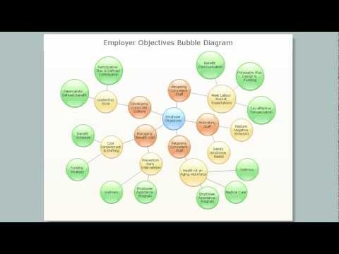
 Bar Graphs
The Bar Graphs solution enhances ConceptDraw DIAGRAM functionality with templates, numerous professional-looking samples, and a library of vector stencils for drawing different types of Bar Graphs, such as Simple Bar Graph, Double Bar Graph, Divided Bar Graph, Horizontal Bar Graph, Vertical Bar Graph, and Column Bar Chart.
Entity Relationship Diagram - ERD - Software for Design Crows Foot ER Diagrams
_Win_Mac.png)
Basic Diagramming
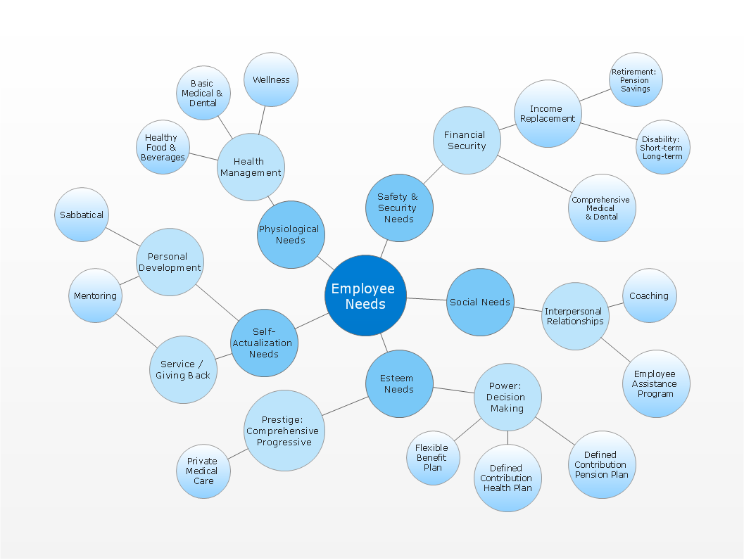
 Divided Bar Diagrams
The Divided Bar Diagrams Solution extends the capabilities of ConceptDraw DIAGRAM with templates, samples, and a library of vector stencils for drawing high impact and professional Divided Bar Diagrams and Graphs, Bar Diagram Math, and Stacked Graph.
Simple Drawing Applications for Mac
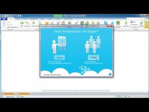
Online Collaboration via Skype

HelpDesk
How to Create a Time Series Dashboard

Basic Diagramming
ConceptDraw Solution Park
ConceptDraw Solution Park collects graphic extensions, examples and learning materials
HelpDesk
How to Draw a Histogram

HelpDesk
How to Draw a Pareto Chart

- ConceptDraw Solution Park | How to Draw a Divided Bar Chart in ...
- Business Productivity Diagramming | How to Draw a Divided Bar ...
- Sales Growth. Bar Graphs Example | Bar Chart Examples | Financial ...
- Flow Chart Online | Online Flow Chart | How to Create a Timeline ...
- Bar Chart Software | In searching of alternative to MS Visio for MAC ...
- Mind Map Exchange | Online Collaboration via Skype | Sales ...
- Online Collaboration via Skype | Sales Growth. Bar Graphs Example ...
- ConceptDraw PROJECT Project Management Tool | PERT chart ...
- Flow Chart Online | ConceptDraw Solution Park | How To Create a ...
- Sales Growth. Bar Graphs Example | Bar Diagrams for Problem ...
- Flow Chart Online | How to Create a Timeline Diagram in ...
- | Bar Chart Template for Word | Timeline Diagrams | Chronological ...
- Bar Chart Software | Pie Chart Software | Bubble Chart Maker | Easy ...
- How To Create a PERT Chart | Flow Chart Online | How to Draw the ...
- Online Result Software Diagram
- Spider Chart Template | Business Diagram Software | Rainfall Bar ...
- Flow Chart Online | Online Flow Chart | ConceptDraw Solution Park ...
- Flow Chart Online | Online Flow Chart | Program Evaluation and ...
- Flow Chart Online | Program Evaluation and Review Technique ...
- Make A Chart Online