Bar Chart Examples
Bar graphs
“Chart” can be also called as a “graph”. Both “graphs” and “charts” are known to be the graphical representations of data, where this data is represented with the help of the symbols. The symbols can be bars, which are used in the so-called “bar charts” or “bar graphs”, lines in the “line charts” and slices in the “pie charts”. Any kind of a chart or a graph represents some particular data, which can be tabular or numeric, or sometimes both. Any chart can also represent any kind of qualitative structure, the functions, providing different information about some particular structure.
The "chart" term has multiple meanings. It can be, for example, a “data chart”, which is one of the types of graphs, with the aid of which it is simpler to organize as well as represent any numerical and/or qualitative data. The so-called “chord chart” can be used in the music notation, the same as a “record chart”. Maps can also consist of a lot of different information, following the specific purpose. Maps are also often called as “charts”: “aeronautical” or “nautical” ones.
Charts are used for simplifying the understanding of large quantities of data in a way of illustrating the relationships between a few different parts of this data. Charts or graphs can be read more quickly and easily than the raw data, that is why they are so very popular. In most of the occasions, they are used in a wide variety of different fields of businesses and everyone can create them both by hand or using a computer with ConceptDraw DIAGRAM software downloaded to it as well as the ConceptDraw STORE one.
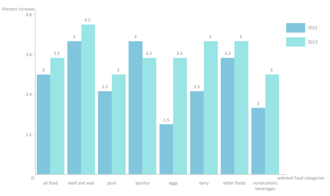 View full size
Example 1. Double bar chart example
Thinking about what exactly to use in order to represent your data, you can always consider at least a few types of charts to use, taking into consideration the specification of your data, which has to be illustrated using them. Some of the charts can be more useful in order to present a particular data set, to compare to the others. Each chart can illustrate a large amount of data in a variety of forms, but still having some common features, providing those charts with their ability to extract the needed meaning from some data, are needed to be specified. Because of some data, mentioned in a chart, can be represented in a graphical form, it simplifies its understanding, so it becomes clearer for those who are meant to see that chart, what it is all about. In general, it is easier for people to infer any meaning from the pictures, as some meaning is usually more complex to get from the text with no images and obvious structure.
There are many types of charts, which can be used for your data representation. One of such charts is known to be called as a “bar chart”, or “bar graph”. Being a chart or graph, that presents the grouped data in a way of the bars (usually in the shapes of rectangles), this type of chart is there to help everyone, who is meant to see it, what exactly goes on and how one part of data is connected to another. The lengths of such charts can be proportional to the values which they represent. The bars within such charts can be plotted either vertically or horizontally, depending on what the charts are meant to use for and why. There is so-called “vertical bar chart” (which is also known as a “Line graph”) that can be also always created with the help of ConceptDraw DIAGRAM using the needed solution to simplify the work of drawing such graph.
Usually, any bar graph uses vertical or horizontal bars, so it is obvious which comparisons are being used among the different categories. Each axis of each chart shows the specific categories, which are meant to be compared. Some of the bar graphs can present the bars clustered in groups of over one and most of them have a discrete range, being scaled, so in this way all of the data can fit in one chart. The bars, used within the particular chart, may be arranged in any needed or any wanted order. The “bar charts” are arranged from the highest to the lowest incidence, which are known to be called the “Pareto charts”. At the same time those, which tend to show the frequency, are usually arranged in the chronological sequence.
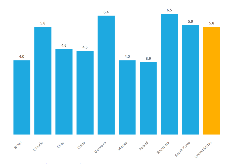 View full size
Example 2. Vertical bar chart example
With the help of bar charts you can always visually present any categorical data, which is being grouped into the discrete groups and you can also use them for complex comparing the particular data using the so-called “grouped bar charts” or the so-called “stacked bar charts”. The “grouped bar charts” usually have two or more bars for each categorical group and they are colour-coded in order to be able to represent a particular grouping. At the same time, the horizontal axis can represent the weeks of the months, when the vertical axis shows the revenue of some business owner.
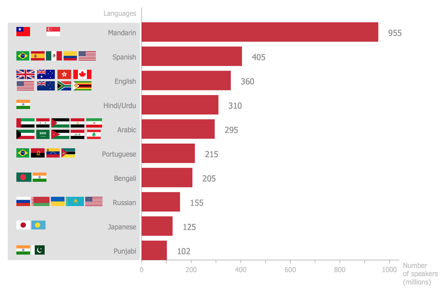 View full size
Example 3. Horizontal bar chart example
All these bar chart samples are included in the Bar Graphs solution.
You can quickly rework these bar graph examples into your own charts by simply changing displayed data, title and legend texts.

Example 4. Vertical bar chart example — Global competitiveness index infrastructure score.
No matter what type of chart you want to create, you can always do it within only a couple of hours, or even minutes, using the professional and smart ConceptDraw DIAGRAM drawing software. Once you have to make any of the described before graphs, then you can simply download this software in order to create great looking and truly smart, professional charts, including the “bar” ones, as well as ConceptDraw STORE, which is another product of CS Odessa full of the so-called “solutions” with the needed drawing tools. Thus, having a “Bar Graphs solution” downloaded from the “Graphs and Charts area” of ConceptDraw DIAGRAM Solution Park from this site (or from ConceptDraw STORE) can be very useful for you as it is the best thing to have in order to get the needed great looking result within a short period of time having all of the necessary tools available for your use. In the mentioned “Bar Graphs solution” you can find all of the needed pre-made templates and examples of different kinds of charts, as well as a vector stencil library for quick and simple drawing of both “bar” and “column” charts.
See Also:
- Line Chart Examples
- Pie Chart Examples
- Scatter Chart Examples
- Pyramid Chart Examples
- Column Chart Examples