Project Timeline

HelpDesk
How to Create a Timeline Diagram

 Timeline Diagrams
Timeline Diagrams solution extends ConceptDraw DIAGRAM diagramming software with samples, templates and libraries of specially developed smart vector design elements of timeline bars, time intervals, milestones, events, today marker, legend, and many other elements with custom properties, helpful for professional drawing clear and intuitive Timeline Diagrams. Use it to design simple Timeline Diagrams and designate only the main project stages, or highly detailed Timeline Diagrams depicting all project tasks, subtasks, milestones, deadlines, responsible persons and other description information, ideal for applying in presentations, reports, education materials, and other documentation.
Timeline Examples

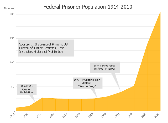
This area chart sample shows the US federal prisoner population changes from 1914 to 2010.
"The Federal Bureau of Prisons (BOP) is a United States federal law enforcement agency. A subdivision of the U.S. Department of Justice, the Bureau is responsible for the administration of the federal prison system. The system also handles prisoners who committed acts considered felonies under the District of Columbia's law. The Bureau was established in 1930 to provide more progressive and humane care for federal inmates, to professionalize the prison service, and to ensure consistent and centralized administration of the 11 federal prisons in operation at the time.
According to its official web site, the Bureau consists of more than 116 institutions, six regional offices, its headquarters office in Washington, D.C., two staff training centers, and 22 community corrections offices, and is responsible for the custody and care of approximately 210,000 federal offenders. Approximately 82 percent of these inmates are confined in Bureau-operated correctional facilities or detention centers. The remainder are confined through agreements with state and local governments or through contracts with privately operated community corrections centers, detention centers, prisons, and juvenile facilities." [Federal Bureau of Prisons. Wikipedia]
This area graph sample was redesigned from the Wikimedia Commons file: Federal timeline US prisoners.gif. [commons.wikimedia.org/ wiki/ File:Federal_ timeline_ US_ prisoners.gif]
The area chart example "Federal timeline US prisoners" was created using the ConceptDraw PRO diagramming and vector drawing software extended with the Area Charts solution from the Graphs and Charts area of ConceptDraw Solution Park.
Area graph
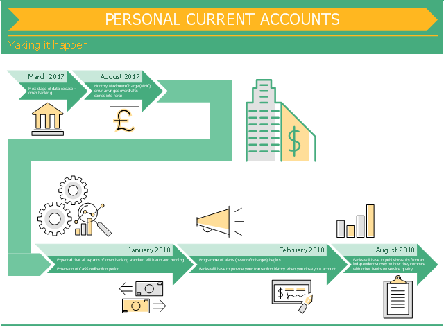
This finance infographic sample was designed on the base of the infographic "Personal current accounts Making it happen" from the the UK Government website. [gov.uk/ government/ uploads/ system/ uploads/ attachment_ data/ file/ 588882/ pcas-timeline-making-it-happen.pdf]
Contains public sector information licensed under the Open Government Licence v3.0.
"In banking "personal account" refers to one's account at the bank that is used for non-business purposes. Most likely, the service at the bank consists of one of two kinds of accounts or sometimes both: a savings account and a current account.
Banks differentiate their services for personal accounts from business accounts by setting lower minimum balance requirements, lower fees, free checks, free ATM usage, free debit card (Check card) usage, etc." [Personal account. Wikipedia]
The finance infographic sample "Personal current accounts timeline" was designed using ConceptDraw PRO software extended with Finanlial Infographics solution from Business Infographic area of ConceptDraw Solution Park.
Financial infogram
Infographic Generator

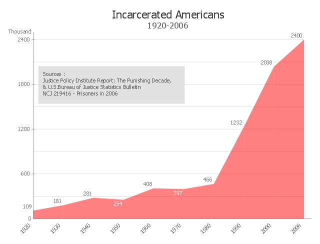
This area chart sample shows the timeline of total number of inmates in U.S. prisons, jails, and juvenile facilities from 1920 to 2006. It was redesigned from the Wikimedia Commons file: US incarceration timeline-clean.gif. [commons.wikimedia.org/ wiki/ File:US_ incarceration_ timeline-clean.gif]
"Incarceration in the United States of America is one of the main forms of punishment, rehabilitation, or both for the commission of felony and other offenses. The United States has the highest documented incarceration rate in the world. At year-end 2009, it was 743 adults incarcerated per 100,000 population.
According to the U.S. Bureau of Justice Statistics (BJS), 2,266,800 adults were incarcerated in U.S. federal and state prisons, and county jails at year-end 2011 – about 0.94% of adults in the U.S. resident population. Additionally, 4,814,200 adults at year-end 2011 were on probation or on parole. In total, 6,977,700 adults were under correctional supervision (probation, parole, jail, or prison) in 2011 – about 2.9% of adults in the U.S. resident population.
In addition, there were 70,792 juveniles in juvenile detention in 2010.
Although debtor's prisons no longer exist in the United States, residents of some U.S. states can still be incarcerated for debt as of 2014." [Incarceration in the United States. Wikipedia]
The area graph example "US incarceration timeline-clean" was created using the ConceptDraw PRO diagramming and vector drawing software extended with the Area Charts solution from the Graphs and Charts area of ConceptDraw Solution Park.
Area graph
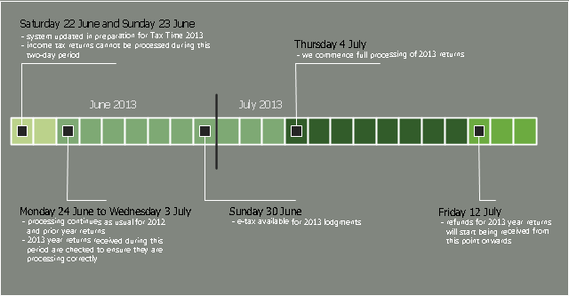
This timeline diagram sample was created on the base of the figure illustrating the webpage "Preparing for Tax Time 2013" from the website of the Australian Taxation Office of the Australian Government. [ato.gov.au/ Tax-professionals/ Prepare-and-lodge/ Tax-Time-2013/ Preparing-for-Tax-Time-2013/ System-availability-and-start-of-return-processing]
"There are many forms of taxation in Australia. Individuals and companies in Australia may be required to pay taxes or charges to all levels of government: local, state, and federal governments. Taxes are collected to pay for public services and transfer payments (redistribution of economic wealth).
Income taxes are the most significant form of taxation in Australia, and collected by the federal government through the Australian Taxation Office. Australian GST revenue is collected by the Federal government, and then paid to the states under a distribution formula determined by the Commonwealth Grants Commission.
Australia maintains a relatively low tax burden in comparison with other wealthy, developed nations, at 25.6% of GDP in 2013." [Taxation in Australia. Wikipedia]
The timeline diagram example "Tax Time 2013 - System availability and processing timeline" was created using the ConceptDraw PRO diagramming and vector drawing software extended with the Timeline Diagrams solution from the Management area of ConceptDraw Solution Park.
Project timeline
Timeline Diagrams

Electrical Schematics

EPC for Business Process Implementation

This timeline diagram sample was created on the base of the figure illustrating the webpage "Preparing for Tax Time 2013" from the website of the Australian Taxation Office of the Australian Government. [ato.gov.au/ Tax-professionals/ Prepare-and-lodge/ Tax-Time-2013/ Preparing-for-Tax-Time-2013/ System-availability-and-start-of-return-processing]
"There are many forms of taxation in Australia. Individuals and companies in Australia may be required to pay taxes or charges to all levels of government: local, state, and federal governments. Taxes are collected to pay for public services and transfer payments (redistribution of economic wealth).
Income taxes are the most significant form of taxation in Australia, and collected by the federal government through the Australian Taxation Office. Australian GST revenue is collected by the Federal government, and then paid to the states under a distribution formula determined by the Commonwealth Grants Commission.
Australia maintains a relatively low tax burden in comparison with other wealthy, developed nations, at 25.6% of GDP in 2013." [Taxation in Australia. Wikipedia]
The timeline diagram example "Tax Time 2013 - System availability and processing timeline" was created using the ConceptDraw PRO diagramming and vector drawing software extended with the Timeline Diagrams solution from the Management area of ConceptDraw Solution Park.
"There are many forms of taxation in Australia. Individuals and companies in Australia may be required to pay taxes or charges to all levels of government: local, state, and federal governments. Taxes are collected to pay for public services and transfer payments (redistribution of economic wealth).
Income taxes are the most significant form of taxation in Australia, and collected by the federal government through the Australian Taxation Office. Australian GST revenue is collected by the Federal government, and then paid to the states under a distribution formula determined by the Commonwealth Grants Commission.
Australia maintains a relatively low tax burden in comparison with other wealthy, developed nations, at 25.6% of GDP in 2013." [Taxation in Australia. Wikipedia]
The timeline diagram example "Tax Time 2013 - System availability and processing timeline" was created using the ConceptDraw PRO diagramming and vector drawing software extended with the Timeline Diagrams solution from the Management area of ConceptDraw Solution Park.
Project timeline
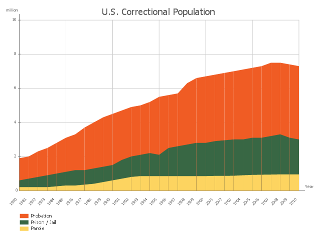
This area chart sample shows the 1980-2013. U.S. timeline of people under adult correctional supervision. It was designed on the base of the Wikimedia Commons file: US correctional population timeline.gif. [commons.wikimedia.org/ wiki/ File:US_ correctional_ population_ timeline.gif]
"Incarceration in the United States is one of the main forms of punishment, rehabilitation, or both for the commission of felony and other offenses. The United States has the largest prison population in the world, and the second-highest per-capita incarceration rate, behind Seychelles (which in 2014 had a total prison population of 735 out of a population of around 92,000). In 2013 in the US, there were 698 people incarcerated per 100,000 population. This is the U.S. incarceration rate for adults or people tried as adults.
According to the US Bureau of Justice Statistics (BJS), 2,220,300 adults were incarcerated in US federal and state prisons, and county jails in 2013 – about 0.91% of adults (1 in 110) in the U.S. resident population." [Incarceration in the United States. Wikipedia]
The area graph example "US correctional population timeline" was created using the ConceptDraw PRO diagramming and vector drawing software extended with the Area Charts solution from the Statistical Charts and Diagrams area of ConceptDraw Solution Park.
Area chart
"Value Stream Mapping (VSM):
– Special type of flow chart that uses symbols known as "the language of Lean" to depict and improve the flow of inventory information. ...
Value Stream Mapping ...
Provide optimum value to the customer through a complete value creation process with minimum waste in:
– Design (concept to customer);
– Design (concept to customer);
– Build (order to delivery);
– Sustain (in-use through life cycle to service)." [courses.washington.edu/ ie337/ Value_ Stream_ Mapping.pdf]
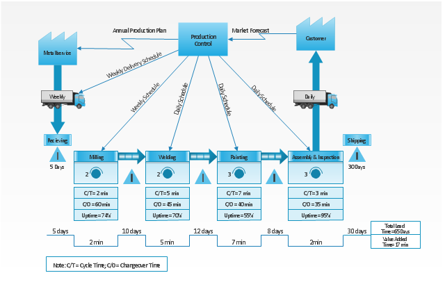
This sample Value Stream Map shows how customer value is created in the steps of manufacturing, production control, and shipping processes.
This VSM example was created using the ConceptDraw PRO diagramming and vector drawing software extended with the Value Stream Mapping solution from the Quality area of ConceptDraw Solution Park.
– Special type of flow chart that uses symbols known as "the language of Lean" to depict and improve the flow of inventory information. ...
Value Stream Mapping ...
Provide optimum value to the customer through a complete value creation process with minimum waste in:
– Design (concept to customer);
– Design (concept to customer);
– Build (order to delivery);
– Sustain (in-use through life cycle to service)." [courses.washington.edu/ ie337/ Value_ Stream_ Mapping.pdf]
This sample Value Stream Map shows how customer value is created in the steps of manufacturing, production control, and shipping processes.
This VSM example was created using the ConceptDraw PRO diagramming and vector drawing software extended with the Value Stream Mapping solution from the Quality area of ConceptDraw Solution Park.
Value stream mapping
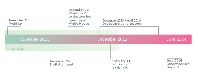
This sample was created on the base of the figure illustrating the webpage "SmartAmerica Challenge Timeline" from the website of the National Institute of Standards and Technology (NIST), an agency of the U.S. Department of Commerce. [nist.gov/ el/ sactl.cfm]
"The SmartAmerica Challenge is a White House Presidential Innovation Fellow project with the goal to bring together research in Cyber-Physical Systems (CPS) and to combine test-beds, projects and activities from different sectors, such as Smart Manufacturing, Healthcare, Smart Energy, Intelligent Transportation and Disaster Response, to show tangible and measurable benefits to the US economy and the daily lives of American citizens.
Cyber-Physical Systems is a name for the combination of the Internet of Things and System Control. So rather than just being able to “sense” where something is, CPS adds the capability to control the “thing” or allow it to interact with physical world around it.
Over 65 Companies, Government Agencies and Academic institutions came together on December 12, 2013 and launched 12 teams/ projects. Since that time 12 new projects have been formed. These teams have been hard at work over the past months building systems, prototypes, pilots and products that demonstrate the capabilities of CPS, but more importantly as the goal of the SmartAmerica Challenge they will show how these technologies will deliver socio-economic benefits to America.
The Challenge will culminate with the SmartAmerica Expo on June 11 at the Washington DC Convention Center." [smartamerica.org/ about/ ]
The timeline diagram example "" was created using the ConceptDraw PRO diagramming and vector drawing software extended with the Timeline Diagrams solution from the Management area of ConceptDraw Solution Park.
Timeline diagram
Activity Network Diagram Method

Chore charts with ConceptDraw DIAGRAM

Orgchart

"Value Stream Map (VSM)
1. A tool used to improve a process by identifying added value and eliminating waste.
2. A process map that follows the value creation process.
A. “strap yourself to the product (or service) and see where you go”
3. A process map with data added.
A. Times: processing, wait, cycle.
B. Quality: number of rejects.
C. Inventory.
D. Resources.
1) Number of people.
2) Space.
3) Distance traveled.
E. Whatever else is useful for analyzing the process." [ocw.mit.edu/ courses/ aeronautics-and-astronautics/ 16-660j-introduction-to-lean-six-sigma-methods-january-iap-2012/ lecture-notes/ MIT16_ 660JIAP12_ 1-6.pdf]
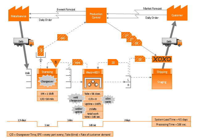
This sample VSM flowchart shows the value stream in a manufacturing, production control and shipping processes.
This value stream mapping diagram example was created using the ConceptDraw PRO diagramming and vector drawing software extended with the Value Stream Mapping solution from the Quality area of ConceptDraw Solution Park.
1. A tool used to improve a process by identifying added value and eliminating waste.
2. A process map that follows the value creation process.
A. “strap yourself to the product (or service) and see where you go”
3. A process map with data added.
A. Times: processing, wait, cycle.
B. Quality: number of rejects.
C. Inventory.
D. Resources.
1) Number of people.
2) Space.
3) Distance traveled.
E. Whatever else is useful for analyzing the process." [ocw.mit.edu/ courses/ aeronautics-and-astronautics/ 16-660j-introduction-to-lean-six-sigma-methods-january-iap-2012/ lecture-notes/ MIT16_ 660JIAP12_ 1-6.pdf]
This sample VSM flowchart shows the value stream in a manufacturing, production control and shipping processes.
This value stream mapping diagram example was created using the ConceptDraw PRO diagramming and vector drawing software extended with the Value Stream Mapping solution from the Quality area of ConceptDraw Solution Park.
Value stream mapping
- Business Process Mapping — How to Map a Work Process | How to ...
- Project Timeline | Timeline Examples | How to Make a Timeline ...
- Timeline Examples | Project Timeline | How to Make a Timeline ...
- Timeline Examples | Project Timeline | How to Create a Timeline ...
- Sample Timelines
- Sample Project Timeline
- Timeline Diagrams | Sample Diagram Of A Business Proposal
- Timeline Examples | Project Timeline | Timeline Diagrams | Visio ...
- How to Create a Timeline Diagram | Project Timeline | How to Make ...
- Timeline Diagrams | Examples Of Process Timelines
- Process Flow Chart With Timeline Sample
- Pyramid Diagram | Project Timeline | Project — Assigning ...
- Timeline template | What is Infographics Area | Concise Project ...
- HVAC Marketing Plan | Pyramid Diagram and Pyramid Chart ...
- Project Timeline | How To use House Electrical Plan Software | 3 ...
- Project Timeline | Timeline Examples | How to Make a Timeline ...
- Timeline Diagrams | Cafe and Restaurant Floor Plans | Business ...
- Project Timeline | How to Make a Timeline | Timeline Diagrams ...
- | Timeline Diagrams | AWS Architecture Diagrams | Diagram Of ...
- Fishbone Diagrams | How Is A Timeline Graph Applied To Problem ...