Excellent Examples of Infographic Maps

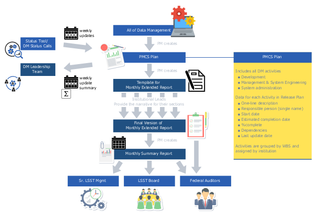
This business infographic sample depicts the project data management reporting system processes. It was designed on the base of the diagram "Weekly Updates and Monthly Reports" from the wiki of the Large Synoptic Survey Telescope (LSST) project.
" The DM project uses the following process for monthly reporting:
1. ... the DM Project Manager maintains data challenge release and management/ system engineering plans in the LSST Project Management Control System (PMCS). Each activity in the plan includes the name of the activity, expected start and end dates, and assignees (with primary/ lead person listed first).
2. The LSST Project provides a web-based tool for weekly status reporting against the plan. The status collected included % complete, actual and expected start and finish dates, and comments."
[dev.lsstcorp.org/ trac/ wiki/ PlanningReportingProcess#DataManagementReportingProcess]
"Data management comprises all the disciplines related to managing data as a valuable resource." [Data management. Wikipedia]
The business infographic example "Data management reporting process" was designed using ConceptDraw PRO diagramming and vector drawing software extended with the Business and Finance solution from Illustration area of ConceptDraw Solution Park.
Infographic
Tools to Create Your Own Infographics

HelpDesk
How to Add Data-driven Infographics to a MS Word Document Using ConceptDraw PRO

How tо Represent Information Graphically

Spatial infographics Design Elements: Location Map

Data Infographics

HelpDesk
How to Create Data-driven Infographics

How to draw Metro Map style infographics? Moscow, New York, Los Angeles, London

HelpDesk
How To Create a MS Visio Data-driven Infographics Using ConceptDraw PRO

HelpDesk
How to Create PowerPoint Presentation from Data Driven Infographics Using ConceptDraw PRO

Informative and Well-Designed Infographics

- Chore charts with ConceptDraw PRO | Typography Infographic ...
- Spatial Infographics | Spatial Data Analysis | Process Flowchart ...
- Event-driven Process Chain Diagrams | What are Infographic Area ...
- Process Flowchart | Spatial infographics Design Elements: Location ...
- Visualization Spatial Data Using Thematic Maps Combined with ...
- Tools to Create Your Own Infographics | Data Flow Diagram Process ...
- Data Infographics | Infographic Tools | Design Elements - Data ...
- Process Flowchart | Data Flow Diagrams | How to Create Data ...
- How To Convert Data -driven Infographics to Adobe PDF Using ...
- Process Flowchart | Education Infographics | Data Flow Diagram ...
- Spatial Infographics | Event-driven Process Chain (EPC) Diagrams ...
- How to Create Data -driven Infographics | How to Add Data -driven ...
- Typography Infographic Examples | Examples of Infographics | Data ...
- Spatial Data Analysis | Informative and Well-Designed Infographics ...
- How to Add Data -driven Infographics to a MS Word Document Using ...
- Flowcharts | Sales Flowcharts | How to Add Data -driven Infographics ...
- Hr Process Infographic Element
- Process Flowchart | Seating Plans | Business Infographics Area | Dfd ...
- How to Add Data -driven Infographics to a MS Word Document Using ...
- Cross-Functional Flowchart | Process Flowchart | How To Convert ...