HelpDesk
How to Create a Picture Graph

 ConceptDraw Solution Park
ConceptDraw Solution Park collects graphic extensions, examples and learning materials
HelpDesk
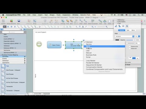
How to Create a Bar Chart in ConceptDraw PRO

HelpDesk
How to Draw a Divided Bar Chart in ConceptDraw PRO

 Line Graphs
How to draw a Line Graph with ease? The Line Graphs solution extends the capabilities of ConceptDraw PRO v10 with professionally designed templates, samples, and a library of vector stencils for drawing perfect Line Graphs.
HelpDesk
How to Draw the Different Types of Pie Charts
HelpDesk
How to Create Data-driven Infographics

Process Flowchart

HelpDesk
How to Draw a Pie Chart Using ConceptDraw PRO

HelpDesk
How to Draw a Line Chart Quickly

State Machine Diagram

Business Diagram Software

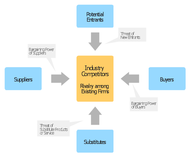
"Porter five forces analysis is a framework for industry analysis and business strategy development. It draws upon industrial organization (IO) economics to derive five forces that determine the competitive intensity and therefore attractiveness of a market. Attractiveness in this context refers to the overall industry profitability. An "unattractive" industry is one in which the combination of these five forces acts to drive down overall profitability. A very unattractive industry would be one approaching "pure competition", in which available profits for all firms are driven to normal profit.
Three of Porter's five forces refer to competition from external sources. The remainder are internal threats.
Porter referred to these forces as the micro environment, to contrast it with the more general term macro environment. They consist of those forces close to a company that affect its ability to serve its customers and make a profit. A change in any of the forces normally requires a business unit to re-assess the marketplace given the overall change in industry information. The overall industry attractiveness does not imply that every firm in the industry will return the same profitability. Firms are able to apply their core competencies, business model or network to achieve a profit above the industry average. A clear example of this is the airline industry. As an industry, profitability is low and yet individual companies, by applying unique business models, have been able to make a return in excess of the industry average.
Porter's five forces include - three forces from 'horizontal' competition: the threat of substitute products or services, the threat of established rivals, and the threat of new entrants; and two forces from 'vertical' competition: the bargaining power of suppliers and the bargaining power of customers.
This five forces analysis, is just one part of the complete Porter strategic models. The other elements are the value chain and the generic strategies." [Porter five forces analysis. Wikipedia]
The block diagram example "Porter's five forces model" was created using the ConceptDraw PRO diagramming and vector drawing software extended with the Block Diagrams solution from the area "What is a Diagram" of ConceptDraw Solution Park.
Block diagram
HelpDesk
How to Draw a Histogram in ConceptDraw PRO

- Create Graphs and Charts | Sales Growth. Bar Graphs Example ...
- Design elements - Marketing charts | How to Create a Picture Graph ...
- Picture Graphs | How to Create a Picture Graph in ConceptDraw ...
- ConceptDraw Solution Park | How to Create a Picture Graph in ...
- Sales Growth. Bar Graphs Example | Bar Chart Examples | Bar ...
- Create Graphs and Charts
- Online Graph Drawing
- Sales Growth. Bar Graphs Example | Sales Dashboard | Sales ...
- Product life cycle process - Flowchart | Draw Flowcharts with ...
- Line Graph | Chart Software for Better Presentations | How to Create ...
- Flow chart Example. Warehouse Flowchart | Create Graphs and ...
- Swim Lane Diagrams | How to Create an IDEF0 Diagram for an ...
- Bar Graphs
- Create Graphs and Charts | Line Graph Charting Software | Polar ...
- Create Graphs and Charts | Graphs and Charts Area | Basic ...
- Pyramid Diagram and Pyramid Chart | Energy Pyramid Diagram ...
- Create Graphs and Charts | How to Create a Line Chart | Line ...
- Bar Graphs | Sales Growth. Bar Graphs Example | How to Create a ...
- Create Graphs and Charts | Best Diagramming Software for Mac ...
- How to Create a Timeline Diagram in ConceptDraw PRO | Timeline ...