HelpDesk
How to Draw the Different Types of Pie Charts
HelpDesk
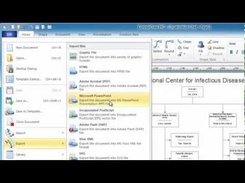
How to Draw a Pie Chart Using ConceptDraw PRO

 Pie Charts
Pie Charts are extensively used in statistics and business for explaining data and work results, in mass media for comparison (i.e. to visualize the percentage for the parts of one total), and in many other fields. The Pie Charts solution for ConceptDraw PRO v10 offers powerful drawing tools, varied templates, samples, and a library of vector stencils for simple construction and design of Pie Charts, Donut Chart, and Pie Graph Worksheets.
HelpDesk
How to Create a Timeline Diagram in ConceptDraw PRO

Basic Diagramming

Simple Diagramming

 ConceptDraw Solution Park
ConceptDraw Solution Park collects graphic extensions, examples and learning materials
HelpDesk
How to Draw a Divided Bar Chart in ConceptDraw PRO

Simple Drawing Applications for Mac

HelpDesk
How to Draw an Area Chart in ConceptDraw PRO

HelpDesk
How to Design a Food-related Infographics Using ConceptDraw PRO

HelpDesk
How to Create Data-driven Infographics

HelpDesk
How to Create Education Infographics

HelpDesk
How to Draw a Histogram in ConceptDraw PRO

HelpDesk
How to Create a Picture Graph in ConceptDraw PRO

- How To Create a PERT Chart | Flow Chart Online | How to Draw the ...
- How to Draw an Organization Chart | Gant Chart in Project ...
- How to Create a Pie Chart | How to Draw the Different Types of Pie ...
- Donut Chart Templates | Pie Donut Chart. Pie Chart Examples ...
- Pie Chart Software | How to Draw a Pie Chart Using ConceptDraw ...
- Flow Chart Online | Online Flow Chart | How to Create a Timeline ...
- Make Charts Online
- Flow Chart Online | How To Create a PERT Chart | Flow chart ...
- Flow Chart Online | How To Create a PERT Chart | How to Create a ...
- Flowchart Software | SWOT analysis matrix diagram templates ...
- Simple Diagramming | Pie Chart Examples and Templates ...
- How to Create Presentation of Your Project Gantt Chart | Pie Donut ...
- Make Your Own Pie Chart
- Make Own Calendar Online For Free
- Flow Chart Online | How to Create a HR Process Flowchart Using ...
- Flow Chart Online | How to Create a Social Media DFD Flowchart ...
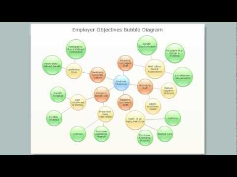
- Bubble Chart Maker | How to Draw a Bubble Chart | Bubble ...
- Pie Donut Chart
- Pie Chart Software | How to Draw the Different Types of Pie Charts ...
- Sales Growth. Bar Graphs Example | Bar Chart Examples | Financial ...