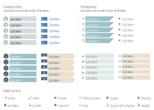
The vector stencils library "Management list blocks" contains 20 list block shapes: numbered list, bulleted list, bullets.
Use these list elements to design your management infograms.
"In typography, a bullet is a typographical symbol or glyph used to introduce items in a list. ...
The bullet symbol may take any of a variety of shapes, such as circular, square, diamond, arrow, etc. ...
Bullets are most often used in technical writing, reference works, notes and presentations. ...
Bulleted items – known as "bullet points" – may be short phrases, single sentences, or of paragraph length. Bulleted items are not usually terminated with a full stop if they are not complete sentences, although it is not rare to terminate every item except the last one with a semicolon, and terminate the last item with a full stop. It is correct to terminate a bullet point with a full stop if the text within that item consists of one 'full' sentence or more." [Bullet (typography). Wikipedia]
The shapes example "Design elements - Management list blocks" was created using the ConceptDraw PRO diagramming and vector drawing software extended with the Management Infographics solition from the area "Business Infographics" in ConceptDraw Solution Park.
Numbered lists, bulleted lists, bullets
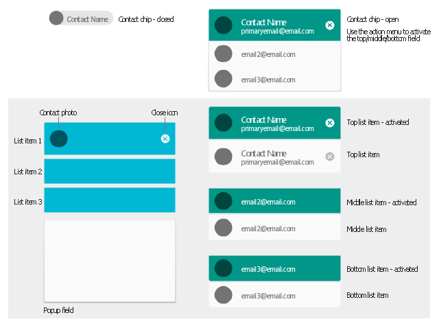
The vector stencils library "Android chips" contains 14 chip elements: contact chips, list items, popup field, contact photo, close icon.
Use it to design user interface of your Android application.
The shapes example "Design elements - Android chips" was created using the ConceptDraw PRO diagramming and vector drawing software extended with the "Android user interface" solution from the "Software Development" area of ConceptDraw Solution Park.
Chip elements
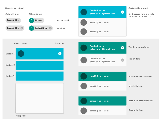
The vector stencils library "Android chips" contains 17 chip elements: contact chips, list items, popup field, contact photo, close icon.
Use it to design user interface of your software applications for Android OS with ConceptDraw PRO software.
The shapes example "Design elements - Android chips" was created using the ConceptDraw PRO diagramming and vector drawing software extended with the "Android user interface" solution from the "Software Development" area of ConceptDraw Solution Park.
Chip elements
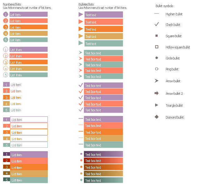
The vector stencils library "List blocks" contains 20 numbered list elements, bulleted list elements and bullet symbols for creating marketing infograms.
"In typography, a bullet ( • ) is a typographical symbol or glyph used to introduce items in a list. ...
The bullet symbol may take any of a variety of shapes, such as circular, square, diamond, arrow, etc., and typical word processor software offer a wide selection of shapes and colours. ...
Bullets are most often used in technical writing, reference works, notes and presentations." [Bullet (typography). Wikipedia]
The shapes example "Design elements - List blocks" was created using the ConceptDraw PRO diagramming and vector drawing software extended with the Marketing Infographics solition from the area "Business Infographics" in ConceptDraw Solution Park.
Lists
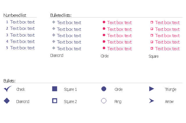
The vector stencils library "Bulleted and numbered lists" contains 12 elements of bulleted and numbered lists, and bullets for creating typography infographics.
"In typography, a bullet ( • ) is a typographical symbol or glyph used to introduce items in a list. ... The bullet symbol may take any of a variety of shapes, such as circular, square, diamond, arrow, etc., and typical word processor software offer a wide selection of shapes and colours. Several regular symbols are conventionally used in ASCII-only text or another environments where bullet characters are not available, such as * (asterisk), - (hyphen), . (period), and even o (lowercase O). Of course, when writing by hand, bullets may be drawn in any style. Historically, the index symbol was popular for similar uses." [Bullet (typography). Wikipedia]
The example "Design elements - Bulleted and numbered lists" was created using the ConceptDraw PRO diagramming and vector drawing software extended with the Typography Infographics solition from the area "What is infographics" in ConceptDraw Solution Park.
Typography infographics elements - Bulleted and numbered lists
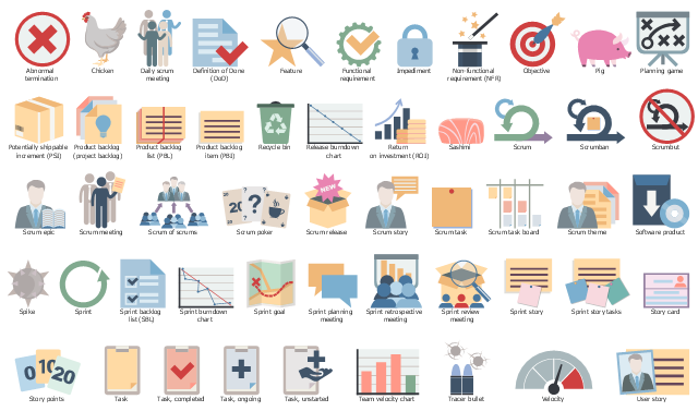
The vector stencils library "Scrum artifacts" contains 52 icons.
Use this clipart set to design your agile software development diagrams and infographics with ConceptDraw PRO software.
"Product backlog
The product backlog comprises an ordered list of requirements that a scrum team maintains for a product. It consists of features, bug fixes, non-functional requirements, etc.—whatever must be done to successfully deliver a viable product. The product owner orders the product backlog items (PBIs) based on considerations such as risk, business value, dependencies, and date needed. ...
Sprint backlog
The sprint backlog is the list of work the development team must address during the next sprint. The list is derived by the scrum team selecting product backlog items from the top of the product backlog until the development team feels it has enough work to fill the sprint. This is done by the development team asking "Can we also do this?" and adding product backlog items to the sprint backlog. The development team should keep in mind its past performance assessing its capacity for the new sprint, and use this as a guide line of how much "effort" they can complete.
The product backlog items may be broken down into tasks by the development team. Tasks on the sprint backlog are never assigned; rather, tasks are signed up for by the team members as needed according to the set priority and the development team member skills. This promotes self-organization of the development team, and developer buy-in. ...
Sprint burn-down chart
The sprint burndown chart is a public displayed chart showing remaining work in the sprint backlog. Updated every day, it gives a simple view of the sprint progress. ...
Release burn-down chart
The release burndown chart is the way for the team to track progress and provide visibility. The release burndown chart is updated at the end of each sprint by the scrum master. The horizontal axis of the release burndown chart shows the sprints; the vertical axis shows the amount of work remaining at the start of each sprint." [Scrum (software development). Wikipedia]
The clip art sample "Design elements - Scrum artifacts" is included in the Scrum solution from the Project Management area of ConceptDraw Solution Park.
Clipart set
The vector stencils library "Controls" contains 53 icons of Windows 8 controls.
Use it to design graphic user interface (GUI) prototypes of your software applications for Windows 8.
"A graphical control element or widget is an element of interaction in a graphical user interface (GUI), such as a button or a scroll bar. Controls are software components that a computer user interacts with through direct manipulation to read or edit information about an application. ...
Each widget facilitates a specific type of user-computer interaction, and appears as a visible part of the application's GUI as defined by the theme and rendered by the rendering engine. The theme makes all graphical control elements adhere to a unified aesthetic design and creates a sense of overall cohesion. Some widgets support interaction with the user, for example labels, buttons, and check boxes. Others act as containers that group the widgets added to them, for example windows, panels, and tabs." [Graphical control element. Wikipedia]
The design elements example "Controls - Vector stencils library" was created using the ConceptDraw PRO diagramming and vector drawing software extended with the Windows 8 User Interface solution from the Software Development area of ConceptDraw Solution Park.
Balloon
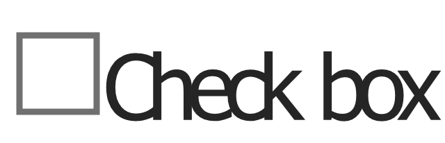
Check box - checked
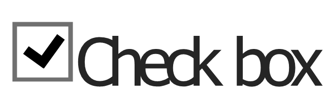
Check box - unchecked
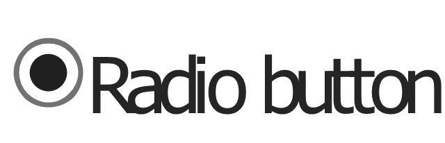
Radio button - selected
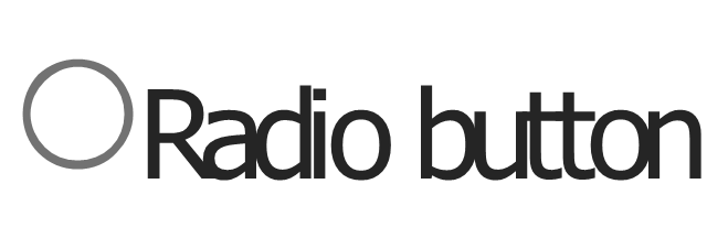
Radio button
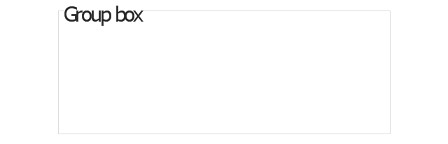
Group box
Standard command button
Default command button
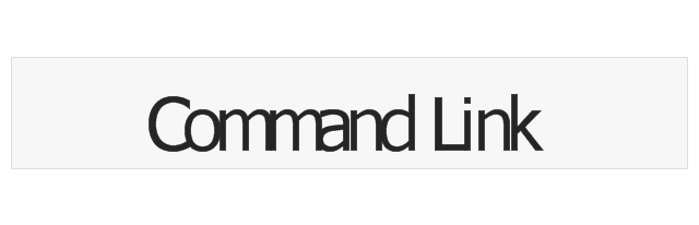
Link
Command link - selected
Command link
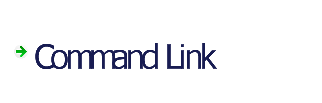
Command link
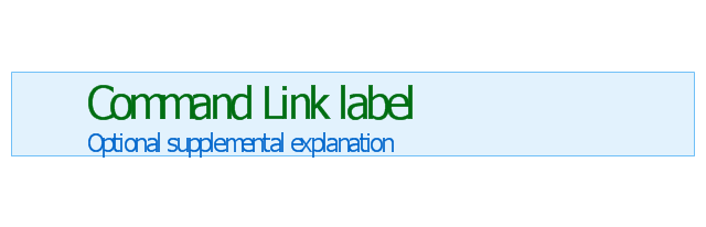
Command link 2
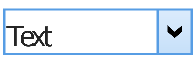
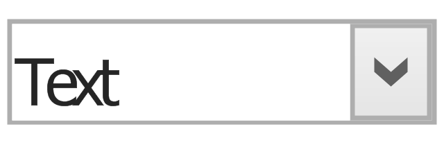
Drop-down button with text box
Drop-down button with text box - selected
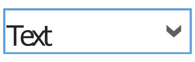
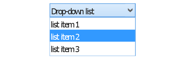
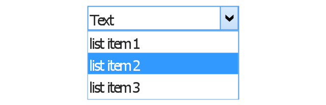
Drop-down list
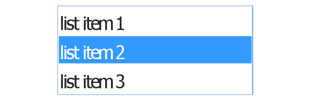
List item
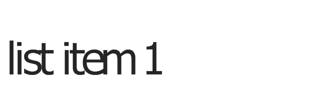
List item - selected

Drop-down button with text box 2
Drop-down list 2
Drop-down button
Drop-down button - selected
Combo box
Combo box 2
Combo box with scroller
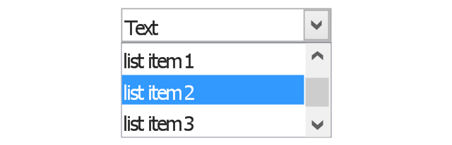
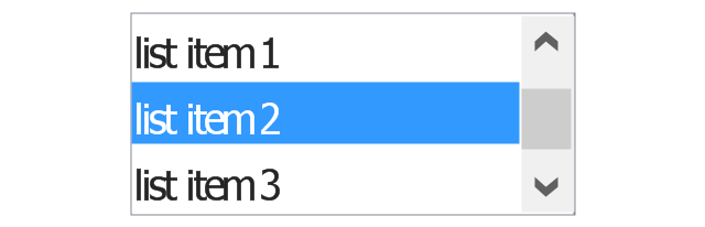
List box
List box with scrollbar
List view
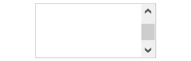
Vertical scroller

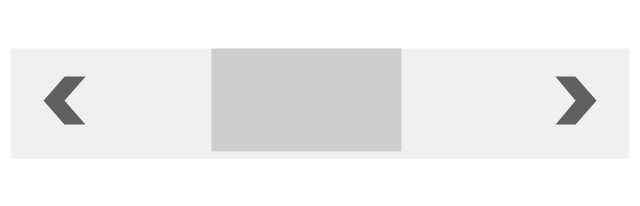
Horizontal scroller
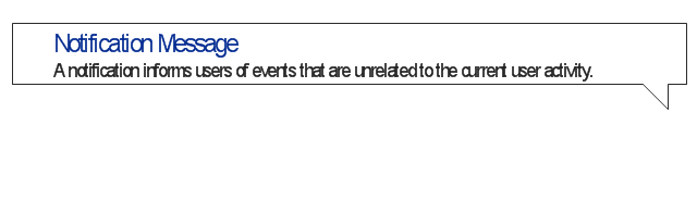
Notification
Options button

Close button

Text label
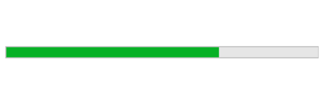
Progress bar
Search box
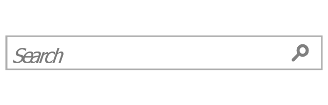
Search symbol

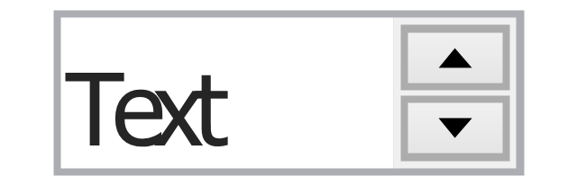
Spin control
Slider - 5 intervals
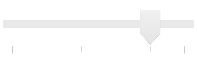
Slider - 10 intervals
Status bar

Start button

Status bar with Start button
Viewed window
Current window state
Tab control
Tab control - selected
Tab view page

Tab view
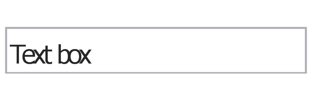
Text box
Text box label
Tooltip

Infotip
UML Diagram Types List

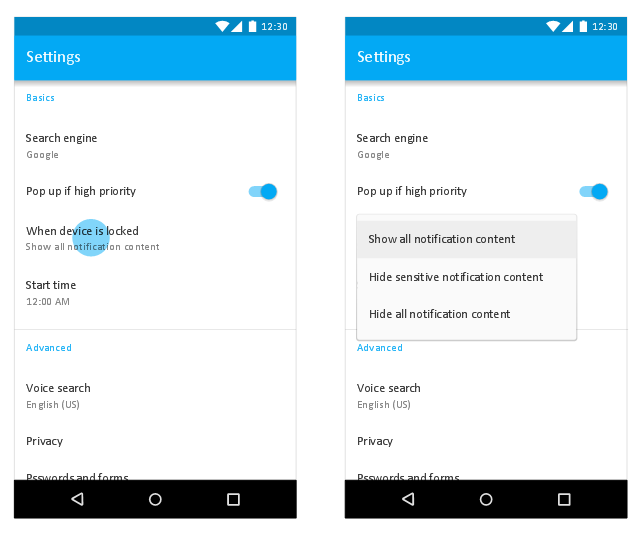
This Android 7 user interface sample shows Material Design simple menu.
"Menus display a list of choices on a transient sheet of material.
Menus appear upon interaction with a button, action, or other control. They display a list of choices, with one choice per line.
Menu items may be disabled if not applicable to a certain context. ...
Use simple menus in lists to display the options for a specific list item. ...
When opened, simple menus attempt to vertically align the currently selected menu item with the list item. The currently selected menu item is highlighted." [material.io/ guidelines/ components/ menus.html]
The Android 7 UI design example "Simple menu" was created using the ConceptDraw PRO diagramming and vector drawing software extended with the "Android user interface" solution from the "Software Development" area of ConceptDraw Solution Park.
Settings dialog
Process Flowchart

Electrical Symbols, Electrical Diagram Symbols

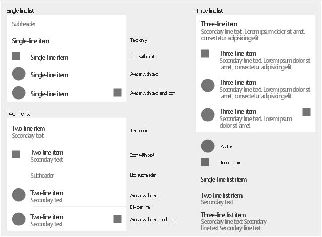
The vector stencils library "Android lists" contains 29 list elements.
Use it to design user interface of your software applications for Android OS with ConceptDraw PRO software.
The shapes example "Design elements - Android lists" was created using the ConceptDraw PRO diagramming and vector drawing software extended with the "Android user interface" solution from the "Software Development" area of ConceptDraw Solution Park.
List elements
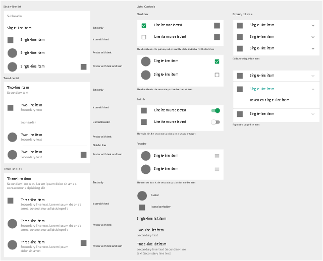
The vector stencils library "Android lists" contains 20 list elements.
Use it to design user interface of your Android 5 application.
The shapes example "Design elements - Android lists" was created using the ConceptDraw PRO diagramming and vector drawing software extended with the "Android user interface" solution from the "Software Development" area of ConceptDraw Solution Park.
List elements
Local area network (LAN). Computer and Network Examples
. Computer and Network Examples")
UML Component Diagram. Design Elements
")
- List Item Design
- Design elements - Bulleted and numbered lists | Design elements ...
- Design elements - Bulleted and numbered lists | Design elements ...
- Android List Item Design
- Item List With Icon
- Process Flowchart | Add Item To List Ui
- Design elements - Management list blocks | Design elements - List ...
- Design elements - Education list blocks | Wireframe Tools | Design ...
- Example Design Address List
- Design elements - Education list blocks | Design elements - List ...
- Basic Flowchart Symbols and Meaning | Design elements ...
- Design elements - Education list blocks | Education Information ...
- Design elements - Education list blocks | Design elements - Bulleted ...
- Text List Design
- Basic Flowchart Symbols and Meaning | Design elements ...
- List Item Android Different Uis
- Design elements - Bulleted and numbered lists | How to Create a ...
- Compound sentence | Design elements - Management list blocks ...
- Controls - Vector stencils library | Process Flowchart | Interior Design ...
- Ribbon interface - Vector stencils library | Design elements - Tabbed ...