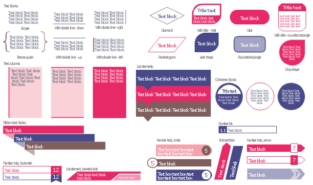
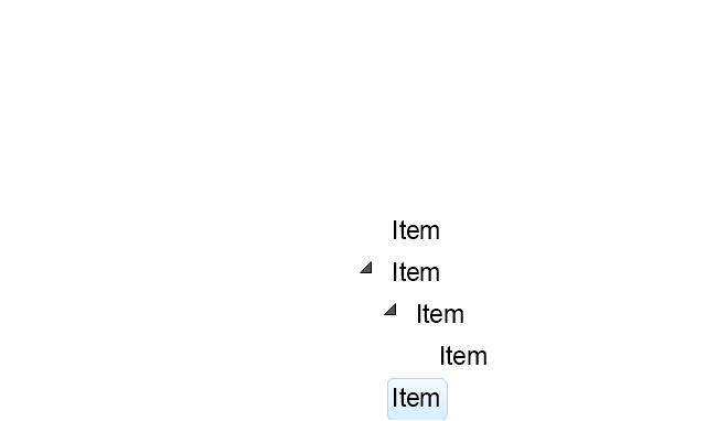
The vector stencils library "Text blocks" contains 38 text blocks including braces quote, blocks with divider line, text columns, list and numbered list elements, inclined list elements, blocks, different shape blocks (arrow, ribbon, circle, rounded rectangle, oval, diamond, parallelogram, leaf, drop), titled text blocks. Use it to add typography elements into your infographics.
The example "Text blocks" was created using the ConceptDraw PRO diagramming and vector drawing software extended with the Typography Infographics solition from the area "What is infographics" in ConceptDraw Solution Park.
The example "Text blocks" was created using the ConceptDraw PRO diagramming and vector drawing software extended with the Typography Infographics solition from the area "What is infographics" in ConceptDraw Solution Park.
Typography infographics elements - Text blocks
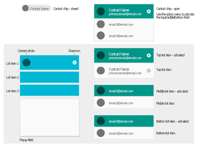
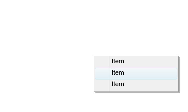
The vector stencils library "Android chips" contains 14 chip elements: contact chips, list items, popup field, contact photo, close icon.
Use it to design user interface of your Android application.
The shapes example "Design elements - Android chips" was created using the ConceptDraw PRO diagramming and vector drawing software extended with the "Android user interface" solution from the "Software Development" area of ConceptDraw Solution Park.
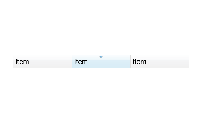
Chip elements
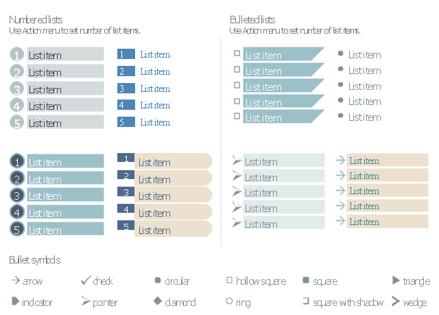
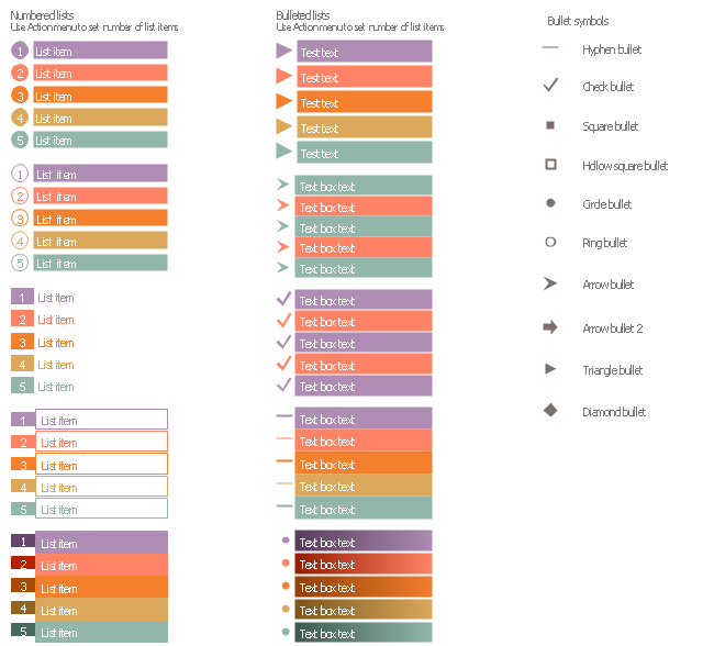
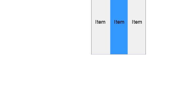
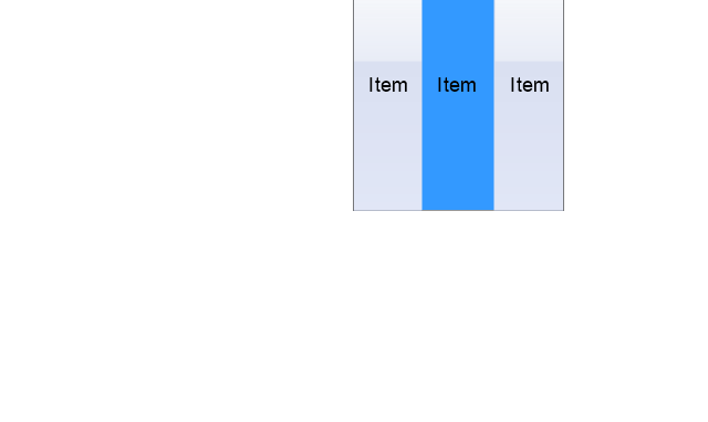
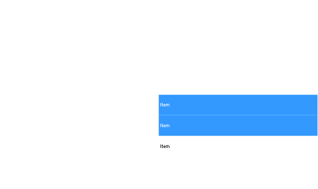
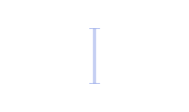
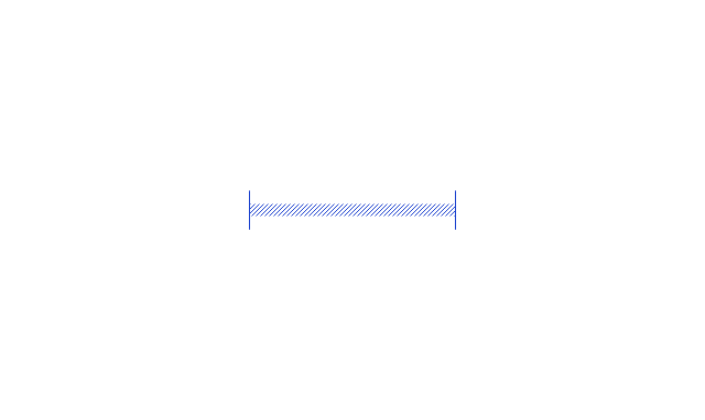
The vector stencils library "Management list blocks" contains 20 list block shapes: numbered list, bulleted list, bullets.
Use these list elements to design your management infograms.
"In typography, a bullet is a typographical symbol or glyph used to introduce items in a list. ...
The bullet symbol may take any of a variety of shapes, such as circular, square, diamond, arrow, etc. ...
Bullets are most often used in technical writing, reference works, notes and presentations. ...
Bulleted items – known as "bullet points" – may be short phrases, single sentences, or of paragraph length. Bulleted items are not usually terminated with a full stop if they are not complete sentences, although it is not rare to terminate every item except the last one with a semicolon, and terminate the last item with a full stop. It is correct to terminate a bullet point with a full stop if the text within that item consists of one 'full' sentence or more." [Bullet (typography). Wikipedia]
The shapes example "Design elements - Management list blocks" was created using the ConceptDraw PRO diagramming and vector drawing software extended with the Management Infographics solition from the area "Business Infographics" in ConceptDraw Solution Park.
Numbered lists, bulleted lists, bullets
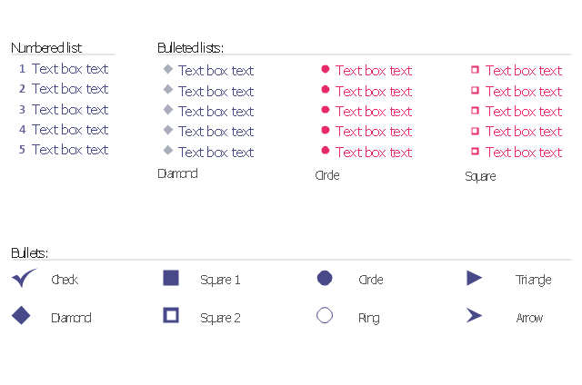
The vector stencils library "Bulleted and numbered lists" contains 12 elements of bulleted and numbered lists, and bullets for creating typography infographics.
"In typography, a bullet ( • ) is a typographical symbol or glyph used to introduce items in a list. ... The bullet symbol may take any of a variety of shapes, such as circular, square, diamond, arrow, etc., and typical word processor software offer a wide selection of shapes and colours. Several regular symbols are conventionally used in ASCII-only text or another environments where bullet characters are not available, such as * (asterisk), - (hyphen), . (period), and even o (lowercase O). Of course, when writing by hand, bullets may be drawn in any style. Historically, the index symbol was popular for similar uses." [Bullet (typography). Wikipedia]
The example "Design elements - Bulleted and numbered lists" was created using the ConceptDraw PRO diagramming and vector drawing software extended with the Typography Infographics solition from the area "What is infographics" in ConceptDraw Solution Park.
Typography infographics elements - Bulleted and numbered lists
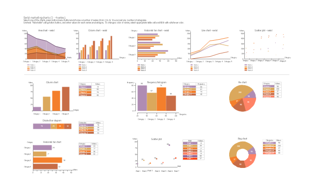
The vector stencils library "Marketing charts" contains 12 graphs and charts: area chart, column chart, divided bar diagram, histogram, horizontal bar graph, line graph, pie chart, ring chart, scatter plot.
Use it to create your marketing infograms.
"A chart can take a large variety of forms, however there are common features that provide the chart with its ability to extract meaning from data.
Typically the data in a chart is represented graphically, since humans are generally able to infer meaning from pictures quicker than from text. Text is generally used only to annotate the data.
One of the more important uses of text in a graph is the title. A graph's title usually appears above the main graphic and provides a succinct description of what the data in the graph refers to.
Dimensions in the data are often displayed on axes. If a horizontal and a vertical axis are used, they are usually referred to as the x-axis and y-axis respectively. Each axis will have a scale, denoted by periodic graduations and usually accompanied by numerical or categorical indications. Each axis will typically also have a label displayed outside or beside it, briefly describing the dimension represented. If the scale is numerical, the label will often be suffixed with the unit of that scale in parentheses. ...
The data of a chart can appear in all manner of formats, and may include individual textual labels describing the datum associated with the indicated position in the chart. The data may appear as dots or shapes, connected or unconnected, and in any combination of colors and patterns. Inferences or points of interest can be overlaid directly on the graph to further aid information extraction.
When the data appearing in a chart contains multiple variables, the chart may include a legend (also known as a key). A legend contains a list of the variables appearing in the chart and an example of their appearance. This information allows the data from each variable to be identified in the chart." [Chart. Wikipedia]
The shapes example "Design elements - Marketing charts" was created using the ConceptDraw PRO diagramming and vector drawing software extended with the Marketing Infographics solition from the area "Business Infographics" in ConceptDraw Solution Park.
Graphs and charts
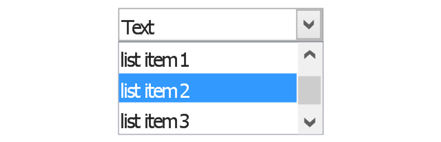
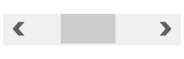
The vector stencils library "Controls" contains 53 icons of Windows 8 controls.
Use it to design graphic user interface (GUI) prototypes of your software applications for Windows 8.
"A graphical control element or widget is an element of interaction in a graphical user interface (GUI), such as a button or a scroll bar. Controls are software components that a computer user interacts with through direct manipulation to read or edit information about an application. ...
Each widget facilitates a specific type of user-computer interaction, and appears as a visible part of the application's GUI as defined by the theme and rendered by the rendering engine. The theme makes all graphical control elements adhere to a unified aesthetic design and creates a sense of overall cohesion. Some widgets support interaction with the user, for example labels, buttons, and check boxes. Others act as containers that group the widgets added to them, for example windows, panels, and tabs." [Graphical control element. Wikipedia]
The design elements example "Controls - Vector stencils library" was created using the ConceptDraw PRO diagramming and vector drawing software extended with the Windows 8 User Interface solution from the Software Development area of ConceptDraw Solution Park.
Balloon
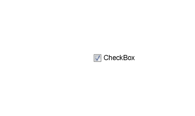
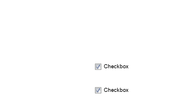
Check box - checked
Check box - unchecked
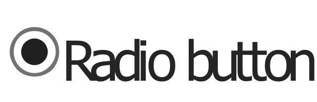
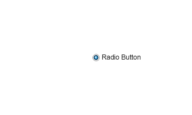
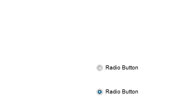
Radio button - selected
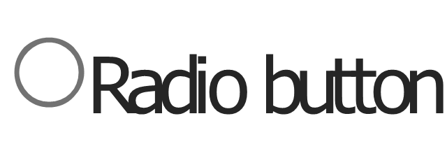
Radio button
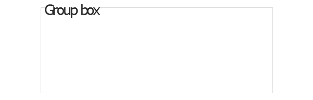
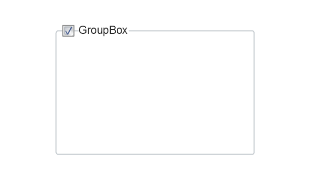
Group box
Standard command button
Default command button
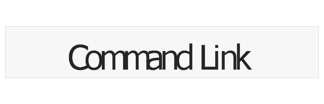
Link
Command link - selected
Command link
Command link
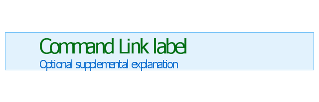
Command link 2
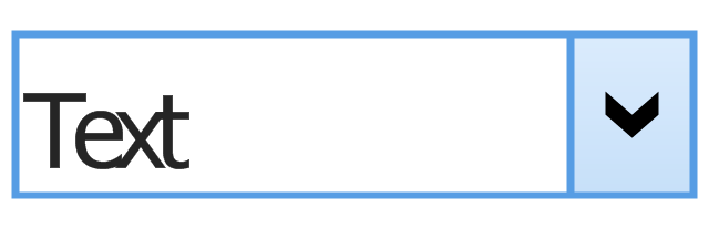
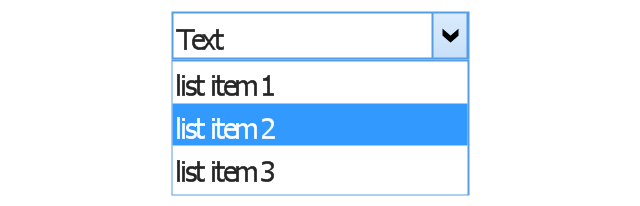
Drop-down button with text box
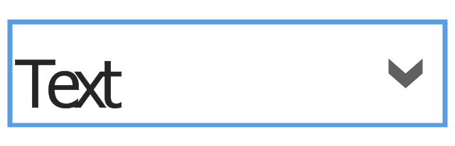
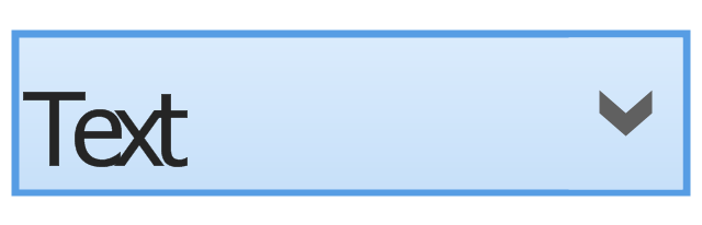
Drop-down button with text box - selected
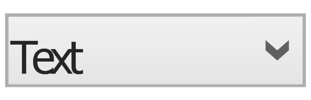
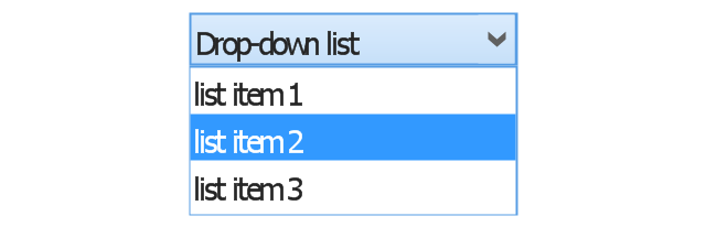
Drop-down list
List item
List item - selected

Drop-down button with text box 2
Drop-down list 2
Drop-down button
Drop-down button - selected
Combo box
Combo box 2
Combo box with scroller
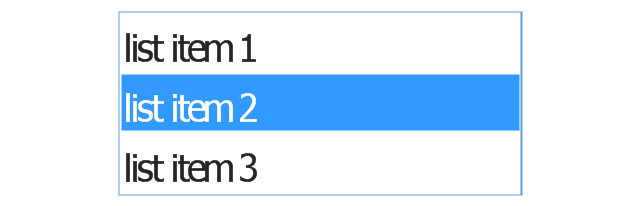
List box
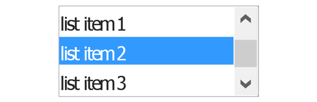
List box with scrollbar
List view
Vertical scroller

Horizontal scroller
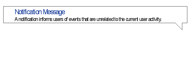
Notification
Options button

Close button

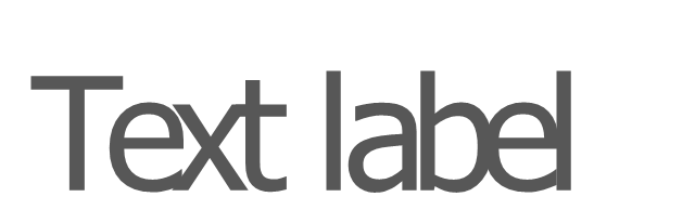
Text label
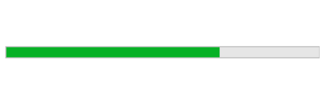
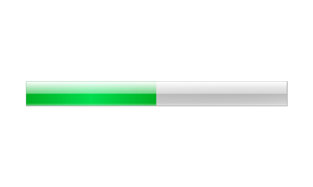
Progress bar
Search box
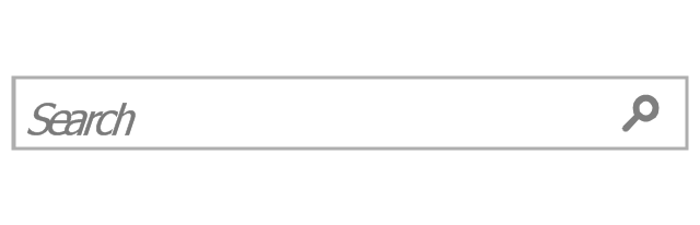
Search symbol

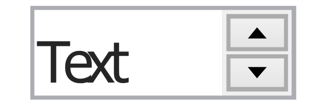
Spin control
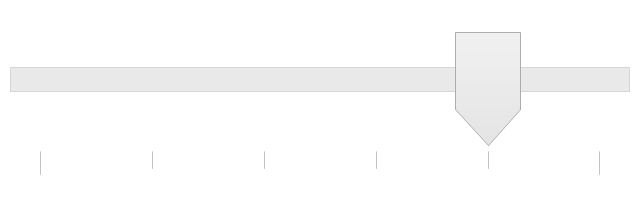
Slider - 5 intervals
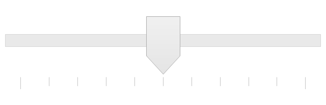
Slider - 10 intervals
Status bar

Start button

Status bar with Start button
Viewed window
Current window state
Tab control
Tab control - selected
Tab view page

Tab view
Text box
Text box label
Tooltip

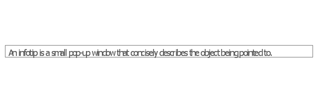
Infotip
HelpDesk
How to Create a Typography Infographic Using ConceptDraw PRO

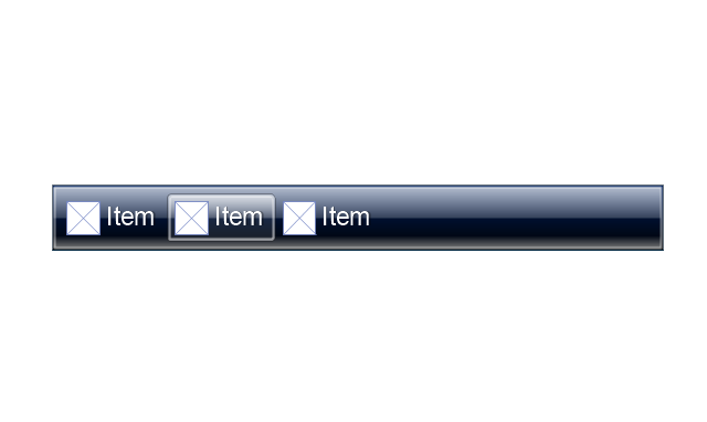
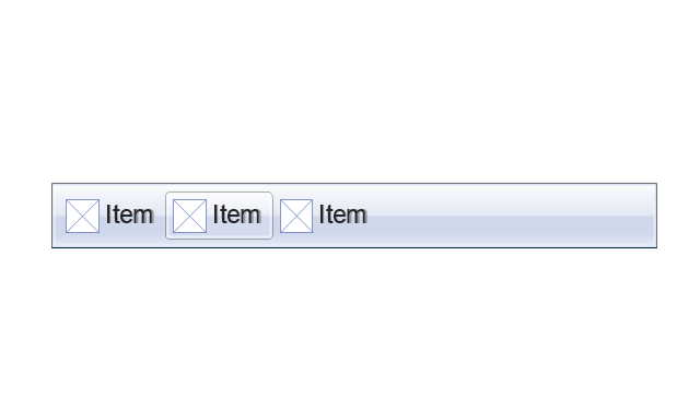
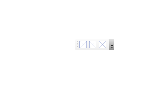
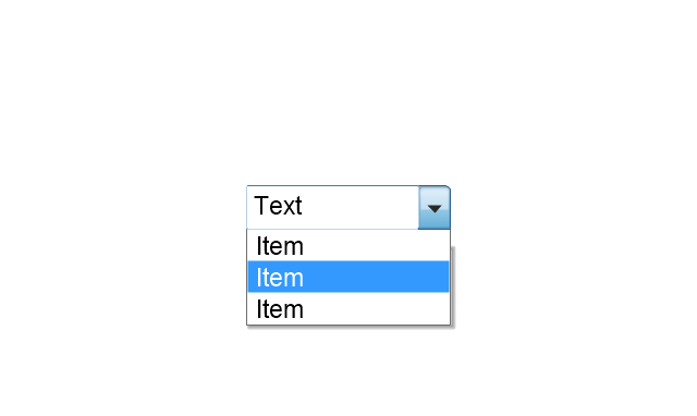
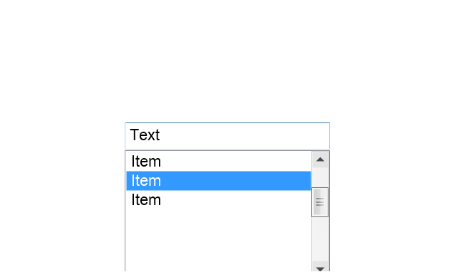
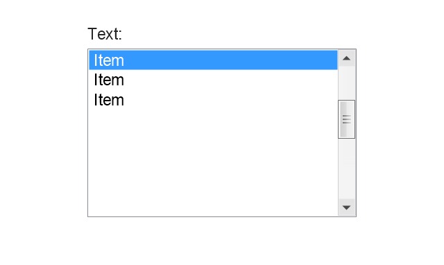
The vector stencils library "List blocks" contains 20 numbered list elements, bulleted list elements and bullet symbols for creating marketing infograms.
"In typography, a bullet ( • ) is a typographical symbol or glyph used to introduce items in a list. ...
The bullet symbol may take any of a variety of shapes, such as circular, square, diamond, arrow, etc., and typical word processor software offer a wide selection of shapes and colours. ...
Bullets are most often used in technical writing, reference works, notes and presentations." [Bullet (typography). Wikipedia]
The shapes example "Design elements - List blocks" was created using the ConceptDraw PRO diagramming and vector drawing software extended with the Marketing Infographics solition from the area "Business Infographics" in ConceptDraw Solution Park.
Lists
 Android User Interface
The Android User Interface solution allows ConceptDraw PRO act as an Android UI design tool. Libraries and templates contain a variety of Android GUI elements to help users create images based on Android UI design.
The vector stencils library "MS Windows Vista user interface" contains 76 MS Windows Vista design elements.
Use it for designing Microsoft ribbon graphic user interface (GUI) of software for computers with MS Windows Vista OS in the ConceptDraw PRO diagramming and vector drawing software extended with the Graphic User Interface solution from the Software Development area of ConceptDraw Solution Park.
Use it for designing Microsoft ribbon graphic user interface (GUI) of software for computers with MS Windows Vista OS in the ConceptDraw PRO diagramming and vector drawing software extended with the Graphic User Interface solution from the Software Development area of ConceptDraw Solution Park.
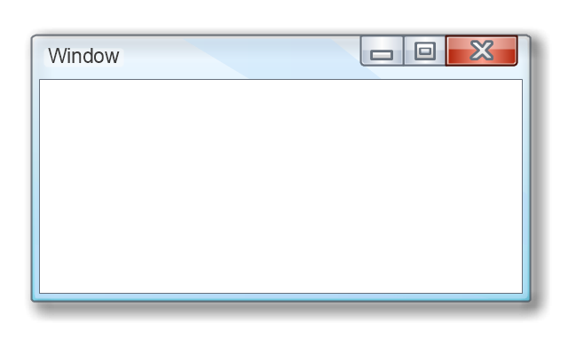
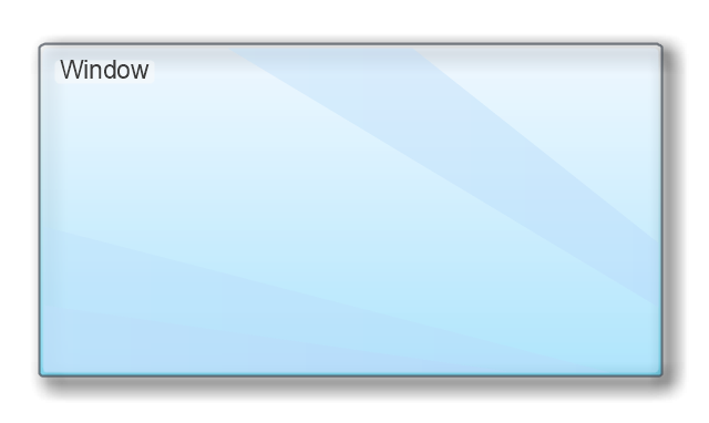
Window
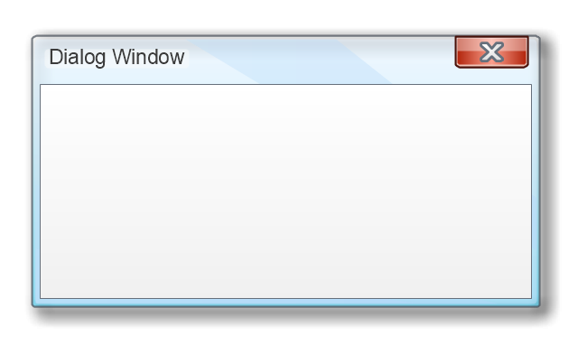
Dialog Window
Empty Window
Field
Horizontal Scrollbar
Vertical Scrollbar
Window Buttons
Window Buttons
Window Button 1
Window Button 2
Window Button 3
Window Button 4

Navigation
Menu Bar
Gradient Menu Bar
Drop-down Menu
Button
Toolbar Pannel
Tool Button
Primary Toolbar

Toolbar 1
Toolbar 2
Customizable Tollbar
Tab View
List View
Text Field
Vertical Separator
Horizontal Separator
Group Box
Text Label
Link
Line Edit
Search
Search with Button
Spin Box
Combo-box
Editable Combo-box
Editable List Box
List Box
Single-selection List
Multiple-selection List
Check Box
Radio Button
Check box group
Radio Buttons Group
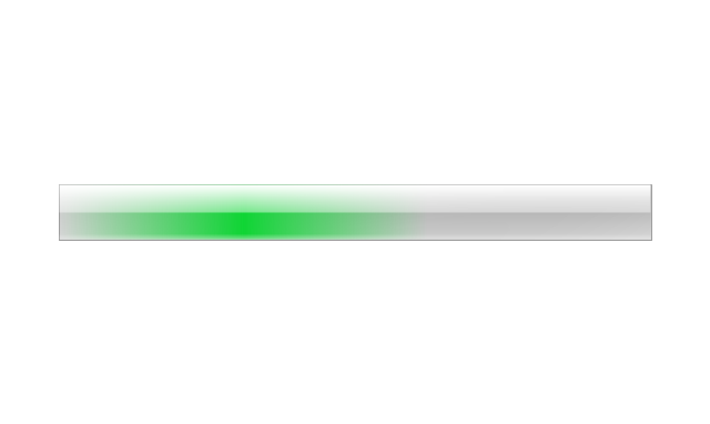
Progress Bar
Modal Progress Bar
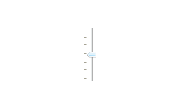
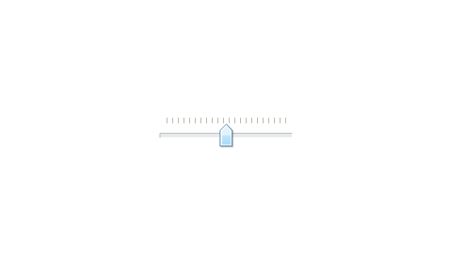
Vertical Slider with Ticks
Horizontal Slider with Ticks
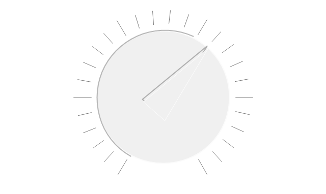
Dial
Catalogue Tree
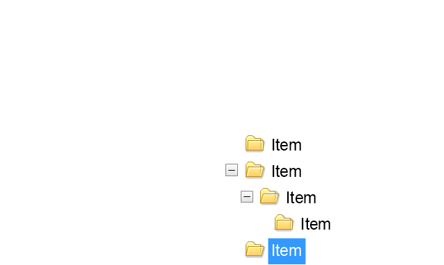
Tree View 1
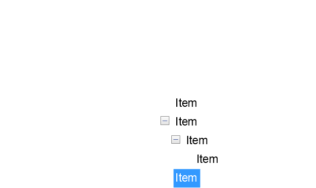
Tree View 2
Vertical Spacer
Horizontal Spacer
Chevron 1
Arrow 1
Arrow 2
Plus/Minus Control
Rotating Triangle
Chevron 3
Chevron 2
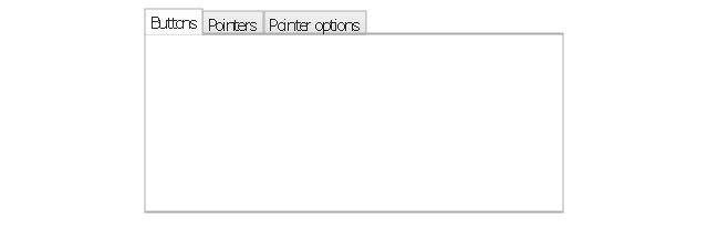
Normal Select Cursor

Link Select Cursor
Text Select Cursor

Working in Background Pointer
Busy Pointer
Unavailable Cursor
Precision Select Cursor
Error Icon
Warning Icon
Information Icon
Question Mark Icon
Balloon
Tooltip/Infotip
Calendar
- Text Box Design Png
- Design elements - Text blocks
- Design elements - Tabbed text blocks | Design elements - Text ...
- Png Text Box Design
- Basic Flowchart Symbols and Meaning | Design elements - Text ...
- Design elements - Bulleted and numbered lists | Design elements ...
- Design elements - Text and Images | Design elements - Stakeholder ...
- Ribbon interface - Vector stencils library | Design elements - Tabbed ...
- Design elements - Text blocks | CMP adaptive management cycle ...
- Design elements - Text and Images | Website Wireframe | Design ...
- Mac OS X Lion user interface - Vector stencils library | Design ...
- Basic Flowchart Symbols and Meaning | Design elements ...
- Hierarchy of laws | Design elements - Tabbed text blocks | Ribbon ...
- Design elements - Text blocks | Design elements - Stakeholder ...
- Design elements - List blocks | Design elements - Management list ...
- Ribbon Text Box Png
- How to Add Text to a Connector in ConceptDraw PRO | Flowchart ...
- Design elements - Android text fields | iPhone interface - Vector ...
- Flowchart design . Flowchart symbols, shapes, stencils and icons ...
- Design elements - Management title blocks | Design elements ...