This pie chart sample shows the make up of the top one percent of United States wage earners, grouped by occupation. Data for this graph is sourced from the November 2010 report written by Jon Bakija, Adam Cole, and Bradley T. Heim titled "Jobs and Income Growth of Top Earners and the Causes of Changing Income Inequality: Evidence from U.S. Tax Return Data", column "2005" in table 2, titled "Percentage of primary taxpayers in top one percent of the distribution of income (excluding capital gains) that are in each occupation", on page 50.
This pie chart sample was redesigned from the Wikimedia Commons file: Percentage of the top 1% wage earners in the United States by occupation (pie chart).svg.
[commons.wikimedia.org/ wiki/ File:Percentage_ of_ the_ top_ 1%25_ wage_ earners_ in_ the_ United_ States_ by_ occupation_ (pie_ chart).svg]
This file is licensed under the Creative Commons Attribution-Share Alike 3.0 Unported license. [creativecommons.org/ licenses/ by-sa/ 3.0/ deed.en]
"The distribution of wealth is a comparison of the wealth of various members or groups in a society. It differs from the distribution of income in that it looks at the distribution of ownership of the assets in a society, rather than the current income of members of that society." [Distribution of wealth. Wikipedia]
The pie chart example "Percentage of the top 1% wage earners in the US by occupation" was created using the ConceptDraw PRO diagramming and vector drawing software extended with the Pie Charts solutiton of the Graphs and Charts area in ConceptDraw Solution Park.
Pie chart

 People
This solution extends ConceptDraw DIAGRAM software with samples, templates and libraries of vector clipart for drawing the People illustrations. Use it to make professional-looking documents, presentations and websites illustrated with color scalable vector c
Network Visualization with ConceptDraw DIAGRAM

The vector stencils library "HR workflow" contains 60 HR workflow symbols.
Use this HR icon set to draw your HR flowcharts, workflow diagrams and process charts with the ConceptDraw PRO diagramming and vector drawing software.
The HR pictograms library "HR workflow" is included in the HR Flowcharts solution from the Management area of ConceptDraw Solution Park.
Use this HR icon set to draw your HR flowcharts, workflow diagrams and process charts with the ConceptDraw PRO diagramming and vector drawing software.
The HR pictograms library "HR workflow" is included in the HR Flowcharts solution from the Management area of ConceptDraw Solution Park.
Applicant

Award

Bank data

Blog

Business conference

Checklist

Compensation and benefits

Contract of employment

Cost planning and reporting

Credit plan

CV (resume, abstract)
-hr-workflow---vector-stencils-library.png--diagram-flowchart-example.png)
Disciplinary procedures

Employee man

Employee woman

Engage and retain

Family

Flexible spending account

Functions

Geolocation

Health plan

Hiring

Human resource

Human resources

Illness

Insurance

Job descriptions

Job offer

Job pricing

Job search

Leave

Manager

Meeting

Negotiation

Onboarding

Online application

Organizational assignment

Outsourcing

Overtime

Payment

Pensioner

Person specification

Personal data (badge icon)
-hr-workflow---vector-stencils-library.png--diagram-flowchart-example.png)
Personal profile

Personnel / staff / employees

Position / occupation

Reception

Recruitment

Remuneration (payment, salary, wage)
-hr-workflow---vector-stencils-library.png--diagram-flowchart-example.png)
Resume

Schedule

Social networks

Survey

Tax data

Team

Time evaluation

Time sheet

Time statement

Training

Vacancy

Vacant post

 Pie Charts
Pie Charts are extensively used in statistics and business for explaining data and work results, in mass media for comparison (i.e. to visualize the percentage for the parts of one total), and in many other fields. The Pie Charts solution for ConceptDraw DIAGRAM offers powerful drawing tools, varied templates, samples, and a library of vector stencils for simple construction and design of Pie Charts, Donut Chart, and Pie Graph Worksheets.
This training classroom seating plan sample depicts the educational equipment and furniture layout.
"Training is the acquisition of knowledge, skills, and competencies as a result of the teaching of vocational or practical skills and knowledge that relate to specific useful competencies. Training has specific goals of improving one's capability, capacity, productivity and performance. It forms the core of apprenticeships and provides the backbone of content at institutes of technology (also known as technical colleges or polytechnics). In addition to the basic training required for a trade, occupation or profession, observers of the labor-market recognize as of 2008 the need to continue training beyond initial qualifications: to maintain, upgrade and update skills throughout working life. People within many professions and occupations may refer to this sort of training as professional development." [Training. Wikipedia]
The floor plan example "Training classroom" was created using the ConceptDraw PRO diagramming and vector drawing software extended with the School and Training Plans solution from the Building Plans area of ConceptDraw Solution Park.
Floor plan

Electrical Engineering

SWOT Matrix

Medical Symbol

 Electrical Engineering
This solution extends ConceptDraw DIAGRAM.9.5 (or later) with electrical engineering samples, electrical schematic symbols, electrical diagram symbols, templates and libraries of design elements, to help you design electrical schematics, digital and analog
The vector stencils library "Composition charts" contains 6 templates: 2 pie charts, 2 divided bar charts and 2 double divided bar charts.
The vector stencils library "Composition indicators" contains 6 templates of visual indicators.
Use these design elements to visualize composition comparison of your data in your visual dashboard created using the ConceptDraw PRO diagramming and vector drawing software.
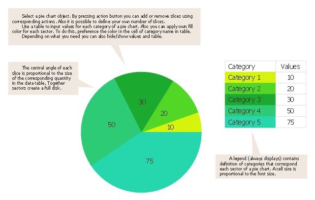
"A pie chart (or a circle graph) is a circular chart divided into sectors, illustrating numerical proportion. In a pie chart, the arc length of each sector (and consequently its central angle and area), is proportional to the quantity it represents. While it is named for its resemblance to a pie which has been sliced, there are variations on the way it can be presented. ...
An obvious flaw exhibited by pie charts is that they cannot show more than a few values without separating the visual encoding (the “slices”) from the data they represent (typically percentages). When slices become too small, pie charts have to rely on colors, textures or arrows so the reader can understand them. This makes them unsuitable for use with larger amounts of data. Pie charts also take up a larger amount of space on the page compared to the more flexible alternative of bar charts, which do not need to have separate legends, and can also display other values such as averages or targets at the same time. ...
Most subjects have difficulty ordering the slices in the pie chart by size; when the bar chart is used the comparison is much easier. Similarly, comparisons between data sets are easier using the bar chart. However, if the goal is to compare a given category (a slice of the pie) with the total (the whole pie) in a single chart and the multiple is close to 25 or 50 percent, then a pie chart can often be more effective than a bar graph." [Pie chart. Wikipedia]
The example "Design elements - Composition charts and indicators" is included in the Composition Dashboard solution from the area "What is a Dashboard" of ConceptDraw Solution Park.
The vector stencils library "Composition indicators" contains 6 templates of visual indicators.
Use these design elements to visualize composition comparison of your data in your visual dashboard created using the ConceptDraw PRO diagramming and vector drawing software.
"A pie chart (or a circle graph) is a circular chart divided into sectors, illustrating numerical proportion. In a pie chart, the arc length of each sector (and consequently its central angle and area), is proportional to the quantity it represents. While it is named for its resemblance to a pie which has been sliced, there are variations on the way it can be presented. ...
An obvious flaw exhibited by pie charts is that they cannot show more than a few values without separating the visual encoding (the “slices”) from the data they represent (typically percentages). When slices become too small, pie charts have to rely on colors, textures or arrows so the reader can understand them. This makes them unsuitable for use with larger amounts of data. Pie charts also take up a larger amount of space on the page compared to the more flexible alternative of bar charts, which do not need to have separate legends, and can also display other values such as averages or targets at the same time. ...
Most subjects have difficulty ordering the slices in the pie chart by size; when the bar chart is used the comparison is much easier. Similarly, comparisons between data sets are easier using the bar chart. However, if the goal is to compare a given category (a slice of the pie) with the total (the whole pie) in a single chart and the multiple is close to 25 or 50 percent, then a pie chart can often be more effective than a bar graph." [Pie chart. Wikipedia]
The example "Design elements - Composition charts and indicators" is included in the Composition Dashboard solution from the area "What is a Dashboard" of ConceptDraw Solution Park.
Composition charts and visual indicators

Use this pie chart template in the ConceptDraw PRO diagramming and vector drawing software to add pie charts to your business documents, websites, presentation slides and infographics.
"An obvious flaw exhibited by pie charts is that they cannot show more than a few values without separating the visual encoding (the “slices”) from the data they represent (typically percentages). When slices become too small, pie charts have to rely on colors, textures or arrows so the reader can understand them. This makes them unsuitable for use with larger amounts of data. Pie charts also take up a larger amount of space on the page compared to the more flexible alternative of bar charts, which do not need to have separate legends, and can also display other values such as averages or targets at the same time.
Statisticians generally regard pie charts as a poor method of displaying information, and they are uncommon in scientific literature. One reason is that it is more difficult for comparisons to be made between the size of items in a chart when area is used instead of length and when different items are shown as different shapes.
Further, in research performed at AT&T Bell Laboratories, it was shown that comparison by angle was less accurate than comparison by length. This can be illustrated with the diagram to the right, showing three pie charts, and, below each of them, the corresponding bar chart representing the same data. Most subjects have difficulty ordering the slices in the pie chart by size; when the bar chart is used the comparison is much easier. Similarly, comparisons between data sets are easier using the bar chart. However, if the goal is to compare a given category (a slice of the pie) with the total (the whole pie) in a single chart and the multiple is close to 25 or 50 percent, then a pie chart can often be more effective than a bar graph." [Pie chart. Wikipedia]
The template "Pie chart" is included in the Pie Charts solution of the Graphs and Charts area in ConceptDraw Solution Park.
Circle chart
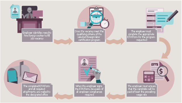
This HR infographics example was designed on the base of workflow diagram in the webpage "About Foreign Labor Certification" from the website of the U.S. Department of Labor.
"Hiring foreign workers for employment in the U.S. normally requires approval from several government agencies. ...
Although each foreign labor certification program is unique, there are similar requirements that the employer must complete prior to the issuance of a labor certification. In general, the employer will be required to complete these basic steps to obtain a labor certification:
1. The employer must ensure that the position meets the qualifying criteria for the requested program.
2. The employer must complete the ETA form designated for the requested program. This may include the form and any supporting documentation (e.g., job description, resume of the applicant, etc.).
3. The employer must ensure that the wage offered equals or exceeds the prevailing wage for the occupation in the area of intended employment.
4. The employer must ensure that the compliance issues effected upon receipt of a foreign labor certification are completely understood.
5. The completed ETA form is submitted to the designated Department of Labor office for the requested program (e.g., SWA, processing center or the national office).
6. The employer is notified of the determination of the Department of Labor."
[foreignlaborcert.doleta.gov/ about.cfm]
The HR infographics example "Foreign labor certification workflow" was created using the ConceptDraw PRO diagramming and vector drawing software extended with the HR Flowcharts solution from the Management area of ConceptDraw Solution Park.
HR workflow infographics
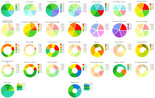
The vector stencils library Pie charts contains 30 templates you can use to add pie and donut charts in your business documents, presentation slides and infographics using the ConceptDraw PRO diagramming and vector drawing software.
"A pie chart (or a circle graph) is a circular chart divided into sectors, illustrating numerical proportion. In a pie chart, the arc length of each sector (and consequently its central angle and area), is proportional to the quantity it represents. While it is named for its resemblance to a pie which has been sliced, there are variations on the way it can be presented. ...
Pie charts are very widely used in the business world and the mass media. However, they have been criticized, and many experts recommend avoiding them, pointing out that research has shown it is difficult to compare different sections of a given pie chart, or to compare data across different pie charts. Pie charts can be replaced in most cases by other plots such as the bar chart. ...
However, if the goal is to compare a given category (a slice of the pie) with the total (the whole pie) in a single chart and the multiple is close to 25 or 50 percent, then a pie chart can often be more effective than a bar graph. ...
A doughnut chart (also spelled donut) is functionally identical to a pie chart, with the exception of a blank center and the ability to support multiple statistics as one." [Pie chart. Wikipedia]
The example "Design elements - Pie charts" is included in the Pie Charts solution of the Graphs and Charts area in ConceptDraw Solution Park.
Templates
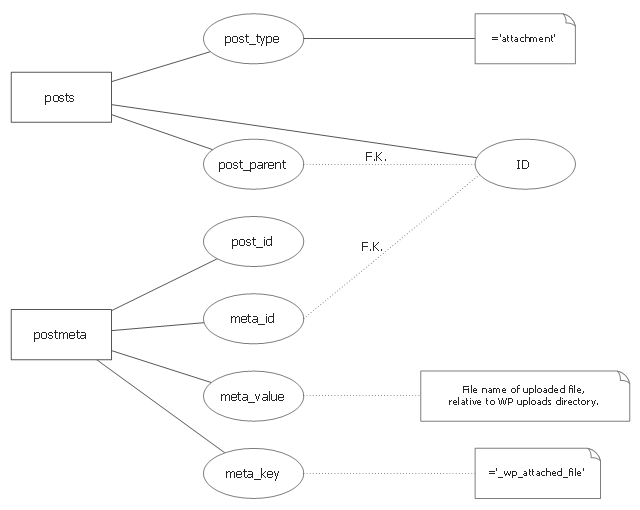
This ERD sample was redesigned from the Wikimedia Commons file: WordPress file-reference ERD.svg. [commons.wikimedia.org/ wiki/ File:WordPress_ file-reference_ ERD.svg]
"WordPress is a MySQL-backed blogging platform in which uploaded files are saved to a user-configurable uploads directory. Files in this directory can be organised into a number of different subdirectory structures (by default, named by year and month) under wp-content/ uploads/ in the installation directory. Files are accessed directly by the web server (and not read/ written via the application). Each uploaded file has a single row in the posts table (which may or may not be linked to an actual post row via the post_ parent key). The post_ type column of this row has a value of 'attachment'. Rows in the postmeta table are linked to this row. Where the meta_ key column of postmeta is '_ wp_ attached_ file', the meta_ value column is a filename, relative to the WP upload directory." [Web application file-reference methods. Wikiversity]
The ERD example "WordPress file-reference ERD" was created using the ConceptDraw PRO diagramming and vector drawing software extended with the Chen Notation solution from the Software Development area of ConceptDraw Solution Park.
ERD
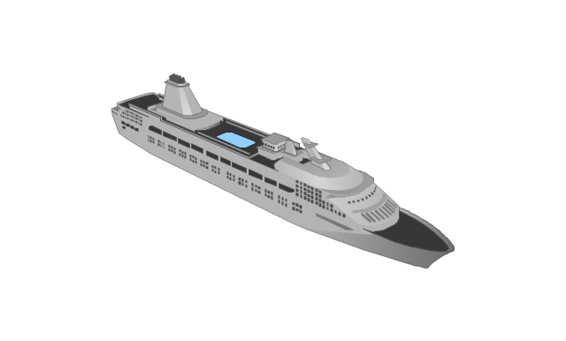
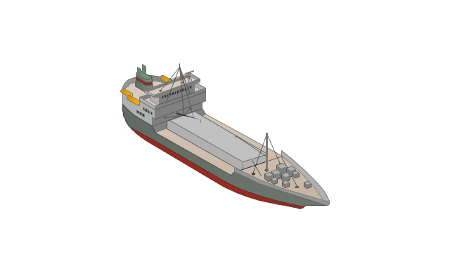
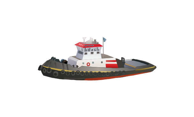
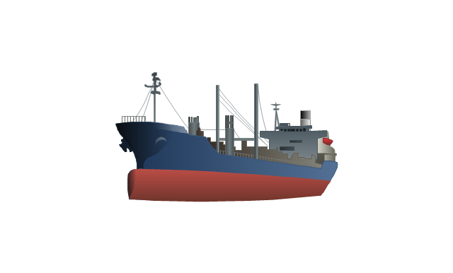
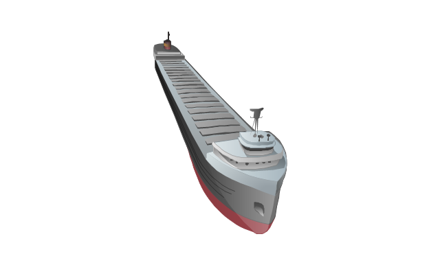
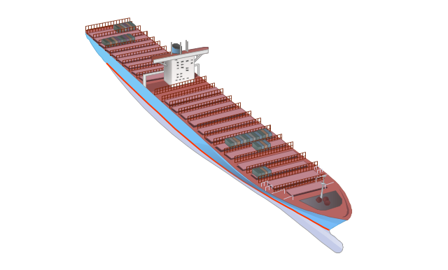
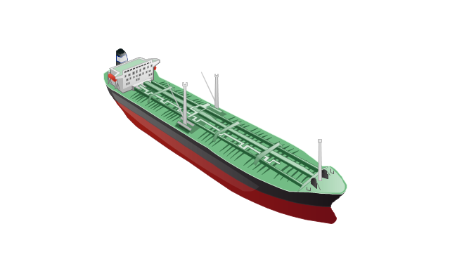
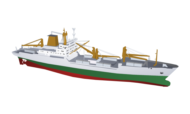
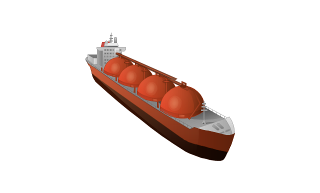
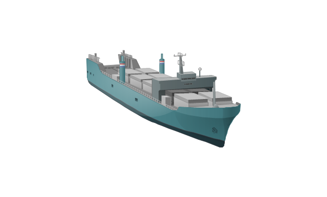
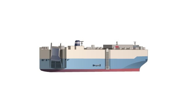
The vector stencils library "Watercraft" contains 28 clip art images for creating ship transport illustrations, presentation slides, infographics and webpages using the ConceptDraw PRO diagramming and vector drawing software.
"The term watercraft covers a range of different vehicles including ships, boats, hovercraft and submarines, and differs from a simple device that merely floats, such as a log raft. ...
Usually the purposes behind watercraft designs and skills are for seafaring education or leisure activities, fishing and resource extraction, transportation of cargo or passengers, and for conducting combat or salvage operations. In general, the purpose of a water vehicle identifies its utility with a maritime industry sub-sector." [Watercraft. Wikipedia]
The vector stencils library "Watercraft" is included in the Aerospace and Transport solution from the Illustrations area of ConceptDraw Solution Park.
www.conceptdraw.com/ solution-park/ illustrations-aerospace-transport
Boat

Motorboat

Yacht

Sailing yacht

Motor yacht

Passenger vessel

Sailing ship

Passenger ship
Regular ship
Tugboat
Oil ship
Dry cargo ship

Dry cargo vessel
Capesize bulk-carrier

Handysize bulk-carrier

Container ship
Multipurpose ship

Reefer

Oil tanker
Reefer vessel
Gas ship
Lighter aboard ship
Offshore oil platform

Car carrier
Battleship

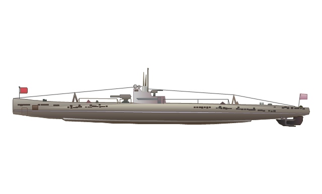
Submarine
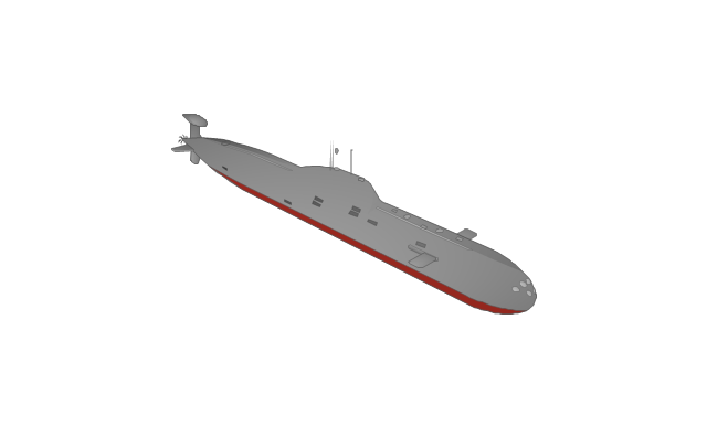
Submarine
Container ship

- Draw Occupation Diagram
- Draw A Diagram Showing A Chart Of Occupation
- Percentage of the top 1% wage earners in the US by occupation ...
- Pie Charts | Different Types Of Occupation Charts
- Percentage Pie Chart. Pie Chart Examples | Percentage of the top 1 ...
- Pie Charts | Network Visualization with ConceptDraw DIAGRAM ...
- How to Draw a Pie Chart Using ConceptDraw PRO | Schedule pie ...
- Percentage Pie Chart. Pie Chart Examples | Data Visualization ...
- Business People Clipart | HR workflow - Vector stencils library ...
- Design elements - Professions | ConceptDraw Solution Park ...
- Percentage Pie Chart. Pie Chart Examples | Exploded pie chart ...
- Line Graphs | France exports of goods and services | Percent of ...
- Percentage Pie Chart. Pie Chart Examples | How to Draw the ...
- How to Draw the Different Types of Pie Charts | Percentage Pie ...
- Classroom Layout | How to Create a Floor Plan for the Classroom ...
- HR professions - Vector stencils library | Internet marketing ...
- HR professions - Vector stencils library | Design elements - HR ...
- How to Draw the Different Types of Pie Charts | How to Create a Pie ...
- Post and Mail - Vector stencils library | HR professions - Vector ...
- Training classroom | Classroom floor plan | Classroom Seating ...