HelpDesk
How to Draw the Different Types of Pie Charts

Pie Chart Examples and Templates
Pie Chart Software

 Pie Charts
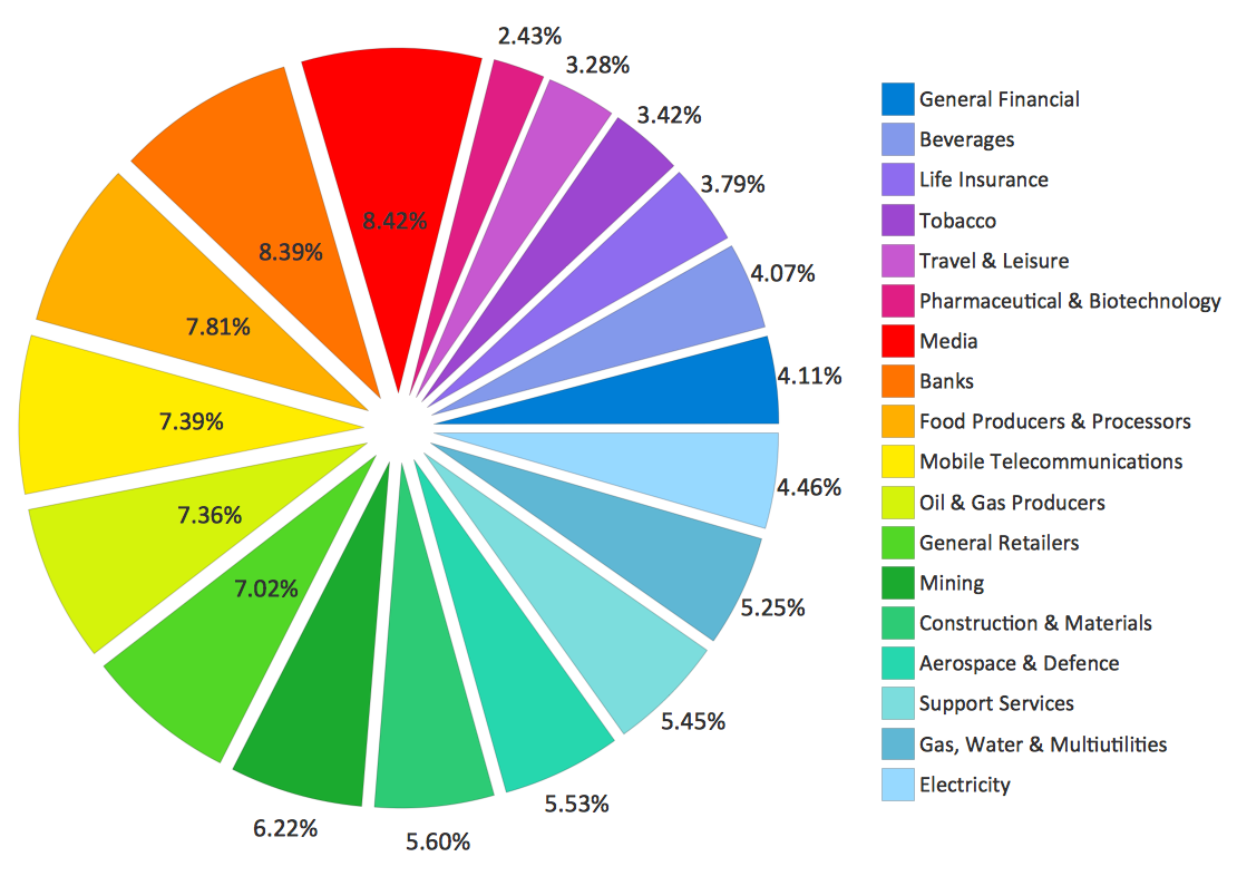
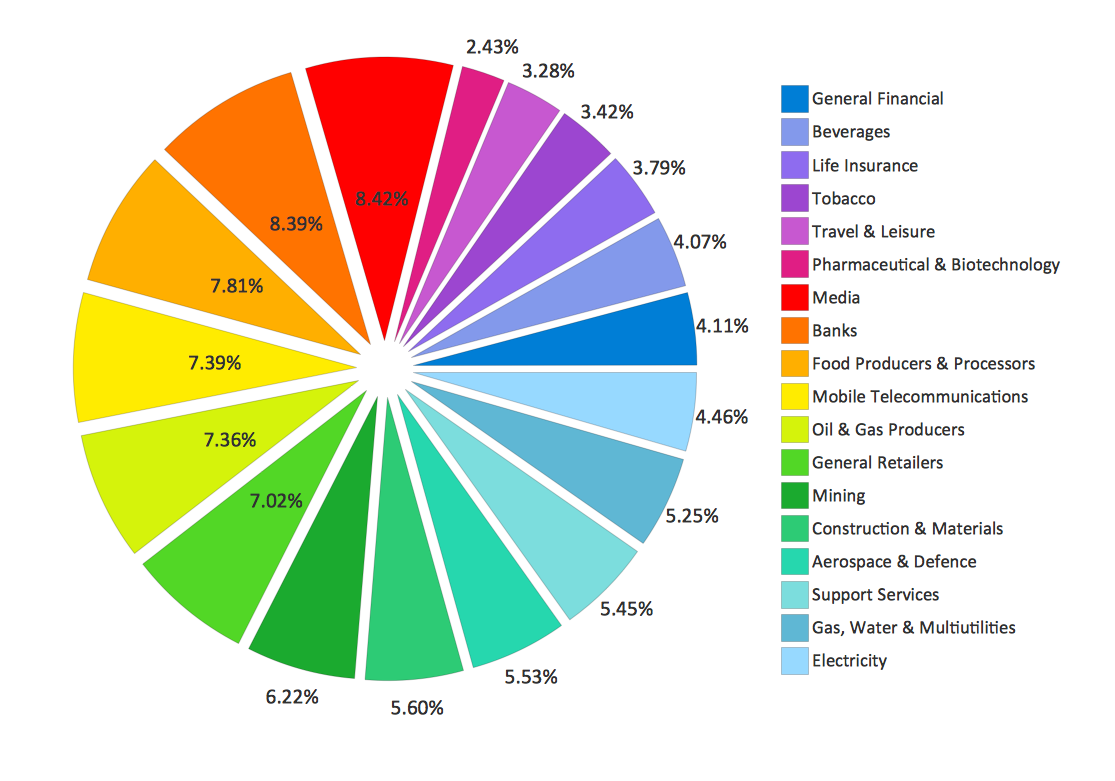
Pie Charts are extensively used in statistics and business for explaining data and work results, in mass media for comparison (i.e. to visualize the percentage for the parts of one total), and in many other fields. The Pie Charts solution for ConceptDraw DIAGRAM offers powerful drawing tools, varied templates, samples, and a library of vector stencils for simple construction and design of Pie Charts, Donut Chart, and Pie Graph Worksheets.
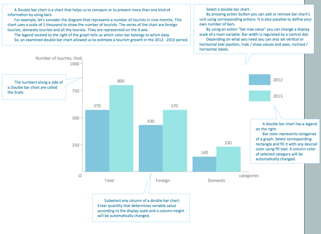
Chart Maker for Presentations

HelpDesk
How to Draw a Pie Chart

 Basic Pie Charts
This solution extends the capabilities of ConceptDraw DIAGRAM (or later) with templates, samples, and a library of vector stencils for drawing pie and donut charts.
Pie Chart
Business Report Pie. Pie Chart Examples

Examples of Flowcharts, Org Charts and More
Column Chart Software
Line Chart Template for Word

Chart Templates
Pie Donut Chart. Pie Chart Examples
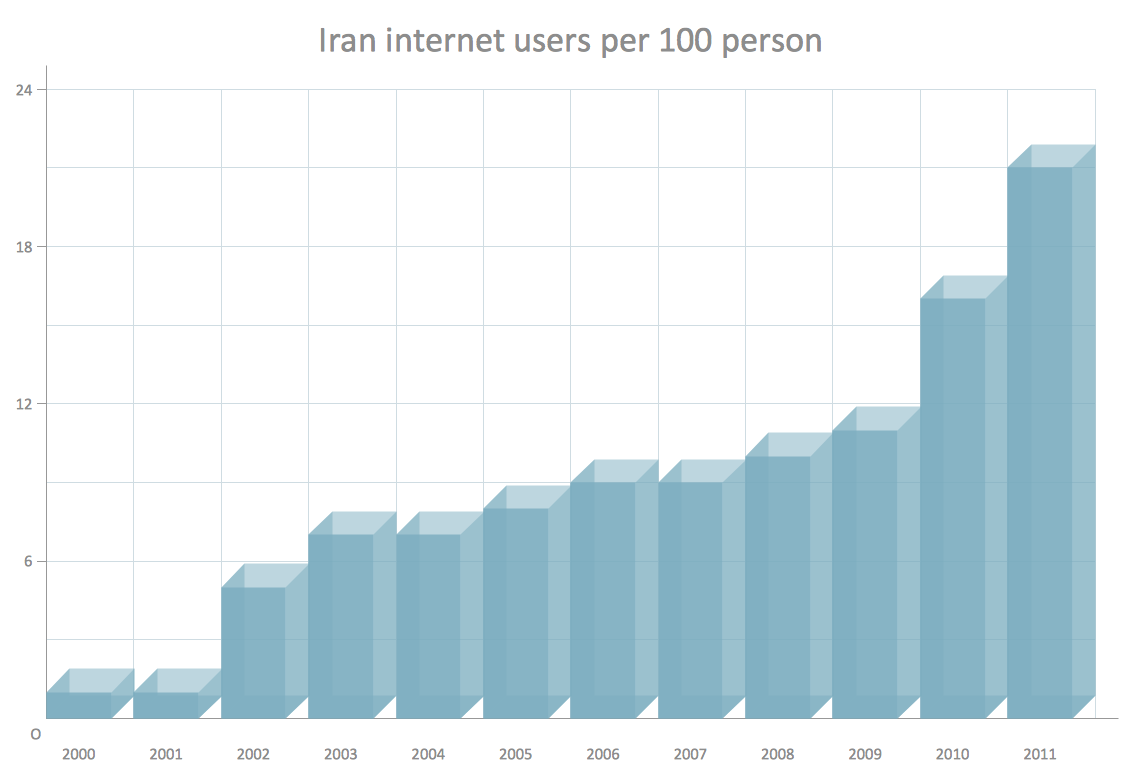
This wheel diagram sample was created on the base of figure illustrating the webpage "Chapter 3: Current State of the Ecosystem" of the website of the National Broadband Plan of US Federal Communications Comission (FCC). "The broadband ecosystem includes applications and content: e-mail, search, news, maps, sales and marketing applications used by businesses, user-generated video and hundreds of thousands of more specialized uses. Ultimately, the value of broadband is realized when it delivers useful applications and content to end-users.
Applications run on devices that attach to the network and allow users to communicate: computers, smartphones, set-top boxes, e-book readers, sensors, private branch exchanges (PBX), local area network routers, modems and an ever-growing list of other devices. New devices mean new opportunities for applications and content.
Finally, broadband networks can take multiple forms: wired or wireless, fixed or mobile, terrestrial or satellite. Different types of networks have different capabilities, benefits and costs.
The value of being connected to the network increases as more people and businesses choose to adopt broadband and use applications and devices that the network supports. Several factors contribute to their decisions. These include whether they can afford a connection, whether they are comfortable with digital technology and whether they believe broadband is useful.
Networks, devices and applications drive each other in a virtuous cycle. If networks are fast, reliable and widely available, companies produce more powerful, more capable devices to connect to those networks. These devices, in turn, encourage innovators and entrepreneurs to develop exciting applications and content. These new applications draw interest among end-users, bring new users online and increase use among those who already subscribe to broadband services. This growth in the broadband ecosystem reinforces the cycle, encouraging service providers to boost the speed, functionality and reach of their networks."
[broadband.gov/ plan/ 3-current-state-of-the-ecosystem/ ]
The circle pie chart example "Forces shaping the broadband ecosystem in the US" was created using the ConceptDraw PRO diagramming and vector drawing software extended with the Target and Circular Diagrams solution from the Marketing area of ConceptDraw Solution Park.
www.conceptdraw.com/ solution-park/ marketing-target-and-circular-diagrams
Wheel diagram

- How to Draw the Different Types of Pie Charts | Percentage Pie ...
- How to Draw the Different Types of Pie Charts | Pie Chart Software ...
- How to Draw the Different Types of Pie Charts | Online Diagram Tool ...
- How to Draw the Different Types of Pie Charts | How to Draw an ...
- How to Draw the Different Types of Pie Charts | Virtuous circle ...
- How to Draw the Different Types of Pie Charts | Pie Donut Chart. Pie ...
- Percentage Pie Chart . Pie Chart Examples | How to Draw the ...
- How to Draw the Different Types of Pie Charts | How to Create a Pie ...
- Pie Charts | How to Draw the Different Types of Pie Charts | How to ...
- How to Draw the Different Types of Pie Charts | Chart Maker for ...
- Pie Chart Software | How to Draw the Different Types of Pie Charts ...
- How to Draw the Different Types of Pie Charts | How to Draw a Pie ...
- Pie Chart Examples and Templates | Pie Chart Software | Business ...
- How to Draw the Different Types of Pie Charts | Basic Flowchart ...
- How to Create a Pie Chart | How to Draw the Different Types of Pie ...
- Types of Flowcharts | How to Draw the Different Types of Pie Charts ...
- How to Draw the Different Types of Pie Charts | Pie Chart Examples ...
- How to Draw a Pie Chart Using ConceptDraw PRO | Pie Chart ...
- How to Draw the Different Types of Pie Charts | How to Create ...
- Percentage Pie Chart . Pie Chart Examples | Sector diagram ...