Export from ConceptDraw PRO Document to a Graphic File

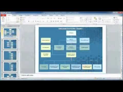
How to Create Presentation of Your Project Gantt Chart

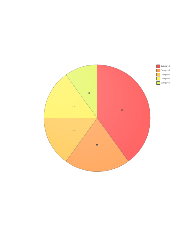
 Pie Charts
Pie Charts are extensively used in statistics and business for explaining data and work results, in mass media for comparison (i.e. to visualize the percentage for the parts of one total), and in many other fields. The Pie Charts solution for ConceptDraw PRO v10 offers powerful drawing tools, varied templates, samples, and a library of vector stencils for simple construction and design of Pie Charts, Donut Chart, and Pie Graph Worksheets.
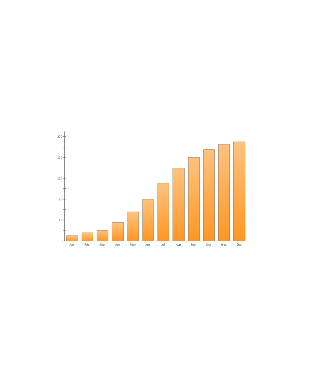
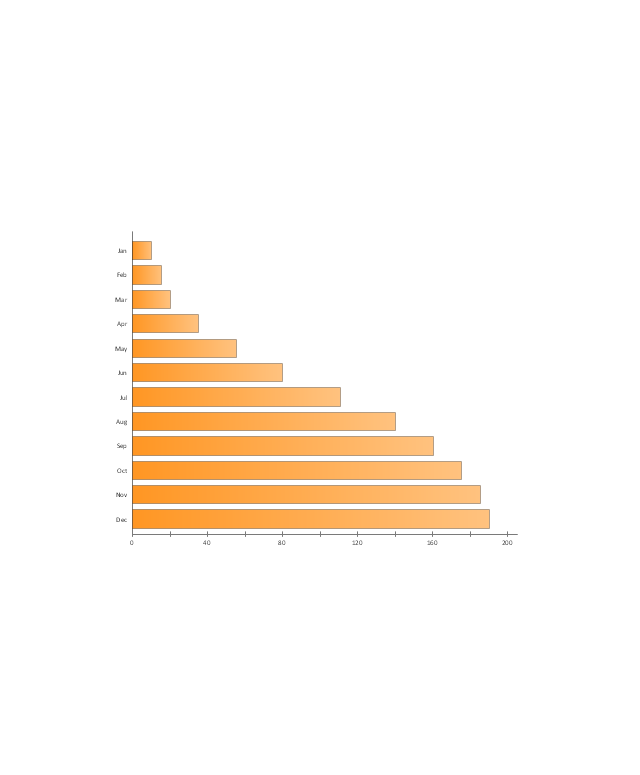
 Bar Graphs
The Bar Graphs solution enhances ConceptDraw PRO v10 functionality with templates, numerous professional-looking samples, and a library of vector stencils for drawing different types of Bar Graphs, such as Simple Bar Graph, Double Bar Graph, Divided Bar Graph, Horizontal Bar Graph, Vertical Bar Graph, and Column Bar Chart.
HelpDesk
How to Connect Text Data to a Time Series Chart on Your Live Dashboard

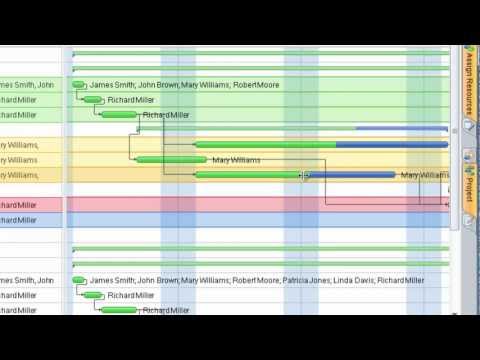
Gant Chart in Project Management

 Composition Dashboard
Composition dashboard solution extends ConceptDraw PRO software with templates, samples and vector stencils library with charts and indicators for drawing visual dashboards showing data composition.
 Basic Bar Graphs
This solution enhances ConceptDraw PRO v10.3.0 (or later) with templates, samples and a library of vector stencils for drawing Bar Graphs.
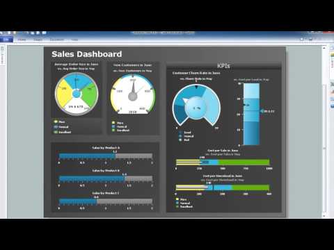
 Business Intelligence Dashboard
Business Intelligence Dashboard solution extends the ConceptDraw PRO v11 functionality with exclusive tools, numerous ready-to-use vector objects, samples and quick-start templates for creation professional Business Intelligence Dashboards, Business Intelligence Graphics, Business Intelligence Charts and Maps of different kinds. Design easy the BI dashboard, BI model or Dynamic chart in ConceptDraw PRO to monitor the company's work, to track the indicators corresponding your company's data, to display and analyze key performance indicators, to evaluate the trends and regularities of the processes occurring at the company.
 Frequency Distribution Dashboard
Frequency distribution dashboard solution extends ConceptDraw PRO software with samples, templates and vector stencils libraries with histograms and area charts for drawing the visual dashboards showing frequency distribution of data.
HelpDesk
How to Get Images for Project Presentation on Macintosh

How to Discover Critical Path on a Gantt Chart

This example visual dashboard example shows website traffic metrics. Divided bar chart and pie chart are used to visualize compositional data. Scatter plot is used to visually analyse correlation between two data sets.
"Web traffic is the amount of data sent and received by visitors to a web site. ...
This is determined by the number of visitors and the number of pages they visit. Sites monitor the incoming and outgoing traffic to see which parts or pages of their site are popular and if there are any apparent trends, such as one specific page being viewed mostly by people in a particular country. There are many ways to monitor this traffic and the gathered data is used to help structure sites, highlight security problems or indicate a potential lack of bandwidth not all web traffic is welcome. Some companies offer advertising schemes that, in return for increased web traffic (visitors), pay for screen space on the site. Sites also often aim to increase their web traffic through inclusion on search engines and through search engine optimization." [Web traffic. Wikipedia]
The example "Website traffic dashboard" was created using the ConceptDraw PRO diagramming and vector drawing software extended with the Corellation Dashboard solution from the area "What is a Dashboard" of ConceptDraw Solution Park.
Visual dashboard

 Correlation Dashboard
Correlation dashboard solution extends ConceptDraw PRO software with samples, templates and vector stencils library with Scatter Plot Charts for drawing the visual dashboard visualizing data correlation.
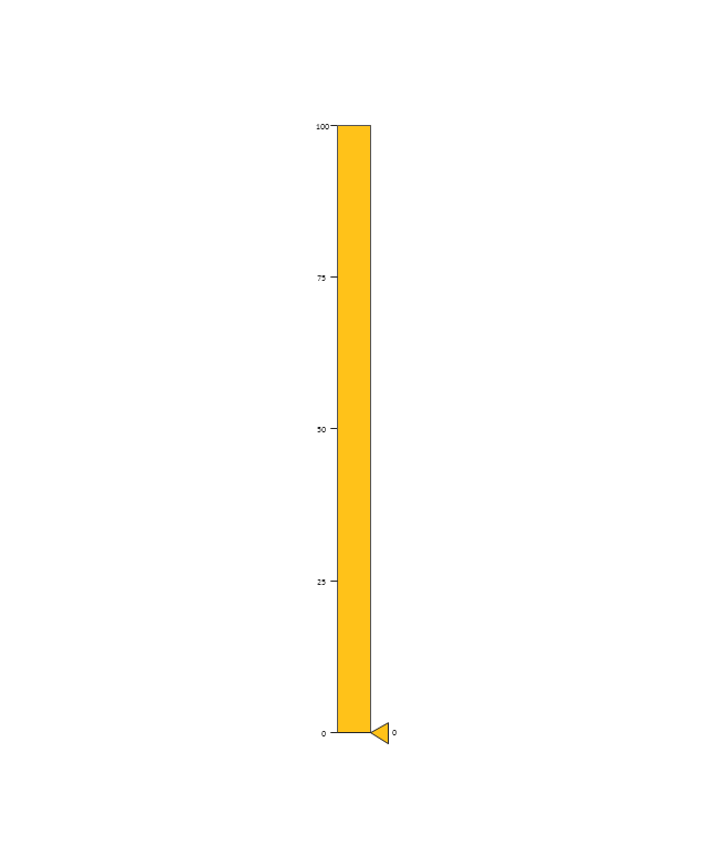
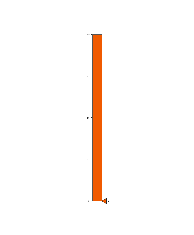
The vector stencils library "Sales dashboard" contains 27 charts and graphic indicators.
Use it for drawing sales dashboards in the ConceptDraw PRO diagramming and vector drawing software extended with the Sales Dashboard solution from the Marketing area of ConceptDraw Solution Park.
Use it for drawing sales dashboards in the ConceptDraw PRO diagramming and vector drawing software extended with the Sales Dashboard solution from the Marketing area of ConceptDraw Solution Park.
Column Chart
Bar Chart
Line Chart
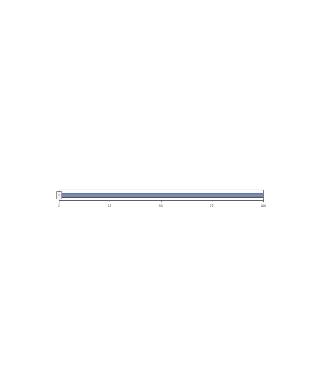
Divided Bar

Pie Chart
Two Bubbles Indicator
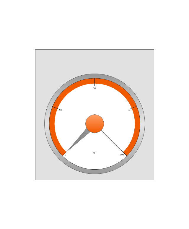
Speedometer Gauge 1
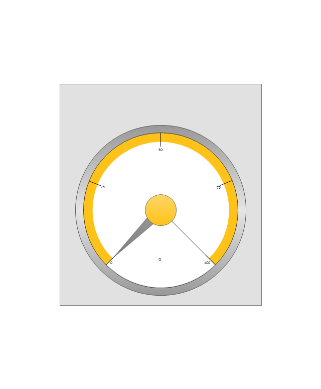
Speedometer Gauge 2
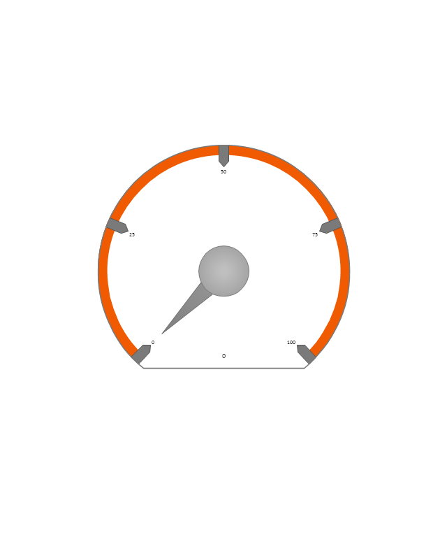
Speedometer Gauge 3
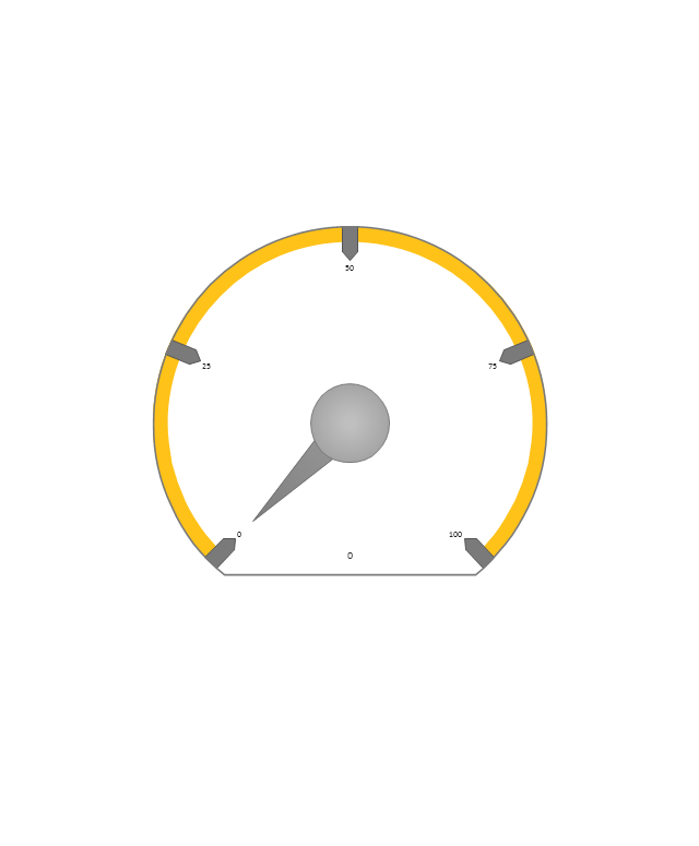
Speedometer Gauge 4
Slider Horizontal 1

Slider Horizontal 2
Slider Horizontal 3
Slider Horizontal 4

Slider Horizontal 5
Slider Horizontal 6
Slider Horizontal 7
Slider Vertical 1
Slider Vertical 2
Slider Vertical 3
Bullet 1
Bullet 2

Bullet 3

Bullet 4
Backgroung 1

Backgroung 2

Backgroung 3

- Process Flowchart | Gant Chart in Project Management | Dashboard ...
- How to Create Presentation of Your Project Gantt Chart | Status ...
- How to Create Presentation of Your Project Gantt Chart | Sales ...
- Dashboard Service Desk Png
- Indicator Performance Infographics Png
- Website traffic dashboard | Wireless Networks | Welcome Png
- Dashboard Graphic Design Png
- KPI Dashboard | Business Productivity - Marketing | Process ...
- How to Create Presentation of Your Project Gantt Chart | Business ...
- Create Flow Chart on Mac | Business Process Diagrams | Status ...
- Growth Of Indicators Png
- Track Transport Png
- Kpi Png
- Time Series Graph Png
- Office Dashboard Icon Png
- 2 3 Pie Chart Png
- Kpis Png
- ConceptDraw Dashboard for Facebook | Employee Engagement ...
- Management - Design Elements | Pie Charts | Pictures of ...
- Png Mix Products