Tables’ Beauty
Behind any graphs, charts and even flowcharts there is data, big data, usually stored in tables.

To keep data in tables is useful, but tables are not convenient for presentations or communication. All graphs are intended to make the presentation of data clearly and simply. But are tables always that bad?
In many cases, working with tables is familiar. We all use public transport schedules on a regular basis and understand it well.

Report Cards in schools and universities do their jobs perfectly adequately in a table format.

Wouldn’t you think that finding your mark on a chart would be more difficult?
Weather forecast is also easy to read in a table format.

What’s wrong with tables? Why do we try to avoid using them? If we don’t know the subject well, we come face-to-face with our problems immediately. It takes time to understand what each column means, which units are used and why? Once we have overcome the first steps, we are left with the question: what does it all mean? When it comes for weather, it’s clear that +30 is hot and +15 is cool. But if it’s a table of expenses, to note where we spent too much is not such an easy task.
But if we will put the table in order, it is much more informative and helpful than any chart. Let’s go back to Loan Amortization Schedule table.
Let’s polish our table. Any line-crossings are visually-complex elements. Even one cross can distract, and when there are dozens of them, we just can’t see anything else. Let’s get rid of the table lines:

To read the data quickly, we make some space between the columns:

With all this, we have limited the visibility of the least important information in our chart. We address to it seldom, so there is no need to make it prominently visible. This concludes the first steps in formatting a table.
The entire timeline is a bit less than two years. One typical mistake when using dates is that it is easy to include excessive information. Don’t indicate the year in each date. In many cases, showing just the month and day is enough.

All the other columns of tables indicate money.
Moreover, a specific currency: Dollars. So, there is no need to add the dollar sign at each table cell.
It is better to align sums by the right side to allow for easy numerical comparison:

Last touch — mark the sections with different colors numbers, highlighting the most relevant information in your chart:
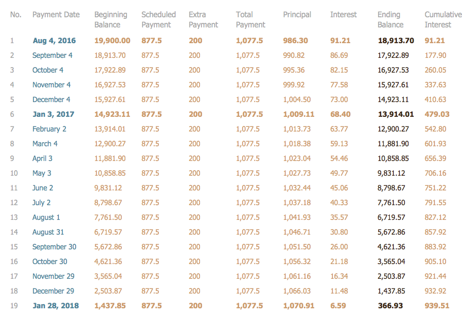
Thus, we have all of our information in a legible easy-to-read format. An important difference between tables and schedules is their credibility. That’s why we have a greater confidence in their accuracy. Any column can be double-checked, because we have ALL the data in front of us.
Yes, graphics and charts are more eye-catching, but often they don’t have nearly as much real information as a chart of the raw data.
NINE RELATED HOW TO's:
The Social Media Response solution creates interactive social media flow charts and action mind maps. The solution includes a video tutorial and a number of samples helping social media teams refine and organize their response process.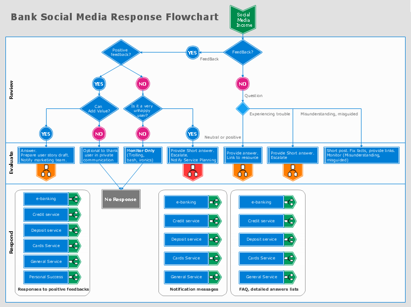
Picture: How to Connect Social Media DFD Flowchart with Action Maps
Related Solution:
Social media is a popular view of mass communication which allows people, companies and organizations create, share, discover, modify, access, comment, discuss and exchange information through the Internet. Social Media Response solution for ConceptDraw DIAGRAM provides collection of 10 libraries with diversity of predesigned vector social media flowchart symbols for fast and easy creating interactive Social Media Flowcharts, Response Charts and Action Mind Maps.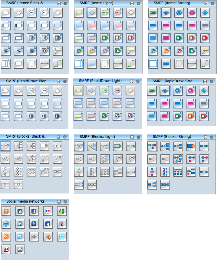
Picture: Social Media Flowchart Symbols
Related Solution:
While creating flowcharts and process flow diagrams, you should use special objects to define different statements, so anyone aware of flowcharts can get your scheme right. There is a short and an extended list of basic flowchart symbols and their meaning. Basic flowchart symbols include terminator objects, rectangles for describing steps of a process, diamonds representing appearing conditions and questions and parallelograms to show incoming data.
This diagram gives a general review of the standard symbols that are used when creating flowcharts and process flow diagrams. The practice of using a set of standard flowchart symbols was admitted in order to make flowcharts and other process flow diagrams created by any person properly understandable by other people. The flowchart symbols depict different kinds of actions and phases in a process. The sequence of the actions, and the relationships between them are shown by special lines and arrows. There are a large number of flowchart symbols. Which of them can be used in the particular diagram depends on its type. For instance, some symbols used in data flow diagrams usually are not used in the process flowcharts. Business process system use exactly these flowchart symbols.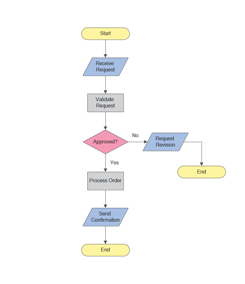
Picture: Flowchart Symbols: Meaning and Examples
Related Solution:
The ConceptDraw Flowchart component includes a set of samples and templates. This geathered as flowchart maker toolbox which focused on drawing flowcharts of any industry standards.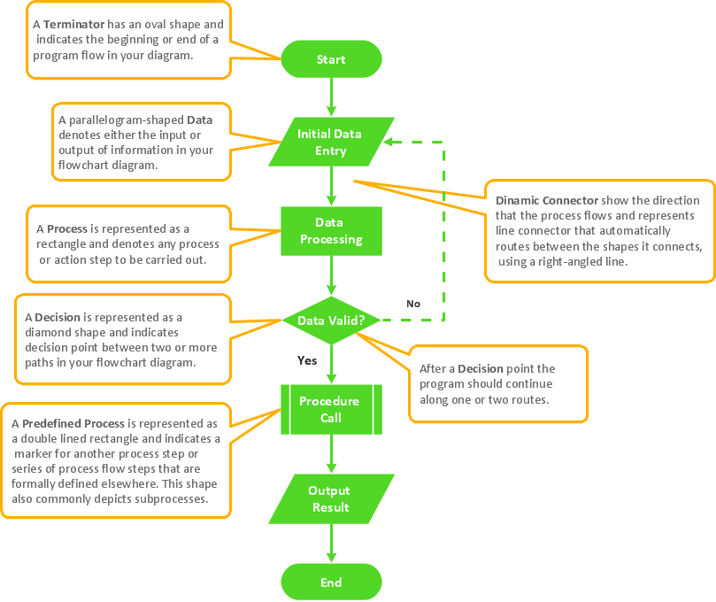
Picture: Flowchart Components
Related Solution:
A concept map is a way of representing relationships between ideas, images, or words.
How to draw a Concept Map quick, easy and effective? ConceptDraw DIAGRAM offers the unique Concept Maps Solution from the Diagrams Area that will help you!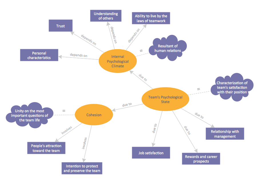
Picture: Concept Map
Related Solution:
The Process Flowchart or Process Flowchart Diagram (PFD) is a visual representation relations between major parts of the system, the steps in a process, and even connections between various systems. The possibility to easy create professional-looking and attractive Process Flowcharts, Business Process Diagrams and Maps which visualize the steps of complex processes is provided by Business Process Diagram Solution from the Business Processes Area of ConceptDraw Solution Park and 16 libraries with 230 process flowchart symbols from BPMN 1.2 and BPMN 2.0.
Picture: Process Flowchart Symbols
Related Solution:
The Accounting flowchart shows how information flows from source documents through the accounting records. The are based on the accounting procedures or processes.
Flowcharts are used to represent accounting information in a system. There are special symbols which are used to create accounting flowcharts. Try conceptdraw flowcharting set of symbols to draw a professional charts.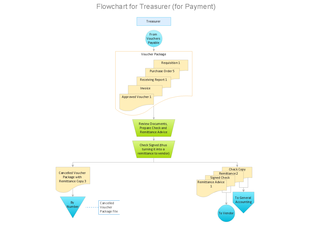
Picture: Why Flowchart Important to Accounting Information System?
Related Solution:
ConceptDraw DIAGRAM is the best network diagram software. To design the Cisco Network Diagrams and visualize the computer networks topology use ConceptDraw DIAGRAM diagramming and vector drawing software extended with Cisco Network Diagrams solution for ConceptDraw DIAGRAM Solution Park.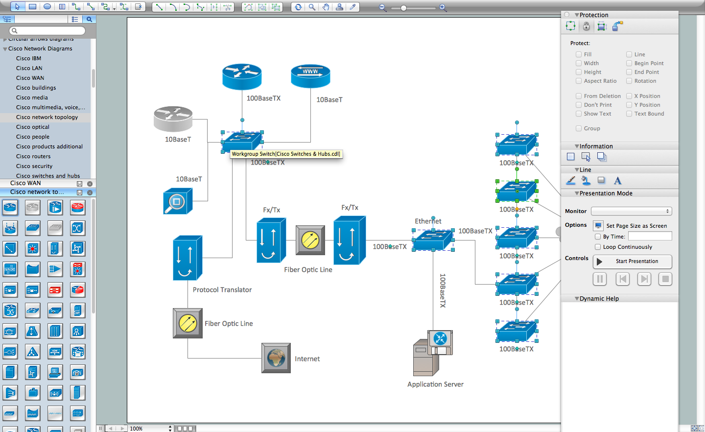
Picture: Cisco Network Diagram Software
Related Solution:
Business Process Modeling Notation (BPMN) is a set of standard symbols that allow you to create a graphical view of a business process. The symbols were developed to help users develop standard, unified structure of processes, and any messages shared between these processes.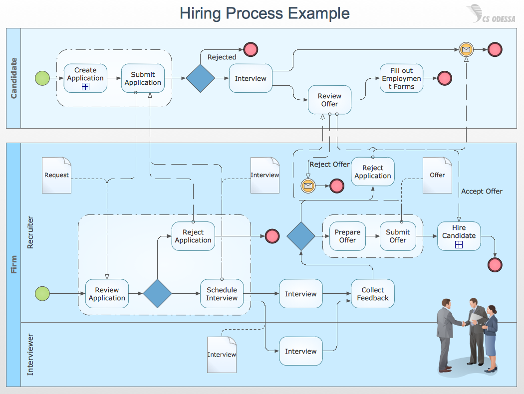
Picture: How to Draw Business Process Diagrams with RapidDraw Interface


