Making Dashboards Useful Again. Part 0.

Have you ever used dashboards? You probably have, and not just once. Speedometer, tachometer, fuel and oil level indicators, clock, and GPS – this is a typical set of instrumentation that can be found on a car dashboard. Even though all of these indicators are present, an experienced driver feels the speed and engine rpm with sufficient accuracy without looking at the dashboard consistently. The dashboard is an important tool in the car, but not necessarily an irreplaceable one: we need all these indicators to be available while driving, but for 99% of the time they are superfluous.
This issue of dashboards has an analog in the electronic devices world. Sales charts, traffic dashboards, sales and expenses – all of these provide important information, but managers are generally aware of this data and the state of the business. Dashboards are an at-a-glance indicator of the overall process. They do not provide a detailed report into the minutiae – for this, there is always Excel.
Just as a rear-view mirror needs the constant attention of the driver but it is not part of the dashboard display, it is the same way with key data on digital dashboards. Many times, mission-critical data is not present or it is hidden by secondary graphs and charts.
Today, there is a big Dashboard area in ConceptDraw Solution Park. The Dashboard area is a set of several charts that help to give an idea of a project’s current status.
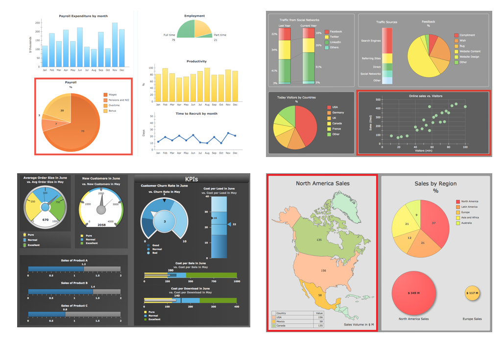
We at CS Odessa also are using dashboards. Each team member may see website daily visitors, registrations, plan progress, and sales on the touch screen monitor in one of our central hallways. Every minute the display shuffles thru five dashboard screens that represent different segments of the company with updated data.
Because of our years of experience with dashboard-creation and usage, there were a lot of ideas and questions as how to make this tool really handy and helpful. Currently main the problems with dashboards are:
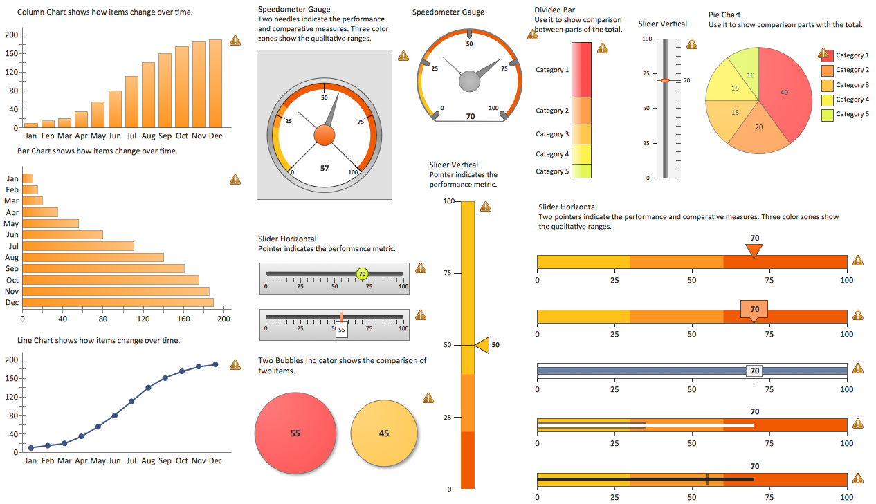
1. Complexity
Sometimes it takes more than 15 minutes to read just one indicator, and sometimes there are 5 of them on a dashboard.
2. Triviality
Often, dashboard data is already known (e.g. manager uses other indicators during the day).
3. Redundancy
Usually it refers indiscriminately to the all of the data, so there is often too much detail, or the time interval used is too large, or both.
4. Lack of comparison
This is perhaps the biggest problem. Many dashboards consist of indicators that use absolute values (number of tickets, registrations etc.), which by itself is uninformative, since the main aim of a dashboard is to show whether things are good or bad, and this can be done only by comparison.
5. Incorrectness
That's right! Often, data are simply displayed incorrectly with the wrong units (or no units at all), or discrete data are represented in a continuous form (can be seen almost on any chart of site visits).
This article starts a cycle in which we will try to solve these problems and present the result as dashboards, ready-to-use in your company.