Coloring Graphs
Abundance of colors
Color can be a very powerful tool when crafting images. Often, however, its usage is not justified. A typical example is when a color is added for the sake of the chart legend. So, if there is a legend — you must designate something with it. In most cases, a legend is already an excess, uncomfortable formalism — it makes the viewer divide their attention between a graph and a legend. Here is an example of how to simplify the data flow by removing the legend and the color:

The monochromatic variant demonstrates much better overall dynamic of the graph. The silhouette is more quickly understood when there are not excessive colors. When data becomes larger, this solution works worse:

So, we can add color:

Just as in the first variant, we have a legend, which we want to get rid of. But first, let’s take a closer look at the colors and details. On the one hand, when we switch our attention to a certain color, we may trace the dynamics. That is, what colors do best — indicate categories with purely visual elements, but there is a problem: the color choices do not add to the semantic value to the chart.
From the four indicators we have three corporations and one unifying concept. It would be nice to show the fundamental difference in the types of data.

Again, we have removed the color and the legend. The graph has not lost relevance and clarity. If our main purpose was to trace the market share changes not occupied by main players, this variant is the best.
If we want to get the most out of such a presentation, we will still have to add color. But we will do it more consciously:

We have purposely chosen the colors of different hues with a strong saturation — now, filtering by color will be much easier.
Color selection
For a better understanding how to use a color without creating the visual clutter, let’s look at the color model Hue — Saturation — Lightness (HSL):

Let’s take the most intense and the most vivid color of this green hue (top right corner) and its derivatives with respect to lightness and saturation:

Construct the same grid for a red hue:

If we choose the colors with the same saturation, but with low lightness, it may often be a problem with the contrast:

Therefore, it is better to choose more vivid colors:

But with such saturated colors it can be hard to work, especially if there are a lot of them. Therefore, preserving the “lightness,” we can reduce the saturation and go into more pastel colors:
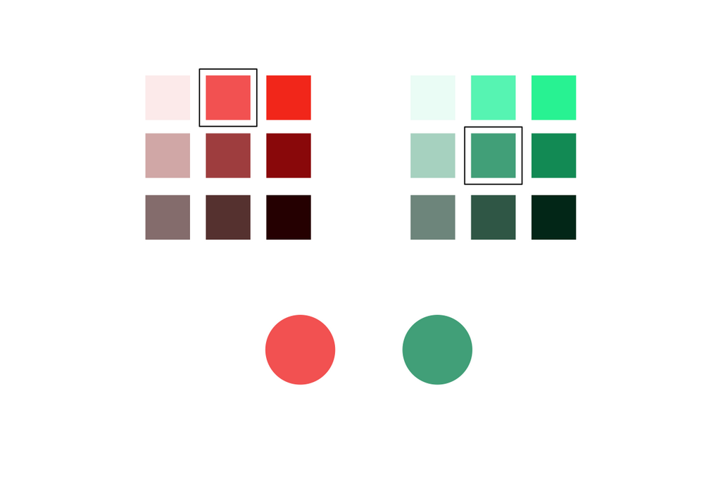
As you can see, we have reduced lightness for green — different hues have their own characteristics and there is no easy way to find the best color. For example, green, in bright variants, becomes almost luminous on the screens; while green with a low lightness can be almost black.
Later, we again will touch the topic of color palette selection on the example graphics, and other types of diagrams and illustration.