Tables’ Beauty
Behind any graphs, charts and even flowcharts there is data, big data, usually stored in tables.

To keep data in tables is useful, but tables are not convenient for presentations or communication. All graphs are intended to make the presentation of data clearly and simply. But are tables always that bad?
In many cases, working with tables is familiar. We all use public transport schedules on a regular basis and understand it well.

Report Cards in schools and universities do their jobs perfectly adequately in a table format.

Wouldn’t you think that finding your mark on a chart would be more difficult?
Weather forecast is also easy to read in a table format.

What’s wrong with tables? Why do we try to avoid using them? If we don’t know the subject well, we come face-to-face with our problems immediately. It takes time to understand what each column means, which units are used and why? Once we have overcome the first steps, we are left with the question: what does it all mean? When it comes for weather, it’s clear that +30 is hot and +15 is cool. But if it’s a table of expenses, to note where we spent too much is not such an easy task.
But if we will put the table in order, it is much more informative and helpful than any chart. Let’s go back to Loan Amortization Schedule table.
Let’s polish our table. Any line-crossings are visually-complex elements. Even one cross can distract, and when there are dozens of them, we just can’t see anything else. Let’s get rid of the table lines:

To read the data quickly, we make some space between the columns:

With all this, we have limited the visibility of the least important information in our chart. We address to it seldom, so there is no need to make it prominently visible. This concludes the first steps in formatting a table.
The entire timeline is a bit less than two years. One typical mistake when using dates is that it is easy to include excessive information. Don’t indicate the year in each date. In many cases, showing just the month and day is enough.

All the other columns of tables indicate money.
Moreover, a specific currency: Dollars. So, there is no need to add the dollar sign at each table cell.
It is better to align sums by the right side to allow for easy numerical comparison:

Last touch — mark the sections with different colors numbers, highlighting the most relevant information in your chart:
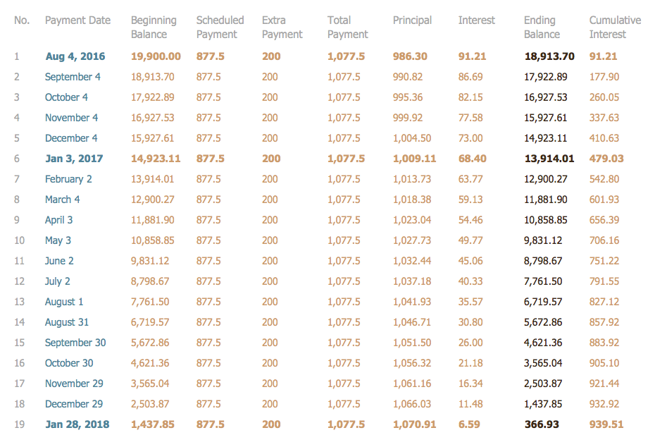
Thus, we have all of our information in a legible easy-to-read format. An important difference between tables and schedules is their credibility. That’s why we have a greater confidence in their accuracy. Any column can be double-checked, because we have ALL the data in front of us.
Yes, graphics and charts are more eye-catching, but often they don’t have nearly as much real information as a chart of the raw data.
SIX RELATED HOW TO's:
A flowchart is a powerful tool for examining processes. It helps improving processes a lot, as it becomes much easier to communicate between involved people, to identify potential problems and to optimize workflow. There are flowcharts of different shapes, sizes and types of flowchart vary from quite basic process flowcharts to complex program flowcharts. Nevertheless, all these diagrams use the same set of special symbols like arrows to connect blocks, parallelogram to show data receiving or rectangles for showing process steps.
Basic flowcharts are used to represent a simple process algorithm. A basic flowchart notation consists of rectangles (business processes), arrows (the flow of information, documents, etc.). The same notation is used in items such as the "decision", which allow you to do the branching. To indicate the start of the entire business process and its termination can be used the "Terminator" element. The advantages of Basic Flowchart are simplicity and clarity. With it you can quickly describe the business process steps. Creating of Basic Flowchart does not require any special knowledge, as easily understand by employees with different levels of education and IQ.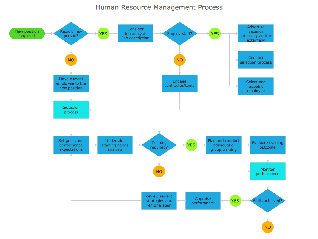
Picture: Types of Flowchart — Overview
Related Solution:
Any business process consists from a number of tasks carrying out the certain business goal. It is useful to diagram business processes to ensure that they are as foolproof, logical and sequential as possible. This business process diagram describes a typical booking process flow by the example of a cab booking process. It can be used as a roadmap for any booking system implementation. Diagramming a business process allows you to look at the entire project and take into account all types of possible scenarios. Business process diagram helps you investigate and clarify the process thoroughly so that you can find out how it can be improved. Business process diagram supports team communications by ensuring that each process element is clear and everyone in the team is on the same page.
Sometimes your company brings you less profit than you expect it to be, and it’s difficult to reveal the causes. Maybe it’s time to learn new technologies, because business diagram are easily developed by means of special software, so you won’t make any extra effort. In return, you will increase your productivity and get more done in a less time.
Picture: Business Diagram Software
Related Solutions:
Perfect charts and graphics diagramming software with rich examples and template. ConceptDraw is ideal to draw Charts and Graphics.
Picture: Basic Diagramming
Related Solution:
When trying to figure out the nature of the problems occurring within a project, there are many ways to develop such understanding. One of the most common ways to document processes for further improvement is to draw a process flowchart, which depicts the activities of the process arranged in sequential order — this is business process management. ConceptDraw DIAGRAM is business process mapping software with impressive range of productivity features for business process management and classic project management. This business process management software is helpful for many purposes from different payment processes, or manufacturing processes to chemical processes. Business process mapping flowcharts helps clarify the actual workflow of different people engaged in the same process. This samples were made with ConceptDraw DIAGRAM — business process mapping software for flowcharting and used as classic visio alternative because its briefly named "visio for mac" and for windows, this sort of software named the business process management tools.
This flowchart diagram shows a process flow of project management. The diagram that is presented here depicts the project life cycle that is basic for the most of project management methods. Breaking a project into phases allows to track it in the proper manner. Through separation on phases, the total workflow of a project is divided into some foreseeable components, thus making it easier to follow the project status. A project life cycle commonly includes: initiation, definition, design, development and implementation phases. Distinguished method to show parallel and interdependent processes, as well as project life cycle relationships. A flowchart diagram is often used as visual guide to project. For instance, it used by marketing project management software for visualizing stages of marketing activities or as project management workflow tools. Created with ConceptDraw DIAGRAM — business process mapping software which is flowcharting visio alternative or shortly its visio for mac, this sort of software platform often named the business process management tools.
Picture: Process Flowchart
Related Solution:
Any flow diagram is a generic concept for a diagram that is depicting a flow or some set of the dynamic relationships that can be found within some system. The term “flow diagram” itself can also be used as a synonym for a flowchart or work flow diagram in case the representation of the work is mentioned.
Any flow diagram can be sometimes seen as a counterpart of some flowchart being created with the help of the ConceptDraw DIAGRAM diagramming and drawing software as well as the Workflow Diagrams solution taken from the ConceptDraw STORE application.
Picture: Work Flow Diagram
Related Solution:


