 Pie Charts
Pie Charts are extensively used in statistics and business for explaining data and work results, in mass media for comparison (i.e. to visualize the percentage for the parts of one total), and in many other fields. The Pie Charts solution for ConceptDraw PRO v10 offers powerful drawing tools, varied templates, samples, and a library of vector stencils for simple construction and design of Pie Charts, Donut Chart, and Pie Graph Worksheets.
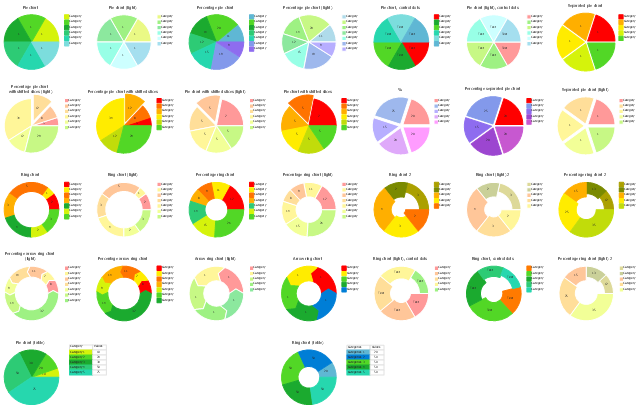
The vector stencils library Pie charts contains 28 templates you can use to add pie and donut charts in your business documents, presentation slides and infographics using the ConceptDraw PRO diagramming and vector drawing software.
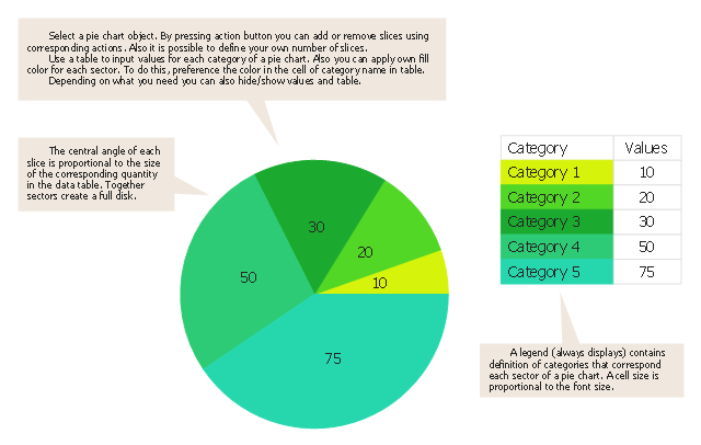
"A pie chart (or a circle graph) is a circular chart divided into sectors, illustrating numerical proportion. In a pie chart, the arc length of each sector (and consequently its central angle and area), is proportional to the quantity it represents. While it is named for its resemblance to a pie which has been sliced, there are variations on the way it can be presented. ...
Pie charts are very widely used in the business world and the mass media. However, they have been criticized, and many experts recommend avoiding them, pointing out that research has shown it is difficult to compare different sections of a given pie chart, or to compare data across different pie charts. Pie charts can be replaced in most cases by other plots such as the bar chart. ...
However, if the goal is to compare a given category (a slice of the pie) with the total (the whole pie) in a single chart and the multiple is close to 25 or 50 percent, then a pie chart can often be more effective than a bar graph. ...
A doughnut chart (also spelled donut) is functionally identical to a pie chart, with the exception of a blank center and the ability to support multiple statistics as one." [Pie chart. Wikipedia]
The example "Design elements - Pie charts" is included in the Pie Charts solution of the Graphs and Charts area in ConceptDraw Solution Park.
Pie chart and donut chart templates
Pie Chart Software

ConceptDraw PRO software with Pie Charts solution helps to create pie and donut charts for effective displaying proportions in statistics, business and mass media for composition comparison, i.e. for visualization of part percentage inside one total.
Pie Chart Word Template. Pie Chart Examples

 Basic Diagramming
This solution extends ConceptDraw PRO software with the specific tools you need to easily draw flowcharts, block diagrams, histograms, pie charts, divided bar diagrams, line graphs, circular arrows diagrams, Venn diagrams, bubble diagrams and concept maps
Percentage Pie Chart. Pie Chart Examples

This sample shows the Pie Chart of the approximate air composition. You can see the percentage of oxygen, nitrogen and other gases in the air visualized on this Pie Chart.
Business Report Pie. Pie Chart Examples

The vector stencils library "Composition charts" contains 6 templates: 2 pie charts, 2 divided bar charts and 2 double divided bar charts.
The vector stencils library "Composition indicators" contains 6 templates of visual indicators.
Use these design elements to visualize composition comparison of your data in your visual dashboard created using the ConceptDraw PRO diagramming and vector drawing software.
"A pie chart (or a circle graph) is a circular chart divided into sectors, illustrating numerical proportion. In a pie chart, the arc length of each sector (and consequently its central angle and area), is proportional to the quantity it represents. While it is named for its resemblance to a pie which has been sliced, there are variations on the way it can be presented. ...
An obvious flaw exhibited by pie charts is that they cannot show more than a few values without separating the visual encoding (the “slices”) from the data they represent (typically percentages). When slices become too small, pie charts have to rely on colors, textures or arrows so the reader can understand them. This makes them unsuitable for use with larger amounts of data. Pie charts also take up a larger amount of space on the page compared to the more flexible alternative of bar charts, which do not need to have separate legends, and can also display other values such as averages or targets at the same time. ...
Most subjects have difficulty ordering the slices in the pie chart by size; when the bar chart is used the comparison is much easier. Similarly, comparisons between data sets are easier using the bar chart. However, if the goal is to compare a given category (a slice of the pie) with the total (the whole pie) in a single chart and the multiple is close to 25 or 50 percent, then a pie chart can often be more effective than a bar graph." [Pie chart. Wikipedia]
The example "Design elements - Composition charts and indicators" is included in the Composition Dashboard solution from the area "What is a Dashboard" of ConceptDraw Solution Park.
Composition charts and visual indicators

Use this pie chart template in the ConceptDraw PRO diagramming and vector drawing software to add pie charts to your business documents, websites, presentation slides and infographics.
"An obvious flaw exhibited by pie charts is that they cannot show more than a few values without separating the visual encoding (the “slices”) from the data they represent (typically percentages). When slices become too small, pie charts have to rely on colors, textures or arrows so the reader can understand them. This makes them unsuitable for use with larger amounts of data. Pie charts also take up a larger amount of space on the page compared to the more flexible alternative of bar charts, which do not need to have separate legends, and can also display other values such as averages or targets at the same time.
Statisticians generally regard pie charts as a poor method of displaying information, and they are uncommon in scientific literature. One reason is that it is more difficult for comparisons to be made between the size of items in a chart when area is used instead of length and when different items are shown as different shapes.
Further, in research performed at AT&T Bell Laboratories, it was shown that comparison by angle was less accurate than comparison by length. This can be illustrated with the diagram to the right, showing three pie charts, and, below each of them, the corresponding bar chart representing the same data. Most subjects have difficulty ordering the slices in the pie chart by size; when the bar chart is used the comparison is much easier. Similarly, comparisons between data sets are easier using the bar chart. However, if the goal is to compare a given category (a slice of the pie) with the total (the whole pie) in a single chart and the multiple is close to 25 or 50 percent, then a pie chart can often be more effective than a bar graph." [Pie chart. Wikipedia]
This Pie chart template is included in the Pie Charts solution of the Graphs and Charts area in ConceptDraw Solution Park.
Pie chart template
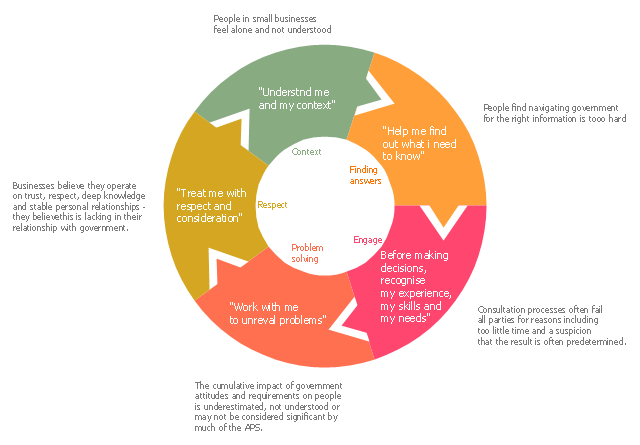
This ring chart example was created on the base of the figure illustrating the article "A framework for understanding and improving interactions" from the Australian government website DesignGov.
"What do these findings mean for understanding the interactions between business and government and how they might be dramatically improved? The framework described below draws on the needs, insights and findings of the project to identify where initiatives are most likely to lead to better experiences. ...
The integrated framework (depicted in Figure ...) starts from the needs and builds on insights to potential solutions at systemic, agency and individual levels. It consists of five facets of the range of interactions, with each facet being supported by the previous one, and supporting the next in turn. ...
Framework for understanding and improving interactions, displaying how each of the facets support each other...
The five facets impacting interaction are:
(1) Context – Understand me and my context. Knowing who the parties are, what they want, what they do and how these things might be changing. Once this context is understood it allows both parties to better communicate with one another.
(2) Finding answers – Help me find out what I need to know. Having the right information in a form that each party can easily use to determine what is relevant to them. Having strong communication will facilitate better engagement.
(3) Engage – Before making decisions, recognise my experience, my skills and my needs. Consulting and engaging well enough to understand the experiences, expertise and capability, drivers, motivations and needs of the relevant parties so as to ensure effective decision-making. Good decision-making will help to avoid potential problems arising.
(4) Problem solving – Work with me to unravel problems. Understanding problems and issues and if (or how) we contribute to them, and having mechanisms by which to transparently resolve the problems. Effective problem solving capabilities lead to better outcomes and a better service experience.
(5) Respect – Treat me with respect and consideration. Having a strong and adaptable service culture, and listening and responding with respect. This in turn assists in better understanding the parties and their context." [design.gov.au/ doing/ projects/ business-and-government-interactions-project/ lost-in-translation-shared-striving-and-mutual-misunderstanding-in-business-and-government-interactions-findings-report-august-2013/ ]
The ring chart example "A framework for understanding and improving interactions" was created using the ConceptDraw PRO diagramming and vector drawing software extended with the Target and Circular Diagrams solution from the Marketing area of ConceptDraw Solution Park.
www.conceptdraw.com/ solution-park/ marketing-target-and-circular-diagrams
Ring chart
Visual Presentations Made Easy with Diagramming Software

Simple Drawing Applications for Mac

Pie Chart Examples and Templates

Pie chart examples and templates created using ConceptDraw PRO software helps you get closer with pie charts and find pie chart examples suite your needs.
Best Program to Make Diagrams

The Best Drawing Program for Mac

Donut Chart Templates

All these donut chart templates are included in the Pie Charts solution.
You can quickly rework these examples into your own charts by simply changing displayed data, title and legend texts.
 Composition Dashboard
Composition dashboard solution extends ConceptDraw PRO software with templates, samples and vector stencils library with charts and indicators for drawing visual dashboards showing data composition.
- Pie Charts | Pie Chart Examples and Templates | Pie Chart Software |
- Pie Charts | Composition Dashboard | Basic Diagramming |
- Basic Diagramming | Pie Charts | Universal Diagramming Area |
- Pie Chart Examples | Pie Charts | Pie Chart Software |
- Pie Chart Examples | Pie chart template | Pie Charts |
- Ring chart template | Pie Chart Examples and Templates | Design ...
- Pie chart template | Pie Charts | Chart Templates
- Pie Charts | Create Graphs and Charts | LLNL Flow Charts |
- Pie Charts | Composition Dashboard | What is a Dashboard Area |
- Composition Dashboard | Pie Charts | Basic Diagramming |
- Process Flowchart | Pie Charts | Basic Flowchart Symbols |
- How to Create a Pie Chart | Pie Charts | Pie ... - Conceptdraw.com
- Scatter Chart Analysis. Scatter Chart Example | Bubble Plot | Pie ...
- How to Draw an Organization Chart | Pie Charts | PM Easy |
- How to Create a Pie Chart | Pie Chart Examples | Pie Chart Software |
- Pie Chart Examples and Templates | How to Create a Pie Chart | Pie ...
- Pie Chart Examples and Templates | Pie Chart Software | How to ...
- Business Report Pie. Pie Chart Examples
- Pie Chart Software | Pie Chart Examples and Templates | Pie Donut ...
- Pie Chart Software - Conceptdraw.com