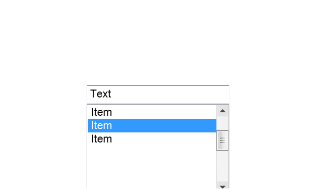
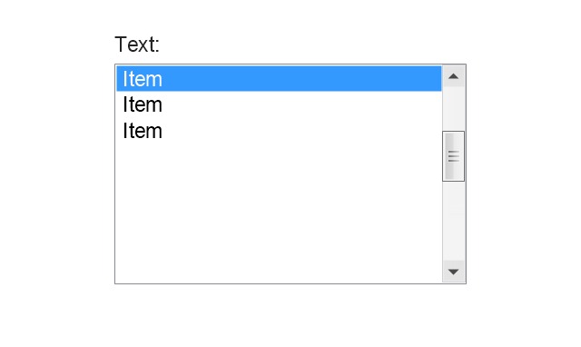
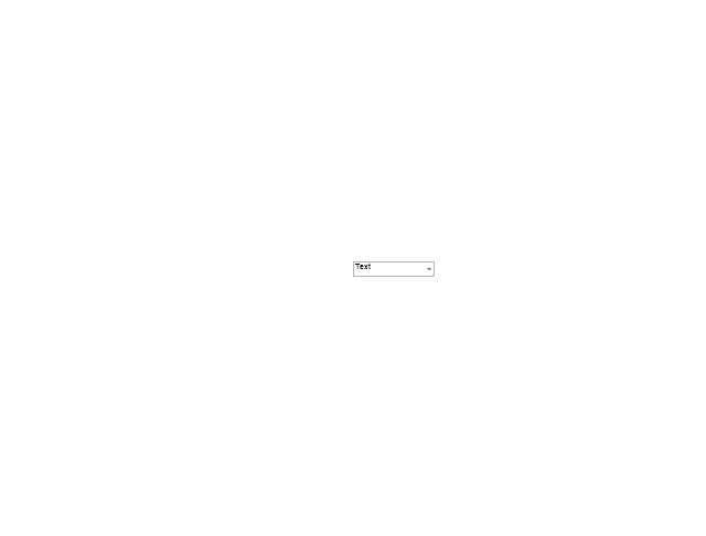
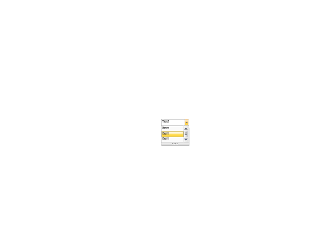
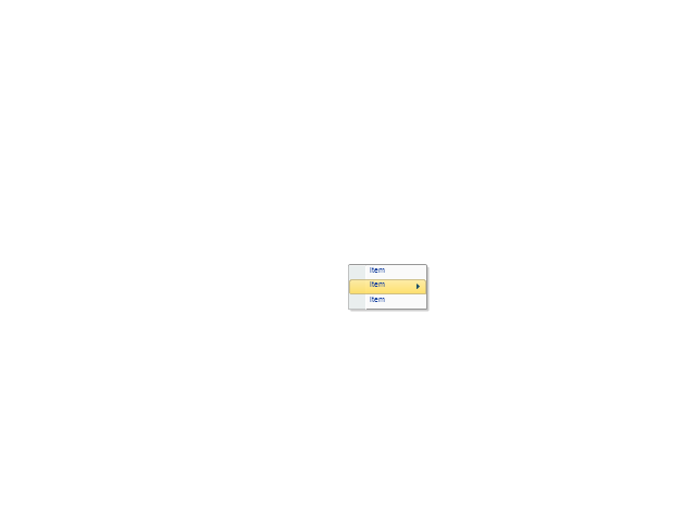
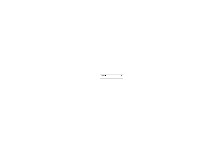
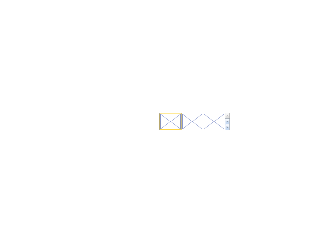
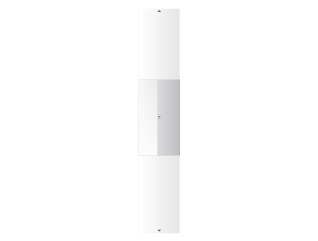
The vector stencils library "Menus" contains 14 icons of Windows 8 menus.
Use this menu UI icon set to design graphic user interface (GUI) prototypes of your software applications for Windows 8.
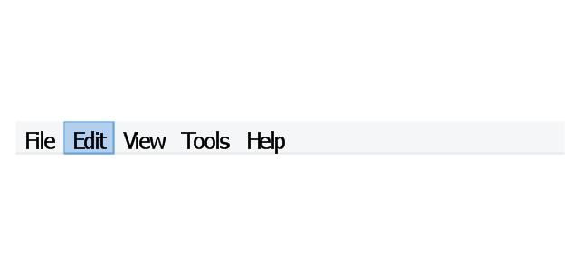
"A menu bar is a graphical control element which contains drop down menus. The menu bar's purpose is to supply a common housing for window- or application-specific menus which provide access to such functions as opening files, interacting with an application, or displaying help documentation or manuals. Menu bars are typically present in graphical user interfaces that display documents and representations of files in windows and windowing systems but menus can be used as well in command line interface programs like text editors or filemanagers where drop-down menu is activated with shortcut key or combination. ...
The menu bar in Microsoft Windows is usually anchored to the top of a window under the title bar; therefore, there can be many menu bars on screen at one time. Menus in the menu bar can be accessed through shortcuts involving the Alt key and the mnemonic letter that appears underlined in the menu title. Additionally, pressing Alt or F10 brings the focus on the first menu of the menu bar." [Menu bar. Wikipedia]
The menu elements example "Menus - Vector stencils library" was created using the ConceptDraw PRO diagramming and vector drawing software extended with the Windows 8 User Interface solution from the Software Development area of ConceptDraw Solution Park.
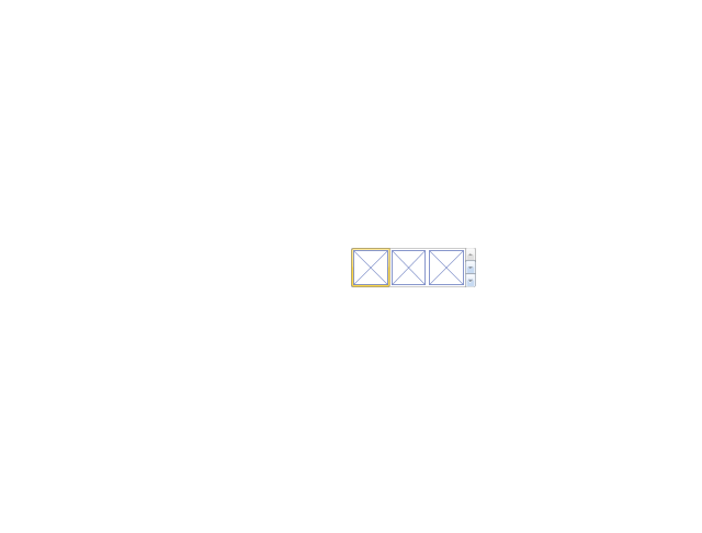
Use this menu UI icon set to design graphic user interface (GUI) prototypes of your software applications for Windows 8.
"A menu bar is a graphical control element which contains drop down menus. The menu bar's purpose is to supply a common housing for window- or application-specific menus which provide access to such functions as opening files, interacting with an application, or displaying help documentation or manuals. Menu bars are typically present in graphical user interfaces that display documents and representations of files in windows and windowing systems but menus can be used as well in command line interface programs like text editors or filemanagers where drop-down menu is activated with shortcut key or combination. ...
The menu bar in Microsoft Windows is usually anchored to the top of a window under the title bar; therefore, there can be many menu bars on screen at one time. Menus in the menu bar can be accessed through shortcuts involving the Alt key and the mnemonic letter that appears underlined in the menu title. Additionally, pressing Alt or F10 brings the focus on the first menu of the menu bar." [Menu bar. Wikipedia]
The menu elements example "Menus - Vector stencils library" was created using the ConceptDraw PRO diagramming and vector drawing software extended with the Windows 8 User Interface solution from the Software Development area of ConceptDraw Solution Park.
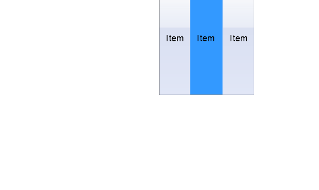
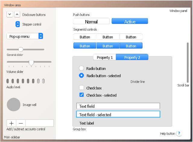
Menu bar
Menu category

Menu category - selected

Menu bar background

Drop-down menu
Separator line

Check

Option
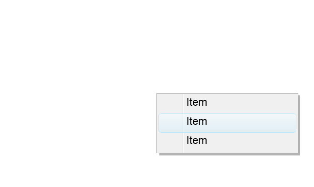
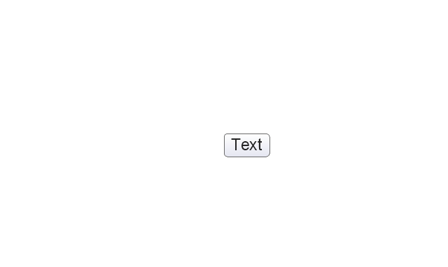
Menu item
Menu item - selected
Menu item - disabled

Arrow indicator
Menu item with arrow
Menu item with arrow - selected
How to Create a Column Chart

How to Create a Line Chart

The vector stencils library "MS Windows Vista user interface" contains 76 MS Windows Vista design elements.
Use it for designing Microsoft ribbon graphic user interface (GUI) of software for computers with MS Windows Vista OS in the ConceptDraw PRO diagramming and vector drawing software extended with the Graphic User Interface solution from the Software Development area of ConceptDraw Solution Park.
Use it for designing Microsoft ribbon graphic user interface (GUI) of software for computers with MS Windows Vista OS in the ConceptDraw PRO diagramming and vector drawing software extended with the Graphic User Interface solution from the Software Development area of ConceptDraw Solution Park.
Window
Dialog Window
Empty Window
Field
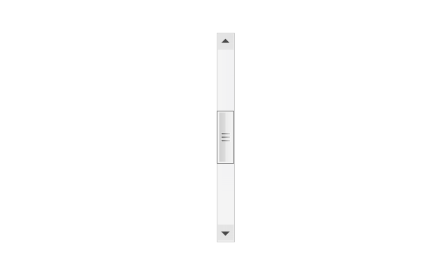
Horizontal Scrollbar
Vertical Scrollbar
Window Buttons
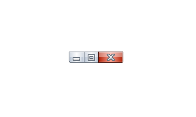
Window Buttons
Window Button 1
Window Button 2
Window Button 3
Window Button 4

Navigation
Menu Bar
Gradient Menu Bar
Drop-down Menu
Button
Toolbar Pannel
Tool Button
Primary Toolbar

Toolbar 1
Toolbar 2
Customizable Tollbar
Tab View
List View
Text Field
Vertical Separator

Horizontal Separator

Group Box
Text Label

Link

Line Edit
Search

Search with Button

Spin Box
Combo-box
Editable Combo-box
Editable List Box
List Box
Single-selection List
Multiple-selection List
Check Box
Radio Button
Check box group
Radio Buttons Group
Progress Bar
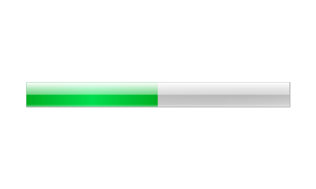
Modal Progress Bar

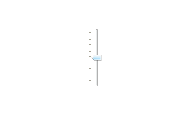
Vertical Slider with Ticks
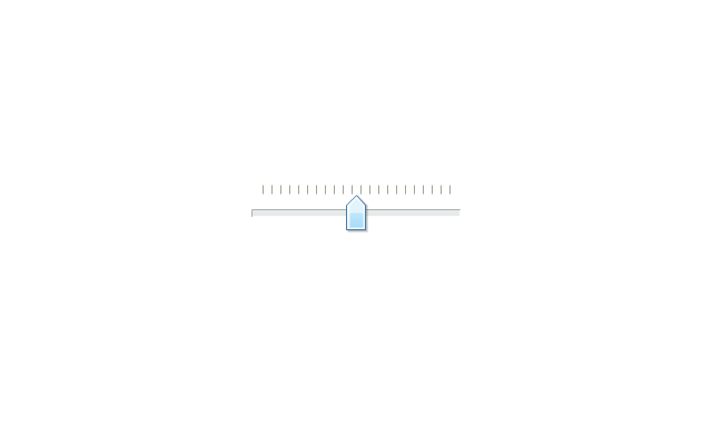
Horizontal Slider with Ticks
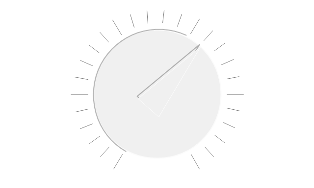
Dial
Catalogue Tree
Tree View 1
Tree View 2
Vertical Spacer
Horizontal Spacer
Chevron 1
Arrow 1
Arrow 2
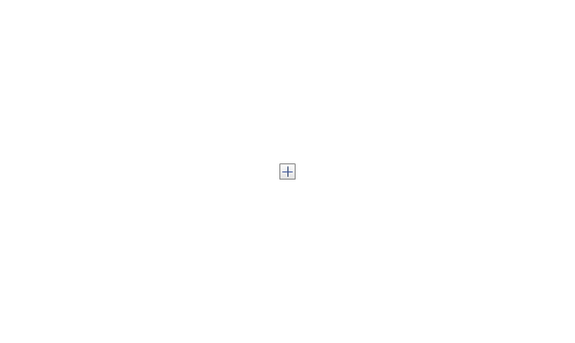
Plus/Minus Control
Rotating Triangle

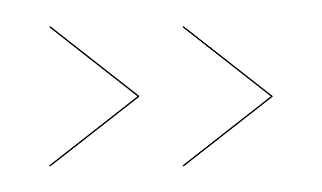
Chevron 3
Chevron 2
Normal Select Cursor

Link Select Cursor

Text Select Cursor

Working in Background Pointer

Busy Pointer

Unavailable Cursor
Precision Select Cursor
Error Icon
Warning Icon
Information Icon
Question Mark Icon
Balloon
Tooltip/Infotip
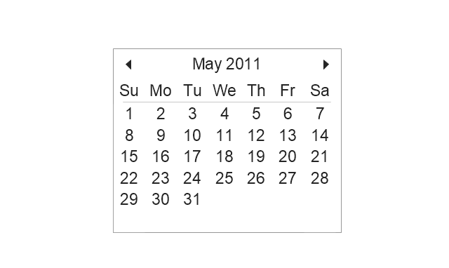
Calendar
The vector stencils library "Menus" contains 22 menu elements.
Use this UI icon set to design graphic user interface (GUI) of your software application for OS X 10.10 Yosemite Apple Mac operating system.
The example "Menus - Vector stencils library" was created using the ConceptDraw PRO diagramming and vector drawing software extended with the Mac OS User Interface solution from the Software Development area of ConceptDraw Solution Park.
Menu bar
Menu bar menu

Menu bar menu - selected

Apple menu

Apple menu - selected

General menu

Dock menu

Menu item

Menu item - selected

Menu item - disabled

Divider
AirPlay

Time Machine

Bluetooth

AirPort

Eject

Sound

Battery

Battery - charging

Power icon
Spotlight

Notifications

The vector stencils library "Toolbar control elements" contains 42 toolbar graphical control elements.
Use this tool bar control element UI icon set to design graphic user interface (GUI) of your software application for OS X 10.10 Yosemite Apple Mac operating system.
The example "Toolbar control elements - Vector stencils library" was created using the ConceptDraw PRO diagramming and vector drawing software extended with the Mac OS User Interface solution from the Software Development area of ConceptDraw Solution Park.
Drop-down button

Drop-down button - ON press left

Drop-down button - ON press right

Tool bar button

Tool bar button - ON press

Tool bar button - selected

Left segment

Left segment - ON press

Left segment - selected

Middle segment

Middle segment - ON press

Middle segment - selected

Right segment

Right segment - ON press

Right segment - selected

Segmented control - 2 buttons

Segmented control - 3 buttons

Segmented control - 4 buttons

Small button toggle

Back - Forward button

List/Icons view control
Arrange button

Action menu

Downloads button

Copy button

Share button

Edit tags button

Sidebar button

Slider element

Tool bar button 2

Tool bar button 2 - ON press

Tool bar button 2 - selected

Search field

Search field - active

"Stoplights" control
Close button

Minimize button

Maximize button

Close button - hover

Minimize button - hover

Maximize button - hover

Action button - inactive

The vector stencils library "MS Windows Vista user interface" contains 76 MS Windows Vista design elements.
Use it for designing Microsoft ribbon graphic user interface (GUI) of software for computers with MS Windows Vista OS in the ConceptDraw PRO diagramming and vector drawing software extended with the Graphic User Interface solution from the Software Development area of ConceptDraw Solution Park.
Use it for designing Microsoft ribbon graphic user interface (GUI) of software for computers with MS Windows Vista OS in the ConceptDraw PRO diagramming and vector drawing software extended with the Graphic User Interface solution from the Software Development area of ConceptDraw Solution Park.
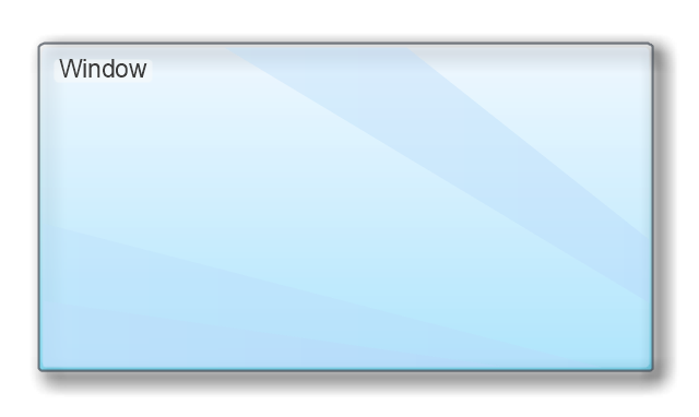
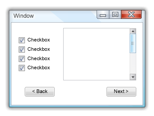
Window
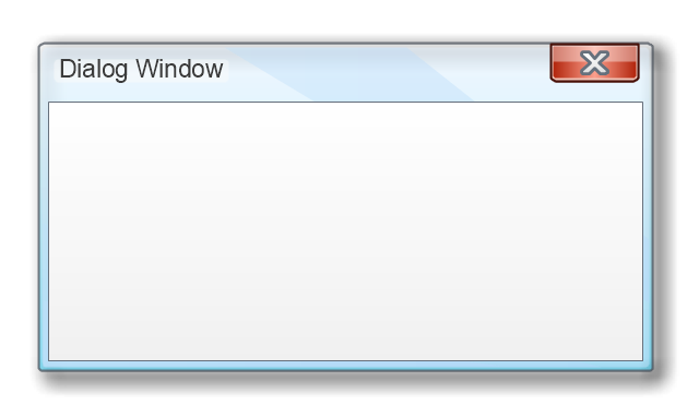
Dialog Window
Empty Window
Field
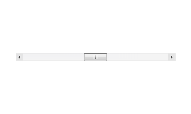
Horizontal Scrollbar
Vertical Scrollbar
Window Buttons
Window Buttons
Window Button 1
Window Button 2
Window Button 3
Window Button 4
Navigation
Menu Bar
Gradient Menu Bar
Drop-down Menu
Button
Toolbar Pannel
Tool Button
Primary Toolbar
Toolbar 1
Toolbar 2
Customizable Tollbar
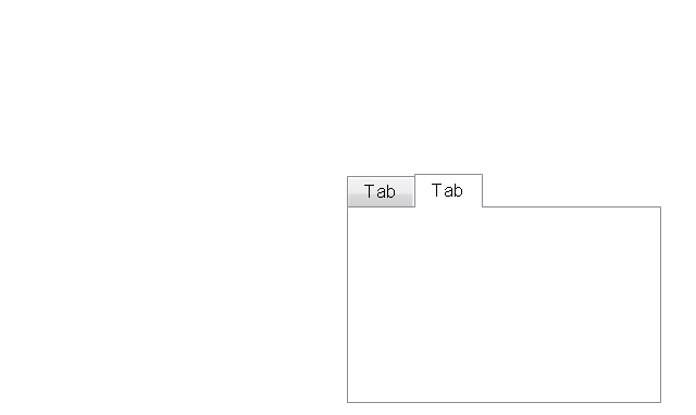
Tab View
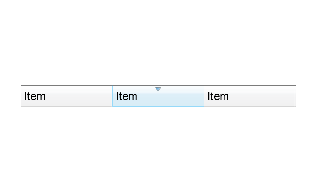
List View
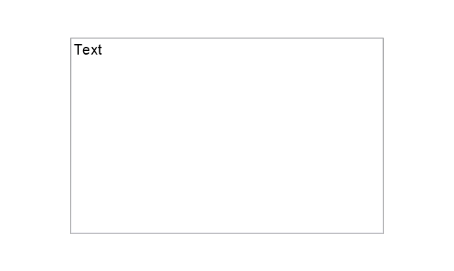
Text Field
Vertical Separator
Horizontal Separator
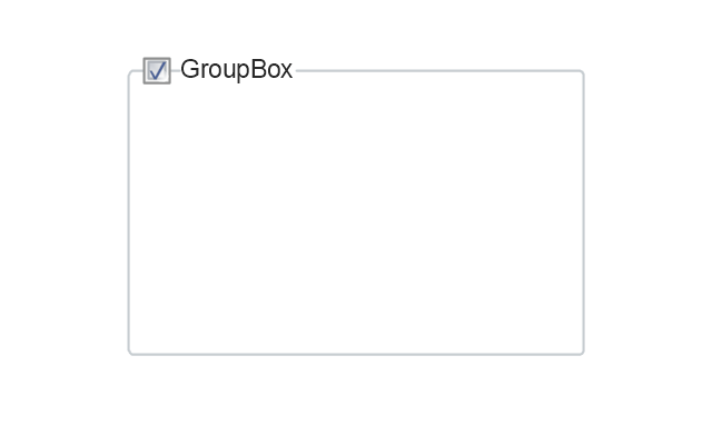
Group Box
Text Label
Link
Line Edit
Search
Search with Button
Spin Box
Combo-box
Editable Combo-box
Editable List Box
List Box
Single-selection List
Multiple-selection List
Check Box
Radio Button
Check box group
Radio Buttons Group
Progress Bar
Modal Progress Bar
Vertical Slider with Ticks
Horizontal Slider with Ticks
Dial
Catalogue Tree
Tree View 1
Tree View 2
Vertical Spacer
Horizontal Spacer
Chevron 1
Arrow 1
Arrow 2
Plus/Minus Control
Rotating Triangle
Chevron 3
Chevron 2
Normal Select Cursor
Link Select Cursor
Text Select Cursor
Working in Background Pointer
Busy Pointer
Unavailable Cursor
Precision Select Cursor
Error Icon
Warning Icon
Information Icon
Question Mark Icon
Balloon
Tooltip/Infotip
Calendar
How to Create a Bar Chart

The vector stencils library "Glyph icons" contains 38 glyph and symbol UI icons. Use this glyph UI icon set to design graphic user interface (GUI) of your software application for OS X 10.10 Yosemite Apple Mac operating system.
The example "Glyph icons - Vector stencils library" was created using the ConceptDraw PRO diagramming and vector drawing software extended with the Mac OS User Interface solution from the Software Development area of ConceptDraw Solution Park.
The example "Glyph icons - Vector stencils library" was created using the ConceptDraw PRO diagramming and vector drawing software extended with the Mac OS User Interface solution from the Software Development area of ConceptDraw Solution Park.
Check mark grey
Check mark black
Submenu indicator
Command glyph
Add glyph
Delete glyph
Drag vertical glyph
Drag horizontal glyph
Expand corner
Collapse up icon
Collapse down icon
Settings icon
Chevron
Up-down arrows
Divider
Up arrow
Delete key
Key control
Search icon
Search icon 2
All My Files icon
AirDrop icon
iCloud icon
Applications icon
Documents icon
Downloads icon
Desktop icon
Tag - red
Tag - orange
Tag - yellow
Tag - green
Tag - blue
Tag - purple
Tag - gray
All tags
Apple icon
Disclosure triangle
Refresh
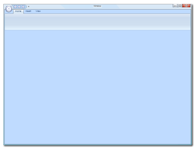
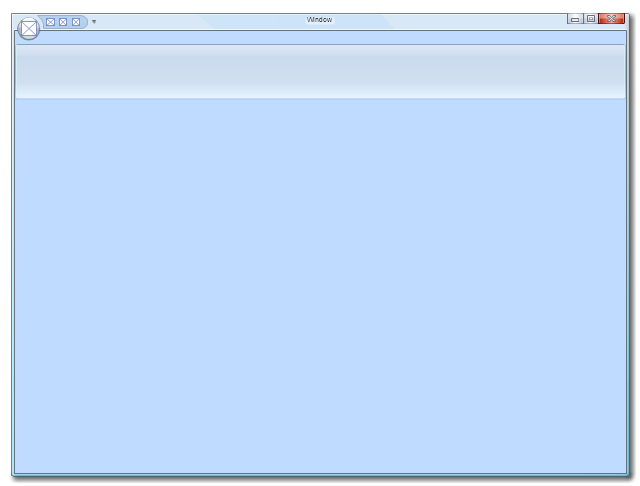
Use this template to prototype and design the Windows graphic user interface.
"In human–computer interaction, WIMP stands for "windows, icons, menus, pointer", denoting a style of interaction using these elements of the user interface. ... Other expansions are sometimes used, substituting "mouse" and "mice" or "pull-down menu" and "pointing", for menus and pointer, respectively. ...
In a WIMP system:
(1) A window runs a self-contained program, isolated from other programs that (if in a multi-program operating system) run at the same time in other windows.
(2) An icon acts as a shortcut to an action the computer performs (e.g., execute a program or task).
(3) A menu is a text or icon-based selection system that selects and executes programs or tasks.
(4) The pointer is an onscreen symbol that represents movement of a physical device that the user controls to select icons, data elements, etc.
(5) cut, copy, and paste.
This style of system improves human–computer interaction (HCI) by emulating real-world interactions and providing better ease of use for non-technical people - both novice and power users. Users can carry skill at a standardized interface from one application to another.
Due to the nature of the WIMP system, simple commands can be chained together to undertake a group of commands that would have taken several lines of command line instructions." [WIMP (computing). Wikipedia]
The Windows Vista graphic user interface template for the ConceptDraw PRO diagramming and vector drawing software is included in the Graphic User Interface solution from the Software Development area of ConceptDraw Solution Park.
Windows GUI template
The vector stencils library "Ribbon interface" contains 41 ribbon shapes.
Use it for designing Microsoft ribbon graphic user interface (GUI) of software for Windows computers in the ConceptDraw PRO diagramming and vector drawing software extended with the Graphic User Interface solution from the Software Development area of ConceptDraw Solution Park.
Use it for designing Microsoft ribbon graphic user interface (GUI) of software for Windows computers in the ConceptDraw PRO diagramming and vector drawing software extended with the Graphic User Interface solution from the Software Development area of ConceptDraw Solution Park.
Main Window with Menu
Main Window
Menu
Special Menu
Field
Tools Group
Tools Group Minimized
Tool Button

Tool Button
Toolbar
Label
Text Label

Edit Box
Combobox
Combobox with List
Drop-down Menu
Spin Box
Check Box

Radio Button

Styles Control 1
Styles Control 2
Rounded Tab

Floating Dialogue
Status Bar

Small Toolbar (for Status Bar)
-ribbon-interface---vector-stencils-library.png--diagram-flowchart-example.png)
Zoom Slider

Horizontal Scroll
Vertical Scroll
Drop-down List
Arrow
Close

Drop-down Menu Base

Drop-down Menu Left Part

Menu/List Item (Text)
-ribbon-interface---vector-stencils-library.png--diagram-flowchart-example.png)
Menu/List Item (Image)
-ribbon-interface---vector-stencils-library.png--diagram-flowchart-example.png)
Menu/List Item (Image with Text)
-ribbon-interface---vector-stencils-library.png--diagram-flowchart-example.png)
Meny/List Header
Drop-down Menu Separator

Vertical Separator

Chek/Option for Drop-down Menu
Image

How to create a UML Diagram

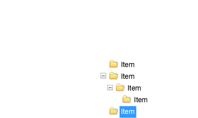
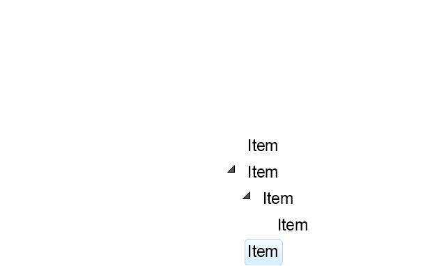
The vector stencils library "Progressive disclosure controls" contains 12 icons of Windows 8 progressive disclosure controls.
Use it to design graphic user interface (GUI) prototypes of your software applications for Windows 8.
"With a progressive disclosure control, users can show or hide additional information including data, options, or commands. Progressive disclosure promotes simplicity by focusing on the essential, yet revealing additional detail as needed. ...
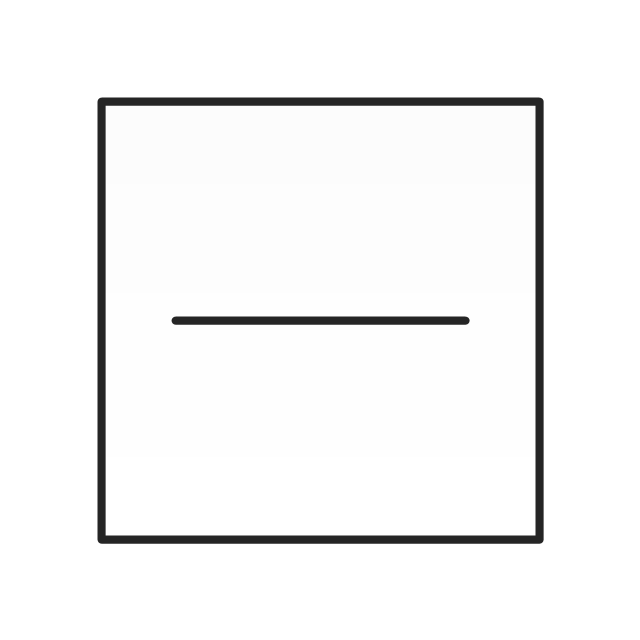
Chevrons show or hide the remaining items in completely or partially hidden content. Usually the items are shown in place, but they can also be shown in a pop-up menu. When in place, the item stays expanded until the user collapses it. ...
Arrows show a pop-up command menu. The item stays expanded until the user makes a selection or clicks anywhere.
If the arrow button is an independent control, it receives input focus and is activated with the space bar. If the arrow button has a parent control, the parent receives input focus and the arrow is activated with Alt+down arrow and Alt+up arrow keys, as with the drop-down list control. ...
Plus and minus controls expand or collapse to show container content in place when navigating through a hierarchy. The item stays expanded until the user collapses it. Although these look like buttons, their behavior is in-place.
The associated object receives input focus. The plus is activated with the right arrow key, and the minus with the left arrow key. ...
Rotating triangles show or hide additional information in place for an individual item. They are also used to expand containers. The item stays expanded until the user collapses it.
The associated object receives input focus. The collapsed (right-pointing) triangle is activated with the right arrow key, and the expanded (downward-pointing) triangle with the left arrow key. ...
Like chevrons, additional information is shown or hidden in place. The item stays expanded until the user collapses it. Unlike chevrons, the glyphs have a graphical representation of the action, typically with an arrow indicating what will happen. ... Preview arrows are best reserved for situations where a standard chevron doesn't adequately communicate the control's behavior, such as when the disclosure is complex or there is more than one type of disclosure." [msdn.microsoft.com/ en-us/ library/ windows/ desktop/ dn742409%28v=vs.85%29.aspx]
The icons example "Progressive disclosure controls - Vector stencils library" was created using the ConceptDraw PRO diagramming and vector drawing software extended with the Windows 8 User Interface solution from the Software Development area of ConceptDraw Solution Park.
Use it to design graphic user interface (GUI) prototypes of your software applications for Windows 8.
"With a progressive disclosure control, users can show or hide additional information including data, options, or commands. Progressive disclosure promotes simplicity by focusing on the essential, yet revealing additional detail as needed. ...
Chevrons show or hide the remaining items in completely or partially hidden content. Usually the items are shown in place, but they can also be shown in a pop-up menu. When in place, the item stays expanded until the user collapses it. ...
Arrows show a pop-up command menu. The item stays expanded until the user makes a selection or clicks anywhere.
If the arrow button is an independent control, it receives input focus and is activated with the space bar. If the arrow button has a parent control, the parent receives input focus and the arrow is activated with Alt+down arrow and Alt+up arrow keys, as with the drop-down list control. ...
Plus and minus controls expand or collapse to show container content in place when navigating through a hierarchy. The item stays expanded until the user collapses it. Although these look like buttons, their behavior is in-place.
The associated object receives input focus. The plus is activated with the right arrow key, and the minus with the left arrow key. ...
Rotating triangles show or hide additional information in place for an individual item. They are also used to expand containers. The item stays expanded until the user collapses it.
The associated object receives input focus. The collapsed (right-pointing) triangle is activated with the right arrow key, and the expanded (downward-pointing) triangle with the left arrow key. ...
Like chevrons, additional information is shown or hidden in place. The item stays expanded until the user collapses it. Unlike chevrons, the glyphs have a graphical representation of the action, typically with an arrow indicating what will happen. ... Preview arrows are best reserved for situations where a standard chevron doesn't adequately communicate the control's behavior, such as when the disclosure is complex or there is more than one type of disclosure." [msdn.microsoft.com/ en-us/ library/ windows/ desktop/ dn742409%28v=vs.85%29.aspx]
The icons example "Progressive disclosure controls - Vector stencils library" was created using the ConceptDraw PRO diagramming and vector drawing software extended with the Windows 8 User Interface solution from the Software Development area of ConceptDraw Solution Park.
Single chevron control - down
Single chevron control - up
Double chevron control - back
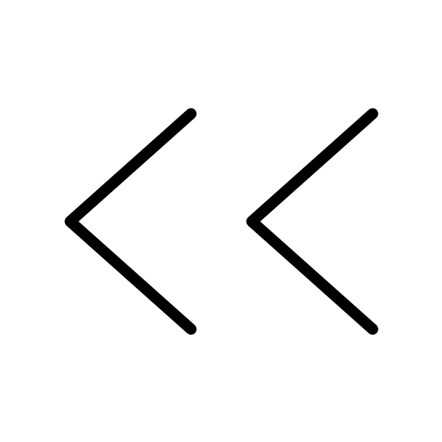
Double chevron control - forward
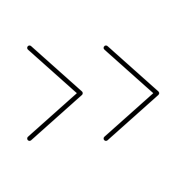
Arrow control button - down
Arrow control button - right
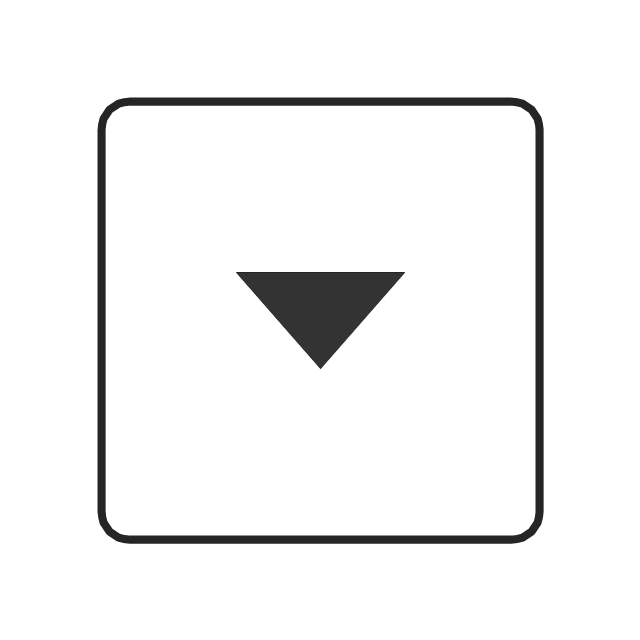
Arrow control - down
Arrow control - right
Plus control
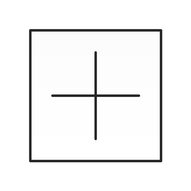
Minus control
Rotating triangle - expand

Rotating triangle - collapse

Network Topology Mapper

The vector stencils library "General window elements" contains 31 window elements.
Use this window UI icon set to design graphic user interface (GUI) of your software application for OS X 10.10 Yosemite Apple Mac operating system.
"A window provides a frame for viewing and interacting with content in an app. ...
A window consists of window-frame areas and a window body. The window-frame areas are the title bar and toolbar, which are typically combined. ... The window body can extend from the top edge of the window (that is, underneath the combined title bar/ toolbar area) to the bottom edge of the window.
The window body represents the main content area of the window. ...
OS X defines appearances that can affect the look of controls and views in particular contexts, such as a window’s sidebar. ...
OS X specifies a set of control/ style combinations that are designed to look good on the toolbar, whether the toolbar is translucent or opaque. ...
Every document window, app window, and panel has, at a minimum:
- A title bar (or a combined title bar and toolbar), so that users can move the window.
- A close button, so that users have a consistent way to dismiss the window.
A standard document window may also have the following additional elements that an app window or panel might not have:
- Transient horizontal or vertical scroll bars, or both (if not all the window’s contents are visible).
- Minimize and fullscreen buttons (note that the fullscreen button changes to a zoom button if the window doesn’t support fullscreen mode or when users hold down the Option key).
- A proxy icon and a versions menu (after the user has given a document a name and save location for the first time).
- The title of the document (that functions as the title of the window).
- Transient resize controls." [https:/ / developer.apple.com/ library/ mac/ documentation/ UserExperience/ Conceptual/ OSXHIGuidelines/ WindowAppearanceBehavior.html#/ / apple_ ref/ doc/ uid/ 20000957-CH33-SW1]
The example "Design elements - General window elements" was created using the ConceptDraw PRO diagramming and vector drawing software extended with the Mac OS User Interface solution from the Software Development area of ConceptDraw Solution Park.
Window elements
- Minimize Button Rectangle Down Arrow Png Icon
- Sub Menu Icon Png
- Android Drop Down List Example
- Glyph icons - Vector stencils library | Ios Dropdown Menu Arrow
- Icon To Expand Menu
- Arrow Image Down
- My Menu Icon
- Menu Icon Apple
- Menus - Vector stencils library | DroidDia PRO unlocker | Menus ...
- Chevron Focus Indicator Icon Png
- Sub Menu Icons
- Up Down Icon Png
- Glyph icons - Vector stencils library
- Button Dropdown Down Arrow
- Icon Menu Apple Png
- Drop Down Png Image
- Glyph icons - Vector stencils library | Progressive disclosure controls ...
- Volume Up Down Icon
- Dialogue Icon
- Menus - Vector stencils library | OS X 10.10 Yosemite home screen ...