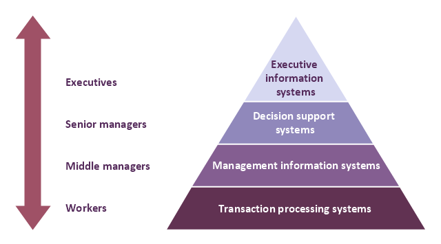
A four level pyramid model of different types of Information Systems based on the different levels of hierarchy in an organization. The first level represents transaction processing systems for workers. The second level represents management information systems for middle managers. The third level represents decision support systems for senior menegers. The fourth level represents executive information systems for executives.
"The "classic" view of Information systems found in the textbooks in the 1980s was of a pyramid of systems that reflected the hierarchy of the organization, usually transaction processing systems at the bottom of the pyramid, followed by management information systems, decision support systems, and ending with executive information systems at the top. Although the pyramid model remains useful, since it was first formulated a number of new technologies have been developed and new categories of information systems have emerged, some of which no longer fit easily into the original pyramid model.
Some examples of such systems are:
data warehouses,
enterprise resource planning,
enterprise systems,
expert systems,
search engines,
geographic information system,
global information system,
office automation." [Information systems. Wikipedia]
This diagram was redesigned using the ConceptDraw PRO diagramming and vector drawing software from Wikimedia Commons file Four-Level-Pyramid-model.png. [commons.wikimedia.org/ wiki/ File:Four-Level-Pyramid-model.png]
This file is licensed under the Creative Commons Attribution-Share Alike 3.0 Unported license. [creativecommons.org/ licenses/ by-sa/ 3.0/ deed.en]
The triangle chart example "Information systems types" is included in the Pyramid Diagrams solution from the Marketing area of ConceptDraw Solution Park.
Pyramid diagram
 Area Charts
Area Charts are used to display the cumulative totals over time using numbers or percentages; or to show trends over time among related attributes. The Area Chart is effective when comparing two or more quantities. Each series of data is typically represented with a different color, the use of color transparency in an object’s transparency shows overlapped areas and smaller areas hidden behind larger areas.
- Organizational Structure | Process Flowchart
- 4 Level pyramid model diagram - Information systems types | 5 Level ...
- Process Flowchart | Organizational Structure | Flow chart Example ...
- Chart Of Management Information System With Diagram
- Using A Diagram Explain The Units Of The Organisational Structure
- | Pyramid Diagram | | Management Information System
- Management Control And Information Systems Flowchart
- Process Flowchart | Organizational Structure | Data structure ...
- Cross Functional Flowchart Symbols | Basic Flowchart Symbols and ...
- Describe Various Levles Of Managemet And Levels Of Information
- Explain The Basic Flow Chart Of Management Information System
- Audit flowchart - Project management process
- Cross- Functional Flowchart (Swim Lanes) | Payroll process - Swim ...
- Data Flow Draigram For Export Information
- Process Flowchart | Flow chart Example. Warehouse Flowchart ...
- Business Management Information System Diagram With Explanation
- Cross- Functional Flowchart (Swim Lanes) | Swim Lane Diagrams ...
- Cross- Functional Flowchart (Swim Lanes) | Swim Lane Diagrams ...
- Data Flow Diagram | Process Flowchart | Data Flow Diagram ...
- Process Flow Chart Of A Company With Explanation